Porsche logo history and the Porsche emblem meaning

Even if you’re not familiar with Porsche logo history, there’s a good chance you’d be able to pick the Porsche emblem out from a line-up of luxury cars. One of the better-known automobile symbols in the world, the Porsche badge is synonymous with luxury and performance.
Almost acting as a seal of approval for some of the world’s most sought-after vehicles, the Porsche symbol is highly coveted by automobile fans today. You can even buy merchandise sporting the famous image, from jackets, to gloves.
Today, we’re going to be celebrating the outstanding power of the Porsche logo over the years, by giving you an insight into the Porsche emblem and its meaning.
Porsche history: The Porsche logo today
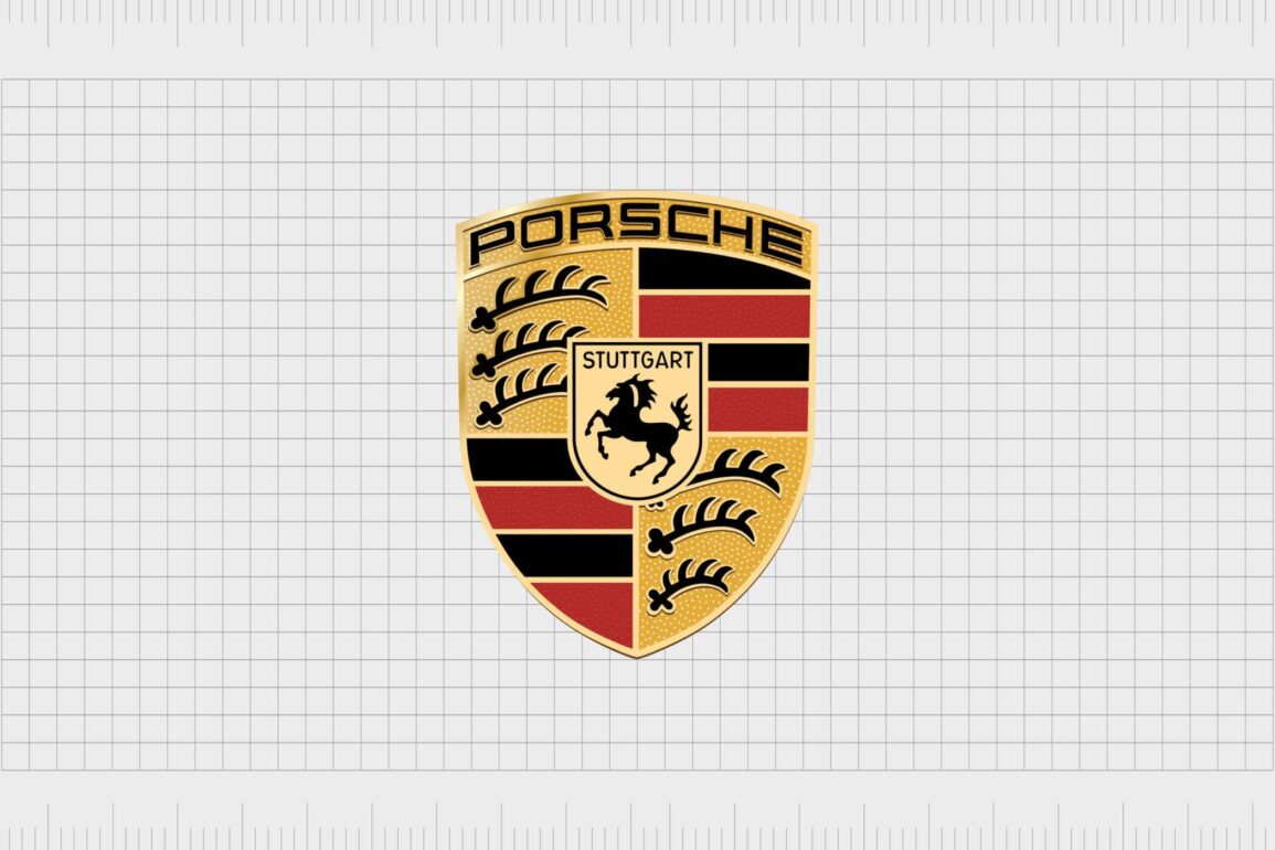
The Porsche car logo is an icon of all things luxury and class. Leveraging one of the more traditional approaches to vehicle emblems, the Porsche symbol is similar in style to a shield of arms.
The image features a set of four red and four black stripes on a golden background, with the Porsche horse in its own, separate shield.
There’s also a series of three antlers on each side of the Porsche logo. The image is separated into four sections, with the iconic Porsche wordmark printed at the top in a sans-serif, all-capital font. You’ll also see the word “Stuttgart” inscribed above the horse in the same golden type.
The image sometimes comes accompanied by a separate wordmark, which appears as a slightly flatter, and more modern version of the Porsche sans-serif font in the shield.
| Founded: | 1931 |
| Founder: | Ferdinand Porsche |
| Headquarters: | Stuttgart, Germany |
| Website: | www.porsche.com |
| Logo downloads: |
The Porsche luxury car brand was first established almost 100 years ago, in 1931. Like many famous car companies today, the title for the company came from the name of the founder, Ferdinand Porsche.
Ferdinand launched the brand with Anton Piech and Adolf Rosenberger, in Germany, where the company is still headquartered today.
Currently, Porsche belongs to the larger Volkswagen corporation, and produces a host of performance sports cars, sedans, SUVs, and other amazing vehicles. The brand is best-known for its dedication to exceptional quality and luxury, and currently serves customers across the globe.
Porsche crest evolution: Porsche logos through the years
The Porsche car logo is a testament to the company’s identity as a historical, and unforgettable brand in the automobile industry. Though the old Porsche logo was quite different to the image most people know today, many elements of the symbol have remained consistent.
Every iteration of the Porsche crest over the years has been updated with a focus on showcasing timeless elegance, beauty, and historical power.
1922
The initial Porsche logo journey starts before the company was officially created. Because the brand was established in Stuttgart, it adopted an existing crest, the crest of Wurttemberg as its official emblem.
The city of Stuttgart was the capital of Wurttemberg, famous for its horse farms. This is something which clearly influenced the later versions of the Porsche logo.
The coat of arms for Wurttemberg was a large crest shield, featuring two deer – one on each side. You’ll notice the central shield features the same striped red and black elements, and the sections with three antlers which appear in Porsche logos today.
1938
In 1939, an alternative coat of arms for the Stuttgart region was introduced, which further inspired the Porsche logo. This was introduced alongside a coat of arms for Wurttemberg in 1945.
The shield of Stuttgart features a prancing horse in black on a yellow background – an image most people have come to associate with Porsche today.
The shield for Wurttemberg was simply the quartered image featuring red and black lines, and the set of three antlers in two sections. Notably, in the lower left corner of the shield, the antlers become progressively smaller from the top to the bottom.
1952
In 1952, the first ideas for the new Porsche crest began to emerge. A sketch was created of the potential Porsche symbol, which is similar to the one we know today. This image featured the same Stuttgart coat of arms shield overlaid on top of the Wurttemberg coat of arms.
The emblem also included the “Porsche” name written in sans-serif capitals at the top of the shield.
Finally, in 1952, the official version of the Porsche emblem was updated and introduced, this time in a much more regal looking gold, red, and black color scheme. The shade of gold replaced the previous yellow coloring in older depictions of the Porsche logo.
The choice to switch yellow to gold helps to make the current Porsche logo appear more modern and professionally-made, while demonstrating ideas of opulence and luxury.
The Porsche logo today also features the name “Porsche” in capital sans serif letters, and the word “Stuttgart” to draw attention back to the origins of the business.
Porsche symbol meaning: The Porsche emblem
There are various elements to unpack when identifying the meaning of the Porsche emblem. The overall logo is a golden crest, consisting of four segments, and a smaller crest in the middle.
The four crests are split into contrasting images, on the left, there’s a top-right section with a gold background and three black antlers. Underneath this, we see the four stripes in red and black.
On the right-hand side of the crest, the stripes are at the top, and the antlers fall to the bottom. The size of the antlers in this section gradually get smaller towards the bottom of the shield. This image represents the coat of arms for Wurttemberg, as a reference to Porsche’s history.
The antlers in the image highlight the strength and power of the brand, while also drawing attention to the company’s natural resources. The red and black stripes combine an insight into traditions, with ideas of color psychology, symbolizing the unity of passion and design.
In the middle of the larger Wurttemberg shield is the Stuttgart coat of arms, represented in gold (rather than traditional yellow), with the word “Stuttgart” in sans-serif capitals. There’s a horse prancing in the middle of the shield, demonstrating the ideas of great strength and elegance.
At the very top of the Porsche crest is the name “Porsche” written in stylish sans-serif font, designed in black with a golden outline.
Porsche logo colors
Aside from the unique imagery of the deer and the horse presented by the Porsche logo, the colors of the emblem are some of the most memorable factors. The shades used by the Porsche team are red, black and gold.
All of these colors are linked back to the colors of the region where Porsche was originally created. However, they also have their own meaning.
Red is often associated with power and passion, while black symbolizes strength and innovation. Gold, of course, is excellent for conveying luxury and wealth.
The Porsche logo color codes are:
American Bronze
HEX color: #402306
RGB color: rgb(64, 35, 6)
Outer Space
HEX color: #464C47
RGB color: rgb(70, 76, 71)
Aztec Gold
HEX color: #C29049
RGB color: rgb(194, 144, 73)
Sweet Brown
HEX color: #A43131
RGB color: rgb(164, 49, 49)
Black
HEX color: #000000
RGB color: rgb(0, 0, 0)
What font is the Porsche logo?
The Porsche logo font is a custom font designed specifically for the Porsche brand. Crucially, the lettering for the logo hasn’t undergone any major changes since the company first created its emblem. The major differences to the typography have been in its coloring.
The Porsche font is a simple but modern sans-serif type written in all capitals. On the current emblem, the font appears slightly raised due to texturing.
Celebrating the Porsche logo today
The Porsche logo is easily one of the most recognizable symbols of luxury and elegance – at least in the automobile manufacturing world. Though the symbol has remained almost entirely the same for a number of decades, it continues to make a significant impact on the market today.
Now read these:
—Which car companies own which car brand?
—Famous car brands, their names and logos
—The ultimate list of French car brand logos
—The 50 best-known car logos with wings
—The definitive guide to German car logos
—Famous car logos and emblems with stars
—Top American car brands and their logos
—Your ultimate guide to Italian car brands
—American car companies that went bust
—The conclusive guide to British car logos
—The essential list of Japanese car logos
—A decisive guide to car logos with circles
Fabrik: A branding agency for our times.
Clarity starts with a conversation.
Thanks—we’ll get back to you shortly.
Whether you're navigating a rebrand, merger, or simply need a clearer identity—we’re here to help. No hard sell, just honest advice from people who know the sector.
Let’s start with a simple question…
Prefer to email? Drop us a line.
Fabrik’s been helping organisations rethink and reshape their brands for over 25 years. We’ve guided companies through mergers, rebrands and new launches. Whatever stage you’re at, we’ll meet you there.


