Kodak logo history: The evolution of the Kodak symbol

How much do you know about Kodak logo history? A household name for consumers around the world, Kodak is one of the most recognizable brands in the photography industry. Like many major brands, Kodak has used its symbol to capture the attention of customers for decades.
However, the Kodak logo hasn’t always been the bright emblem most people are familiar with today. Since the company launched in 1892, starting life as “The Eastman Dry Plate and Film Company”, it has gone through a number of logo changes, designed to refine and enhance its image.
Today, the Kodak brand mark conveys the unique vision of the brand, to make photography as simple and convenient as using a pencil. If you’ve ever wondered where the Kodak logo began, or how it has transformed over the years, read on for a complete guide to Kodak logo history.
The Kodak symbol: Introducing the Kodak brand
Otherwise known as the “Eastman Kodak Company”, Kodak is an American brand, best-known for producing products for the photography industry. It was the first company ever created to introduce photography to the mass market, transforming the way we capture images forever.
The brand began with a partnership between Henry A. Strong and George Eastman, who joined forces to create a simple “film roll camera”. After the first device was released in 1888, the Eastman Kodak company was incorporated in 1882.
Interestingly, the name “Kodak” doesn’t have any specific meaning. Eastman said he chose it because the letter “K” seemed like a strong, incisive letter.
Under the direction of Eastman, Kodak quickly emerged as the world’s largest film and camera manufacturer. The company held a strong position in the photographic film space for most of the 20th century, producing a number of innovations for the modern market.
In 1990, Koda began to struggle financially, thanks to increased competition from brands like FujiFilm, and the rise of digital photography. After a struggle with bankruptcy, Kodak restructured, and began to rally again throughout the 2000s, introducing new products and services.
Kodak logo history: Kodak logo evolution
Like many photography companies, Kodak hasn’t always used the same logo to represent its brand. In fact, initially, the company had a very different, more traditional logo, and an entirely different name.
Let’s take a closer look at Kodak logo history, and explore how the company discovered its evocative and eye-catching modern image.

1889
When George Eastman and Henry A Strong began working on their first camera, their business was known as the “Eastman Dry Plate and Film Company”. The vintage Kodak logo created for the brand was very traditional, featuring a number of decorative elements.
In the middle, we see a vertical rectangle in black, with the brand’s name written in an uppercase, scratch font, similar to human handwriting. The words are surrounded by various flourishes. On either side of the rectangle are details of the company’s location.
Around the entire banner, we see an ornate border, featuring swirls and leafy designs, intended to draw attention to the company’s creative nature. The old Kodak logo was one of the most interesting, and complex Kodak symbols on this list.
1907
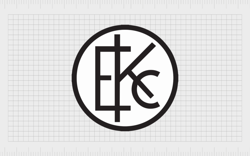
In 1907, the company’s name was officially changed to the “Eastman Kodak Company”. The new name paved the way for an updated, monogram style logo. This design was much simpler than the previous, featuring a circular badge, with the overlapping letters “EKC” in the center.
The Eastman Kodak logo was depicted in black and white, and featured sans-serif lettering, where all three characters were executed with geometric cuts and straight lines. The monogram looked sleek and modern, helping to separate the company from its competitors.

1935
Almost 30 years after introducing their monogram logo, the team designed a new Kodak symbol, this time focusing on the word “Kodak” alone. The new emblem featured a bright red inscription, written in a bold font with slab serifs.
The color choice was evocative and passionate, as well as excellent for capturing the attention of Kodak’s audience. The blocky letters gave the company’s inscription a sense of power and confidence, cementing its power in the photography space.
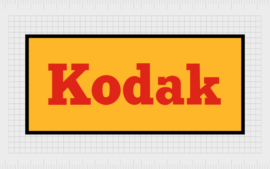
At the same time, a variation of this logo was introduced, featuring the same inscription on a yellow background with a black border. This was the first time Kodak introduced the core shades of its modern color palette: yellow and red.
1960
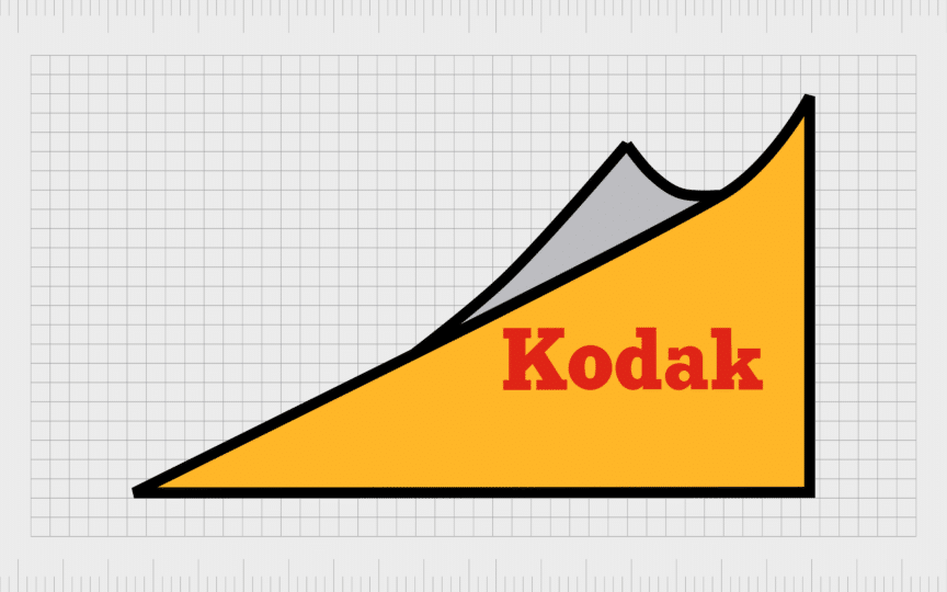
During the 1960s, Kodak began experimenting with the shapes used in its logo. The rectangular image mentioned above was converted into a triangle shape, with a slightly curved line on the top. A grey element was also added to the upper part of the badge.
The geometric design was complemented by the official Kodak colors of the time, with yellow in the background of the main triangle, and “Kodak” written in red font. The typography was the same as that used in previous designs, though the inscription was a little smaller.
1971
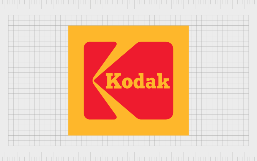
In the early 70s, the first version of the new Kodak logo we know today was introduced. The updated emblem featured a solid yellow square in the center, with a “K” shape constructed of geometric shapes, depicted in bright red.
The “Kodak” inscription was changed to yellow to contrast with the red background, and placed in the right part of the “K” graphic element.

1983
During the early 80s, Kodak began to implement more minimalistic designs for its brand image. A new wordmark was introduced, similar to the design used in 1935. However, this time, the team used a simple and neat sans-serif typeface, with sleeker lines.
The “A” character was modernized, and the removal of the slab serifs made the company appear more modern, informal, and approachable. While the yellow coloring disappeared, the red used in previous Kodak logos was retained for the inscription.

Also in the 80s, Kodak introduced another modern logo design, featuring the Kodak name in black, underneath a unique geometric badge. The badge featured a “K” shape, created in white on a black background, with numerous thin white lines cutting through the lower half.
This dynamic logo might have been monochrome in color, but it drew attention to the company’s innovative and creative personality.

1987
In 1987, Kodak upgraded the original Kodak red and yellow logo from the 1870s. The yellow square with the “K” element in red was reintroduced. The contours of the K shape were refined, and the typeface used in the design was updated to the sans-serif version.
This logo stayed with Kodak for almost 20 years, and formed the foundation for the emblem most fans are familiar with today.
2006
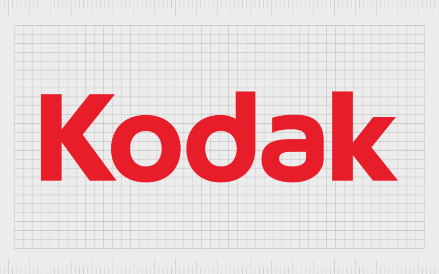
Taking inspiration from the Kodak logo produced in the 1980s, Kodak’s emblem for 2006 was once again a simplified wordmark, written in sans-serif red font. The lines of the typeface were smoother, and more progressive, enhancing the company’s modern image.

2016
Finally, Kodak began using its K-shape logo again in 2016, re-introducing the red design on the yellow square background. The main difference between this logo and the design from the 80s is in the inscription. This time, the letters of the company’s name appear vertically on the left side.
The typeface itself has also been altered. Though the company still uses a sans-serif font, the characters are all uppercase, giving the brand a confident and powerful appearance.
What does the Kodak logo mean? Kodak logo meaning
The Kodak logo has come a long way since the original Kodak logo was introduced in the 1800s. While the founder of Kodak might not have chosen the name of the company for a specific reason, he did infuse meaning into all of the Kodak symbols.
The latest Kodak logo is more than just a bright and eye-catching symbol. Each component of the design holds its own unique meaning. For instance, the yellow background and font choice is intended to convey ideas of optimism, light, and joy.
The color red, in color psychology, is generally associated with ideas of passion, vitality, and power. Together, the two colors create a visually arresting design, sure to grab attention.
Notably, the geometric design in the new Kodak logo isn’t just intended to look like the letter “K” symbolizing the company’s name. It also looks a little like a traditional camera.
The Kodak camera logo: Fonts and colors
The Kodak camera logo has evolved significantly over the years, from the vintage Kodak logo introduced in the 1800s, to the new, modern design. Vibrant and engaging, the new Kodak logo conveys ideas of passion and joy, inspiring customers everywhere.
If you want to take a closer look at the elements of the Kodak logo, you can find some useful resources linked below:
What is the Kodak logo font?
The Kodak brand actually uses two official fonts in its image. The first is the uppercase sans-serif typeface, depicted vertically on the Kodak yellow and red logo. The second is the lower-case version of this font, created for the 2006 inscription, sometimes still used today.
The font choice is bold and attractive, with sleek lines and sophisticated curves. The design is similar to the Maven Pro Bold font, available online.
What are the Kodak logo colors?
While Kodak has experimented with a handful of colors throughout the years, the company has always shown a preference for yellow and red. The two official Kodak colors today are Kodak yellow, and a bright shade of red, sometimes accompanied by a white background.
The shades are similar to:
Spanish Yellow
Hex color: #fab617
RGB: 250 182 23
CMYK: 0 27 91 2
Pantone: PMS 7549 C
KU Crimson
Hex color: #e30613
RGB: 227 212 173
CMYK: 0 4 20 7
Pantone: PMS Bright Red C
The eye-catching Kodak logo
An insight into Kodak logo history demonstrates just how many changes the photography company has made to its image over the years. The Kodak brand has experimented with various symbols, colors, and typefaces, even changing its name at one point.
Today, the Eastman Kodak logo is a symbol of vitality, passion, and creativity. It combines the joy and light of the color yellow, with the power of the red shade. The unique geometric design, combined with the simple sans-serif font choice, gives the image a modern edge.
Fabrik: A branding agency for our times.
Clarity starts with a conversation.
Thanks—we’ll get back to you shortly.
Whether you're navigating a rebrand, merger, or simply need a clearer identity—we’re here to help. No hard sell, just honest advice from people who know the sector.
Let’s start with a simple question…
Prefer to email? Drop us a line.
Fabrik’s been helping organisations rethink and reshape their brands for over 25 years. We’ve guided companies through mergers, rebrands and new launches. Whatever stage you’re at, we’ll meet you there.


