Fiat logo history; symbol, meaning and evolution

How much do you know about Fiat logo history? The company’s name, and its current simplistic logo are well-known around the globe today. Over the years, Fiat has become one of the most popular global brands in the automotive industry, selling a range of affordable vehicles.
However, like many famous car brands, Fiat has updated its emblem throughout the years, refining its image to suit the preferences of a more modern audience. In fact, the Fiat car brand has made more changes to its symbol than virtually any other automotive company.
If you’ve ever wondered where the Fiat symbol came from, or you’ve searched for meaning behind the Fiat emblem, you’re in the right place. Today, we’re taking a closer look at all of the old Fiat logos from throughout the years, as well as the current Fiat badge.
Introducing the Fiat brand: When was Fiat founded?
Before we dive into Fiat logo history, let’s take a closer look at the origins of the Italian company. Fiat is one of the world’s largest Italian automotive manufacturers. It currently operates as a subsidiary of Stellantis, and was originally formed in 1899.
The original Fiat company opened its first plant in 1900, with only 35 members of staff. Despite its small size, the company made a name for itself. It was well known for its talent and creativity in the emerging automotive world.
Today, Fiat Automobiles is the largest vehicle manufacturer in Italy, and has remained one of the largest automotive manufacturers in Europe for most of its history. Fiat-brand cars are now built and distributed in various locations around the world, from Italy, to Brazil, Poland, and Mexico.
The brand has also received a variety of awards for its vehicles, including nine awards for “European Car of the Year” – the most of any vehicle manufacturer.
What does Fiat mean?
The name “Fiat” stands for “Fabbrica Italiana di Automobili Torino”, which translates to mean the “Italian Automobiles Factory of Turin”. The name was chosen by Giovanni Agnelli, and the other founding members of the Fiat group, when it was first established in 1899.
Fiat logo history: The Fiat car logo over the years
Not only is Fiat one of the most popular car manufacturers in the modern world, it’s also well-known for its approach to transformative branding. The company has changed its logo design, color scheme, and typography numerous times over the years.
Here’s a quick insight into Fiat logo history.
1899
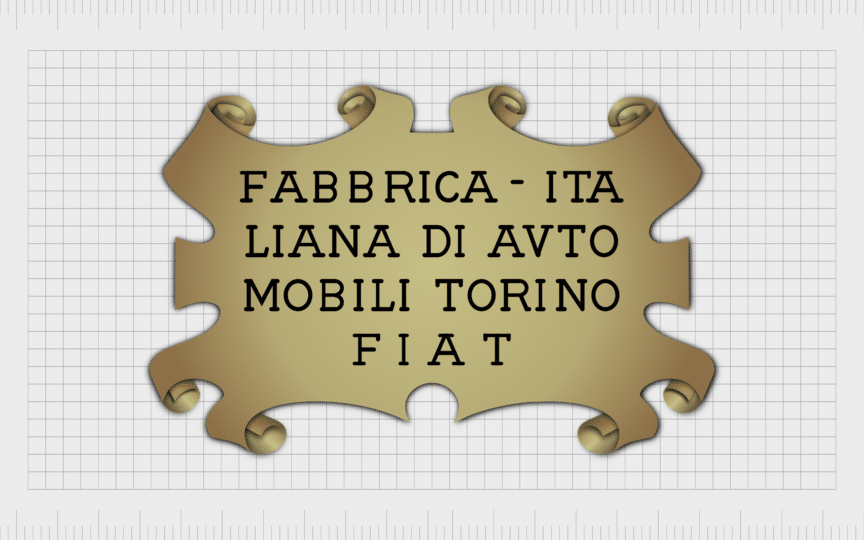
The first Fiat logo, introduced in the early years of the brand’s rich history, is by far the most traditional. It featured the full name of the brand, as well as its acronym, in simple, serif font, depicted in black, on a golden background.
The background of the image is designed to look like a traditional scroll, with a bold black outline, and rounded edges on the curved components.
1901
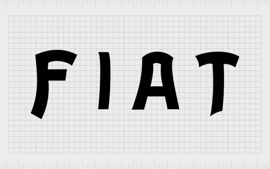
In 1901, Fiat updated its logo to focus on the official company name. The word “Fiat” was presented in unique, sans-serif font (still in black) on a white background. Despite its simplicity, this logo was quite modern and dynamic for the time.

1903
The new Fiat logo introduced in 1903 matched the popular design elements of the time. It was drawn in an Art-Deco style, featuring gold letterings, placed on a blue-enameled plate. The design was quite ornate, featuring a variety of decorative elements, such as a rising sun and leaves.
Though this logo was quite complex, it offered an insight into the first version of the Fiat logotype most consumers are familiar with today.

1908
Like many old Fiat logos, the Fiat symbol introduced in 1908 was extremely decorative and complex. While the typeface of the previous visual identity remained, it was now presented in white letters. The brand’s name appeared on a dark blue background, encased in a lighter blue oval.
The oval badge included a number of decorative lines and elements, intended to draw attention to the symbol, and differentiate Fiat from its competitors.

1921
Fiat moved into an era of circular logos in the early 1920s. The first fiat logo in this era featured the simple Fiat wordmark, in red, placed in a rounded frame. The frame around the logo featured various laurel leaves and traditional decorations, depicted in gray.

1925
In 1925, the gray framing was replaced with gold. The background behind the “Fiat” wordmark was switched to a dark shade of blue, and the wordmark was depicted in white. The design was almost exactly the same as the previous, but with a new color scheme.

1929
In 1929, the gold framing of the Fiat badge was once again reverted to silver, giving the company a more sophisticated appearance. The decorative elements around the Fiat name were removed, allowing the wordmark to take up more of the circular badge.

Fiat also introduced an alternative version of this logo in 1931, which featured all of the same elements, but switched the blue background for a bright shade of red.

1931
In the 1930s, a new era of Fiat logo design began. This time, the company chose an elongated vertical rectangle for its badge, with the letters of the “Fiat” wordmark stretched to meet the new design. The color palette was red and silver, with a black, thin outline.

Throughout the following years, Fiat introduced various new refined versions of this logo, starting with a gradient-style option in 1932, which made the letters of the typeface look as though they were shining. The rounded edges of the Fiat badge were also sharpened.

1938
In 1938, yet another version of the rectangular logo appeared. A shield-style fiat logo was introduced, featuring all of the elements of the previous design, but with a more traditional crest shape. The narrow red badge looked extremely elegant on cars and automobiles.

Throughout the following years, Fiat continued to experiment with this new shape. In 1949, it reverted to a more modern geometric style, with a trapezoid background. In this variation, the lines of the Fiat wordmark seem a little bolder.
In 1959, the shape of the logo changed again. The combine combined an oval shape with a rectangular shape, to create a new, modern design. The border around the Fiat wordmark was thickened, and gradients were added to create a shining, three-dimensional effect.
A version of the new badge introduced in 1959 was also created which featured stripes in the red background behind the “Fiat wordmark”. Once again, in this version of the logo, the border was thickened, while the Fiat lettering was made thinner.

1965
In the 1960s, Fiat went back to its origins, introducing the round logo for a second time, with its laurel leaf border. The round shape allowed for a more organic-looking Fiat wordmark, where the letters weren’t nearly as vertically stretched as they were before.
In this version of the logo, the coloring of the wordmark also changed, placing golden letters on a bright red background.

1968
Another major era in Fiat logo history began in 1968. The company decided to take a geometric approach with its visual identity. The new logo featured four rectangles, all connected to each other, with a separate letter from the Fiat name presented in each.
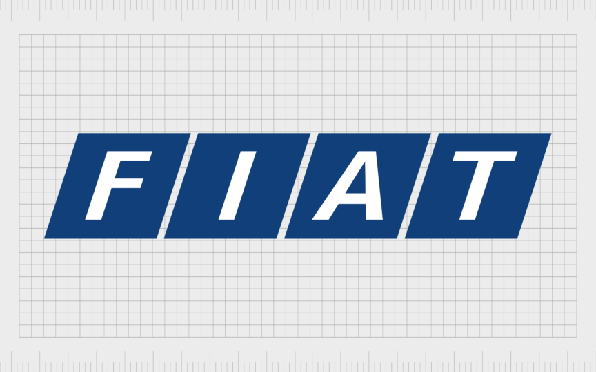
Initially, the Fiat team used a black and silver color palette for this geometric logo. However, in 1972, they updated the color palette to blue and white.

1982
The Fiat car logo changed again in the 80s. This time, the company introduced one of its most minimalistic designs. The Italian automaker eliminated the wordmark from its badge entirely. Instead, the emblem featured only five thick diagonal lines in silver.

This rather abstract logo was refined again in 1991, when Fiat added a little extra color to its emblem. Now, the five lines appeared on a turquoise background, and their edges were rounded.
1999
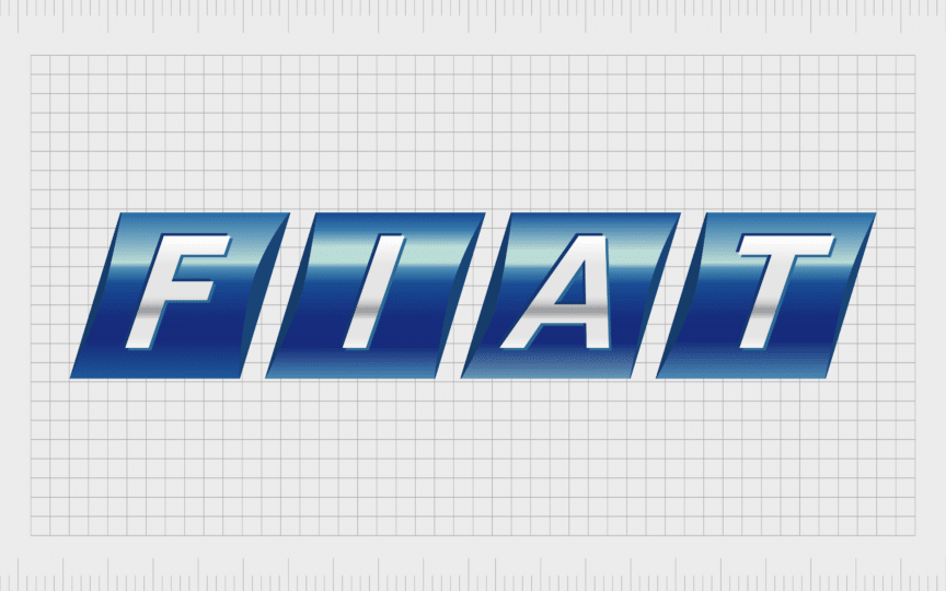
In 1999, Fiat reverted to using its name within its logo again, taking inspiration from the previous “four rectangle” design mentioned above. The four rectangles were presented in gradient blue, with the letters of the design in silver. The design looked glossy, bright, and three-dimensional.

1999
Another reference to Fiat logo history appeared in 1999, when the company revived a version of its circular badge. The new logo featured a dark blue circle with a thick silver frame, covered with crossing lines. The logo looked quite elegant, but it only stayed with the brand for a short time.

2001
In 2001, Fiat modernized its circular logo, removing a lot of the decorative elements. The badge was still created in a three-dimensional format, and featured the color palette of blue and silver. However, the lines were now much sleeker.

2003
For a short time in 2003, the Fiat badge featured only the name of the company in its iconic font. Each letter was designed in a three-dimensional format, to make the image look more dynamic. The lettering was also depicted in gradient blue, showcasing trust and reliability.

2006
One of the better-known Fiat logos was introduced in 2006, and still appears on some cars today. Inspired by early versions of the Fiat logo, this new emblem featured the company’s name, presented on top of a red rhomboid shape, surrounded by a shiny silver border.

2020
In 2020, Fiat followed in the footsteps of many companies embracing more simplified symbols. The new Fiat logo featured only a wordmark, depicted in the geometric lettering that has appeared in countless old Fiat logos.
The company chose two color palettes for this new logo. One showcases the wordmark in red on a white background, while the other features just black and white.
Fiat logo meaning: Understanding the Fiat symbol
Throughout the years, each Fiat logo has had its own specific meaning. Some of the more ornate logos created by Fiat were designed to accommodate a change in design preferences among consumers, and new trends like the Art Deco style.
Others drew attention to Fiat’s sophistication and heritage, such as the round logos with the laurel leaf borders. The current Fiat logo is one of the simplest used by the brand. The big Fiat letters in the emblem are intended to demonstrate the strength and stability of the company.
Each letter has a unique, geometric shape, giving the business a more modern appearance, and highlighting the company’s commitment to ongoing change. The color choices, red, black and white, symbolize passion, excellence, and professionalism.
The Fiat badge: Fonts and colors
Compared to the countless complex Fiat logos introduced over the years, the current Fiat symbol is extremely simple. However, it’s still incredibly impactful. Unlike the company’s first logo, and many symbols introduced after, this logo is extremely modern.
It showcases the brand name in a bold, unique font, drawing attention to concepts like reliability, creativity, and strength.
You can take a closer look at the Fiat logos through the years with the resources below:
What is the Fiat logo font?
While the Fiat logo has changed a number of times throughout the car company’s history, the Fiat font has remained relatively consistent for a number of decades. The unique, geometric font is intended to showcase strength and stability.
This typeface is unique to the brand, but there are some similar options available, such as the Verkehr Regular font – a display sans serif font.
What is the Fiat color palette?
Fiat colors have changed consistently throughout the decades. Though the company has often experimented with common shades such as red and blue. Today, the Fiat logo can appear in black on a white background, or in a deep shade of scarlet.
The evolutionary Fiat emblem
The Fiat logo history is one of the most interesting design histories in the automotive industries. While many companies have changed their emblem a few times, the Italian brand has consistently transformed its image to suit changing preferences.
Today, the current Fiat logo is a world apart from the original logo used by the business. It features a unique typeface, with no surrounding decorative elements or components.
The modern Fiat badge, though simple, highlights the strength of the ever-evolving company, it’s flexibility, and its reliability. Additionally, the use of a similar font to those that appeared in previous designs reminds us of the rich heritage of the Fiat brand.
Fabrik: A branding agency for our times.
Clarity starts with a conversation.
Thanks—we’ll get back to you shortly.
Whether you're navigating a rebrand, merger, or simply need a clearer identity—we’re here to help. No hard sell, just honest advice from people who know the sector.
Let’s start with a simple question…
Prefer to email? Drop us a line.
Fabrik’s been helping organisations rethink and reshape their brands for over 25 years. We’ve guided companies through mergers, rebrands and new launches. Whatever stage you’re at, we’ll meet you there.


