The best zoo logos: Famous zoo logos to go wild for
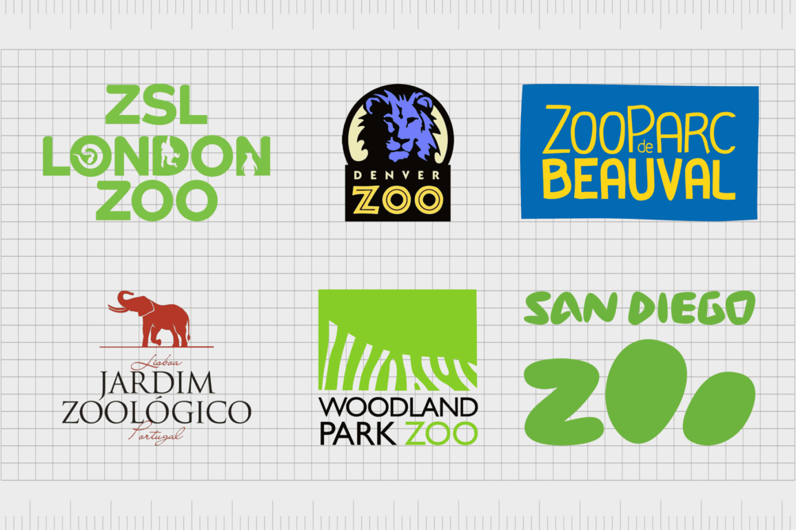
Take a look at some of the most famous zoo logos from around the globe, and you’re sure to see some excellent examples of creativity and passion. Designed to inspire, amaze, and even connect with viewers on an emotional level, the most iconic zoo logos definitely make an impact.
After all, like any organization or business, zoo’s need to compete with other locations to capture the attention of their audience. A well-designed logo is an excellent way to capture the hearts and minds of your potential sponsors and customers.
What’s more, it makes for excellent merchandising opportunities.
The chances are you’ve visited plenty of zoos with their own dedicated gift shops. There you can purchase t-shirts, teddy bears, and a range of other items sporting the group’s logo. It only makes sense for zoo symbols to be as attractive as possible.
Today, we’re going to look at some of the most iconic zoo logos to amaze and inspire you.
The most iconic zoo logos of all time
The world’s most popular zoo logos come in a variety of shapes and sizes. Some designers choose modern minimalistic styles to attract the attention of a more current audience. Others adopt bright colors and bold shapes to appeal to youths.
There are even some great zoo logos with hidden meanings and an impressive use of white space.
Here are just some of the most memorable emblems you may be familiar with…

Vancouver Zoo
Otherwise known as the “Greater Vancouver Zoo”, Vancouver Zoo is a 49-hectare zoo located in Canada. First established in 1970 as the “Vancouver Game Farm”, the location has been renamed twice over the years.
Today, the location even releases animals regularly back into the wild.
The company recently updated its logo for a modern and simplistic feel. Replacing a series of brightly colored animals is a minimalist wordmark, with three different typography choices.
The “Zoo” part of the image is three-dimensional green font, with a white line in the middle. The “Vancouver” component is a modern sans-serif typeface with an artistic feel.

London Zoo
Sometimes referred to as “ZSL”, London Zoo has an amazing history. It’s more than 194 years old, and stands as one of the world’s oldest scientific zoos. At first, the location was intended to be used as an environment for collecting animals for scientific study.
Today, the space is home to more than 673 species of animals – one of the largest collections in the United Kingdom.
An excellent example of the power of white space, London Zoo hides various recognisable images of animals in the letters of the word “London”. The “ZSL” wordmark also features the patterns of various well-known creatures.
A bright and friendly green font reminds us of both the natural world, and the welcoming nature of the zoo.

Dvůr Králové Safari Park
Located in Dvur Kralove in the Czech Republic, Dvur Kralove Safari Park is the second largest zoo in the country, with its own amazing “safari” section. The organisation not only showcases and cares for animals, it also works to protect endangered and threatened species.
The zoo specializes in African animals, including the Northern white rhinoceros.
This example of a popular zoo logo is a wonderfully exotic and appealing image, reminding us of the sunny plains of Africa, and one of the main target animals of the zoo location. The playful lines and color choices is excellent for highlighting the mission and vision of this zoo.
Budapest Zoo
With more than 1,072 animal species, Budapest Zoo is located in the very centre of the city, and first opened its doors in 1866. The park has millions of visitors every year, and is even home to some amazing art nouveau buildings to explore.
Animals range all the way from the phenomenal wombat, and the Komodo dragon.
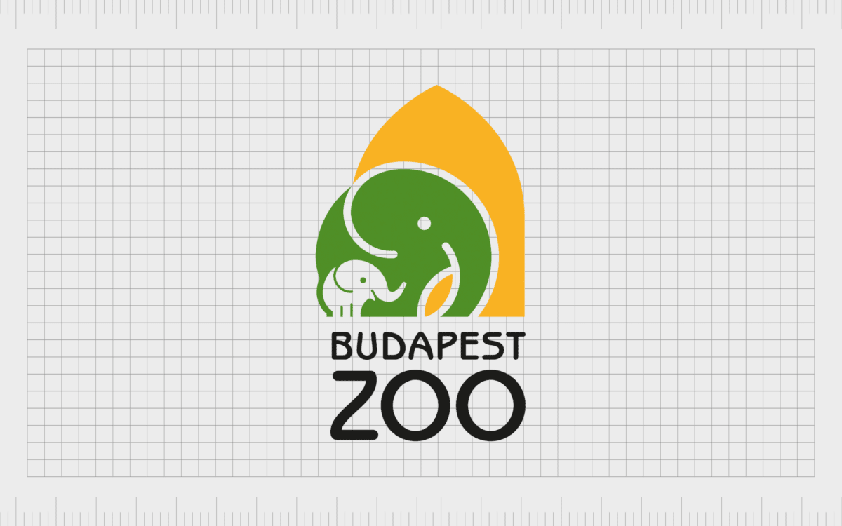
The Budapest Zoo logo might be simple, but it’s still eye catching. The colors are designed to remind us of the home location of the Zoo, with a shape in the background to highlight local architecture.
The minimalistic elephant is a friendly image for a younger audience, while the sans-serif font appeals to a range of viewers.

Prague Zoo
Opened in 1931 with the visionary goal to advance the study of zoology, educate the public, and protect wildlife, Prague Zoo is one of the most popular destinations in the world.
The location is rated one of the best zoos in the world, and is home to around 5,000 animals from 676 different species, including more than 100 threatened species.
Simple, playful, and youthful, Prague Zoo uses abstract versions of familiar paw and hoof prints in its logo. We see a variety of references to different animals in these shapes, as well as a multitude of colors to highlight the fun and joy of the location.
Edinburgh Zoo
Formerly known as the Scottish National Zoological Park, Edinburgh Zoo has some amazing views of the city, as well as a wonderful collection of animals. It’s Scotland’s most popular paid-for attraction among tourists, just after Edinburgh Castle.
What’s more, it’s invested in a range of scientific pursuits, such as the breeding of various endangered species.
The first zoo in the world to breed penguins, Edinburgh Zoo draws attention to its history with its eye-catching logo. The simple symbol features the name of the location, alongside a minimalistic version of a Penguin.
The penguin has remained a mascot of the zoo for quite some time.

Woodland Park Zoo
A wildlife conservation and zoological garden located in Seattle, Washington in the United States, Woodland Park opened more than 123 years ago, in the late 1800s.
The location has won 65 awards among a range of categories, and welcomes millions of visitors every day, even though it’s considered relatively small compared to other zoos.
The Woodland Park Zoo logo has evolved a few times over the years to become more minimalistic and simpler. The image today features a green rectangle with the white stripes of a zebra inlaid at the bottom.
The green coloring reminds us of the natural focus of the group, while still being bright enough to inspire a vibe of creativity.

Minnesota Zoo
Formerly the Minnesota Zoological Garden, Minnesota Zoo is located in Apple Valley of Minnesota, and has long been considered revolutionary in its design. The zoo is built in a suburbanizing rural area, with various spaces to house exhibits.
It was also one of the first zoos to organize animals by living environment, rather than species.
One of the most iconic zoo logos on our list, the Minnesota Zoo symbol is simple and effective. Embracing the trend of minimalist design, this image uses organic shapes like leaves to create the image of a large cat.
The soft and warm colors of green and yellow are excellent for inspiring ideas of joy and nature.

Pittsburgh Zoo & Aquarium
Easily one of the most famous zoo logos on our list, the Pittsburgh Zoo & Aquarium logo has inspired designers across the globe. One of the only major zoo and aquarium combinations in the United States, the location is home to 4,000 animals across 475 species.
The location is also well-known for creating natural habitats for its animals.
An inspirational insight into the wonderful use of white space, Pittsburgh Zoo & PPG Aquarium creates the image of a lion and an ape looking at each other around the image of a tree. This is a beautifully engaging logo, perfect for making viewers look a little closer.

Kolner Zoo
Founded in 1860, and also known as Cologne Zoological Garden, the Kolner Zoo is one of the most famous in Germany, and the world. Featuring incredible exhibits, like a free-flight rainforest hall and a large elephant park, this destination is a must-see attraction for many visitors.
Like many of the most famous zoo logos, Kolner uses white space to its advantage in this image. The positive space used to create the image of an elephant is filled with other references to the zoo’s endeavours, including the image of a rhino and a giraffe.
There’s also an image of an iconic building located towards the back of the creature.

Bronx Zoo
Like a number of the zoo logos we’ve looked at so far, the Bronx Zoo takes advantage of white space to add more meaning to its design. This zoo was originally opened in 1899, and is one of the largest locations to visit in the United States by area.
The zoo has over 2 million visitors per year, and is home to more than 4000 animals from 650 different species.
An iconic zoo logo for our list, this symbol showcases the image of two giraffes, an adult and a youngster standing together, as well as a series of 3 birds. Within the legs of the giraffes, we see the familiar shape of the New York Manhattan skyline.

Denver Zoo
One of the older zoos in America, Denver Zoo was launched in 1896, and covers around 80 acres of ground in the City Park of Denver, in Colorado. The attraction is the most visited location in the Denver Metropolitan area.
However, this organization started small, with the donation of a single orphaned black bear. It was also the first zoo in the US to use natural enclosures instead of cages.
Bright and eye-catching, the Denver Zoo logo is modern and engaging. The color purple in the lion’s head is an excellent symbol of the zoo’s compassion, while shades of yellow remind us of sunlight and joy.
The zoo’s typography is also an excellent choice, with a raw and exotic vibe.

San Diego Zoo
Located in California, San Diego Zoo is home to more than 12,000 animals from around 650 species. The location is owned by the San Diego Zoo Wildlife Alliance.
A pioneer in the concept of open-air and cageless animal exhibitions, the zoo was even well-known for housing and successfully breeding giant pandas, before sending them back to China in 2019.
Though much simpler than some of the popular zoo logos we’ve looked at so far, the San Diego zoo symbol still makes a lasting impression. The bold and bubbly font choice is excellent for attracting a younger audience.
The “O’s” in the word “Zoo” are also intended to look like elements of a paw print, reminding us of the zoo’s purpose.

Melbourne Zoo
Melbourne Zoo is the biggest zoo in Melbourne, and a highly popular attraction for Australia. Today, the location is home to 320 species of animals from both Australia and around the world.
The zoo is set among a number of picnic areas and flower gardens for visitors to explore. Most animals are organized by their climate, rather than species.
Melbourne Zoo’s logo is a fantastic combination of white and green shapes, brought together to form the image of a family of apes. The design takes full advantage of the trends of modern logo design, with a bold green color palette ideal for drawing attention to the natural world.

Australia Zoo
Easily one of the most famous zoos in the world today, the Australia Zoo is located in Queensland, and is owned by Terri Irwin, Steve Irwin’s widow. The location was opened by Lyn and Bob Irwin in 1970, with a focus on helping care for crocodiles and reptiles.
The space has earned a number of awards over the years, and now has more than 1,200 animals.
Unique compared to many of the zoo logos we’ve looked at so far, the Australia Zoo has no reference to animals in its symbol. Instead, the focus is on the location of the zoo, and the region where most of the animals come from.
The “Home of the Crocodile Hunter” tagline is excellent for pulling attention to the space’s unique selling point.
Hanover Zoo
Hanover Zoo, or Erlebnis Zoo in Hanover is the fifth oldest zoo in Germany. Established in 1865, the location has around 3,414 animals across 237 species.
In this amazing location, visitors can enjoy a range of themed areas, including the Zambezi region which recreates the African savannah, with an artificial river where you can travel on small boats to see animals.
Attractive and modern, the Hanover Zoo logo uses white space to place the image of a person’s face just behind the image of a lion’s head. This is an eye-catching and engaging symbol for a zoo, reminding us of the connection between people and wildlife.
Rotterdam Zoo
Known by locals as Diergaarde Blijdorp, Rotterdam Zoo is located in the Northwest of Rotterdam, and is one of the oldest zoos in the Netherlands. First opening in 1857, this zoo is still relatively small, with around 180 animal species in total.
The location is also a member of the Dutch Zoo foundation, and has a range of great themed areas to explore.
Rotterdam Zoo chooses a simple and sophisticated logo as its image. The zoo emblem we see here features the image of a baby and adult giraffe, created using simple lines and shapes. Like many zoos, the company focuses heavily on the use of the color green to represent nature.

Fort Worth Zoo
Fort Worth Zoo is located in Texas in the United States. When it first opened, the location was home to only a handful of animals, including a peacock, coyote, two bear cubs, a lion, and an alligator.
Now, there are more than 7,000 native and exotic animals located in the zoo, and it’s regularly named one of the top visitor attractions in the country.
An excellent example of the impact of simplified logos, Fort Worth Zoo uses a simple shape of an elephant alongside a wordmark for its symbol. Look a little closer, and you’ll notice the head and tusks of the elephant create a “F”, while the legs are designed to look like a “W”.

Singapore Zoo
Formerly known as Singapore Zoological Gardens and Mandai Zoo, the Singapore Zoo is located within the heavily forested central catchment area of Singapore. Opened in 1973, this is a relatively modern location, contributing to a collection of 5 parks with over 1,000 species of animals.
The Singapore Zoo logo is bright and exotic, ideal for grabbing the attention of a younger audience. We see the image of a monkey swinging on a vine, placed next to a bold wordmark with a combination of serif and sans-serif fonts.
The bright coloring is great for making the image stand out from many other zoo symbols.

St Louis Zoo
Officially known as the Saint Louis Zoological Park, the Saint Louis Zoo is located in Missouri, and is widely recognized as one of the top zoos in animal research, conservation, and education.
Admission is also free, so it’s easy for people to visit. First launched in 1910, the zoo is now home to a wide range of over 18,000 animals, from over 603 species.
Taking a different approach to many of the famous zoo logos we’ve looked at so far, the Saint Louis Zoo focuses on creating an image of trustworthiness and compassion.
The shape of the antelope in the image is an interesting choice for showcasing the zoo’s broad animal collection. We also see the memorable tagline “Animals Always”.

Lisbon Zoo
Located in Lisbon in Portugal, Lisbon Zoo first opened in 1884, and is home to around 2,000 animals from over 300 species. The mission of the zoo is to focus on the conservation and breeding of various endangered species, as well as contributing to scientific research and education for the wider public.
There are nearly a million visitors here each year.
Lisbon Zoo’s logo is a little more traditional than some of the images we’ve seen so far. Featuring an elephant with its trunk and one leg raised the image gives us an insight into the life and joy visitors can experience inside the zoo.

ZooParc de Beauval
Commonly referred to simply as Beauval Zoo, ZooParc de Beauval is a French zoological park with more than 35,000 animals located across 40 hectares. This makes the zoo home to one of the largest animal collections both in France and Europe.
It was also the first zoo to have certain animals in France, like white tigers and white lions.
The ZooParc Zoo emblem is a simple wordmark written in yellow on a blue background. The colors remind us of happiness, freedom, and reliability. The fun and playful typography is an excellent way to appeal to a younger audience.
Famous zoo symbols from around the world
There’s no shortage of famous zoo logos to explore if you’re looking for inspiration into some of the most eye-catching emblems around. Zoo logos are often brimming with creativity and passion, making them excellent for capturing the attention of a wide audience of visitors.
Many of the zoo emblems mentioned above are pioneers in the use of white space and hidden meaning in logo design. While many of these symbols have evolved over the years, they continue to be an excellent source of guidance for anyone looking to build the perfect logo.
Don’t forget to check out our other logo collections here on Brand Fabrik, for more amazing insights into the world’s best brand symbols.
Fabrik: A branding agency for our times.
Clarity starts with a conversation.
Thanks—we’ll get back to you shortly.
Whether you're navigating a rebrand, merger, or simply need a clearer identity—we’re here to help. No hard sell, just honest advice from people who know the sector.
Let’s start with a simple question…
Prefer to email? Drop us a line.
Fabrik’s been helping organisations rethink and reshape their brands for over 25 years. We’ve guided companies through mergers, rebrands and new launches. Whatever stage you’re at, we’ll meet you there.


