Exploring the Champion logo and symbol

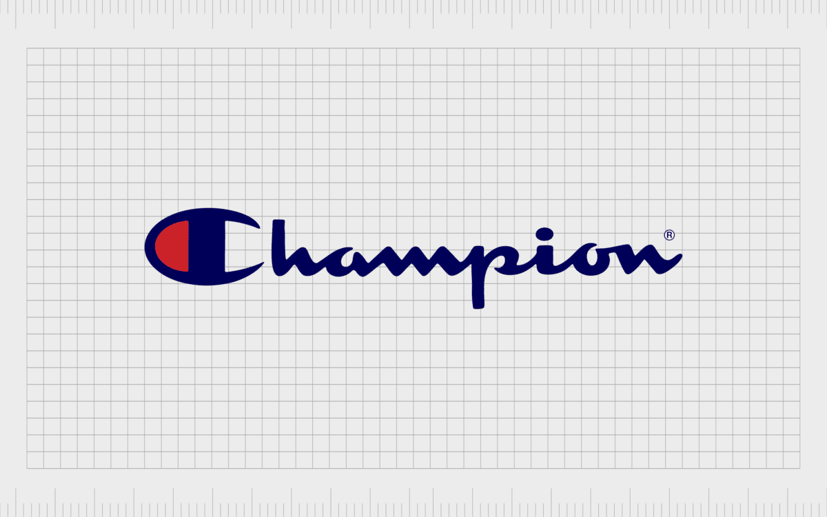
The champion logo is one of the more easily identifiable symbols in the world of athletic apparel. Similar to the three stripes of Adidas, or the unforgettable Nike swoosh, Champion’s emblem has become iconic over the years.
Champion is an American clothing manufacturer sometimes referred to as “Champion U.S.A”. Though the company originally launched as the Knickerbocker Knitting Company, it quickly evolved to become a giant of textiles and footwear.
Nowadays, the company defines itself as an athletic leisure brand, specializing in clothing you can wear anywhere – including to the gym.
Recently, the Champion Company also had a revival, with its logo now spread across a wider range of landscapes.
Today, we’re going to take a closer look at the history and meaning of the Champion symbol, and where it stands now.
Champion history: The champion brand logo
Champion started life as the Knickerbocker Knitting Company in 1919. Soon after its creation, the company signed into a Michigan Wolverines contract to design their team uniforms. This began the brand’s journey into the world of sporting wear.
In the 1930s, Champion embraced the name “Champion Knitting Mills”, and began producing products for the US Military Academy, for use during training exercises and classes for physical education.
In 1989, the organization was acquired by the Sara Lee Corporation, and began producing uniforms for all the NBA teams during the 1990s.
Over the years, the Champion symbol has appeared on the sportswear of teams in the NBA, the NFL, and Champion even made the kit for the Olympic Basketball Team for the 1992 Summer Olympics.
From 2008, the brand began producing kits for the Premier League too!
The Champion logo, and the company itself, has seen a significant revival in recent years, as the company has begun to branch out into various new areas of production.
Different Champion logos over the years
With more than 100 years of history, it’s little surprise there have been a few different champion logos throughout the decades. However, despite the long lifespan of the brand, Champion’s logo has maintained a lot of consistent elements, including a handwritten-style wordmark.
Let’s take a look at some of the variations in the Champion symbol.

1919
The old Champion logo was introduced when the company was still getting used to its new name. The emblem featured the words “Champion Processed Sportswear”. The words “Processed Sportswear” were written in all capitals, while Champion was in sentence-case font.
This logo, depicted in black, white and red, also featured a silhouette of a man running through a finish line.
Notably, while some of the early products produced by Champion featured a large block letter “C”, this was not the official Champion clothing logo.

1940+
The history of the Champion logo is steeped in mystery, without a large number of iterations to refer to over the years. One version of the Champion company catalogue from 1953 can be seen sporting a version of the Champion symbol similar to the one we know today.
Like the more modern Champion logo, this image includes a sleek wordmark, written in a cursive sans-serif font. The “C” in Champion is much larger than the rest of the word.

1960+
Somewhere soon after the introduction of the new style of Champion wordmark typography, the company introduced a slightly different version of its iconic large “C”. This version of the logo featured the colors red, white, and blue – marking the company as a clearly American brand.
Experts say the Champion insignia went through a series of alterations of the years to get the font style and use of color just right. Today, the cursive wordmark is visible on many Champion products, and within the signs of many stores.
However, there are a number of products which only showcase the “C” from Champion as the emblem for the brand.

Champion logo symbol: The “C” emblem
Although the new Champion logo and the older version of the image are a little different, there aren’t as many changes as people might think.
If we look at this version of the black Champion logo for instance, we can see a large block “C” at the beginning which looks very similar to the “C” emblem used on the early Champion products.
Throughout the early years of the Champion brand, as it embraced its new name, the company used the block “C” in a number of different colors throughout its clothing lines.
Due to the confusion around the “C” emblem and the Champion logo history timeline, it’s difficult to say for certain when the iconic image made its debut.
Sweatshirts featuring the “C” either on the tags or emblazoned on the sleeves were already appearing in the 1950s, before the official new Champion logo was introduced.
The “C” patch today is most commonly depicted in red, white, and blue to highlight the position of Champion as an iconic American company.
While the full logo is present on many labels and products, Champion’s iconic “C” has also become a sought-after icon and representation of the brand in its own right.
The “C” is usually present by itself on Champion sweatshirts, sweatpants, and t-shirts. This emblem can also appear in a variety of colors, stepping outside of the typical red, white, and blade colorway.
Elements of the Champion logo
Most of the elements of the Champion logo have remained the same for a number of decades now, helping to give the brand more heritage and impact in its chosen industry.
Like many famous clothing brands in the athletic sector, Champion’s commitment to its history, and a timeless design, has made its image increasingly sought-after.
Let’s take a look at some of the defining elements of the Champion symbol in closer detail.
Champion logo colors
The iconic nature of the Champion logo has led to the creation of many different versions of the image over the year. The athletic-wear company itself has also produced a variety of different color schemes for its logo to match different product collections.
For example, there’s a blue champion logo many people are familiar with, though it may be called the “red Champion logo” due to frequent appearance on a bright red background.
There are also iterations of a black and white Champion logo sometimes used in various branding materials and on specific products. However, the official Champion logo features a dark blue word mark, often on a white background.
The line down the middle of the iconic “C” is depicted in the same blue as the wordmark, with a red fill to the left-hand side, and white on the right-hand side.
The color codes are:
Navy blue:
Hex: #131635
RGB: (19, 22, 53)
Pantone: 5255 C*
Red:
Hex: #EE1C25
RGB: (238, 28, 37)
Pantone: 1788 C*
White:
Hex: #FFFFFF
RGB: (255, 255, 255)
Pantone: 7436 C*
What font does the Champion logo use?
The lettering outside of the iconic “C” on “Champion” may remind a lot of people of an existing font – it’s similar to Monoment, in style. However, the actual Champion logo font is a custom type designed specifically for the athletic brand.
According to the Champion Teamwear style guide, the “KNOCKOUT” font is the name of the typography used for all branding. However, this does not show through in the lettering of the Champion logo.
Champion logo resources:
Celebrating the Champion brand logo
The Champion brand logo has earned its place within the history of athletic wear symbol design. Like many of the top logos in this category, Champion has maintained its unique appeal over the years, with a logo which appeals directly to its target audience.
The use of color in the Champion brand mark is ideal for creating a sense of patriotism among customers.
The deep blue also highlights feelings of reliability and strength in color psychology, while white conveys purity and creativity. Red is the color of passion, making it an excellent shade for a sporting company.
The unique bold “C” of the Champion font immediately grabs attention, and captures the interest of customers, while the rest of the font is luxurious and flowing. The use of a cursive, sans-serif, and lower-case font for the majority of the word helps to make the brand feel more approachable.
The Champions mark is an excellent example of a timeless brand symbol. Don’t forget to check out our other Logofiles to learn more about similar brands.
Fabrik: A branding agency for our times.
Clarity starts with a conversation.
Thanks—we’ll get back to you shortly.
Whether you're navigating a rebrand, merger, or simply need a clearer identity—we’re here to help. No hard sell, just honest advice from people who know the sector.
Let’s start with a simple question…
Prefer to email? Drop us a line.
Fabrik’s been helping organisations rethink and reshape their brands for over 25 years. We’ve guided companies through mergers, rebrands and new launches. Whatever stage you’re at, we’ll meet you there.


