Types of logo design: Exploring the many different logo styles
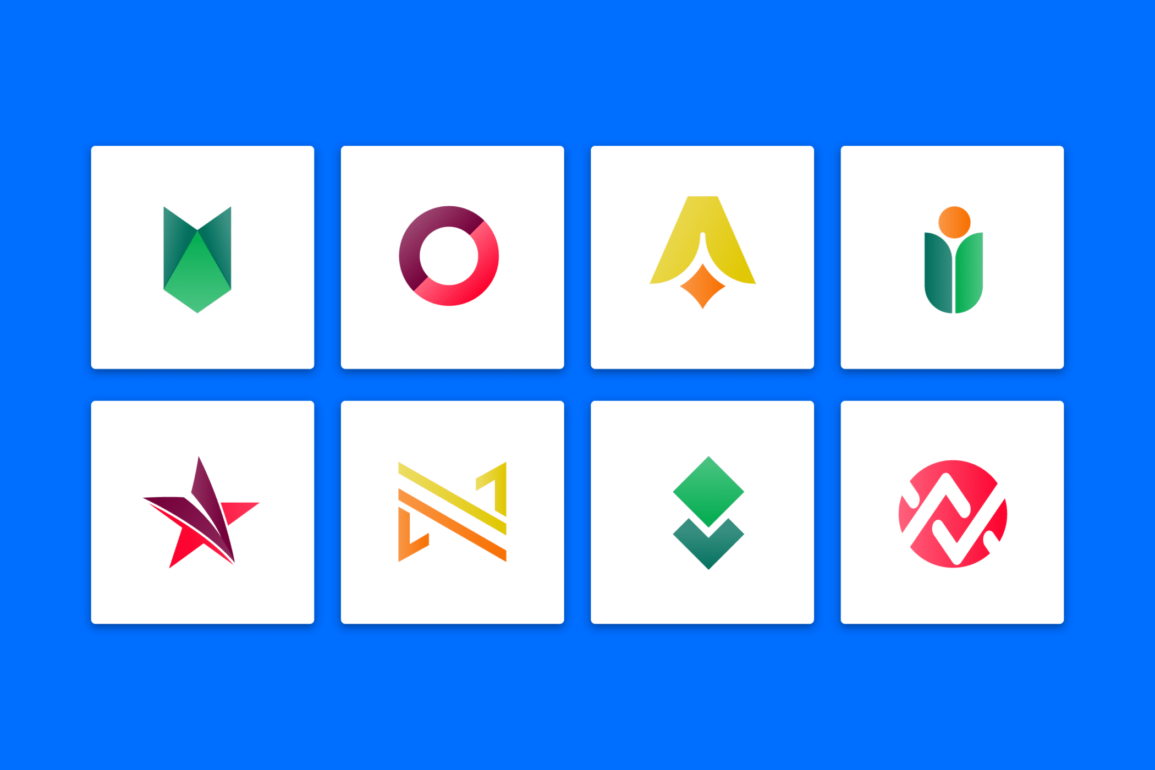
At first glance, there may not seem to be many types of logo design to choose from. Wherever you look, most brand emblems feature the same inherent components: shapes, typography, and images.
However, there are actually various logo styles to choose from in the creative world.
Knowing how to select different types of logos to serve specific purposes is one of the primary tasks of a branding expert or designer. After all, as the heart of your brand aesthetic, your logo needs to perfectly convey who you are in a simple, consistent manner.
Failure to choose the right type of logo from day one makes it harder for you to reach your goals.
Today, we’re going to be exploring the various types of logos available to brands today, and why you might consider using each in your emblem.
Types of logos: Typography focus
When you begin exploring the different kinds of logos, you’ll notice most revolve around either typography, or imagery. Typography-based logos are usually best-suited to companies looking to create an association with a specific letter, group of letters, or a word.
If you want to make your brand name as memorable as possible, it makes sense to use it in your logo.
Let’s take a look at some of the typography-focused logos you can choose…
Monograms and lettermarks
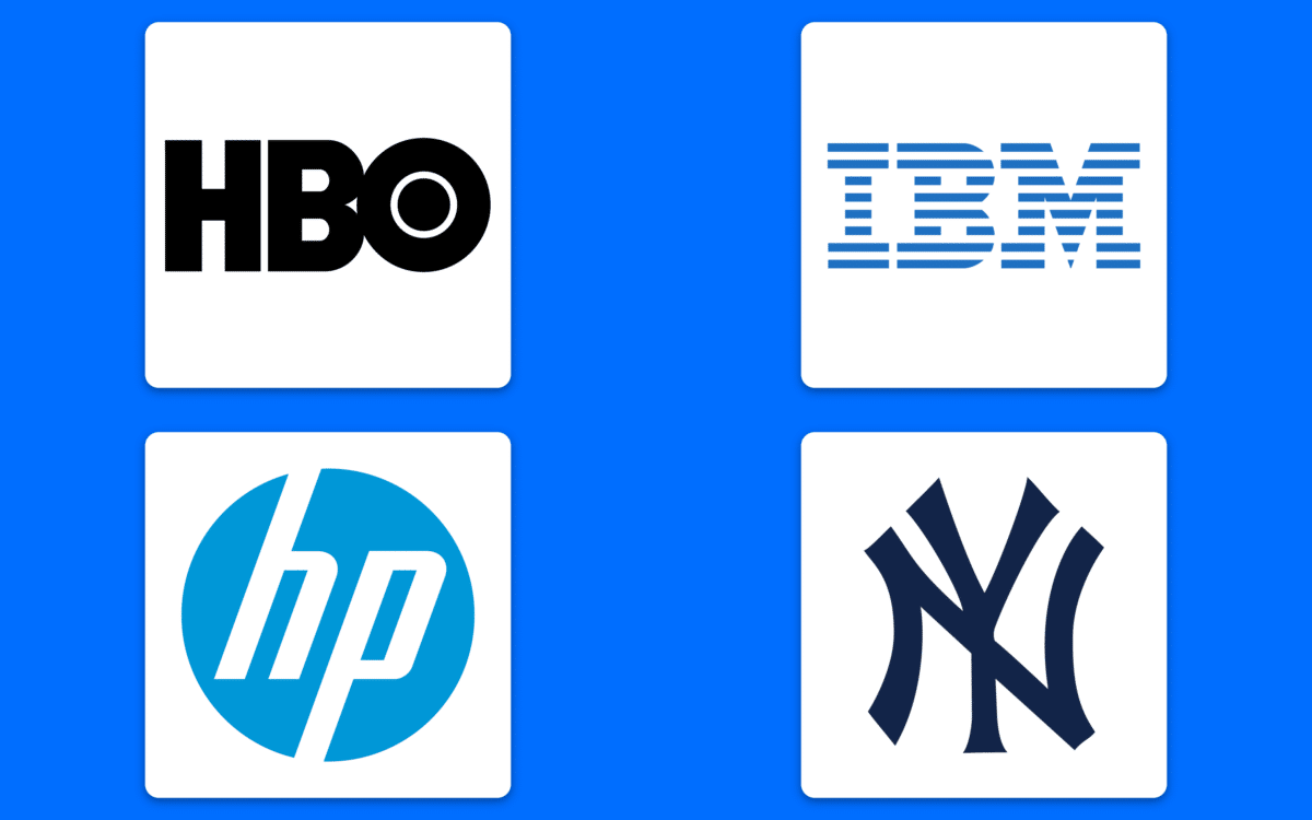
Otherwise known as the “lettermark” a monogram logo focuses exclusively on a specific selection of letters. Unlike the wordmark, which displays a word, or the lettermark, which focuses on a single letter, a monogram highlights letters representative of your company.
Think IBM, HBO, or HP.
Often used by companies with long, complex names, Monograms make a brand’s identity easier to remember. It’s much easier to recall “HP” than Hewlett Packard.
Most companies using abbreviations or initials for their brand identity also find it’s easier to fit a couple of letters into a logo than to create something using the company’s entire name.
Imagine how complex NASA’s logo would be if it used the full “National Aeronautics and Space Administration” title?
When to use a monogram or lettermark
Monograms are usually the best option if you want to get your name out there, but your title is a little too complex for a full wordmark. Longer names, like the New York Yankees, can easily be pared down into a selection of important letters.
The key to success with monograms and lettermarks – like with most typography focused logos – is getting your font right. You’ll need to ensure your choice of font conveys a lot of meaning, while still being legible, as you’re not using a full word for context.
Wordmarks (or signatures/logotypes)
Wordmarks are perhaps the most common form of typography-focused logos in most cases. Unlike your basic monogram, a wordmark uses the entire name of your company to create familiarity and affinity.
Think Uber, Subway, or Coca-Cola.
When it comes to creating a memorable identity for your company, wordmarks can be extremely useful. There’s no need for customers to guess at what a certain selection of shapes or images are supposed to mean.
When you use a wordmark, you’re relying on the word itself to do a lot of the explanation for you.
“Toys R Us” immediately tells us what to expect.
Wordmark logos are convenient when companies already have catchy and memorable names they want to share with their audience.
When to use a wordmark
If you’ve taken the time to painstakingly select a meaningful brand name, it makes sense to convey this in your logo. Your wordmark will help customers to remember your company by giving you a specific word to connect to your brand.
Wordmarks also require less initial investment and creativity on the behalf of the company, because you don’t have to come up with an entirely visual way to convey your identity.
Around 37% of the top 100 brands in the world use just their name in their logo, with the help of a stylized font. The biggest risk is if you don’t use these tools well, they can look generic.
Letterforms
Slightly different to the “lettermark” logo, a letterform focuses exclusively on a single letter. Think about the McDonalds “M” or the Entertainment brand’s “E”. These brand emblems are very similar in style to the lettermark because they rely on a condensed version of a company’s name to convey meaning.
However, you can also use a lot of style with a lettermark to send a clear message.
Letterforms can be particularly useful in today’s digital world because they’re very scalable. You can easily reduce the size of your letterform until it’s perfect for use on an app, for instance.
Letterforms can also be easier to remember than longer names if you have a complex title – similar to lettermarks. The key is to remember you need to get a lot of meaning across with the single letter you choose.
This isn’t always easy.
When to use a letterform?
Letterforms are usually most common among trendy, modern companies in search of simple and scalable designs. The letterform logo is straightforward and to the point, making it easy to integrate into a wide range of brand assets and marketing campaigns.
It’s also common to see companies with a strong existing brand presence using a lettermark. Yahoo no longer needs to use its full name because the “Y” and an exclamation mark is enough to instantly identify the company.
Logo styles: The image-focused logo
When it comes to choosing the right type of logos, visual appeal will always be a crucial consideration. However, some companies rely more heavily on visual inspiration than others.
Choosing a graphic or image-based logo allows you to convey significant meaning through a single picture. After all, a picture says a thousand words.
Let’s take a closer look at some imagery-focused logos…
Pictorial marks or brand marks
Brand marks, logo symbols, or pictorial marks are brand logos focused exclusively on a single visual idea. These emblems use a graphic symbol or icon, typically depicting a real-world object, so it’s easier for customers to identify.
Think about the Bullseye from Target, or the Apple logo.
When the name of your company is deeply connected to a specific image, like the Shell Company and its shell logo, you don’t necessarily need a word to convey your brand.
Pictorial marks are one of the most popular forms of image-focused logos, because they communicate more about a company than an abstract image.
Pictorial marks generally allude to the name of the company, the mission of the brand, or the attitude of the company.
When to use a pictorial mark
Pictorial marks make a lot of sense when your brand’s name automatically lends itself to an inherent image. The word “Apple” in any language conjures the same image among consumers, making the picture of an Apple the perfect choice.
The key to success is considering the implications of the picture you choose carefully. For some companies, it will make sense to choose the immediately obvious image, like John Deere with the John Deere logo.
For others, it might be a good idea to choose an image represents a unique selling prospect, like Snapchat with its ghost logo – highlighting the disappearing nature of the pictures in the platform.
Pictorial marks are particularly useful if you’re creating a global brand, as images can sometimes translate better than words.
Abstract marks
Similar to the pictorial logo, an abstract mark focuses on a specific image to send an idea. There’s usually no word included to help identify the company, but you may see versions of an abstract logo mark using the name somewhere in the image too.
This can be important when it’s difficult to define what the brand does with the image alone.
Unlike pictorial marks, an abstract mark doesn’t use a specific image you’ll naturally associate with the brand. The “swoosh” for Nike generally won’t conjure images of the Greek Goddess Nike for most people, but it does convey an idea of accomplishment.
An abstract mark allows companies to convey what a company does on a symbolic level, without having to rely on the cultural implications of existing images. It’s also much easier to copyright an abstract mark, if you want to prevent someone else from using it.
When to use an abstract mark
An abstract mark gives businesses a lot of freedom, because you don’t have to stick to the confines of a real-world image. If your business does a lot of different things, like the Pepsi brand, an abstract mark can convey who you are without showcasing a particular product.
Abstract marks are also fantastic for creating an emotional connection with your audience. Because the image is unique to your company, it’s not watered down when your audience sees it all over the world. Abstract marks can deliver deeper connections for brands and customers.
While abstract marks are great at creating emotional connections, they’re best left to professionals to do correctly, as it’s easy to send the wrong message.
Brand mascots
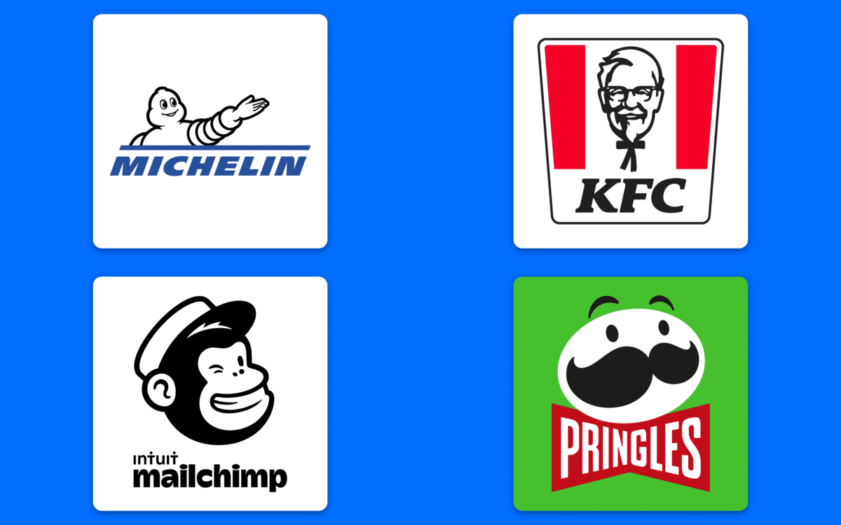
Perhaps one of the most family-friendly types of logos we’ll be covering today, brand mascots are an adorable method of humanizing a company. Mascots are essentially custom-made characters which act as a visual representation of your company’s personality.
They can be a kind of spokesperson in some cases, like the Colonel is for KFC.
Just like in the athletic world, mascots are an excellent way to humanize a bigger concept, like an entire team of players. You refine all of the unique characteristics and traits of your company into a single identity and allow the individual to strengthen your company.
Brand mascots appeal to people of all ages, giving them a living concept to connect with, rather than just an image or a name. They’re excellent for companies who want to create a wholesome identity or attract a wide range of younger customers.
When to use a mascot logo
Mascot logos are ideal when you want to give your company a human, or “living” element for customers to connect with. The majority of mascot logos are used to make businesses more approachable, or appeal to families.
If you offer something a little dry or difficult to understand, like Mailchimp, a mascot will make your company feel more accessible. If you’re trying to present yourself as a family-friendly company who cares, a mascot makes your brand seem warmer and fuzzier.
A mascot may only be one part of your logo design, as a highly-detailed character can be difficult to use across a wide range of brand assets. This could mean you need to create multiple versions of the mascot, or additional logo elements to go alongside it.
Find our more about mascot logos here.
Different types of logos: The combination
Finally, we come to the third of the major types of logo design: the combined logo. These logo styles use a combination of letters, images, shapes, and other elements to convey a complete concept.
Unlike typography and image-focused solutions, they don’t concentrate too heavily on either font or pictures. Instead, they combine the benefits of both.
The combination mark
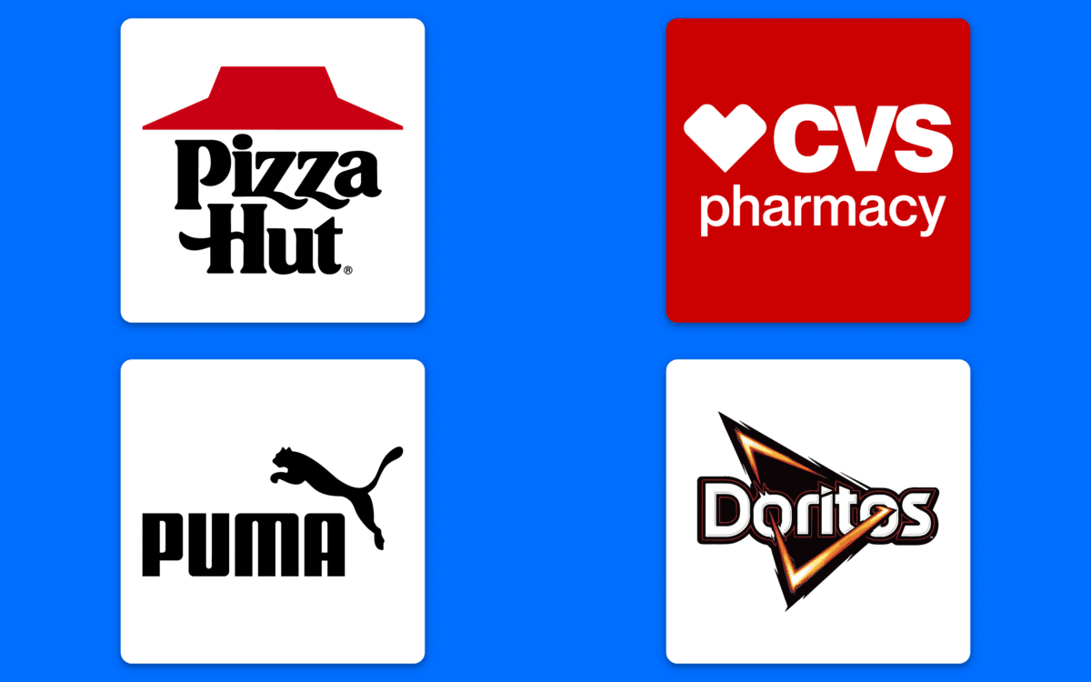
Probably one of the better-known types of logo design, combination marks allow companies to convey a lot of meaning in their logo. You don’t have to rely exclusively on a picture or a name but can instead combine various elements to send the best message.
Combination logos allow users to pair letterforms with mascots, abstract images, with monograms, and so on.
A combination marks is inherently versatile. You have full control over how you combine the image and text, with options to lay your content out side-by-side, or on top of each other.
You can also make it easier for your customers to understand your business and what it stands for, by giving them additional clues.
The word “CVS” might not mean much on its own, but with a heart and the “clinic” word added to it, the image becomes more meaningful.
The combination mark also allows for a relatively simple rebranding process, because customers get to know both your image and your company name, so you can change one or the other without having to start from scratch.
When to use a combination mark
Since you’re using both an image and text to make your company stand out, a combination is an extremely versatile choice for a lot of brands. This trademark is ideal for copyrighting your logo, because pairing symbols and text helps you to create a distinct image.
Combination logos are particularly advantageous if you’re starting a new business, and don’t have a lot of followers yet. Your combination of content in your logo should help your customers to understand you a little better and may convince leads to learn more about your business.
You can always consider reducing your combination logo at a later stage. For instance, Nike started by using a combination mark, but now usually focuses entirely on the iconic Swoosh.
The emblem or shield
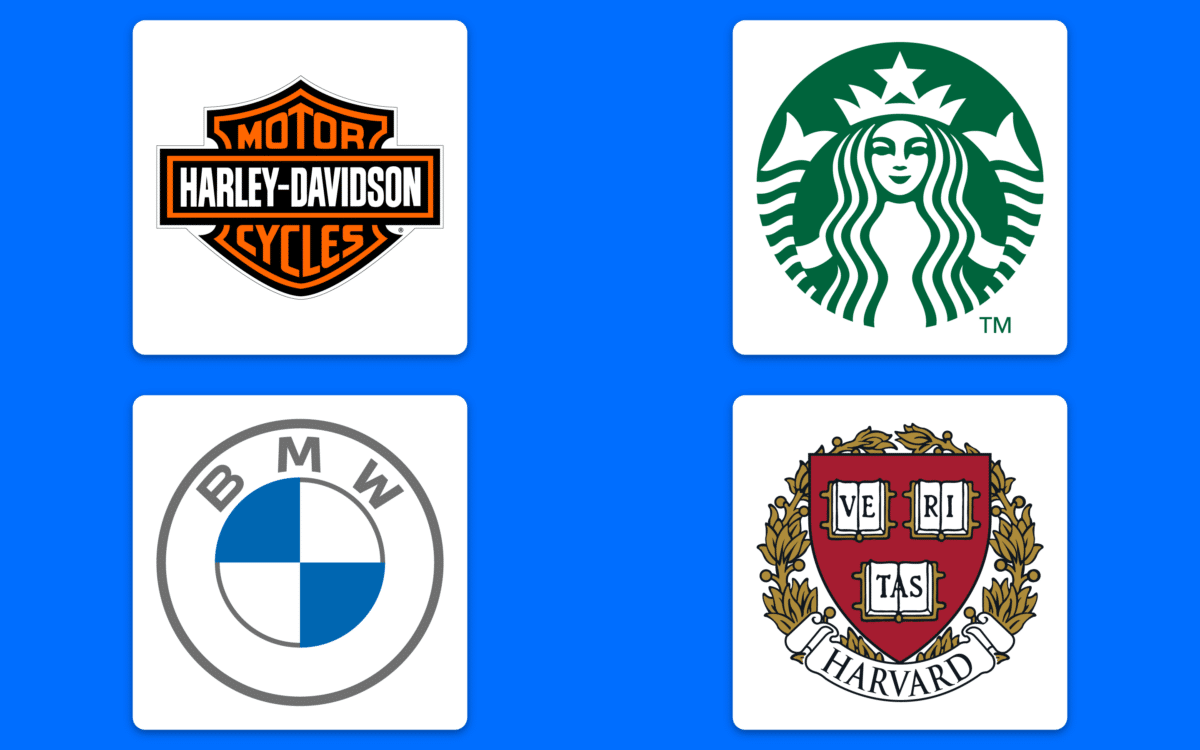
Emblem logos are more traditional, long-lasting logo types, designed to represent companies with significant heritage and background. Emblems feel sophisticated and meaningful, but they’re not quite as old-fashioned as the standard logo “shield”.
An emblem might look like the wax seal of an old family, or the crest of a monarch.
Emblems are commonly associated with luxury, professionalism, and sophistication. They give the impression your company is long-standing and resilient, which can be helpful in a range of different industries, from the automobile landscape to banking.
Emblems look great in many situations, but they don’t have the same flexibility as a standard combination mark and may be too complicated for some digital brands.
Crucially, however, the majority of emblems do use a combination of images and text, so it’s easy to get a lot of information across with these marks.
When to use an emblem
Emblems are best-suited to situations where companies want to exude a strong, professional reputation, or a commitment to various traditional values. Emblems look extremely prestigious, and work well for schools, government agencies, and similar companies.
Some companies also have more “modernized” emblems, like Harley Davidson or Starbucks.
Because emblems generally lean towards the more “detailed” side of logo creation, they can be less versatile than other logos, and difficult to replicate in various scenarios. If you want to stay ahead of the curve in the modern world, it might be a good idea to keep your emblem simple.
Dynamic marks
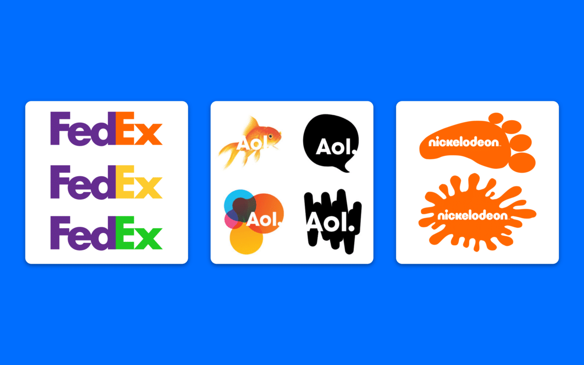
While shields and emblems are generally more traditional and “old-fashioned”, dynamic marks represent one of the newer combination logos on the market. Unlike other logo types, this image can adapt itself to a specific concept or environment where it’s being used.
This means rather than having a single version of your brand mark, you have multiple.
Dynamic marks are a lot more complex than traditional logos and tend to be intended for companies which already have a decent brand presence. After all, it’s difficult to build a good sense of consistency and familiarity with a brand whose logo is always changing.
The good thing about dynamic marks is you can take full advantage of the digital world and be as creative as you choose. You can modify your logo to fit any scenario and make the right impression on your customers wherever you are.
There’s also less of a chance your customers will get “bored” with a dynamic logo because it’s always changing.
When to use a dynamic mark
Dynamic logos are excellent for companies in creative industries like media and entertainment. You can also use this option if you have a business with a wide selection of different branches. You can essentially use the same logo with different colorways.
The biggest challenge of the dynamic logo is you can sometimes lose the associative power of your brand mark, because customers won’t always be able to remember the shape of your logo, or its color.
Be mindful of how often you change your logo, and the alterations you make.
Choosing your logo type
Ultimately, there’s no one-size-fits-all logo suited to every brand. There are countless great logo options out there, and the right one for you will depend on the kind of business you want to build.
The best option, if you’re not sure where to get started with your logo, is to work with a branding agency like Fabrik who understands your needs and the vision you have for your brand.
Remember, getting your logo right first time around will save you a lot of time and headaches in the long-term, as well as cash associated with rebranding.
Contact Fabrik today for help building the perfect logo from day one.
Fabrik: A branding agency for our times.
Clarity starts with a conversation.
Thanks—we’ll get back to you shortly.
Whether you're navigating a rebrand, merger, or simply need a clearer identity—we’re here to help. No hard sell, just honest advice from people who know the sector.
Let’s start with a simple question…
Prefer to email? Drop us a line.
Fabrik’s been helping organisations rethink and reshape their brands for over 25 years. We’ve guided companies through mergers, rebrands and new launches. Whatever stage you’re at, we’ll meet you there.


