Making your mark – What is a brand mark and how does it define you?
Is it time to make your mark in your chosen industry?
If you’re a fan of the content here at Fabrik, then you already know that there’s a lot more to a brand than a logo or image. However, it’s also fair to say that a successful brand can’t exist without a compelling visual identity.
By creating an image that conveys all of the values, expectations, and promises of your company, you improve your chances of earning your customer’s attention and even their loyalty. That’s because human beings simply process visual data better than anything else. Not only does the brain process images 60,000 times faster than text, but 90% of the information you take in each day comes from what you see.
Now here’s a fact that might surprise you…
There are many different types of logo available to help companies appeal to the image-processing epicentre of their customers’ brains. The emblem most likely to speak to your audience on this level is the brand mark – but what is a brand mark, and how is it any different from a standard logo?
Today we’re going to get to the bottom of one of the most over-looked and under-explained terms in the branding dictionary. Here’s your guide to the mysterious brand mark.

What is a brand mark? Divulging brand design terms
If you’ve wondered about brand design terms before, then you’ve probably found a brand mark definition challenging to come by. Alternatively, you may have always assumed that the words “logo” and “brand mark” could just be used interchangeably. However, the truth is that a brand mark is a sub-section of logo design, and it’s something you need to know about when you’re creating your identity.
As you know, a “brand” consists of multiple elements that go far beyond the handful of fonts, colors, and logo shapes that people associate with a company’s image. A brand is a highly emotional and complex concept which demonstrates the core ideas and values of a business.
Your logo plays an integral part in showing customers what you stand for. The colors you choose will elicit certain emotions, while particular shapes remind your audience of influential moments in their lives. However, there are many different kinds of logo in the world, from the letter marks used by brands like IBM, to the wordmarks that represent iconic companies like Coca-Cola.
Most logo designs include a combination of the business name and an image, shape, or some other graphical element intended to engage a customer’s emotional side. However, the brand mark is unique for one fundamental reason – it leaves all letters and words behind to focus exclusively on the descriptive power of imagery.
To define brand mark a little better, imagine the mermaid on the front of Starbucks coffee cups. You don’t need a name to know you’re drinking something from Starbucks, because the image is iconic enough. The same rules apply for businesses like Nike, with their unforgettable swoosh, or Pepsi with their blue, red and white globe.
Your brand mark symbol could be something obvious. For instance, WWF uses the silhouette of a panda to convey the importance of environmental sustainability. Alternatively, you might choose an abstract shape that promotes the feelings that you want your audience to experience when they think about your company. Consider how the Nike swoosh is a fast and dynamic icon that seems to describe motion and energy.
Brand mark vs. logo: What’s the difference?
If our brand mark definition above hasn’t answered all of your questions about the logo vs. brand mark debate, let’s dive a little deeper.
An excellent way to understand the difference between the brand mark vs. logo design is to think of your logo as a comprehensive visual overview of your brand identity. It should probably include a combination of your chosen colors, your business name and any graphics or shapes that make it easier for your audience to understand you. Many logos are a combination of words, forms and other elements, but a brand mark focuses exclusively on an image. For instance, see the Nike logo (left) and the Nike brand mark (right):
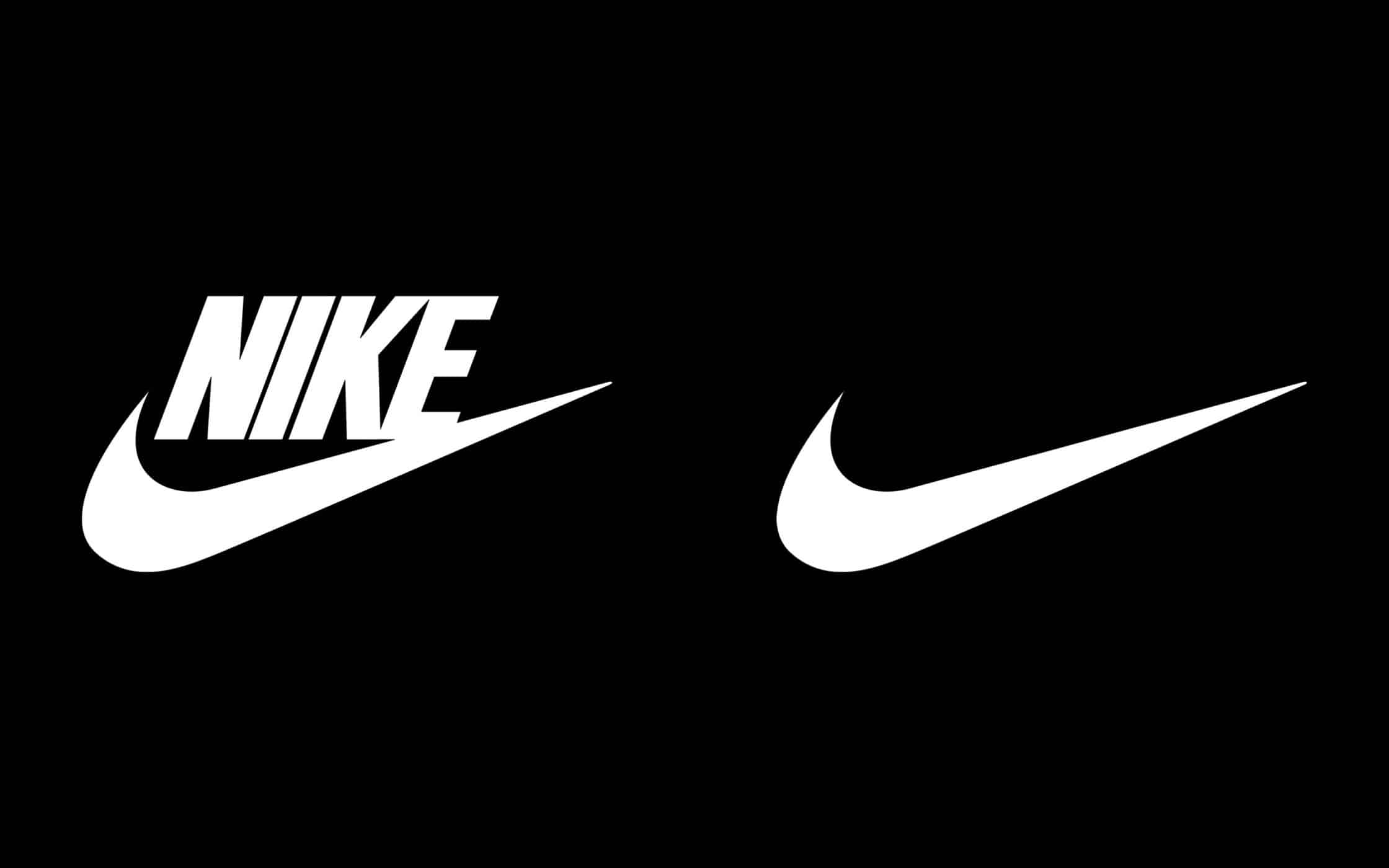
As you define brand mark ideas for your company, think of your logo as the visual shorthand for describing your company. On the other hand, your brand mark is the emotional image, shape, or graphic that sends an emotional cue to your audience. While the term “Nike” might not inspire much of a response in your customers (unless they know a lot about Greek mythology), the swoosh has a more obvious impact.
Brand marks are popular among companies of all sizes from various industries because images are naturally more memorable than letters or words. Symbols and icons can communicate information about your business in a quick and highly meaningful way. However, it takes work to make your brand mark symbol into an instantly-recognizable image.
Brand marks are common among some of the world’s best-known companies. When businesses get big enough that a single shape or graphic is all their customers need to recognize them, they often adjust their logo by removing the name and switching to a brand mark. Unfortunately, the difference between logo and brand mark designs also means that it’s harder for new companies or startups to thrive using a pictorial logo alone.
If your brand name doesn’t lend itself to visual representation (like Apple), then your customers might struggle to understand what makes you special from a picture alone. Additionally, using a brand mark to define your company when you are first getting started may mean that you lock yourself into a description of your identity that you’re not fully committed to yet. This is why many businesses start with a more comprehensive combination logo, then adopt a brand mark symbol at a later date.

Brand mark and trademark: How your image affects your identity
Brand mark and logo aren’t the only two terms that are often used interchangeably by people outside of the industry. Some consumers also mistakenly believe that a “brand mark” is the same as a “trademark.” While you can purchase a trademark on your logo imagery, it’s important to remember that the two concepts aren’t the same.
As mentioned above, a brand mark is the visual element within your logo. Your brand mark may make up your entire logo in some cases – as is common with bigger brands who have evolved beyond needing to show their names on their marketing campaigns and products. For a brand mark symbol to be effective, it needs to be unique enough to differentiate your company, while still evoking familiar feelings and ideas in your audience.
A trademark, on the other hand, is a legal protection that’s placed against various elements of your brand image to stop them from being copied or replicated by other organizations. There are no other brand marks in the world that look anything like the McDonald’s Golden Arches, because the arch shape and its unique coloring are trademarked with the US government. You may have even noticed the small “TM” next to the McDonald’s sign that shows its trademark status.
While a brand mark is one of the many elements that help to define your business as a unique entity in a cluttered world, a trademark is the thing that protects that individuality. In many cases, a brand mark and trademark will go hand-in-hand. After you’ve designed the image that describes your business or had a branding team create it for you, you’ll then apply for a trademark to state that the image is exclusively yours to use.
Not only does a trademark allow you to claim ownership over an essential aspect of your brand image, but it also ensures that no-one else in your industry can try to cash in on your success by replicating your appearance and trying to trick your customers into using their services instead. It’s also possible to trademark things like your business strapline, or your company name.
Importantly, when you’re designing your brand mark symbol, you’ll also have to take other people’s trademarks into account. An experienced branding team will be able to do due diligence on any graphics or shapes that you’re interested in using, to make sure that you’re not treading on anyone else’s toes. This will help to protect your company from any expensive legal issues when you’re first making a name for yourself in the industry.
Choosing a brand mark symbol – What does your business need?
Now that you know all the creative and legal components of a comprehensive brand mark definition, it’s time to consider what you can do to make your own visual identity more appealing.
All logo design requires careful consideration and attention to detail. However, because a brand mark can’t rely on your brand name to help it convey meaning, it needs to be particularly insightful. The easiest way to create a compelling brand mark is to work with a professional. This is particularly true if you plan on using an abstract image, as experts can help you to see how your business lends itself to specific shapes.
However, there are a few things you can keep in mind when creating your brand mark to improve your chances of success. For instance:
1. Make sure that a brand mark is right for your business
Graphics are powerful things. When used in the right context, something as simple as a line or a circle can change the way that your audience feels about your company. When you’re designing a brand mark, you need to understand the value of the pictorial elements that surround your business. There are plenty of brand mark examples out there that you can consider for inspiration, like the Twitter bird, or the Target bullseye.
Because brand images are tricky to gain awareness with as a new company, the best option is to start with a combination logo, and then switch to a brand mark when you’ve earned a reputation. Alternatively, you can try using both your brand mark and a fuller version of your logo as two separate options.

2. Make sure your brand mark connects with your brand identity
Like in any aspect of logo design, it’s important to remember that your visual image isn’t a stand-alone part of your brand – it’s something that needs to resonate with everything else that you do and say. With that in mind, it’s generally a good idea to do some brand manifesto work before you begin to define brand mark designs, as you’ll be able to use your values, purposes, and other crucial information as guidance.
Your brand mark will need to remain in line with your company as it evolves through the years ahead. That means that it’s important not to get too caught up in what you’re doing now and think about what you want to accomplish in the long term. For instance, a sock company might consider using the shape of a sock as their brand mark symbol, but then they wouldn’t be able to expand to shoes and other clothes. However, if the same company used an image that showed their commitment to CSR and sustainability, it could stay with them throughout the decades.
3. Find images with meaning
If you do decide to go all-in with your brand mark symbol, then you’ll need to make sure that you choose the right graphics. Remember that you want this image to be a sustainable part of your company’s identity for as long as possible, so don’t just focus on what you sell now, think about how your business might evolve in the future.
There are plenty of ways to find inspiration for your brand mark. For instance, John Deere takes the “Deer” out of their name, while the Snapchat ghost tells us about the ephemeral nature of the messages sent on the platform. Whatever you pick, your graphic should have purpose, and evoke emotion.
Abstract brand marks like the Adidas flower or the BP starburst can be particularly good at conveying emotion. However, you’ll need to make sure that you get the shapes and colors of your image precisely right. Even something simple like the wrong shade of blue can harm your entire identity.

4. Set standards for consistency
Finally, as a crucial part of your brand identity, your brand mark definition needs to stay consistent throughout every touchpoint with your target audience. Placing guidelines for the shapes, colors, and other essential elements that you need to use into your brand manifesto will help to give you a more cohesive image in the long-term.
It’s worth noting that a complicated brand mark can be more difficult to maintain, particularly as your business evolves. If your image is too intricate and detailed, then you might find that it works well on your website or large billboards, but it struggles to have the same impact when narrowed down into an app-sized icon on a smartphone screen. Think carefully about where your brand mark might show up in the years ahead, and how you can make it as versatile as possible. Sticking to simple shapes is a good rule of thumb – and remember, simpler images can be a lot easier for your customers to remember too.
Brand mark examples: Strategies with staying power
Before you start working on your brand mark ideas, it might be worth taking a look back through history at some of the other companies who have made an impact on the branding world. There are countless businesses around the world that have evolved to use the brand mark as their defining visual feature, from the Playboy bunny to the Apple icon.
Here are a few of our favorite brand mark examples that you can take with you on your journey to create a memorable brand identity.
1. The Nike brand mark
We mentioned the Nike brand mark above, and it’s worth drawing attention to again here. Nike frequently appears in discussions about branding, because of its strong history of creating a sustainable image in the athletic space. Although the Nike “swoosh” brand mark cost the business less than $50 when they first had it designed, it’s gone onto be one of the most recognized images in the world.
Today, you no longer need the iconic “Nike” name to recognize a Nike product. The swoosh is enough to tell you everything you need to know about the organisation. In one simple shape, Nike has conveyed all the fitness, athleticism and versatility of their company, making the swoosh a truly powerful symbol in the consumer world.
2. The WWF brand mark
Another of the best brand mark examples worth looking at before you create your own comes in the form of the World Wildlife Fund’s logo. This universally-recognized logo of a panda remains to be a potent symbol of conservation, restoration, and preservation in the animal kingdom.
Over the years, the impact of the WWF brand mark has become so great that it’s now possible for the business to use other animals in place of their iconic panda, and still achieve the same brand awareness. In 2015, the company revealed a marketing campaign that transformed the shape of the panda into three additional silhouettes of other endangered species.
While none of the new images were intended to replace the initial brand mark, they were a great insight into the versatility that WWF’s imagery has.

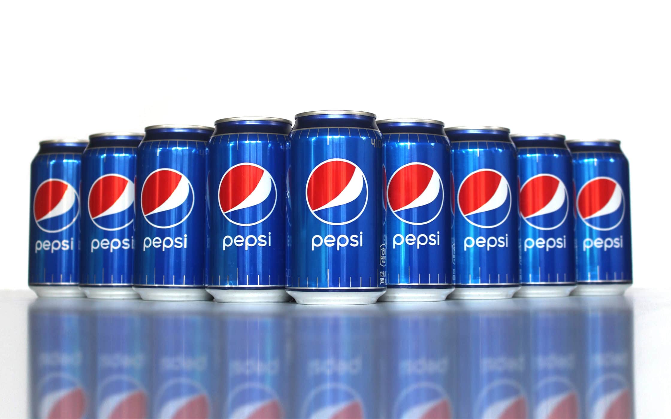
3. The Pepsi globe
Usually, when we talk about branding in the food and beverage space, we talk about Coca-Cola and their iconic red coloring or their unique font. However, when it comes to brand mark examples, it’s impossible to deny that Pepsi is the better business to look at. While Coca-Cola still uses its name in its logo, Pepsi can get by with nothing more than their memorable white, blue and red globe to attract customers attention.
The shape of the globe is iconic enough that Pepsi can easily print it in black and white, or other shades, and customers will still know which beverage business they’re dealing with. Although the Pepsi globe has seen quite a few changes since its inception in the 40s, it has emerged as one of the most memorable brand marks in the world today.
Ready to make your mark?
It’s difficult to overestimate the difference that the right visual asset can make to a brand.
Although there’s certainly more to a company than what it looks like, branding and marketing experts can’t ignore the value of pictures for conveying emotion and meaning. The brand mark – a unique graphical approach to the world of logo design, is an insight into just how powerful an icon can be.
Used correctly, your brand mark symbol can make you an unforgettable part of the business landscape for years to come, and you won’t even need your name to accompany it. However, unlike other forms of logo design, the brand mark does require a lot more work, commitment, and creativity if you want to get it right. Even if you have the best products and services in the world, you may not become iconic overnight.
Which logo strategy is right for you? Let us know your thoughts in the comments section. Alternatively, if you need help creating your company’s visual assets, reach out to the design team here at Fabrik. We’ll give you what you need to make your mark.
If you enjoyed this piece, you might enjoy these too:
— How to choose a brand colour palette
— The meaning of shapes in logo design
Clarity starts with a conversation.
Thanks—we’ll get back to you shortly.
Whether you're navigating a rebrand, merger, or simply need a clearer identity—we’re here to help. No hard sell, just honest advice from people who know the sector.
Let’s start with a simple question…
Prefer to email? Drop us a line.
Fabrik’s been helping organisations rethink and reshape their brands for over 25 years. We’ve guided companies through mergers, rebrands and new launches. Whatever stage you’re at, we’ll meet you there.


