What makes a good logo? Famous logos to inspire your own branding
Just like baking an amazing cake, there are many important ingredients that go into designing the perfect brand.
Though your company vision, customer personas, and brand purpose will dictate the flavours and styles that you use for organisation, some elements will be fundamental for every company. For instance, you’ll always need a great brand name, a strong USP, and of course, an imaginative and relevant logo design.
For many companies, good logos are what customers use to define a brand. Famous brand logos are more than just a graphical representation of a business, they’re a symbol for your company, and a badge that represents your values as an organisation.
Because they’re simple, visual marks, logos are easier to remember than names and stories, but they can be just as effective at developing recognition for your company. After all, they help your valued customers to identify your services and products instantly. The chances are you already know a few famous company logos by heart – from the bold typography of the Coca-Cola brand to the unforgettable Nike “swoosh”.
The question is, what makes a good logo so memorable? How have the famous brand logos that we hold dear today, earned their place in the hearts and minds of a generation of loyal customers?
In today’s voyage through visual branding, we’re going to examine some of the “best of the best” when it comes to famous logos, to discover what most good logos have in common, and what you can learn from image innovators.
Defining “good logos”: What makes a graphic great?
In a sea of modern companies competing for attention, good logos can be the beacon that set your organisation apart. After all, a logo is the face of your company, and it’s often the first thing that a customer will remember when asked to recall your brand.
Famous logos are effective because they’re the perfect combination of visual communication and brand personality. Your logo is more than just a random image that you put on your website and marketing campaigns – good logos are one of the elements that make up your entire brand identity and the reputation you want to carry with you for the life of your business.
So, what makes a good logo? The answer to that question depends on who you ask. We believe that good logos should have at least some of the following attributes.
Good logos are “memorable”
A logo is an image you want to appear in your customer’s mind when they’re looking for a solution to a problem you can solve. Memorability is the quality that ensures your brand will stay “front of mind” for your consumer, regardless of how many new companies might enter the marketplace.
Ideally, your logo should be powerful enough that your customers don’t just remember the shape, but what it stands for too. Famous logos help customers to recall why your business exists, and what it stands for. For instance, Apple’s logo has a “bite” taken out of the image not only to make it easier for customers to remember the image but also because it demonstrates the company’s willingness to explore innovation.
Good logos are distinct
Another point to remember when asking “what makes a good logo”, is that the best images don’t simply imitate what other companies in your industry are doing. While there’s nothing wrong with a bit of competitive analysis to get your creative juices flowing, you shouldn’t look like a copy of the competition.
If your logo isn’t distinct, then potential customers will struggle to differentiate your brand from other people in your sector. This means that they’re more likely to confuse you with your competitors and spend their money elsewhere. Ask yourself, “is this logo unique?”
Good logos reflect your brand
Famous company logos are an expression of the business they hope to represent. Bang and Olufsen’s logo is more than just a combination of letters, it’s an expression of style, and insight into their ability to turn expectations upside down. When you’re wondering what makes a good logo, you’ll need to remember that your mark will communicate things to your customers. This means that you need to ensure that the message you’re sending is consistent with your brand voice.
Start by identifying some of the most important elements of your brand identity, then ask yourself how you can adapt your logo to represent those characteristics. For instance, if your social media messages are fun and modern, then your logo should be too!
Good logos are timeless
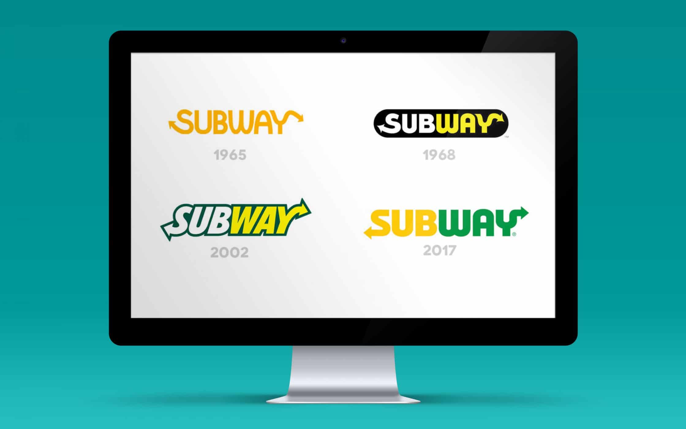
If you look at some of the most famous brand logos in history, you’ll notice that many of them have changed and evolved over the years. Even the best logos need a little adaptation from time-to-time, as new trends emerge, and companies evolve. However, you shouldn’t need a complete rebrand every time you want to refresh your image.
While your logo might evolve over the years, the fundamental elements of it need to stay the same if you want your customers to recognise you. With that in mind, make your logo as timeless as possible. Avoid anything too trendy, as it’s unlikely that popular preferences will last forever.
The anatomy of a logo: Features of famous logos
So far, you should have a basic idea of what makes a good logo. The question is, how do you go about designing a graphic that’s perfectly representative of your brand?
Good logos are a blend of art and science. Here at Fabrik, when we design a logo, we take a range of elements into consideration, including your target audience, the shapes that are most suited to your personality, and the fonts that will support your brand.
The cornerstone of logo design, and the thing that makes famous logos so memorable is that they’re the perfect combination of several ingredients. Here are just some of the aspects that you’ll need to keep in mind when working with your logo design agency.
1. Colour
If you’re a fan of fabrication, then you’ll already know all about the link between colour and psychology. The shades you choose for your logo will send an instant message to the people who see it. Famous company logos are effective because the hues chosen work well with the personality the brand wants to convey.
Keep the reputation of the colours in mind when making your decision. Some colours will speak directly to the industries they’re representative of. For instance, yellow and red are more common colours for the fast-food industry, while blue is well-suited to healthcare and technology.
2. Shapes
Just as the colours in your logo can be crucial to brand recognition, the overall shape of your logo is important too. For instance, while circles convey community and warmth, rectangles and squares are more balanced and orderly.
Some famous brand logos use a combination of shapes in their logo to demonstrate different ideas. However, it’s not important to go too complex with your design choices, as simplicity is often key in what makes a good logo.
3. Typography
Perhaps one of the easiest ways to design a logo is to incorporate the name of your brand. You’ve seen this in everything from Coca-Cola, to FedEx. However, if you choose to use your name in your logo, then you’ll need to select a font that’s right for the identity you want to create.
Typography has an important part to play in the way someone perceives your brand. For instance, while swirly sans-serif fonts might indicate femininity and creativity, bold serif typography is more likely to indicate reliability and tradition.
4. Emotion
Finally, remember that your logo is just one chapter in your brand story. It should help your customers to understand what your business stands for, and what you want to achieve in the long-term. For instance, a company that targets women might use feminine colours, combined with a soft, flowing font and circular shapes. The overall effect creates a warm feeling that appeals to women.
When thinking about what makes a good logo, consider how all the elements involved come together to suggest a feeling. Remember that different elements can have a different impact depending on which audience you’re appealing to.
Famous company logos to liberate your brand
Now that you know the basics of what makes a good logo, it might be a good idea to consider some of the most effective graphics in the world, and what makes them so special. Famous brand logos can provide a source of inspiration for companies who aren’t sure how to get started with their visual identity.
After all, every successful company, from Nike to McDonald’s, has something to teach us about the possibilities of great branding.
1. Famous logos: Nike
When it comes to famous company logos, it’s hard to ignore the impact of one of the sporting world’s greatest brands: Nike. The “swoosh” logo was originally designed by a student from the Portland State University called Carolyn Davidson. Interestingly, the Nike founders weren’t particularly fond of the creation when it was first introduced, describing it as the option that was “the least awful”.

Despite its lukewarm reception, the swoosh has emerged to be an incredible example of what good logos should look like. The sense of speed in the mark and the simple kinetic quality it holds for the brand is perfect for a company known for athletic apparel.
2. Famous logos: McDonald’s
Another incredible example of what makes a good logo, and an insight into the power of famous logos, can be seen in McDonalds “Golden Arches”. The original logo from 1962 featured two arches joined by a diagonal slash representative of the restaurant architecture. However, as the years passed by, the image became increasingly simple.
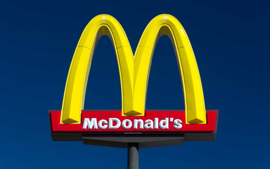
Today, the McDonalds logo can stand strong on its own, without the company name. Importantly, the bright red and yellow shades have stood the test of time as they’re perfect for conveying appetite and joy.
3. Famous logos: Coca-Cola
Unlike many other famous logos that have evolved over the years to completely remove the business name, Coca-Cola’s identity still stands connected to that unique typography we’ve all come to know and love.

Originally designed in 1887, the logo uses a flowing script font to convey ideas of both liquid and creativity. While there have been a few small changes to the logo over the years, the image used today is still very similar to the original. The use of the colour red now helps to convey excitement for everyone’s favourite fizzy drink.
4. Famous logos: Starbucks
We mentioned above that when it comes to deciding what makes a good logo, one element to remember is that your graphic should be distinctive. Famous company logos like the Starbucks mark certainly achieve this “unique” essence. The original inspiration for the iconic image was a 16th-century wood-cutting that featured a mermaid with two tails.

Although the original Starbucks logo was black and white, the company added the green with time to represent their ethical values, and focus on corporate responsibility. Today, the Starbucks logo is instantly recognisable around the world and often associated with the perfect cup of coffee.
5. Famous logos: Apple
Finally, any discussion on famous brand logos, or what makes a good logo would be incomplete without a mention of technology innovator: Apple. When Apple began designing ideas for good logos, they started complex, with sketches of Isaac Newton sitting under his apple tree. However, a year after founding, the company redesigned their logo to an apple with a bite taken out of it.
Over the years, the apple logo has sustained much of that simple image, though colours and designs have changed. The version you know today has the perfect high-tech feel you would expect from a computing company, combined with the simplicity today’s customers crave in their tech.
Guidelines from the greats: Learning from famous brand logos
As mentioned above, each of the famous logos we know today has a lesson to teach us about what makes a good logo, and the importance of branding. Here are just some of the most important messages we think companies should add to their education when examining famous company logos.
Lesson 1: Simplicity is the key to success
One of the most crucial elements in most good logos is simplicity. While it’s tempting to lose yourself in intricate and complex designs, simple solutions are easy to replicate and ideal for when you want to share your visual identity on everything from your storefront, to your website.
The easier it is for the human brain to process an image, the easier it is to remember that icon. It’s for this reason that most brands work their hardest to produce simple ideas that customers won’t struggle to digest. Companies all the way from Ikea, to IBM follow this rule, but one of the best famous logos to look at for simplicity is the one produced by Target:

The Target logo requires no explanation because there’s nothing complex about it. The image is simply two red circles on a white background – taking on the image of a bullseye.
Lesson 2: Versatility is valuable
Good logos are simple because basic images are easier to remember. However, simplicity also makes your graphics more versatile too. After all, if your entire brand message relies on the use of colour and shading in your logo, then you’ll lose the impact the moment that visual shows up in black and white, or needs to be shrunken down for a smaller product.

A flexible logo is one that you can place on countless graphics, products, and websites without compromising on the overall impact. For instance, before Raymond Loewy gave the Shell logo design a much-needed makeover in 1971, it was constantly changing and becoming outdated. However, as soon as Loewy developed a simpler, more versatile design, the business began to grow in a more positive way.
Lesson 3: Clever is better than pretty
Good logos need to be attractive – that’s a given. Human beings covet and remember beautiful things. This means that the more attractive your logo is, the more memorable it becomes. However, the beauty of a logo is more than just skin deep. If you really want to make an impact, then your design should be clever too, using colour and shape to portray a crucial message.
As the marketplace becomes more crowded, smart design is the key to engaging your audience. For instance, some of the world’s most famous company logos are incredible at using negative space to inspire the mind and promote product recall. Just look at FedEx, for instance.

The arrow in the FedEx logo isn’t just an interesting use of shapes, it also demonstrates the company values of forward-thinking service and speed.
Lesson 4: Colour is king
We’ve already mentioned the value of colour in logo design above, but few people realise just how important this simple factor can be. For instance, McDonald’s doesn’t just use red or yellow in its graphics because it knows that both of those colours can make people feel hungry. It uses the perfect combination to stand out as the perfect solution for hungry drivers on the highway.

Multiple colours are hard to pull off in logo design, but they can work effectively in the right circumstances. For example, Google, Windows, and eBay are all incredibly good at using multiple colours in their logo to demonstrate creativity and diversity.
Lesson 5: Make sure you stand the test of time
Finally, as we mentioned above, few logos will last forever, but that doesn’t mean you shouldn’t make “timelessness” one of your primary goals – particularly if famous logos are anything to go by. There are plenty of famous company logos out there that have managed to survive changing trends and ideas with little to no tweaking.

The Disney logo is a perfect example of a brand mark that’s lasted for years! The classic Disney typography emerged in 1995, and since then, it’s remained unchanged, and perfect for representing the magic of the Disney brand identity.
The key to Disney’s success and a major element in many good logos is that the company created an image that fits exactly with their vision and purpose. The fun and creative font demonstrates Disney’s focus on fantasy, and the colouring is simple, so it shows up well in any format.
When image counts: What makes good logos so good
Ultimately, a good logo isn’t the only thing that will determine whether you build a successful brand or not, but the right image can provide a powerful boost. Logos give the world around your company an instant visual representation of what your company stands for. As they say, the right picture really is worth a thousand words.
The problem is, a lot of organisations have trouble conjuring up a logo that captures their essence and promotes brand awareness. While you might have a picture of what your business is about in your head, it’s difficult to commit that image onto paper. That’s where logo design companies like Fabrik come in handy.
Of course, while you’re searching for advice to invigorate your logo design, it’s helpful to check out some famous logos for inspiration. After all, Nike, McDonald’s, Coca-Cola and many other fantastic brands are memorable for more than just their logo design, but it’s safe to say that the right brand mark and visual identity helps.
Famous company logos give you an insight into the ideas common in different industries and get your imagination running. In fact, the right logos can even teach you important lessons about simplicity, timelessness, and creativity, so that you’re fully prepared when it comes to briefing your brand consultancy.
As simple as they seem, logos inspire strong associations with your brand, convincing your customers to trust you, and choose your products over your competitors. A logo design speaks for your company, so make sure it says the right things.
Sign up with Fabrik today to get our latest thoughts and advice on branding sent straight to your inbox! Or why not follow us on LinkedIn?
If you enjoyed this article, you might enjoy these too:
— Discover the meaning of shape in logo design
— Font psychology and typography in branding
Clarity starts with a conversation.
Thanks—we’ll get back to you shortly.
Whether you're navigating a rebrand, merger, or simply need a clearer identity—we’re here to help. No hard sell, just honest advice from people who know the sector.
Let’s start with a simple question…
Prefer to email? Drop us a line.
Fabrik’s been helping organisations rethink and reshape their brands for over 25 years. We’ve guided companies through mergers, rebrands and new launches. Whatever stage you’re at, we’ll meet you there.


