


Activision logo history: The evolution of the Activision logo
How much do you know about Activision logo history? If you’re a fan of the video game industry, then you’re probably familiar with Activision as a brand. However, most new fans wouldn’t be able to picture the company’s first logo off the top of their head.
Despite a relatively long lifespan in the video game space, Activision has only made a few changes to its logo, designed to refine its image and highlight its personality to its growing audience.
Like many famous video game logos, the Activision symbol has been somewhat simplified. However, it still retains the company’s compelling, innovative essence.
Today, we’re going to look back at the Activision logo and how it has evolved to become the iconic symbol we know today.
Here’s everything you need to know about the Activision brand identity.
What made Activision famous? Introducing Activision
Activision, otherwise known as Activision Publishing, is a video games publisher from America, currently based in California (Santa Monica). It serves as the publishing business for the parent company of the brand “Activision Blizzard.”
The organization was originally founded as Activision Inc in 1979 by a team of former Atari game developers.
The founders, David Crane, Bob Whitehead, Alan Miller, and Jim Levy, started the Activision company after they felt they weren’t getting enough recognition within the Atari company. The group asked Atari to treat its game developers fairly, but their requests were ignored.
The team started on its quest to become a third-party development company long before such a concept really existed. Software for video game consoles was typically published exclusively by the makers of the systems.
However, the group wasn’t deterred. They set about coming up with a name for the company, exploring options like “Computer Arts Inc” and “Vsync” before eventually settling on “Activision.” The name is a combination of the words “Active” and “Television.”
Each developer in the team quickly started making their own games, such as Boxing, Fishing Derby, Checkers, and Dragster. To further distinguish themselves, they committed to building a strong brand identity with brightly colored boxes and in-game screenshots on the back cover.
Today, Activision is one of the best-known companies in the gaming world, responsible for titles like Doom 3, Spyro the Dragon, the Destiny series, and more.
Activision logo history: The evolution
Over more than 40 years, the Activision logo has remained relatively consistent. The company only made one major change to its logo when it briefly changed its name to “Mediagenic” after the CEO Jim Levy was replaced by Bruce Davis.
However, after this new business fell into debt, the old Activision name was revived, and the company was brought back to life, stronger than ever.
1979
The Activision logo history began in 1979 when the company was making its way into unchartered territories as one of the first third-party video game development companies. The brand was keen to stand out from its competitors and chose a brightly-colored logo to help it do so.
The combination mark featured the Activision wordmark in bold black font, very similar to the design we know today. The most compelling part of the font choice was the enlarged “V,” with elongated bars which joined with the “T” of Activision and covered the dots of the various “I’s.”
The logotype was accompanied by a rainbow of colored bars connected to the side of the “A.” This colorful element was intended to represent the diversity of the business, its commitment to creating vivid, eye-catching video games, and its unique approach to design.
1988
The first and only major change to the Activision logo was introduced in 1988. After Jim Levy was replaced by Bruce Davis as the CEO of the company, the brand changed its name to Mediagenic. The company branched out into various software applications but rapidly fell into debt.
Eventually, the company was bought out by a small group of investors, including Bobby Kotick, who revamped and restructured the company, returning to the old Activision name. Despite the change in title, the 1988 logo maintained the colorful elements of the previous Activision logo.
In this emblem, all of the letters were large and blocky, made to look more like shapes than characters.
Across the wordmark, a gradient-style rainbow effect was used to make the design stand out, starting with blue at the beginning and ending on a red “C.”
1992
Following the failure of Mediagenic, Activision was reborn, this time more streamlined and modern than ever.
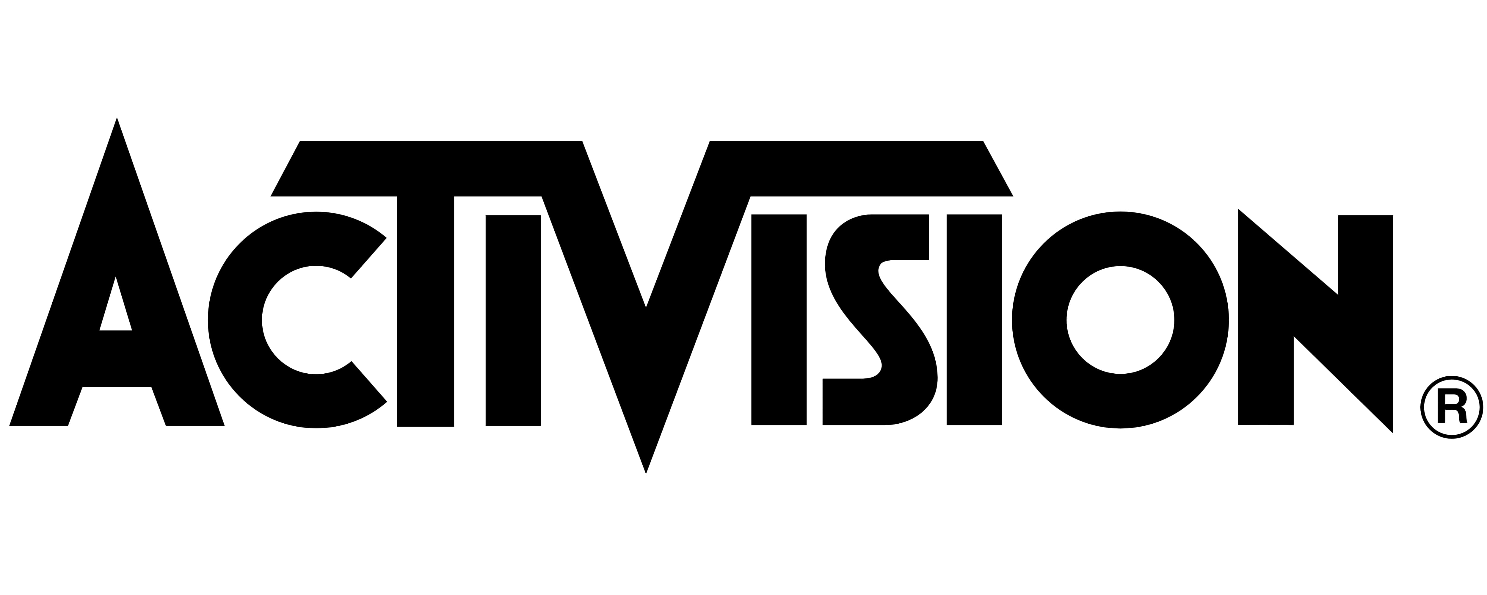
A version of the older logo, absent the rainbow element, was introduced. The minimalist new design was presented entirely in black and white and featured virtually the exact same font as the original emblem.
Though the new Activision logo is a lot simpler, it has proven to be a successful choice for the company. In fact, it’s remained with the brand ever since, with no changes made to its style or design. It still features the unique “V” in the center and the bold, blocky font.
Is Activision owned by Blizzard? The Activision Blizzard Logo
Activision and Blizzard aren’t exactly the same company, but they are owned by the same parent brand. After years of rapid expansion, Activision eventually merged with Blizzard Entertainment in 2008 to create the new company “Activision Blizzard.”
This parent company now oversees the activities of Activision Inc, which operates as the publisher of the brand.
Alongside Activision, Activision Blizzard is also responsible for Blizzard Entertainment, the King brand, Major League Gaming, and the Consumer Products Group.
The Activision Blizzard logo is a combination of both the current Activision logo and the emblem currently used by the Blizzard video game production brand. The two emblems are separated by a line down the center, and they both appear in black and white.
The Activision logo: Fonts and colors
Though relatively simplistic, the Activision logo is a modern, eye-catching, and robust emblem.
Not much about the design has been changed since its original inception. Though the rainbow color palette is no longer present, the Activision logo still maintains its unique font choice, with the large “V” in the middle and its outstretched arms across the top.
The “V” is almost reminiscent of a bird or a plane about to take flight, highlighting the creativity and ambition of the company. The sharp edges on the “N” and the “A” of the Activision logo also symbolize the company’s competitive and confident nature.
Today, this symbol is a timeless and contemporary image in the gaming landscape.
You can find some useful resources for the Activision logo here:
What color is the Activision logo?
In the past, Activision was primarily associated with a wide selection of colors, thanks to its original rainbow emblem and the multi-colored symbol used by Mediagenic. However, the Activision logo color palette has grown increasingly simplistic over the years.
Today, the colors used in the design have been refined to a simple combination of black and white.
Although the Activision logo colors might be relatively simple today, they’re highly impactful. The solid black wordmark stands out perfectly on any background. Without the added rainbow element, the design looks a lot edgier and more powerful than it once did.
What font does the Activision logo use?
The Activision logo font is unique to the brand. It’s a custom sans-serif typeface with carefully sharpened edges and straight bars across the letters. In some ways, certain glyphs are similar to those found in the Boldini Bold Gradient font, but the contours of the letters have been modified.
The most eye-catching part of the Activision logo is by far the enlarged “V” in the center, with its outstretched lines spreading across the other letters.
The impactful Activision logo
Looking at the Activision logo history, the company has always had a relatively strong view of its own visual identity. Aside from a single significant change at one point during the company’s history, the Activision logo hasn’t gone through many changes.
Today, the emblem is a modern and eye-catching wordmark, capable of accurately showcasing the company’s confident and innovative personality. This simple, minimalistic logo is ideal for helping the brand to stand out in its growing market.
Fabrik: A branding agency for our times.

Clarity starts with a conversation.
Thanks—we’ll get back to you shortly.
Whether you're navigating a rebrand, merger, or simply need a clearer identity—we’re here to help. No hard sell, just honest advice from people who know the sector.
Let’s start with a simple question…
Prefer to email? Drop us a line.
Fabrik’s been helping organisations rethink and reshape their brands for over 25 years. We’ve guided companies through mergers, rebrands and new launches. Whatever stage you’re at, we’ll meet you there.