The rise of a gaming giant: The history of the 2K Games logo

How much do you know about the 2K Games logo history? For many gaming fans, the 2K Games logo and brand have become a highly recognizable icon in the industry.
A simple yet impactful emblem, this organization has effectively separated itself from the growing competition in its space.
Though 2K started life a little later than some other well-known video game companies today, it has quickly impacted the market. At present, the 2K logo stands among some of the best-known emblems in the landscape.
Simple and powerful, the 2K logo is an excellent insight into how color psychology and carefully chosen font can highlight the essence of a brand.
Today, we will look closer at the 2K Games logo’s origins and evolution.
Why is 2K called 2K? Introducing 2K Games
2K, sometimes referred to as 2K Games, is a video games publisher founded under Take-Two Interactive in 2005. The organization was created after Take-Two purchased both 2K Games and the 2K Sports label brand at the time, alongside the brand “Visual Concepts.”
A third label for the business, known as “2K Play,” was also introduced in 2007.
In 2005, Take-Two Interactive announced that it had purchased Visual Concepts, the parent brand previously responsible for the 2K Games series.
Visual Concepts once belonged to Sega, but after a $24 million buy-out, it switched hands to Take-Two, giving the new company an opportunity to develop a brand-new publishing label.
Several of the Take-Two Interactive development studios at the time, including Kush Games, Venom Games, and Frog City Software, all became studios of 2K, and Take-Two Licensing started to merge into the new label.
The name “2K Games” comes from the Visual Concept sports game lineup, often referred to as the “2K Series”. These games were first published exclusively for the Dreamcast.
Today, 2K is responsible for a wide range of well-known video game products, including the BioShock series, Borderlands, the Mafia Series, and the Civilization series. Though it is now owned by Take-Two Interactive, 2K still operates as an individual brand.
2K Games logo history: The 2K symbol
2K Games logo history started only a relatively short time ago, in 2005. When the brand was purchased alongside Visual Concepts, a new logo was created specifically for the 2K publisher, and it hasn’t changed much since.
The primary components of the emblem, from its color palette to the unique positioning of the “2K” characters, remain mostly the same.
Like many game development companies, 2K made its logo changes primarily to modernize its image and maintain pace with the trends of the landscape.
2005
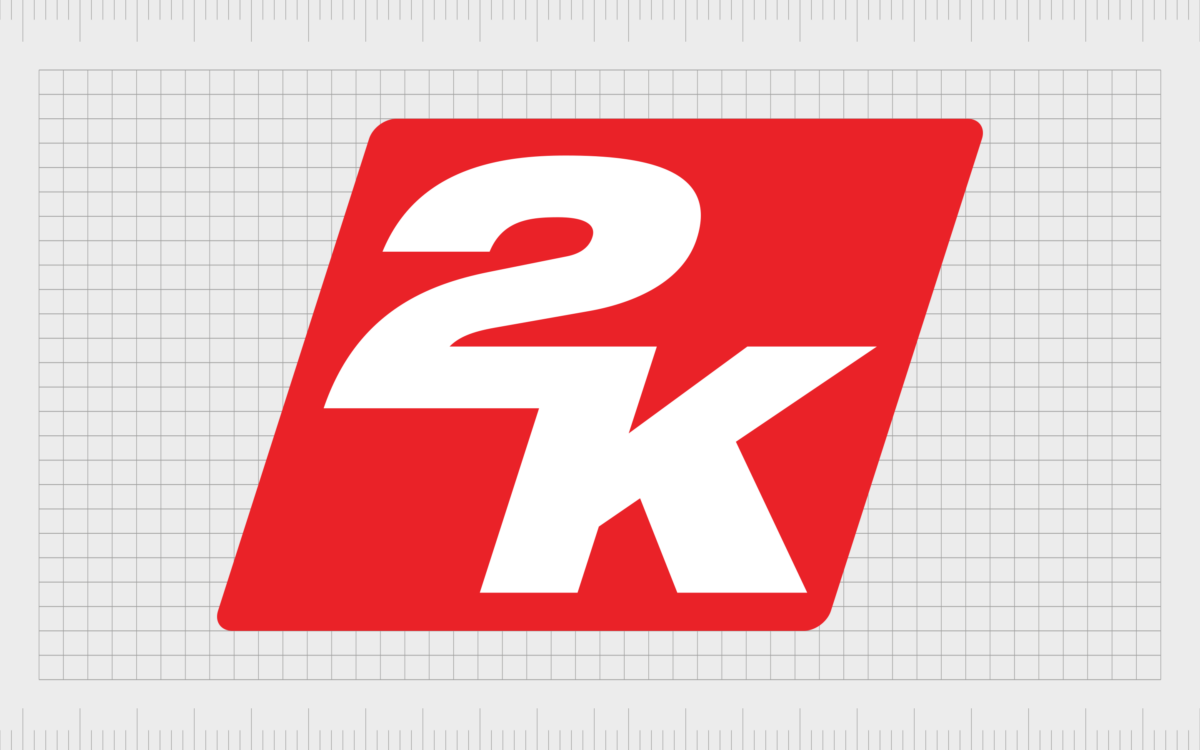
The first logo introduced for the 2K Games company stayed with the brand for most of its life. The design was relatively simple, consisting of a slanted red square angled towards the right to indicate speed and movement.
Within the badge, the name of the company is displayed across two levels, although the “2” and the “K” appear to connect in the middle.
The typeface chosen for the emblem was a large, bold, sans-serif font, depicted in white, creating an excellent contrast against the bright red background. The color choice was intended to convey the passion and power of the brand.
Alongside a relatively simplistic 2-D logo, a version of the emblem, which included some gradients to convey shine, was also introduced.
2021
To date, 2K has only changed its logo once. In 2021, the company revealed a new, slightly simplified version of its previous logo. In this updated design, most of the core elements of the organization’s visual identity are untouched.
Once again, we see the red and white color palette, offering an excellent level of contrast. However, in this instance, the square background has been straightened.
The slight angle to the 2K font choice still remains here, although it appears slightly less aggressive than in the previous design, perhaps due to the change in the background. The characters of the 2K name are still in the same iconic font and still connected in the middle.
Overall, the update gave the new badge a cleaner, more modern look, which works well with the current video game landscape.
What does the 2K logo mean?
The 2K Games logo doesn’t really have any hidden meanings. It’s a simple and straightforward emblem intended to highlight the name of the company and show some elements of its personality.
The timeless nature of the design meant the company didn’t have to make many changes to its visual presence in order to remain “current” in the video game landscape.
Of course, like with most logos, the elements of the logo have been chosen with care. The unusual arrangement of the symbols, and the way they connect in the center, highlight the creative and collaborative nature of the brand.
The connected symbols are also angled slightly to the right to convey a sense of consistent movement and progress.
The designers chose a bold, italic sans-serif typeface in white to symbolize professionalism and detail-oriented work. The red background was chosen to highlight concepts like passion and power, ideas frequently connected with the video game space.
The colors were also chosen to provide an excellent level of contrast. The bright white font on the red background makes a huge impact.
The 2K Games logo: Colors and fonts
The 2K Games logo is a relatively simple yet effective design. The timeless icon has evolved well with the brand, needing very little refinement over the years to maintain its modern edge.
Today, the 2K logo symbolizes the strength and consistency of the company. It highlights a passionate personality committed to excellence and forward movement.
Take-Two Interactive may have also chosen to keep the logo relatively minimalistic to ensure it coincides with its own visual identity. Take-Two’s logo is also extremely simple and features a large “T2” in bold, black font.
If you want to take a closer look at the elements of the 2K Games logo, you can find some useful resources here:
What color is the 2K Games logo?
The 2k Games logo colors haven’t changed much over the years. When the emblem was first introduced, two variations were created. One featured a gradient-style background, which gave the red square a shiny appearance.
The other was a simple, matte-style logo similar to the one we know today. In some parts of the world, where 2K had subsidiaries, different colors have also been used.
Today, the 2K Games logo color palette is still the same mixture of bright white and bold red we saw when the company first emerged in 2005. The color choices offer an excellent level of contrast while also highlighting the unique personality of the brand.
WHITE
Hex: #ffffff
RED
Hex: #ee2722
What font does the 2K Games logo use?
Like the color palette for the 2K Games logo, the font choice has remained consistent since its inception. The 2K Games logo font is a bold, sans-serif typeface, written in italics, to highlight the fast-paced and forward-facing focus of the brand.
The design is very similar to the Helvetica Neue 93 Ext Black font. However, the glyphs have been connected in the center between the two levels.
The connection between the two characters helps to demonstrate the collaborative work of the company, as well as giving the logo a unique visual appeal.
Celebrating the amazing 2K Games logo
There haven’t been many changes to mention throughout the 2K Games logo history. The Take-Two interactive team chose a highly modern and evocative logo for the company from its inception, creating an emblem capable of standing the test of time.
Minimalist and evocative, this eye-catching logo has assisted the company in separating itself from countless other gaming competitors.
Today, the iconic 2K Games logo symbolizes passion and vitality. It highlights the energetic personality of the company, and its commitment to creating fun, engaging video game experiences.
Fabrik: A branding agency for our times.
Clarity starts with a conversation.
Thanks—we’ll get back to you shortly.
Whether you're navigating a rebrand, merger, or simply need a clearer identity—we’re here to help. No hard sell, just honest advice from people who know the sector.
Let’s start with a simple question…
Prefer to email? Drop us a line.
Fabrik’s been helping organisations rethink and reshape their brands for over 25 years. We’ve guided companies through mergers, rebrands and new launches. Whatever stage you’re at, we’ll meet you there.


