Web design trends 2018: 10 strategies to stand out online this year

The digital world is constantly evolving.
New customers enter the marketplace, demanding better experiences, and more memorable interactions. Technology companies deliver new and disruptive concepts like AI and machine learning. Even your average web designer is constantly working behind the scenes to develop new and exciting ways of bringing consumers and companies together.
It’s no surprise that we have a new bundle of web design trends to explore each year.
Of course, no matter how complicated the online landscape becomes – one thing remains the same: your website is still the heart of your digital marketing initiative. Without it, you’d have nothing to connect the various avenues you use to build customer relationships online.
Your website is the central hub linking your social media campaigns, email newsletters, vlogs, podcasts, and even in-person events. The question, is how can you design that cardinal experience to properly promote your products, your services, and of course, your brand?
Why follow 2018 web design trends?
The ever-changing nature of the online world means that the web design trends that worked for you in 2017, 2016, and 2015, may not hold up as well this year. In a world where something as simple as the wrong navigational strategy, or a poor font choice could lose the loyalty of your customers, it’s important to stay ahead of the curve. Remember:
- 77% of companies think that poor website UX is a serious problem for their customers.
- 2 thirds of people say they’d rather look at something beautiful than something plain.
- 38% of customers will stop engaging with a website if it’s unattractive.
Great web design doesn’t necessarily mean changing your online identity every 12 months. However, the more you know about 2018 web design trends, the easier it will be to adapt your strategy to suit your audience when the situation demands it. That’s why we’ve crafted this list containing 10 of the most stylish strategies to hit the headlines this year.
If you’re looking for a quick refresh, or you want to polish your web presence, these trending tips could help.
1. Carefully crafted typography
While the importance of fonts isn’t a new concept in web design, many experts believe that 2018 will be the year of typography. For decades now, companies have agonised over choosing the right typefaces for their logos, visual identities and more. However, typography has been somewhat limited in the digital world, because of concerns that designers had about blending clarity, with beauty and availability.
Fortunately, the rise of new design techniques has ensured that today’s designers have more freedom than ever before to play with bigger, and better type. While it’s still important for today’s companies to find the right balance between background images and foreground fonts, typography now has a range of new possibilities to work with. In fact, there’s even been a rise in something called the “variable font”.
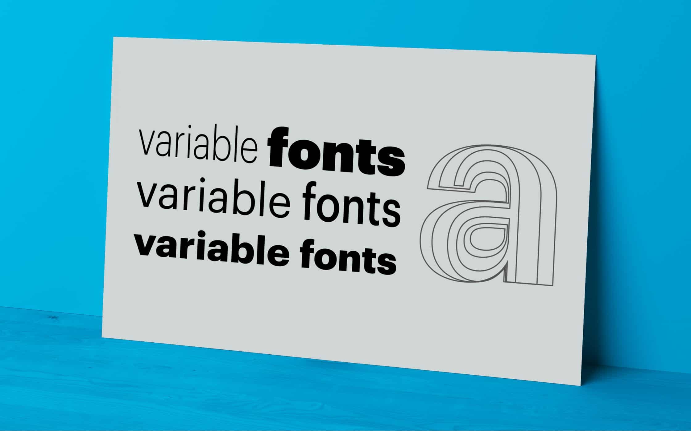
As the name suggests, a variable font is something that can shift dynamically on your web page. For instance, your font might get bolder or bigger when someone hovers their mouse cursor over it. Many designers believe that these solutions will grow more popular in 2018 – particularly as support for dynamic fonts grow on OS and browsers.
As the online world continues to open new doors for professional design teams, web design 2018 could be all about giving companies better ways to refine their voices online. After all, the font your company chooses can go a long way in defining its personality. Variable fonts mean you can adjust the size and width of images or fonts for different screen sizes, and even give specific pages more impact.
2. More creative formatting
Often, when people begin to explore the changing nature of web design trends from year to year, they look at things like the colours used on websites, and the scrolling patterns available. However, in 2018, there’s a good chance that the very foundations of how we design our web presence could change. The growing innovation and complexity in the digital world mean that we finally have a greater level of control over how elements can be rendered on a web page.
Static print design is quickly becoming a thing of the past, driven by the idea that the web experience should be dynamic, and engaging. The evolution of things like CSS over the last twenty years has meant that modern designers can now present an entirely different web experience depending on where a visitor comes from. For instance, the website you see on your computer browser could be completely different to the one you see on your phone.
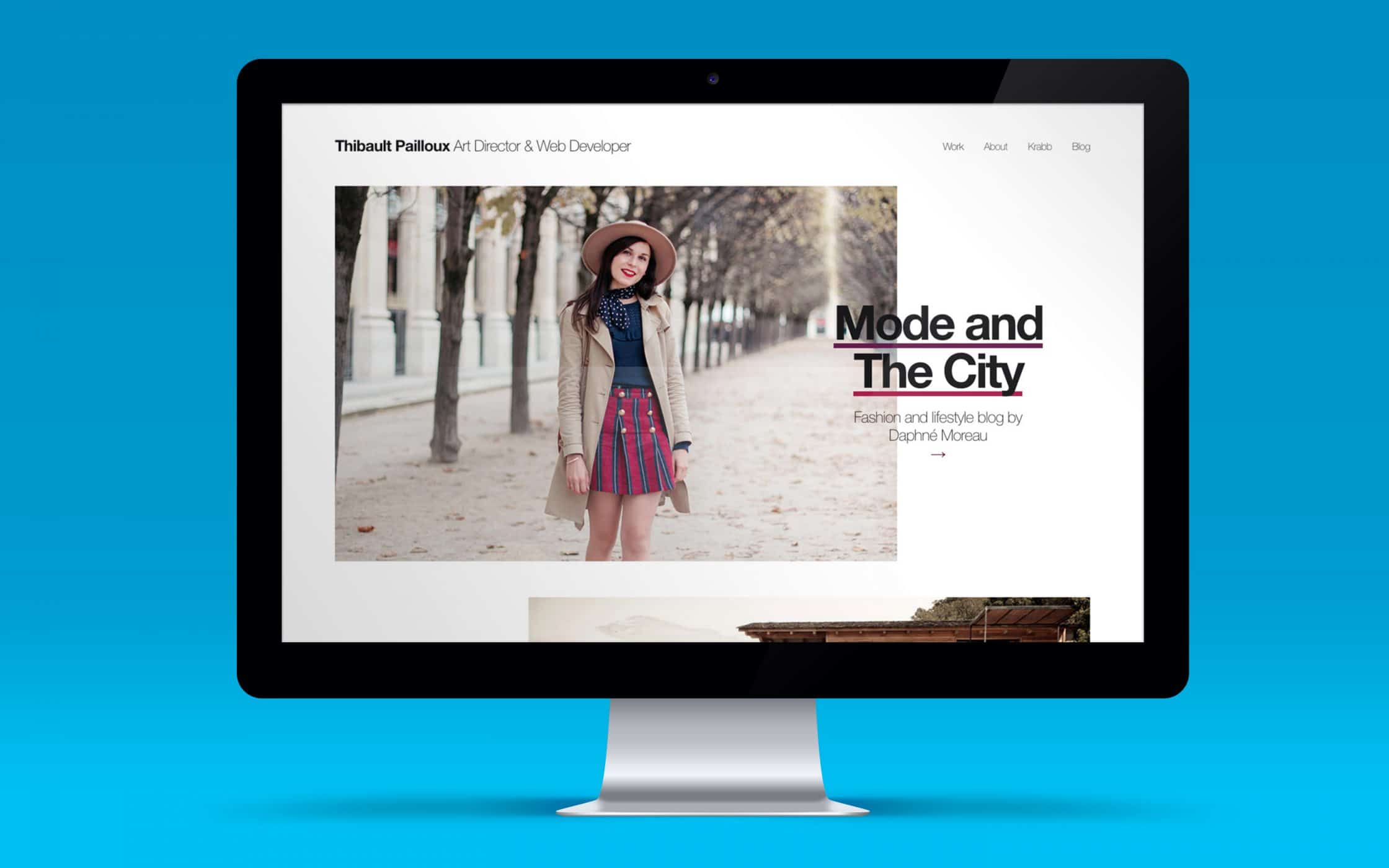
2018 web design trends are sure to take advantage of the CSS grid, and systems like Flexbox, which help to make website layouts inherently more dynamic. For example, we might start to see things like overlapping text and images, which offer a more modern approach for those who want an interesting, but minimalist mobile-friendly design. Look at the Thibault Pailloux website, for instance:
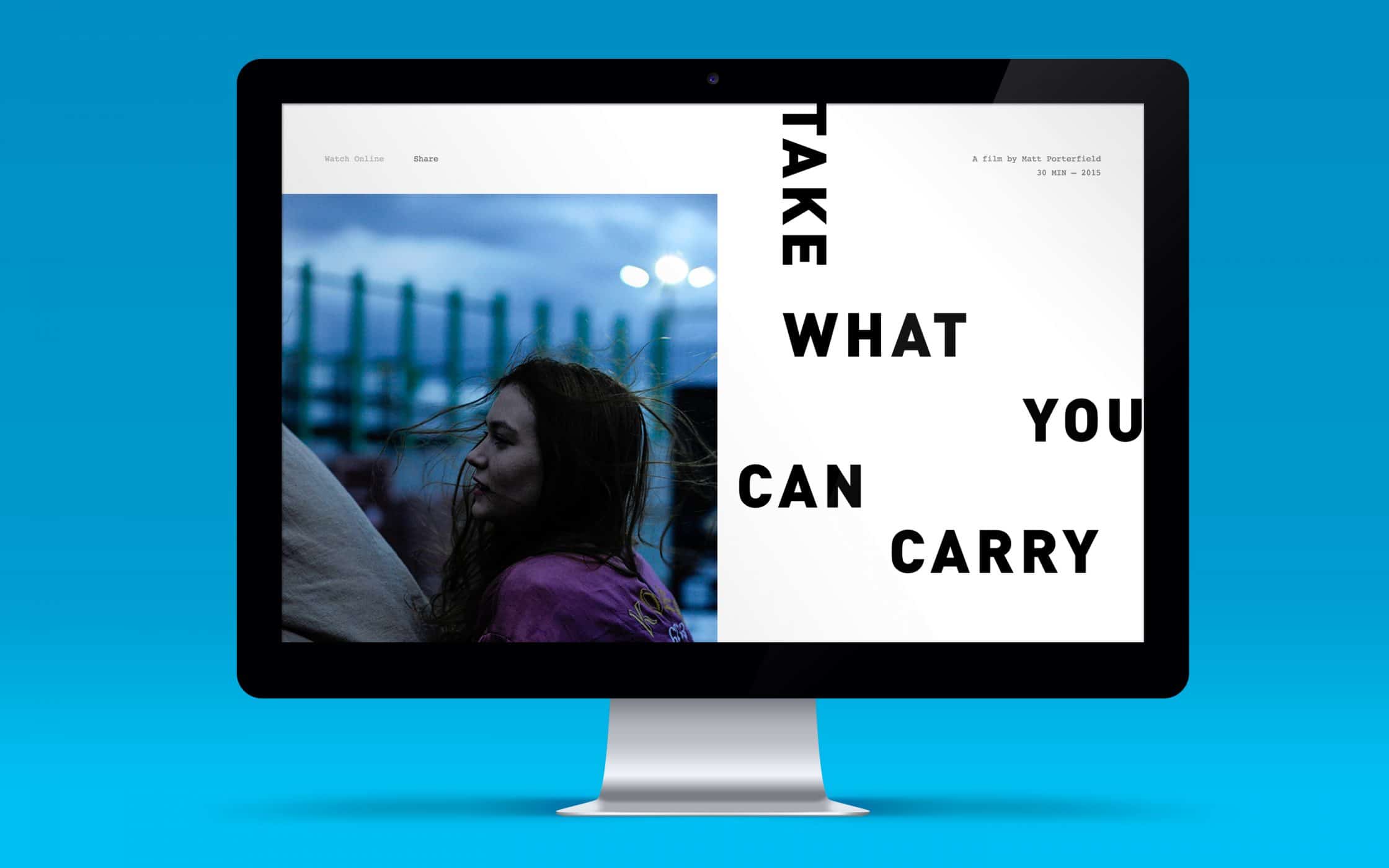
A more flexible CSS grid also means that you can play with the structure of words and images so that they don’t need to follow the same old boring patterns. Check out this example from the Matt Porterfield website, which mixes vertical and horizontal text alignments to bring life to each page:
3. Brighter colours and bolder gradients
If web design 2018 is all about designers becoming more courageous with their ideas, then it’s safe to say they won’t stop with formatting and layout. Colour has always been one of the best ways for web design experts to show off their creative spark – and this year will be no different.
For 2018, the Pantone colour of choice was an extremely bold one: UltraViolet. That choice alone helps to introduce one of the biggest 2018 web design trends – which involves using brighter, and more exciting colours into modern websites. While you don’t necessarily need to play with purple to be trendy, it’s worth recognising the importance of bright colours for earning attention this year.
Over the years, introducing a bright pop of the right colour has been one of the easiest ways to establish a vivid and eye-catching design. The right combination of dark and light colours can create a vivid contrast that directs the eye around the page. However, in 2018, the focus is less on contrast and more on the natural blend of gradients. We started to see those gradients in 2017, and this year, they’re becoming even more popular. Look at the Zurich-based company Y7K, for example:
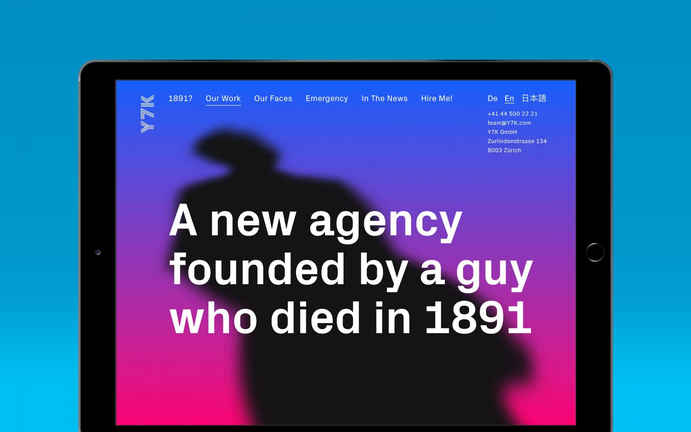
The blend of bright colours helps to bring focus to the unique personality of the brand, and keep customers engaged with the site. Of course, if you don’t want to go too bold with your colour choices, you can always pick softer gradients instead. Ultimately, the aim should be to start with a colour that’s about 20% darker than the one it blends into.
4. Shadows and depth
Flat design was a common trend back in 2017, and something that many companies are continuing to experiment with today. When used properly, flat images or semi-flat visuals on logos and websites can be a great way to portray modernism and style. These designs also gave us a great way to escape the unnatural drop shadows of days gone by.
However, now that we have better graphics displays to work with, the drop shadow is back, and bigger than ever. The difference is, experts are trying to get a more natural look with their shadowing. The key is to provide depth in an image, rather than overwhelming the page with shadow. In a world of augmented and virtual reality, companies want their customers to feel as though they could reach out and touch a piece of font or grab a product off a web page.
One of the main places that we’re starting to see the re-introduction of depth, is in the CTA button. While ghost-buttons and flat buttons are still popular, many designers are experimenting with buttons that look as though they’re naturally raised off the page. For an example, check out the button on the Digital Painting Academy site:
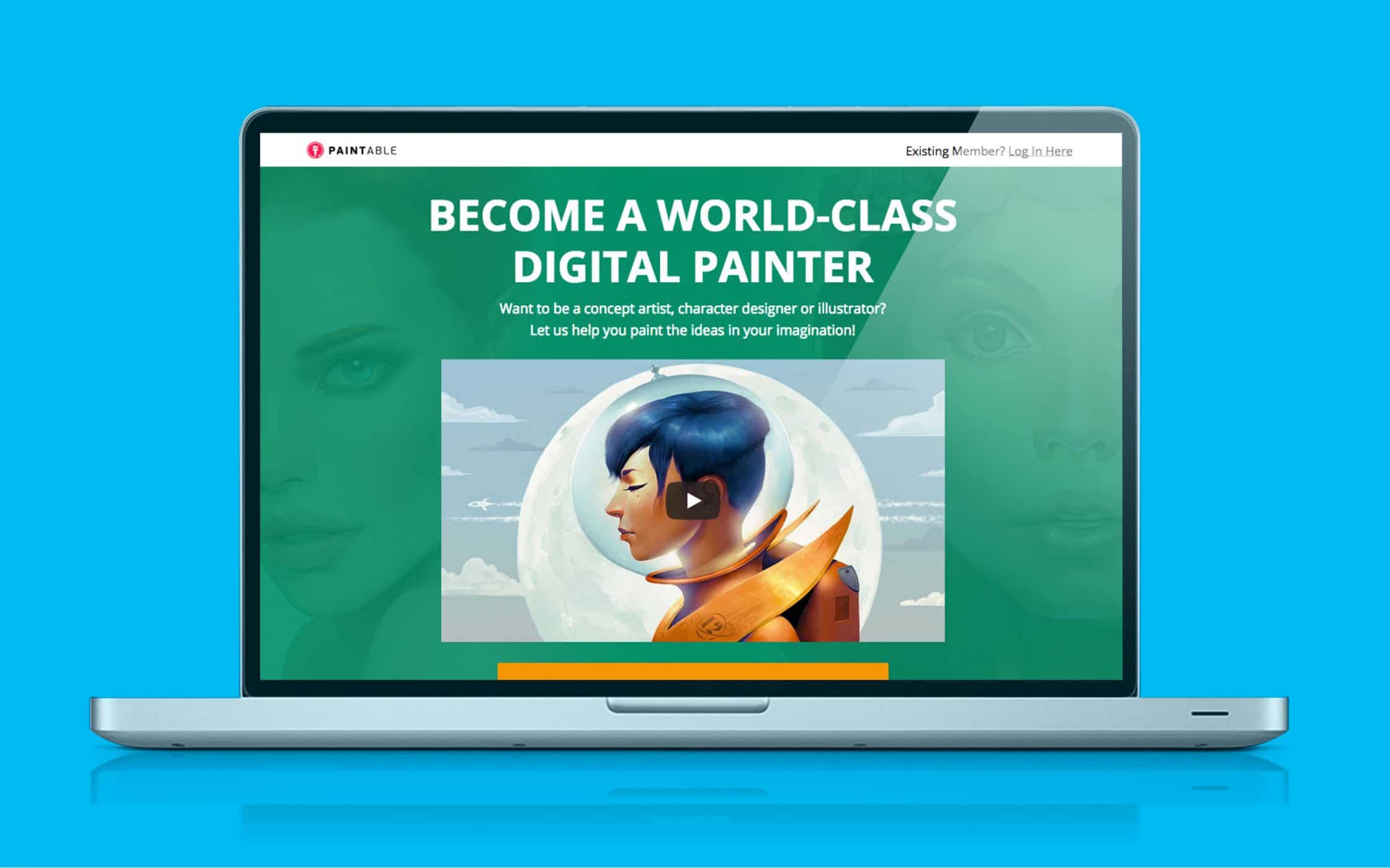
Since CTAs are all about grabbing your customer’s attention and pushing them to take a certain action, it makes sense to think about how you can separate your buttons from the rest of your web design. 3D effects naturally encourage better interactivity from users, but they need to be integrated along the right kind of layout to work.
5. Geometric elements (with a touch of vintage)
These days, it feels like people are all about nostalgia. While it might be bizarre to think that so many customers are drawn to retro concepts and shapes in a time when we’re moving so aggressively towards the future – it does make sense too. After all, the more complex the digital world becomes, the more natural it is for us to crave things that feel familiar and safe.
There’s a distinctly “90’s” feel about some of the shapes appearing in 2018 web design trends. In fact, if you spend a lot of time on fashion sites, you might have noticed the iconic geometric shapes of the Fresh Prince of Bel-Air and Saved by the Bell popping up from time-to-time. Just look at Firebox, for instance:
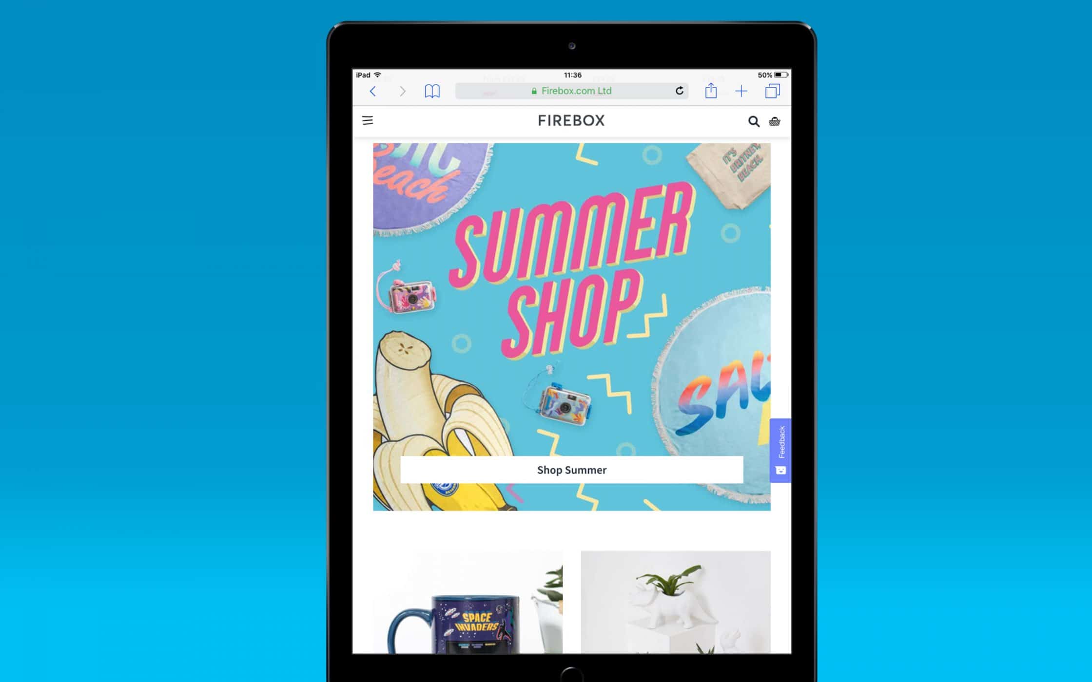
Shapes like squiggly lines, lightning bolts, and triangles can play an important part in web design when you’re trying to create a bold visual look. In fact, even the most traditional companies could benefit from using geometric elements in their design to break up large amounts of content and push the eye around the site.
Not only is the geometric design great for those interested in a bit of vintage branding, but sharp angles can also push the eye directly to a CTA – improving conversions. If the angle is right for your brand identity, then leaning on trends from the past can really help to direct your website into the present.
What’s more, creating a “safe” visual experience packed full of recognisable patterns is a great way to add to the sense of trust that today’s customers need to make a purchase. If your product or service relies heavily on emotion, then a nostalgia-based design can be a great way to generate more sales.
6. Micro-interactions on websites
Above, we mentioned how important it is for today’s companies to recognise the dynamic nature of the online world. In 2017, we started to see something called “micro-interactions” emerging in the digital world, as a way of helping companies to interact more naturally with their customers. Increasingly, as clients scroll through their favourite websites, the information they need isn’t just presented in one block – it slides into your awareness piece by piece.
Today, basic animation is easy to fold into most websites. With the right micro-interactions, you can make every part of your customer’s experience on your website feel more interactive and immersive. Obviously, the key is to make sure that you don’t go too over-the-top here, as there’s always the possibility that too many animations could make an experience overwhelming. The last thing you want is to replicate the chaotic MySpace pages from back in the day.
When used carefully, subtle animations can be an important part of web design 2018. They can direct the visitor’s attention across to the right content at the right time, making sure that people don’t miss important lines of copy or calls-to-action.
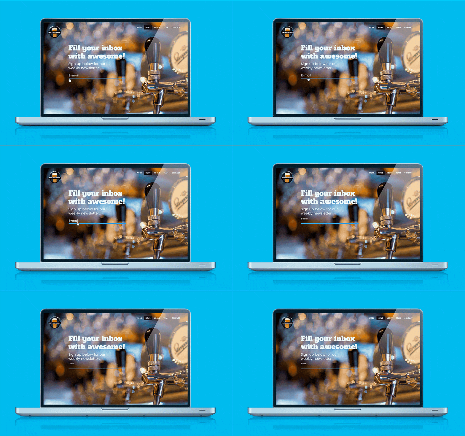
Often, micro-interactions work like animated responses to user behaviour. That means that if someone on your website hovers over a specific part of the site, a drop-down menu might appear, or a new piece of information might pop up. There are countless ways that you can add micro-interactions to your site, from changes in the depth of the page to bouncing effects that deliver new images and words. On this website design, hovering over the “email” element leads to a custom animation effect:
7. Modular blank space
All these bright colours, dynamic fonts, and exciting animations are great. But, what happens when you want to slow down and give your user a simpler, more concise experience? White space can be a powerful part of the online experience, as it allows you to direct your visitor’s attention, without overwhelming them. In fact, the right blend of blank space could even help to convey unique elements of your brand identity – particularly if you want to be minimalist and modern.
For web trends 2018, intentional blank space has become a popular solution for many creators. With large blocks of white space, you can achieve a new level of minimalism on your website, helping to ensure that your message isn’t overwhelmed by too much imagery or animated design.
If a website is cluttered with overlapping and outdated pieces, then white space can help to bring clarity and freshness to the design. In fact, you can even adjust different parts of your website to give every element, from your content to your brand photographs, its own place.
Some websites, like the Danish Agency B14, are cutting the clutter of visuals out of their sites entirely.
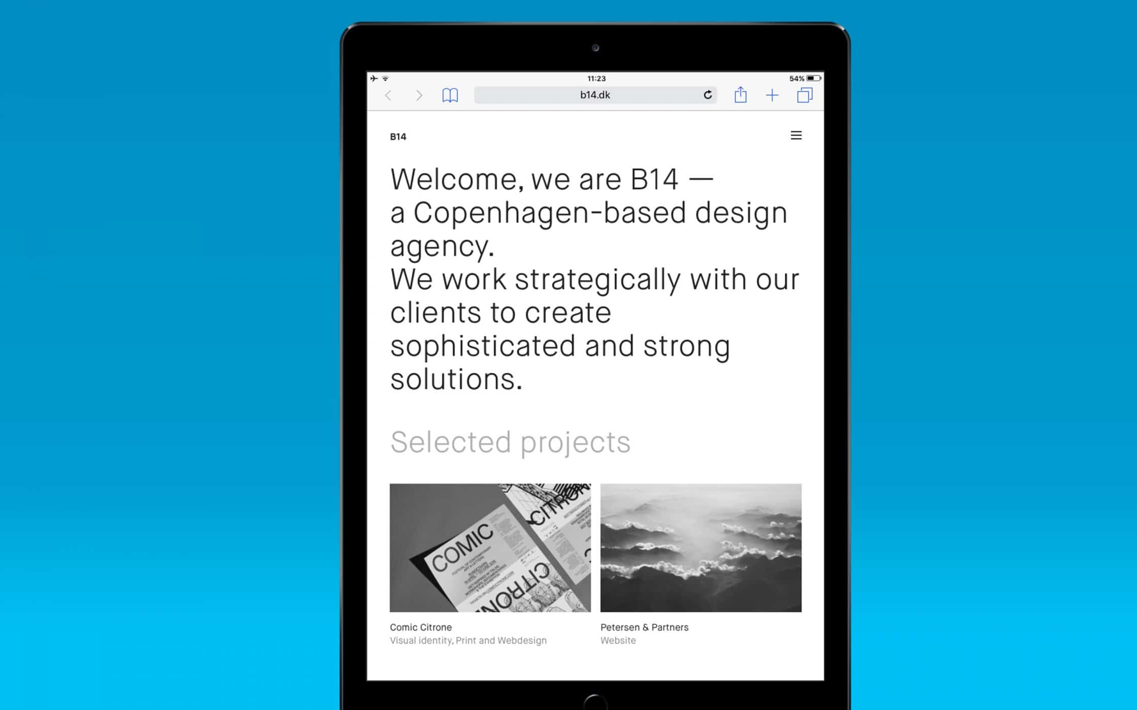
While this is obviously a risky approach in today’s image-first market, it can be an interesting way to show people the unique nature of your company. B14 uses only a few straightforward lines of text to describe their mission statement and provide access to their portfolio. It’s an alternative approach to presenting information, for people who are interested in detail over design.
8. Mastering mobile and wide-screen design
Though web design trends have shifted significantly in the last few years, one focus seems to stay the same. The drive towards more responsive web design is a constant concern for today’s designers. As mobile traffic continues to increase every day, responsive sites have become obligatory for most brands. After all, if your customers can’t get to you from their smartphone, then you’re missing out on a serious number of potential sales.
Mastering mobile design for 2018 web design trends is about figuring out how people are consuming information on smaller devices. For most experts, this means concentrating on not only making web pages clearer but also more dynamically responsive too. For instance, you might decide to design your site for both desktop users, smartphone users, and wide-screen users too:
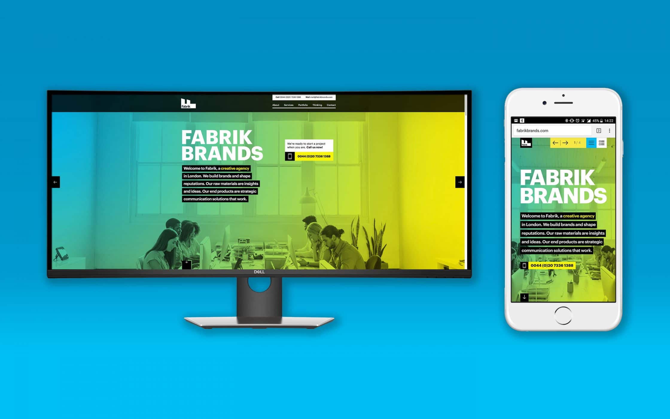
Users in the modern landscape need to love a brand’s mobile experience, or that company risks losing the loyalty of their followers. Adjusting your site design for the modern user means speaking to your web design company about what they can do to make your experience universal. For example, you’ll need to make sure that:
- Your screens aren’t cluttered with information.
- Your users can find the right content easily on desktop and mobile versions of your site.
- You maintain a similar functionality for content navigation.
- You trigger the same emotions through any medium.
9. The push to softer and more organic shapes
Shape is a common consideration for logo and website design. After all, while harsh angles and bold lines can help to portray a modern, forward-thinking brand, softer shapes with curved edges are more welcoming and friendly. In the design world, both desktop and mobile experiences have been dominated by the card-based UI for several years now. And until recently, most of those cards are right-angled and sharp-edged.
In 2017, that trend began to change, and we’re seeing a push towards aggressively rounded corners on everything from Twitter to Pinterest.
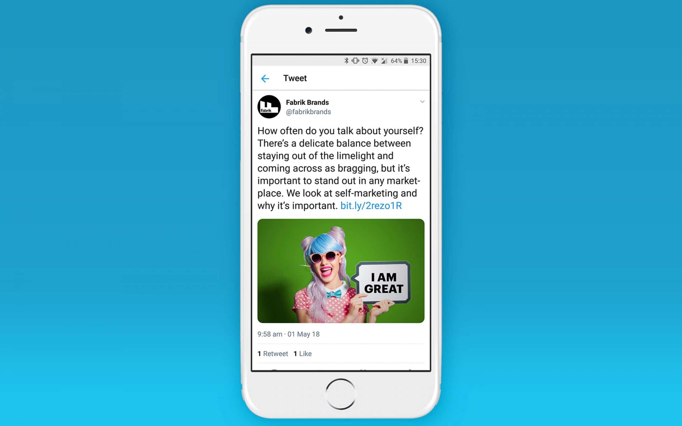
It’s not just entry fields and primary elements that are developing a more organic nature either. There are countless sites out there that are twisting designs out of their standard 90-degree angles into something more unique. The Stripe homepage plays with perspective by angling images on a diagonal line:
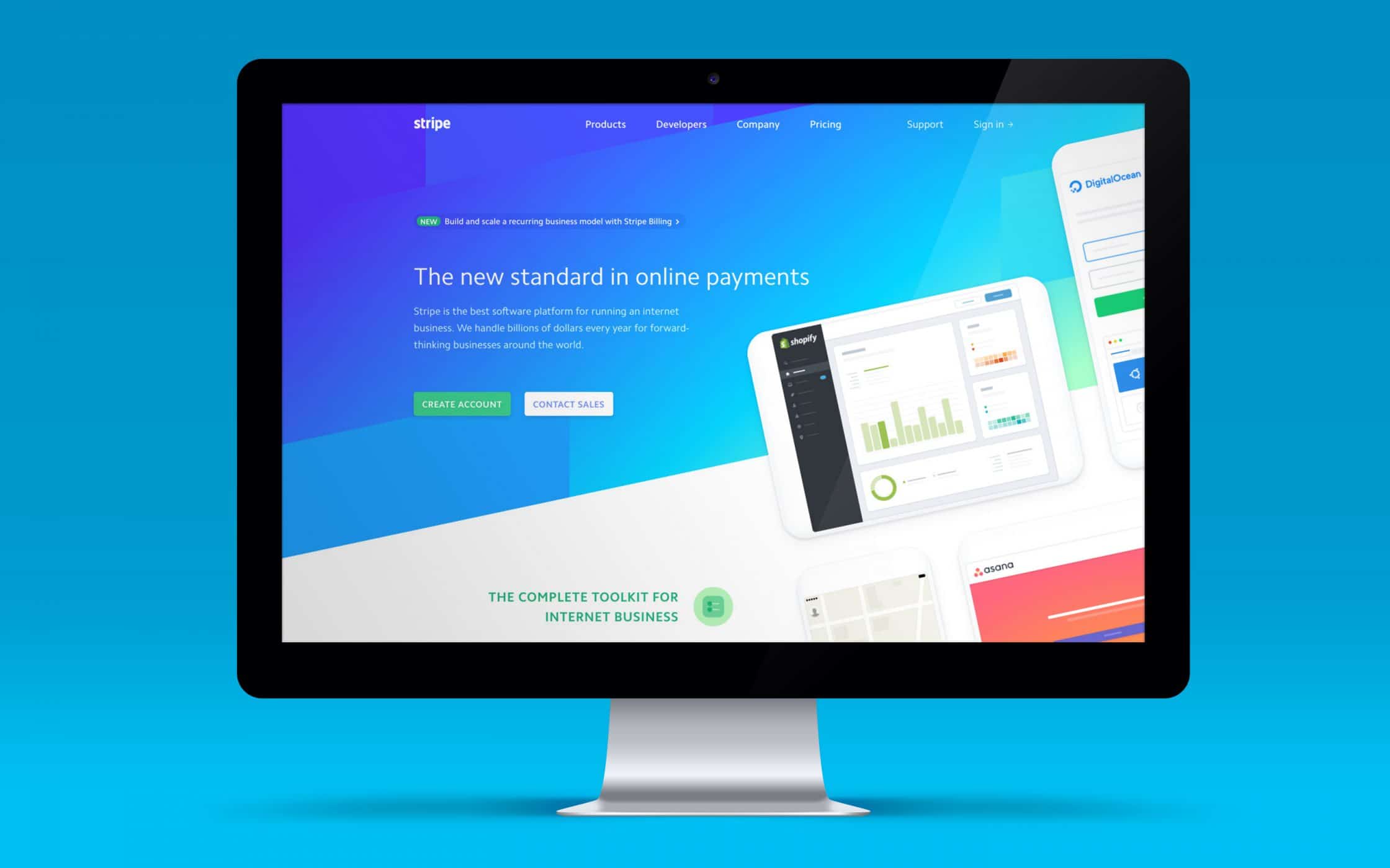
This doesn’t mean that standard boxes, harder shapes, and right angles are going extinct. There’s also plenty of designers out there that have decided to double-down on their use of straight lines. However, for companies who want to take a friendly, and quirky approach to 2018 web design trends, the organic shape could be the way to go.
10. The rebirth of brutalism
Finally, brutalism is a form of architecture that began to emerge during the 1960s. It earned its name because of the description given to the materials used in the architecture: brut (or raw concrete). As you might imagine, the concept of brutalism in web design is something that melds with the rather bold and courageous efforts of this year’s designers. In fact, it seems that most of the 2018 web design trends are based on a push towards more aggressive ways of interacting with customers.
In 2017, we saw a sea of organised and tidy websites emerging in the marketplace. That meant that when 2018 rolled around, designers had to do something different if they wanted to stand out. While brutalism can appear to be somewhat jarring at first, it’s a great way to respond to the increasing standardisation of web design that many designers disagree with. In fact, you could even say that brutalism is going a step further than playing with the CSS grids and standard shapes we mentioned above.
Brutalism hasn’t got a distinct style. Instead, it’s characterised by asymmetrical and exciting visuals presented in a non-conformist standard. You can see it on the page below by “Biannual”:
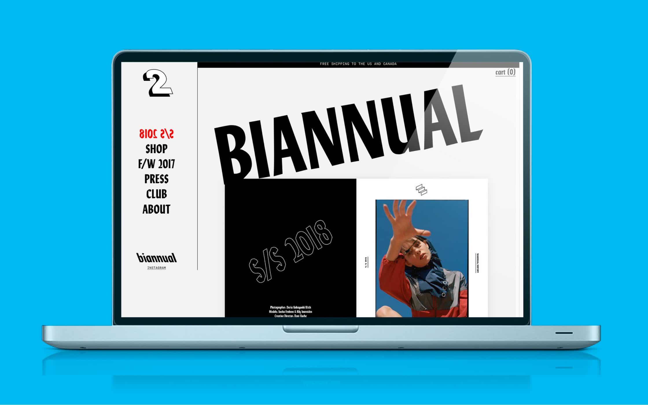
These days, Brutalism appears more often on adventurous websites and artist sites, but it’s also getting a lot of attention from high-end fashion designers too.
How 2018 web design trends can boost your business
We’re only halfway through 2018, and already the concepts outlined above have begun to show how exciting the year could be for web designers. The underlying question around all changes in web design trends is: “How can I capture and keep the attention of my visitors?” The answer for this year seems to be bigger, bolder, and more aggressive elements, with a few subtle touches here and there.
Incorporating any of the ideas addressed above could bring a fresh and exciting vibe into your site. The key to success is figuring out how to upgrade your web design for the modern world, without detracting from your existing brand identity.
While there’s nothing wrong with updating your look from time-to-time, it’s important to make sure that the experiences you create online correspond with the image you’re trying to establish for your brand. If you’re unsure how to do that, then you’re going to need some support from a company like Fabrik.
If you enjoyed this article, you might enjoy these too:
— Web psychology: From experience to art and science
— How guest blogging can be beneficial to your brand
— The future, present and history of graphic design

