


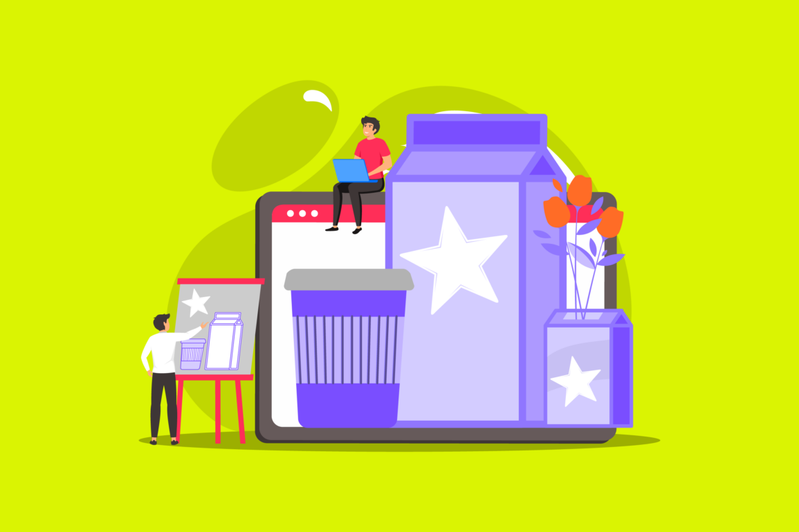
Purple packaging: Should you use purple in packaging design?
Purple in packaging design can convey significant amounts of symbolism and meaning. The chances are you’ve already seen this color used to attract female shoppers in the beauty aisle or showcase the luxurious nature of a food item.
Purple packaging can be an excellent way to make your products stand out on shelves and displays. But only when used correctly.
While purple is a fantastic and vivid shade for organizations looking to capture customer attention, it’s also somewhat controversial. Like many colors, purple can have positive and negative connotations depending on the tone, context, and presentation.
On the one hand, using purple in your packaging choices could be an excellent way to present your brand as unique, compelling, and creative. On the other, purple can also be associated with darkness, frustration, and mystery, which may not appeal to every audience.
Let’s explore the concept of purple product packaging.
What does purple signify in packaging design?
Purple in packaging design can be a highly versatile color. According to color psychology, all of the shades we can see in the world today influence our emotions and perceptions in unique ways. We associate blue with tranquility and reliability, while red is seen as passionate and bold.
Purple, as a secondary color, has many different tones and temperatures for designers to choose from. A warm and vivid purple could convey ideas like creativity and independence. A dark, deep shade of purple elicits curiosity and spirituality.
Alternatively, soft and gentle purples are usually intended to attract a female audience or demonstrate compassion.
In the product design world, we often see certain companies using purple packaging more than others. For instance, because women tend to prefer the color purple more than men, we see this shade a lot in the beauty, skincare, and fashion landscape.
Purple food packaging is also relatively common in the confectionary and chocolate worlds. This is because food with purple packaging usually signifies the item is an indulgence or a treat rather than something we’d consider essential.
The luxurious nature of purple can be further enhanced with complementary colors like gold, which make a product appear rich and extravagant. Depending on the type of purple you choose for your packaging, you could convey the following:
- Imagination and creativity
- Wisdom and dignity
- Mystery and magic
- Luxury and nobility
- Ambition
- Compassion

Should you use purple in packaging?
Compared to other shades like blue, purple isn’t the most popular color in the branding world. It appeals to a particular audience and generally alienates a lot of men.
However, the shade is becoming more universal, and brands have many different tones and styles to choose from to ensure they can generate the right results.
Using purple in packaging design means thinking about how to reach your audience and what emotions you want to elicit. For instance, you may use purple when you want to:
Demonstrate indulgence
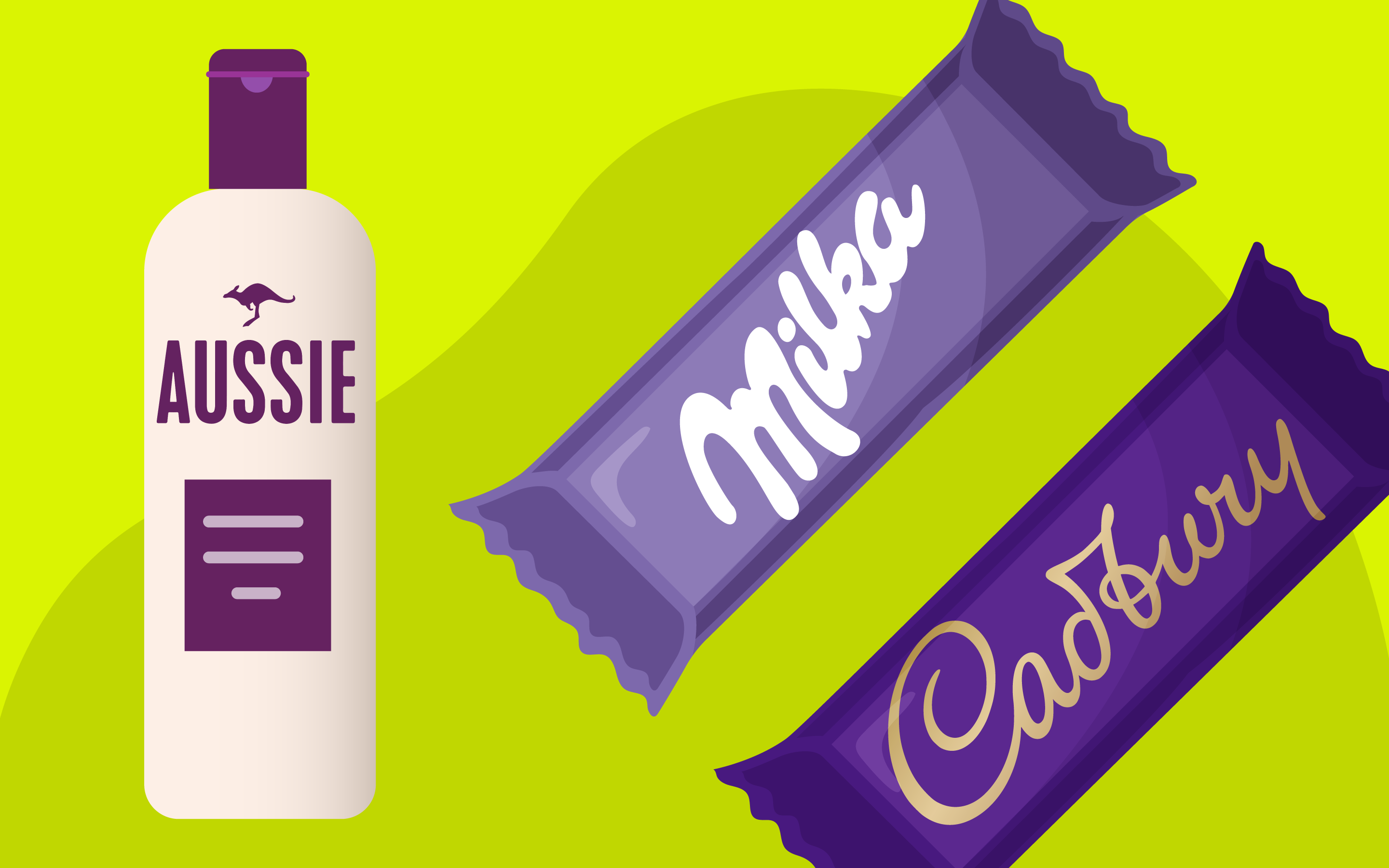
Purple food packaging is everywhere in the confectionary world because the color is commonly associated with luxury and opulence. Chocolate companies like Cadbury are well-known for covering their food with purple packaging.
Showcase exclusivity
Thanks to its connection with nobility and royalty, purple can also make an item seem more high-class than its competitors. Purple could be a good choice for packaging if you’re trying to sell premium products at a higher price point.
Appeal to women
As mentioned above, purple is one of the more popular colors among women, but it rarely appeals to men. As a result, if your target audience is made up mainly of women or those with female sensibilities, this could be the perfect color.
Convey spirituality
As a relatively unique color and something we don’t often see in nature, purple is a popular choice for those who want to showcase spirituality, mystery, and magic. It’s a common branding choice among holistic companies.
Appear unique
Because purple packaging isn’t used as often as other colors, it can be a good way for brands to showcase their independence and out-of-the-box thinking. If your competitors use a range of colors, purple will help your items stand out on the shelves, leading to higher revenue.
How to use purple in packing design
Whether you’re thinking of creating purple food packaging or choosing the perfect purple packaging for your holistic product, it’s crucial to ensure you make the right choice with your design.
The best option for most companies is to work with a professional designer to ensure they select the right palette of colors for each item they produce.
Here are some quick tips you can follow to ensure you have the right impact on your audience.
1. Consider your customer’s perspective
Start by getting to know your target audience, their preferences, and their characteristics. While purple packaging usually appeals most to female customers, it can also be a good choice for those searching for unique, spiritual, or luxurious products.
If you’re unsure how your packaging will appear to your audience, you can consider testing different options on a select group.
2. Research the competition
Purple can be an excellent way for companies to stand out and demonstrate the exclusivity of their product. However, the color won’t have the same impact if your competitors already use it.
Make sure you pay attention to the shades of purple used by other brands, so you can pick something that highlights the unique nature of your company.
3. Consider the full-color palette
In most cases, companies will use more than one shade in their packaging design. Think about how you can accompany your purple shades with other complementary colors like white, yellow, and green. Different complementary shades will send specific messages to your audience.
A combination of yellow and purple is associated with youth while mixing gold and purple shows luxury.
4. Remember functionality
Ensure any purple colors you use in your packaging don’t drown out the critical information you need to share with your audience.
For example, if you choose a purple package for your chocolate bar, the company’s name should appear contrasting. Think about how you can use the various shades selected for your brand palette in balance.
5. Experiment with different shades
Remember, different shades and tones of purple have different connotations. If you’re designing packaging for a company selling natural beauty products, using lighter shades commonly seen in nature rather than dark and sophisticated tones makes sense.
Alternatively, you might pick a brighter color if you want to stand out as unique and exciting.
Brands with purple packaging
It might help to check out some of the purple packaging used by other brands all over the world. For instance, Cadbury is one of the best-known food companies for using purple packaging. They use a combination of deep purple and gold to signify luxury and indulgence.
A competing chocolate company, Milka, uses a much lighter shade of purple to appear more compassionate and friendly. The use of soft purple and white also helps to offer insights into the kind of chocolate the customer is getting – something creamy and light.
Fox’s Biscuits in the UK also uses a purple packaging shade combined with elements of pink to make it seem more fun and youthful. Lighter shades of purple are sometimes associated with compassion and community, so they help customers to imagine sharing their cookies with their friends.
The Aussie haircare company uses purple to convey indulgence and excellence in the health and beauty world. However, it’s also matched with many neutral colors to remind consumers they’re getting a natural product with organic ingredients.
When choosing your own purple packaging, it may be worth considering whether you want the shade to be the core of your color palette or just an accent hue. Purple can help to make other shades stand out when used in small doses.
Is purple a good color for packaging?
When selecting purple in packaging design, you must think carefully about your brand image and audience. There’s no one-size-fits-all strategy for choosing the correct color palette.
Ultimately, it’s up to you to determine which shades will appeal most to your customers and which will help you showcase your brand’s unique values.
Keep in mind there are various other elements of packaging design to consider on top of color. The texture of your packaging, its shape, and even the materials you use can either add to or detract from the experience you give your customers.
The more research you do before choosing your packaging design, the more likely your products will attract the right results.
Fabrik: A branding agency for our times.
Now read these:
—What does purple mean in marketing?
—Is purple a good color for logo design?
—Understanding the psychology of purple
—What does purple signify in branding?
—Why is purple associated with royalty?
—A guide to colors that complement purple
—Definitive guide to the shades of purple
—Popular companies with purple logos
—Your guide to which colors make purple
—Exploring the colors of the rainbow

Clarity starts with a conversation.
Thanks—we’ll get back to you shortly.
Whether you're navigating a rebrand, merger, or simply need a clearer identity—we’re here to help. No hard sell, just honest advice from people who know the sector.
Let’s start with a simple question…
Prefer to email? Drop us a line.
Fabrik’s been helping organisations rethink and reshape their brands for over 25 years. We’ve guided companies through mergers, rebrands and new launches. Whatever stage you’re at, we’ll meet you there.