


MLB logos: 30 Major League Baseball team logos and names

MLB logos are one of the most eye-catching parts of the baseball world. Major League Baseball team logos, like any emblem, are designed to differentiate teams, and tell a meaningful story. However, these images can also have significantly more depth than the standard logo too.
Often referencing the location they represent, MLB logos are emblems of community spirit and heritage. These designs capture the hearts and minds of people all over the world, and inspire incredible support and love from fans.
Since the first Major League Baseball game in 1876, countless unforgettable MLB team logos have risen to fame. Today, we’re going to be looking at just some of the best-known logos from the official game of America, and discussing what they may represent.
Baseball team logos and names
Major League Baseball is the oldest major professional sports league in the world and one of the most iconic sporting organizations of all time.
As of 2022, there are 30 teams playing in the Major League Baseball landscape, with 15 in the “American League” and another 15 playing in the “National League.”
There are also 29 teams in America, and 1 from Canada.
While the National League has been a component of Major League Baseball since 1876, the American League only emerged in 1901. Two years later, in 1903, the two leagues signed an agreement to cooperate, but remained separate entities until 2000.
Today, Major League Baseball has come a long way from when it was first established more than 100 years ago. Countless new Major League baseball team logos and names have entered the game. Interestingly, the first all-professional team was the Cincinnati Red Stockings, founded in 1869.
Let’s take a look at the MLB logos you might know today…
American League MLB team logos

Baltimore Orioles
Playing in the American League East Division of the MLB landscape, the Baltimore Orioles were established in 1901, and were one of the first charter teams introduced in the first year of American League Baseball.
The Orioles chose their name to honor the official state bird of Maryland.
Unsurprisingly, the Baltimore Orioles logo features the namesake bird of the team, designed in a cartoonish style, in the colors of black, orange, and white. The bird also features a baseball hat, giving him a fun and friendly appearance.

Boston Red Sox
Easily one of the better-known professional baseball teams in Major League Baseball, Boston Red Sox are part of the AL East Division. The name actually evolved from a previous team name, the “Boston Red Stockings”.
The team has won nine World Series Championships to date.
The official emblem of the Boston Red socks is simply a pair of red socks, designed to look like the socks a baseball team wears. The team also has a slightly more detailed emblem which places the pair of socks on a circular background intended to look like a baseball.
In this variation, the name of the group is also present in stylized slab serif font.

New York Yankees
Another well-known choice in our name of MLB team logos, the New York Yankees belong to the East Division League of American League baseball. Established during the initial launch of the League, the New York Yankees have collected a significant number of fans over the years.
Today, the Yankees symbol features a top hat with the colors of an American flag, placed on the top of a baseball bat. The word “Yankees” is written in a cursive font, demonstrating elegance, and the whole design is placed on an eye-catching circle with baseball stitching.
Find out more about the New York Yankees logo here.

Tampa Bay Rays
The Tampa Bay Rays began playing in the 1998 Major League Baseball season, for the American League East Division. The team’s logo is a little different to most, featuring an eye-catching serif wordmark, with a bright start-shaped yellow element on the “R”.
The Tampa Bay Rays originally had the name “Devil Rays”, which referred to the manta ray marine animal.
When the name switched to “Rays”, the team started focusing more on the image of a “ray of light”, hence the choice of blue, yellow and white for their logo, which makes us think of the sun lighting up the sky.

Toronto Blue Jays
The only Canadian professional baseball team to play in the MLB landscape, the Toronto Blue Jays were established in 1977 and have emerged as one of the better-known baseball team logos and names. The group’s name originates from the bird of the same name.
Simple but effective, the Blue Jay’s logo features their iconic bird, in the official color of Toronto’s collegiate and sports teams. The maple leaf emblem next to the bird symbolizes the flag of Canada, demonstrating the patriotism of the group.

Chicago White Sox
Competing in the Central Division of the American League, the White Sox is one of the AL’s eight charter franchises. While the group was officially established in 1900 as the Chicago White Stockings, they shortened their name in 1904.
Unique and eye-catching, the White Sox logo is a stylized wordmark which features three letters staggered across different levels. The letters are gothic in style, with a serif finish, and are portrayed in black and white, two of the colors of the team.

Cleveland Guardians
Introduced as part of the Central Division of the American League in 1904, the Cleveland Guardians have won 10 Central Division titles, as well as 2 World Series Championships.
The name of the team refers to the “Guardians of Traffic”, the Art Deco sculptures built in the city’s Memorial Bridge in 1932 by Henry Hering.
The Cleveland Guardian’s logo looks a little like the image of a Norse god, with the placement of two wings situated on a stylized letter “G”. The wings are placed around a 3D baseball, and the angling of the design makes it seem as though the ball is moving at speed.

Detroit Tigers
Part of the Central Division of the American League, the Detroit Tigers are the oldest continuous one city and one name franchise in the league. The name of the group actually comes from a nickname, which most people believe came from the team’s stripy socks.
While not the most complex of the Major League logos on this list, the Detroit Tigers’ emblem is difficult to forget. A gothic-style “D” makes for a highly eye-catching logo, with a lot of unique flourishes, symbolizing the history and heritage of the group.

Kansas City Royals
An American baseball team based in Kansas City; the Kansas City Royals compete in the Central Division of the American League and were founded as an expansion franchise during 1969. The group has won 2 world series.
The name “Royals” is connected to the American Royal livestock show, rodeo, and championship held in Kansas City.
The “Royals” name clearly shows through in the Kansas City logo, which features a shield-style emblem showcasing the letters “KC” with a crown on top. A wordmark in cursive, elegant font also depicts the name of the team.

Minnesota Twins
Part of the American League Central Division, the Minnesota Twins are named after the twin cities area, which features the connecting cities of St Paul and Minneapolis. The team was founded in 1901 originally as the “Washington Senators” in Washington, before moving to Minnesota in 1961.
The “Twins” emblem is one of the more iconic MLB logos, featuring an elegant wordmark “Twins”, placed over a white and red baseball. The baseball is surrounded by a border in deep blue, with the words “Minnesota Baseball Club” emblazoned on it.

Houston Astros
From the Western Division of the American League for Major League Baseball, the Houston Astros first started competing in 1962.
Originally, the team was called the Colt .45s, and they entered the game as an expansion team alongside the New York Mets. The current name reflects Houston’s position as the home of the Johnson Space Center.
The Houston Astros uses a badge style emblem for their logo, featuring the large letter “H” in a serif font on top of a golden star. The border for the badge conveys the full name of the team in serif capital letters.
The design is simple and authoritative.

Los Angeles Angels
A professional baseball team in the LA area, the Angels compete in the American League West Division, and was founded in 1961. The name of the team comes from the common “City of Angels” tagline for Los Angeles.
The team won the World Series in 2002.
A bold red “A” designed with an interesting angular style is the heart of the logo for the LA Angels. The design also features a white halo, situated over the top point of the “A”.
This logo is also evident in a Big “A” sculpture at the Angel Stadium.

Oakland Athletics
The Oakland Athletics team are part of the American League West Division, and they’ve won an incredible nine World Series Championships. The team was actually founded in Philadelphia as the “Philadelphia Athletics”, and eventually moved to Oakland in 1968.
Based on the nickname “Swingin’ A’s”, the Oakland Athletics logo is a badge-style emblem with the “A’s” element placed in the middle in a gothic-style font. The words “Oakland Athletics” are situated around the border of the badge.

Seattle Mariners
Joining the American League West Division as an expansion club in 1977, the Seattle Mariners take their name from the prominence of the marine culture in Seattle. Many fans of this group nickname them the “M’s” – a title which appeared in previous logos.
The current variation of the Seattle Marinas logo is based on the colors adopted by the group in 1993. The design is intended to follow the same badge emblem style as many other baseball team logos, with a compass design flair.

Texas Rangers
Established in 1961, the Texas Rangers are an American League Baseball team, competing in the West Division. The Rangers were first established as the Washington Senators, before moving to Texas, and the Dallas, Fort Worth metroplex.
The name “Rangers” was established in 1972, referring to the well-known Texas rangers of law enforcement. The design for the team’s logo is similar to many baseball emblems, featuring a stylized “T” on a baseball-style badge, with a surrounding border which highlights the name of the group.
National League Baseball team logos

Atlanta Braves
Based in the Atlanta metropolitan area, the Atlanta Braves compete as part of the National League East division. The name “Braves” first appeared in 1912 and originates from a term used for a Native American warrior.
The group also has the nickname “Bravos”.
With a cursive style wordmark depicting the name “Braves”, and a Native American style axe underneath, the Atlanta Braves highlight their roots in their logo. The design is eye-catching and unique compared to many MLB logos.
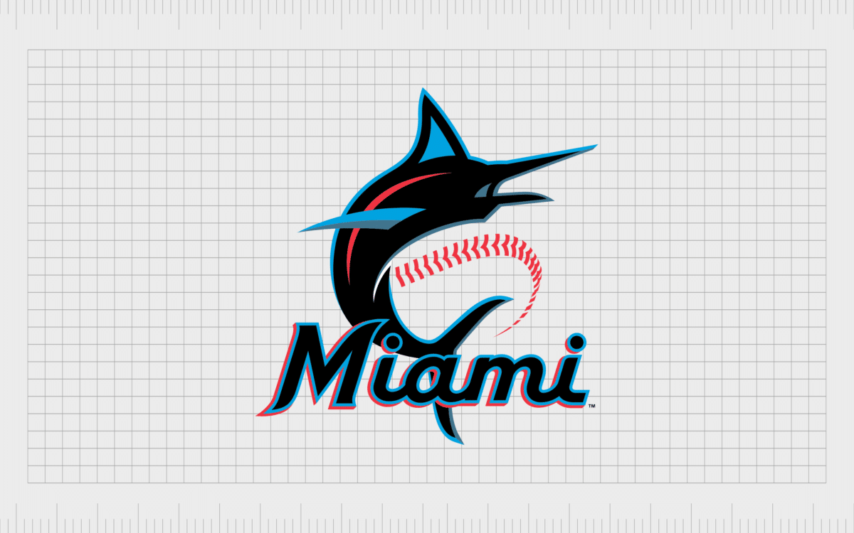
Miami Marlins
Playing for the East Division of the National League, the Miami Marlins franchise began as an expansion team in the 1993 season. The team was first named the “Florida Marlins”, before eventually becoming the “Miami Marlins” as part of an agreement with the Miami dolphins.
The franchise adopted the name “Marlins” from previous minor League teams and features the image of a marlin in its logo, alongside a sans-serif but elegant font. The design also includes the iconic stitching from a baseball.

New York Mets
Playing for the East Division as one of two Major League Baseball clubs in New York City, the New York Mets were founded in 1962. The name “Mets” was adopted as a nickname shortened version of the club’s corporate name “The Metropolitan baseball club”.
Highlighting the city skyline of New York, the New York Mets use a badge-style emblem in their official team colors. The iconic baseball stitching pattern is overlaid on top of the image to make the circular design look like a baseball.

Philadelphia Phillies
The Philadelphia Phillies play for the National League East Division, and are the oldest consistent same-city, same-name franchise in America’s professional sports environment. Winning two World Series Championships, the team has gained a lot of attention over the years.
The name “Phillies” comes from the nickname for Philadelphia. The logo for the Philadelphia Phillies is based on the cracked liberty bell the region is so famous for. This is one of the few Major League Baseball logos using cursive font.

Washington Nationals
The Washington Nationals are a part of the National League East Division, introduced in 1969. The Nationals are the eighth Major League franchise based in Washington. Taken from the “National Association” which the team played for; the name “Nationals” refers to the group’s history.
Similar to many logos in the Major League Baseball landscape, the Washington National logo is a badge-style emblem, with the name of the group written in the border, around a large “W”. The design is elegant, sophisticated, and powerful.

Chicago Cubs
Competing in the Central Division of the National League, the Chicago Cubs were introduced in 1876, and are one of two major teams based in Chicago, alongside the White Sox. The Cubs title comes from a nickname given to the team by the Chicago Daily News in 1902.
Simple but effective, the Cubs logo is one of the best baseball logos of all time. The design follows the similar circular style emblem we’ve seen in other baseball logos. However, this version also uses a large “C” at the start of the club’s name to help highlight the rest of the title.

Cincinnati Reds
Part of the Central division of the National League, the Cincinnati Reds were part of the American Association in 1881, before eventually joining the National League in 1890. The origins of the name can be traced back to an earlier team baring the same name.
The logo for the Cincinnati Reds is an eye-catching design which stands apart from the common circular emblems we’ve seen elsewhere on this list. The white shape surrounding the word “Reds” is intended to look like a “C”.

Milwaukee Brewers
The Milwaukee Brewers compete in the Central Division for the National League, and are named for the city’s association with the brewing sector. The team was actually founded as the Seattle Pilots, before eventually changing their name after their relocation to Milwaukee.
A classic example of one of the more traditional MLB team logos, the Milwaukee Brewers use a circular badge in blue, white and yellow, featuring the name of the group, and an image of a glove holding a baseball in the middle.

Pittsburgh Pirates
Compared to other cool baseball logos on this list, the Pittsburgh Pirates have gone relatively simple with their emblem. The Pirates have won 5 World Series Championships, and earned their nickname due to some scandals during the early years of the baseball team’s history.
Featuring just a golden “P”, the Pittsburgh Pirates rely on the somewhat unique typeface choice for their capital letter to make an impact on the baseball field.

St Louis Cardinals
A famous example of baseball team logos using animals as their mascot, the ST. Louis Cardinals play in the Central Division of the National League, and have won 11 World Series Championships.
The name of the group actually comes from the coloring of the jersey and socks the team won when they were the “Perfectos” in 1899.
With an iconic cardinal bird standing on top of a baseball bat, the St Louis Cardinals logo is wonderfully eye-catching, the image also includes the name of the group in a script font.

Arizona Diamondbacks
Known as the D-Backs in some regions, the Arizona Diamond Backs play in the West Division of the National League, established as an expansion team in 1998. The origins of the group’s team name are a little more mysterious than some of the other groups on this list.
This MLB team logo includes the head of a snack in the white space of a large capital “A”. The unique combination of elements is great for making this group stand out.

Colorado Rockies
Another team playing in the West Division of Major League Baseball’s National League, the Colorado Rockies are named for the incredible Rocky Mountains in Colorado. This baseball team began as an expansion team for the 1993 season.
Simple but effective, the team logo for the Colorado Rockies overlays a large capital “R” on a capital “C”, in a serif font. The design conveys an essence of authority and professionalism, perfect for a well-known baseball team.

Los Angeles Dodgers
Easily one of the better-known baseball teams on our list, the Dodgers were established in 1883. The group considered a wide variety of monikers for a while, before eventually settling on the “Dodgers” title in 1932, as a way of symbolizing their agility and speed.
Featuring a baseball in bright red with lines behind it to symbolize speed, the Los Angels Dodgers’ logo is one of the better-known designs on this list. Like many MLB team logos, the emblem also features a script-style wordmark.
Find out more about the LA Dodgers logo here.

San Diego Padres
Playing in the West Division of the National League, the San Diego Padres were established in 1969, and are one of the two MLB teams in California to actually originate from the state. The name of the team comes from the Pacific Coast League Group from San Diego in 1936.
One of the simpler logos we’ve covered today, the San Diego Padres features an “S” placed on top of a “D”, to make the two letters look as though they’re intertwined. The typeface has very slight serifs, giving it a sense of sophistication and modernity.

San Francisco Giants
The San Francisco Giants compete in the National League West Division, and were first established as a team in 1883 as the “New York Gothans”. The franchise is one of the most successful and oldest in professional baseball, boasting more wins than any other team in American sports.
The Giant’s logo features a very large wordmark placed on top of a baseball image with orange stitching. The design is an excellent larger-than-life design, ideal for a company with a name focused on size.
Celebrarating Major League Baseball team logos
There are countless beautiful examples of MLB logos in the sport today. The Major League Baseball team logos covered above offer an excellent insight into how effectively these teams use their logos to capture the hearts and minds of fans.
Though many of these designs are simple, they’re effective at showcasing the background of the team, and generating a sense of excitement among the fans watching them.
For more insights into the incredible logos of sports teams, make sure you check out some of our other articles here on the Brand Fabrik Logofile.
Fabrik: A branding agency for our times.

Clarity starts with a conversation.
Thanks—we’ll get back to you shortly.
Whether you're navigating a rebrand, merger, or simply need a clearer identity—we’re here to help. No hard sell, just honest advice from people who know the sector.
Let’s start with a simple question…
Prefer to email? Drop us a line.
Fabrik’s been helping organisations rethink and reshape their brands for over 25 years. We’ve guided companies through mergers, rebrands and new launches. Whatever stage you’re at, we’ll meet you there.