


Famous logos with hidden meanings: Uncovering the hidden messages in logos
You’re probably already know about a handful of logos with hidden meanings. The FedEx logo with its iconic arrow, the Toblerone logo with a hidden bear, and even the Baskin Robbins’ logo with its integrated “31” are all great examples.
The most famous logos with hidden meanings have intrigued people around the globe for years. While not every company will use hidden designs in their brand marks to convey additional meaning, those who do offer a fantastic insight into the power of logo creation.
Something as simple as the use of white space in a logo can be enough to give a whole new layer of depth to the design.
Today, we’re going to be looking more closely at some of the best logos with hidden meaning, and explain why they’re so effective at making a lasting impression on their audience.
Why are there hidden messages in logos?
Logos are supposed to be meaningful. These designs are a brand’s opportunity to provide their customers with as much information as possible about the company, in a single, compact image.
Though you may not always notice the message hidden in every logo you see straight away, you can rest assured it was carefully designed to achieve a specific goal. Everything from the colors companies use in their logos, to the choice of shapes and typography, has a unique effect.
Adding hidden elements to the whitespace or positioning of certain elements in a logo can add an extra layer of meaning to the design. The hidden message might say something about the company’s history, or provide an insight into the product’s origins, like with the Toblerone bear.
The underlying purpose of this message, of course, is to create a deeper connection with the company’s target audience.
Let’s take a closer look at some of the hidden designs in logos.
The best logos with hidden meanings
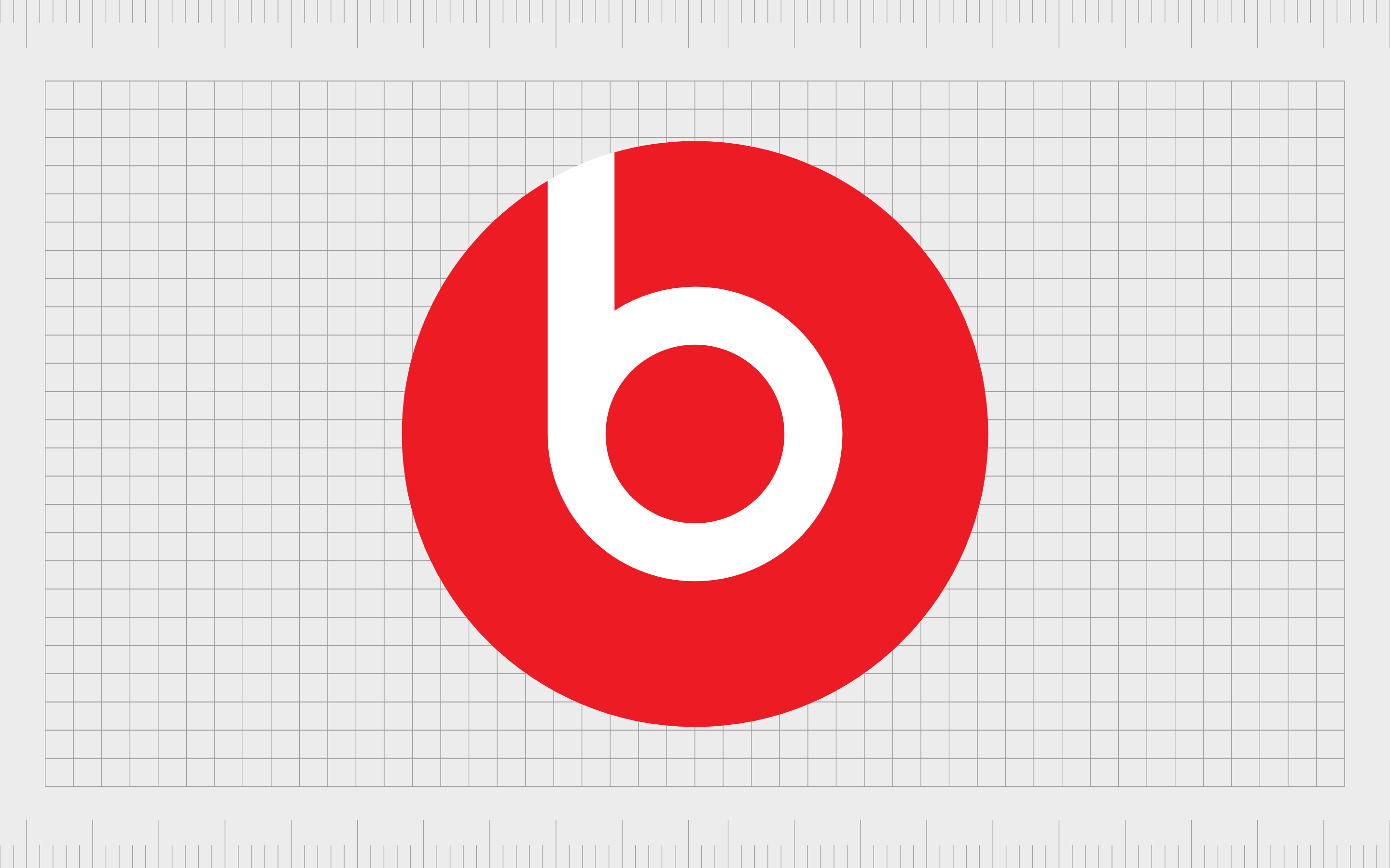
Beats
The logo for Beats by Dre might look simple enough – placing a lowercase “B” in a white circle. However, the design doesn’t just reference the name of the brand, it’s also intended to look like a person’s head, wearing a set of iconic headphones.
The design is perfect for giving beats a more human aesthetic.
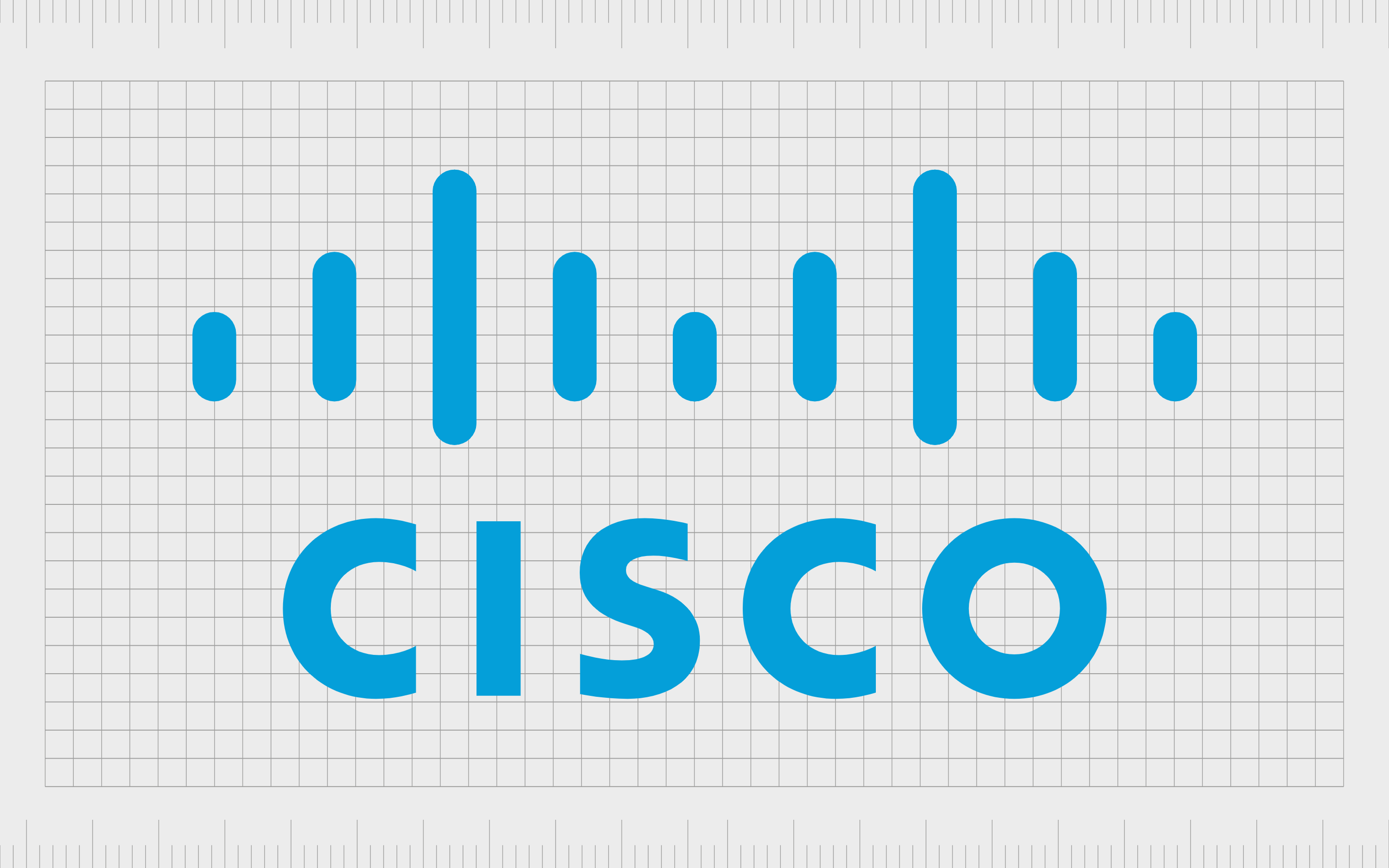
Cisco
Communication and networking leader Cisco offers another excellent example of hidden messages in logos.
The lines placed above the Cisco wordmark remind us of signal waves and electromagnets. However, they’re also intended to represent the Golden Gate Bridge, pulling attention back to the location where Cisco first launched.
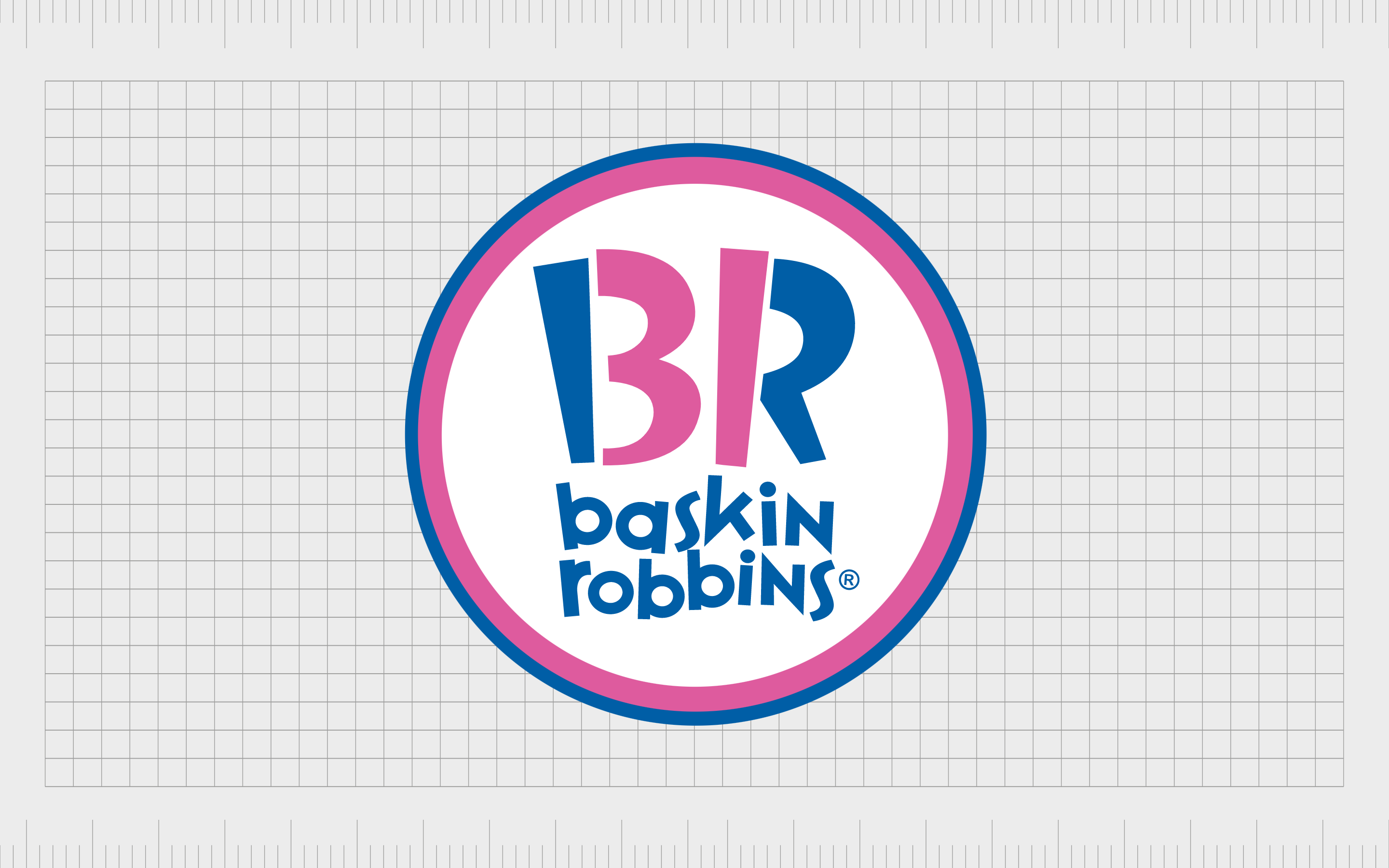
Baskin Robbins
Probably one of the better-known ice cream companies in the world, Baskin Robbins’ has a fantastic, fun, and youthful logo. However, there’s also a hidden meaning within the emblem.
The pink segments of the letters “BR” look like the number “31”. This refers to the number of ice cream flavors the company originally offered.
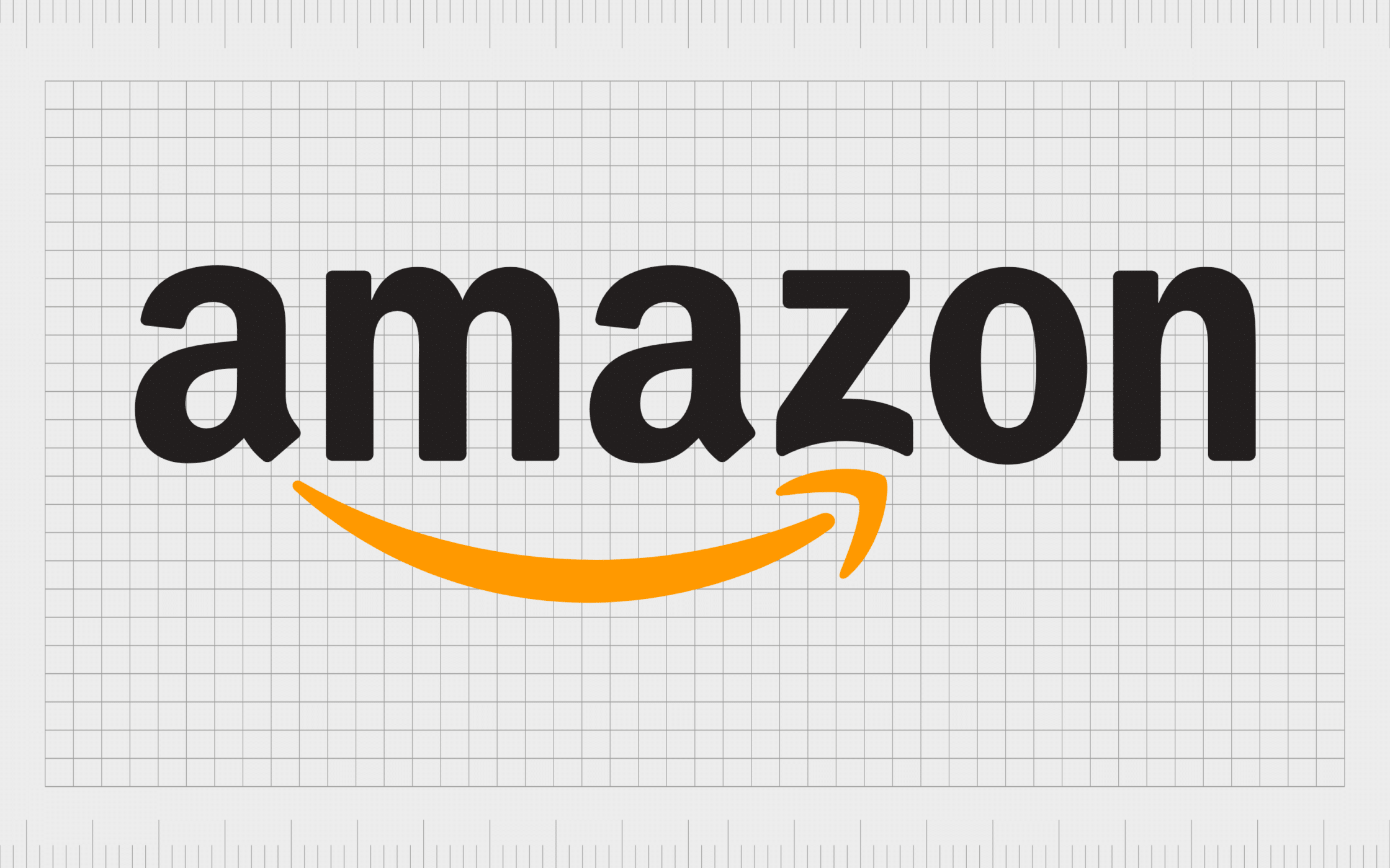
Amazon
When it comes to famous logos with hidden meanings, few options are more easily recognized than Amazon. The world’s largest marketplace embeds a couple of hidden messages into its logo.
The design of the arrow from “A” to “A” is designed to look like a smile, complete with the slight dimpling on the lower part of the “Z”. The “A” to “Z” connection also reminds us of the variety of products available on Amazon.
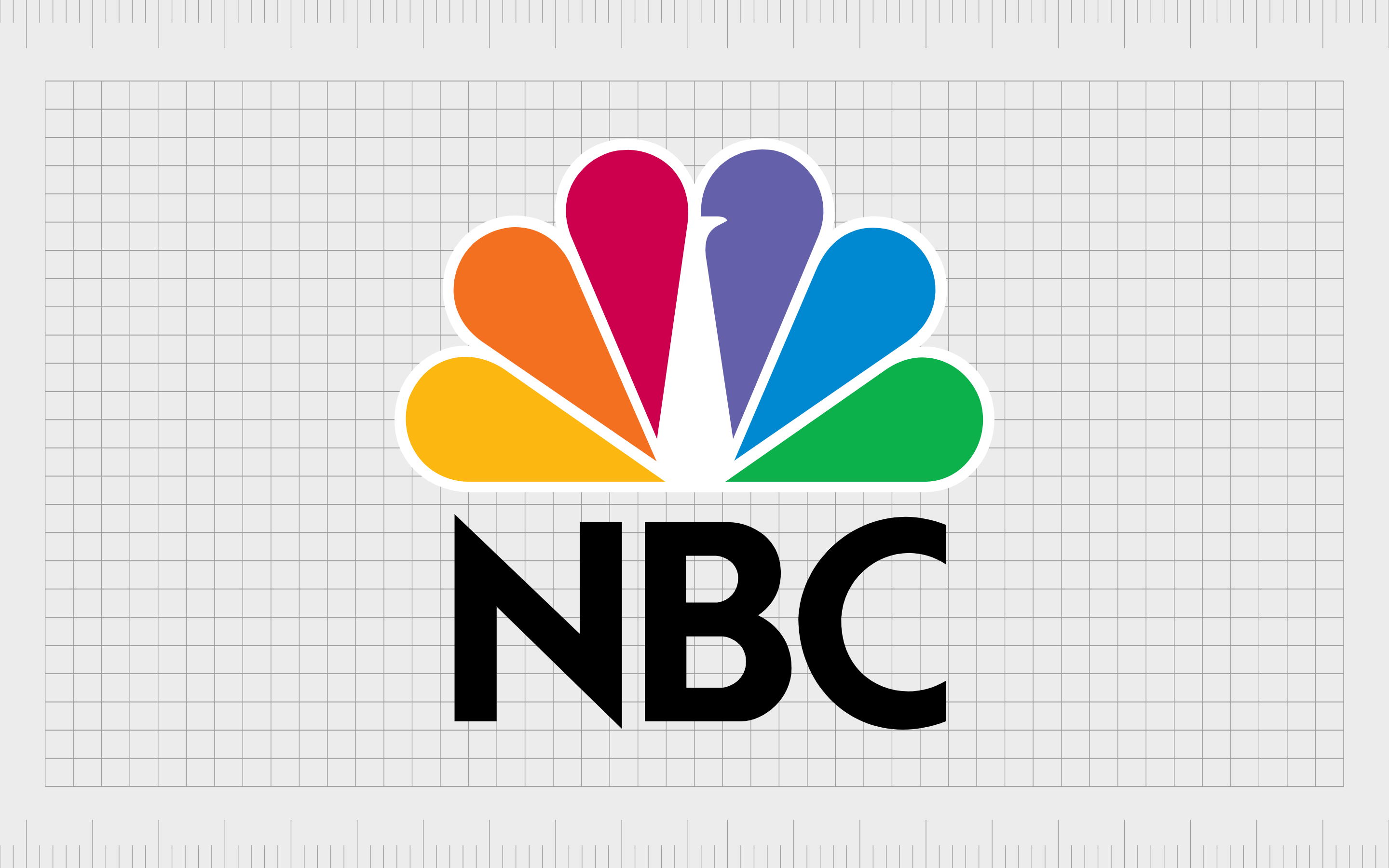
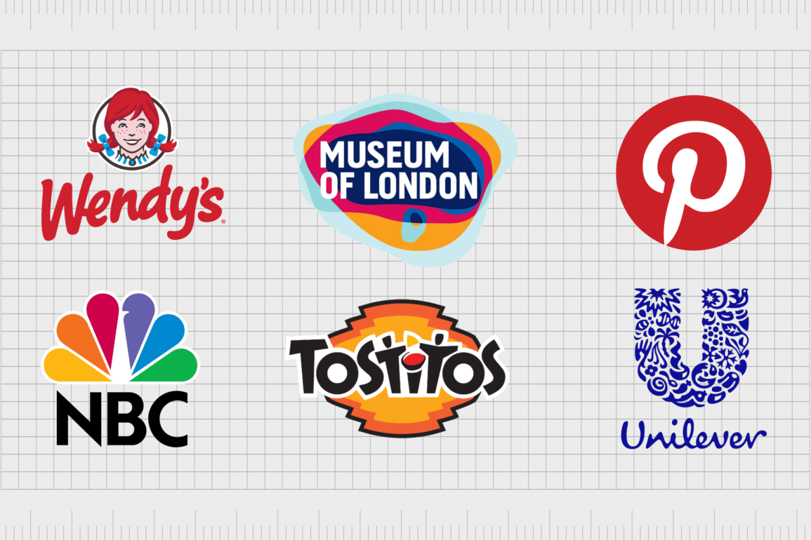
NBC
There are a couple of hidden meanings baked into the NBC logo. The white element in the middle of the colorful tear-drop shapes is supposed to remind us of a peacock. The company chose this design to reference the fact it was launching when color televisions were first being introduced.
The six different colors in the peacock’s tail also represent the six divisions of the NBC.
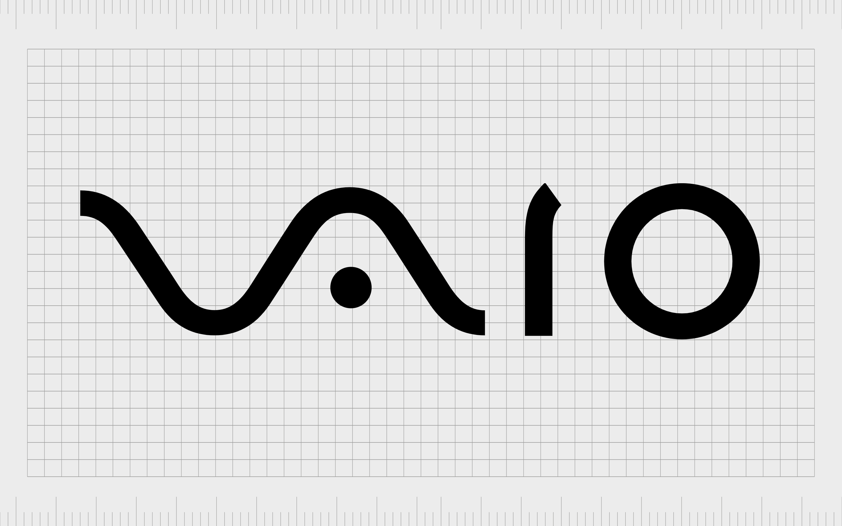
Vaio
Otherwise known as the Sony “Visual Audio Intelligent Organizer” company, Sony Vaio has made a splash worldwide with its technology. At first glance, its logo just looks like a simple design.
However, closer inspection reveals the letters “V” and “A” are designed to look like an analog wave, while the “IO” section is intended to look like a “1” and a “0”, representing binary code.
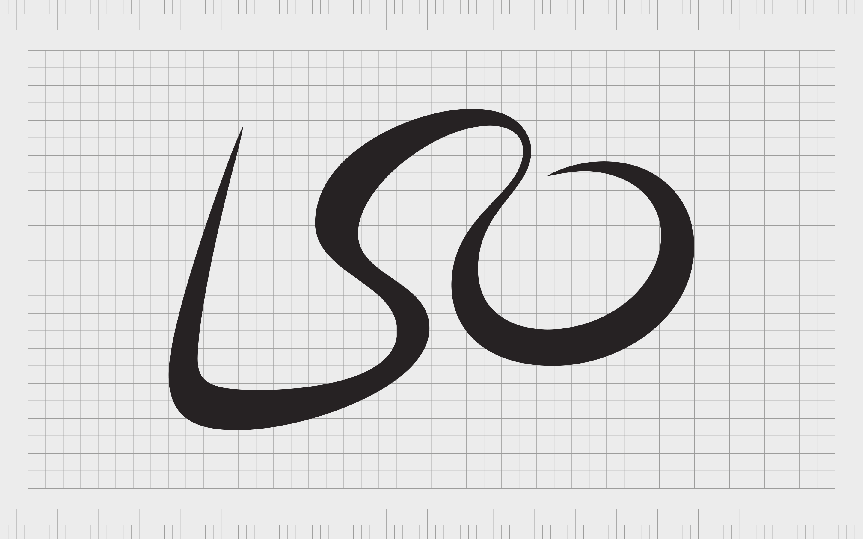
LSO
The London Symphony Orchestra’s logo is a beautiful and creative design, intended to look like a handwritten version of the glyphs “LSO”.
However, when combined, these elements also form the image of a simplistic orchestra conductor. It’s an excellent way of adding some extra life to the company’s image.
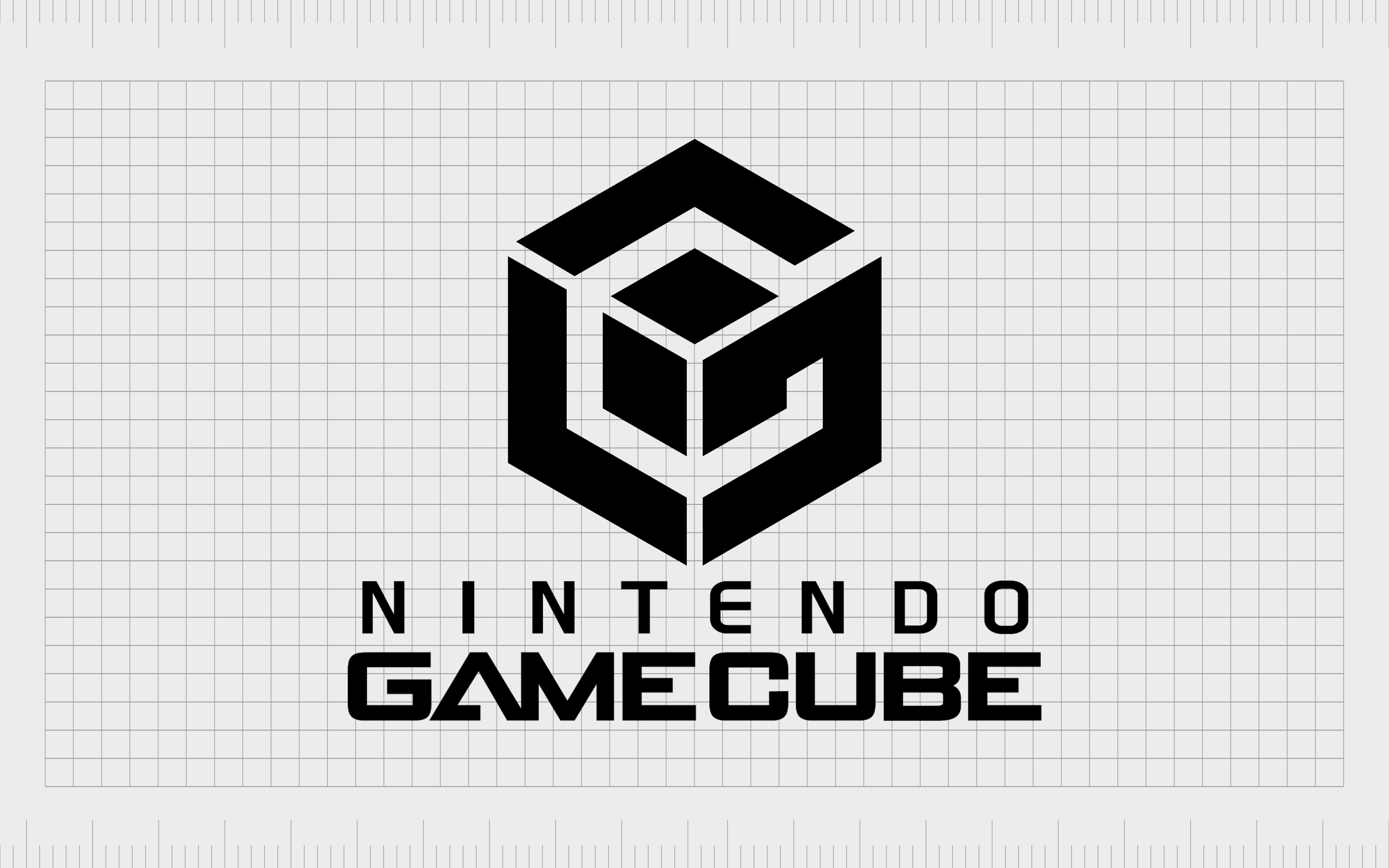
Gamecube
The Gamecube was one of the most significant creations in the gaming landscape for many fans. The logo is intended to look similar to the console itself, while also showcasing the letters “G” and “C” within the design.
You can only just see the letters built into the abstract image, with the “G” in the black, and the “C” in the white space.

BMW
Do you know why BMW has a blue and white checkered section in the middle of its logo? This is another excellent example of subtle hidden symbols in logos.
The image is a reference to the Bavarian flag, which features the colors of white and blue. The sections, according to some, also look like the spinning propellers of a plane in the sky, thanks to BMW’s background in aircrafts.

LG
A recognizable communications company around the world, LG has also become one of the most famous logos with hidden meanings.
The red symbol next to the letters “LG” appear to include the letters “L” and “G” in the middle. However, the placement of these letters, combined with the use of a block white circle, also creates the image of a face.
Like other companies implementing human features into their logo design, the brand did this to appear more friendly and approachable.
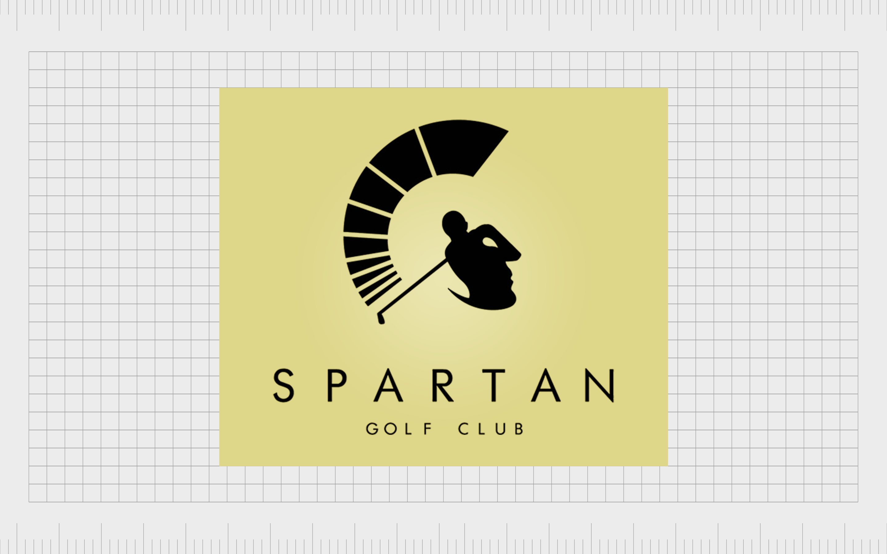
Spartan Golf
A brilliant example of hidden symbols in logos, the Spartan logo shows us we can look at designs from different angles to get a completely unique image.
At first glance, you may see a golfer gearing up to take a swing, with the progressive lines above the club highlighting his level of power. However, you could also see the Spartan helmet and the face of the Spartan himself depicted within the shape of the golfer’s body.
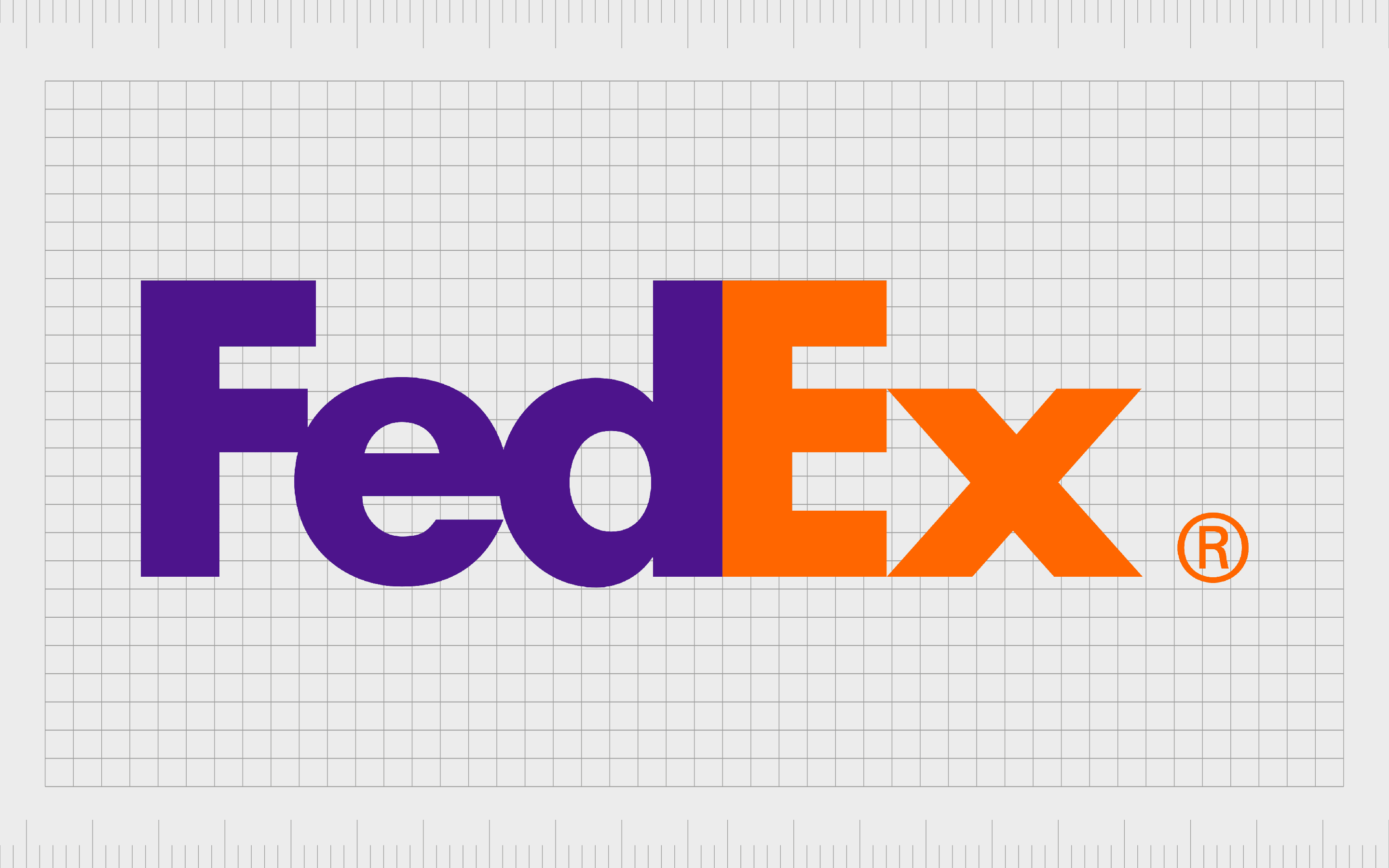
FedEx
Of all the logos with hidden meaning we’re going to look at today, FedEx is probably one of the best-known examples. The design appears in a multitude of colors on different kinds of FedEx delivery vehicles.
The placement of the “E” and the “X” at the end of the logo is specifically designed to create an arrow in the negative space. This helps to highlight the speed and progress of the company, as well as its commitment to constantly moving forward.
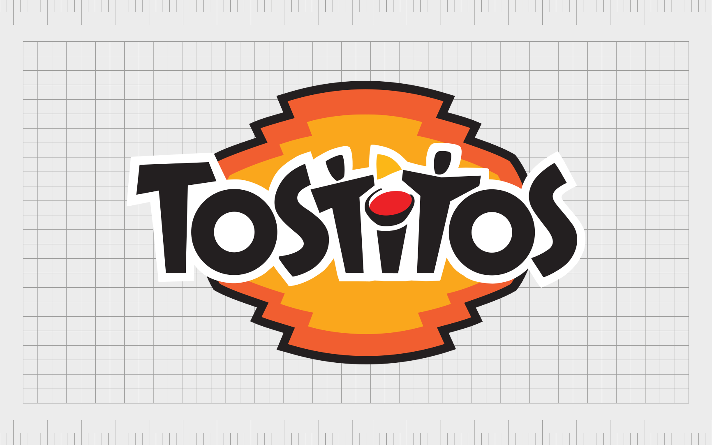
Tostitos
One of the more popular salsa and chip brands in the world, Tostitos makes the most of fun and bright colors to bring its logo to life. Look at little closer at the “TiT” section in the middle of the wordmark, and you’ll notice it’s designed to look like two people sharing a bowl of salsa.
There’s even a small triangle-shaped chip in the middle of the two characters, representing a Tostitos chip. The use of two people eating together gives Tostitos a friendly and sociable vibe.
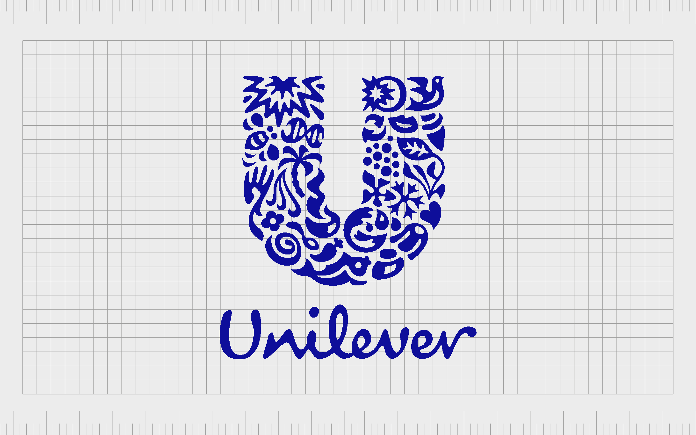
Unilever
At first glance, the symbol of the “Unilever” looks like a confusing jumble of patterns and shapes. However, if we dive a little deeper, we begin to see references to the huge range of products produced by the brand.
The use of multiple different designs combined together to make a large “U” helps to remind us just how versatile the Unilever brand is.
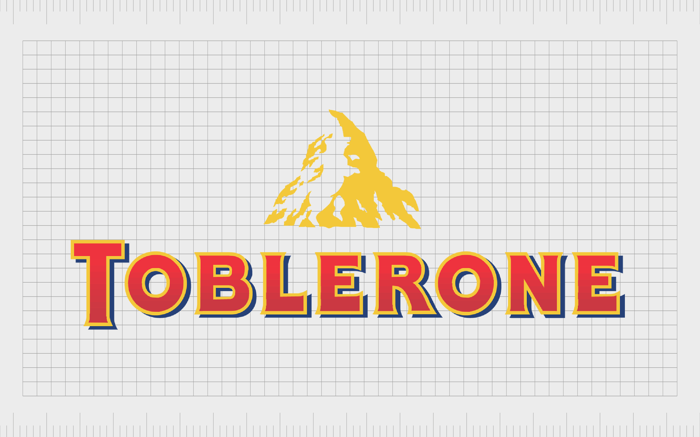
Toblerone
Another of perhaps the most famous logos with hidden meanings, Toblerone’s logo has attracted a significant amount of attention over the years. At a glance, you probably wouldn’t notice anything more than a depiction of the Matterhorn mountain in Switzerland.
However, if you dive a little deeper, you’ll see a bear in the white space of the mountain shape. This symbolizes the fact the chocolate comes from the city of bears, as well as drawing attention to the honey in the product’s formula.
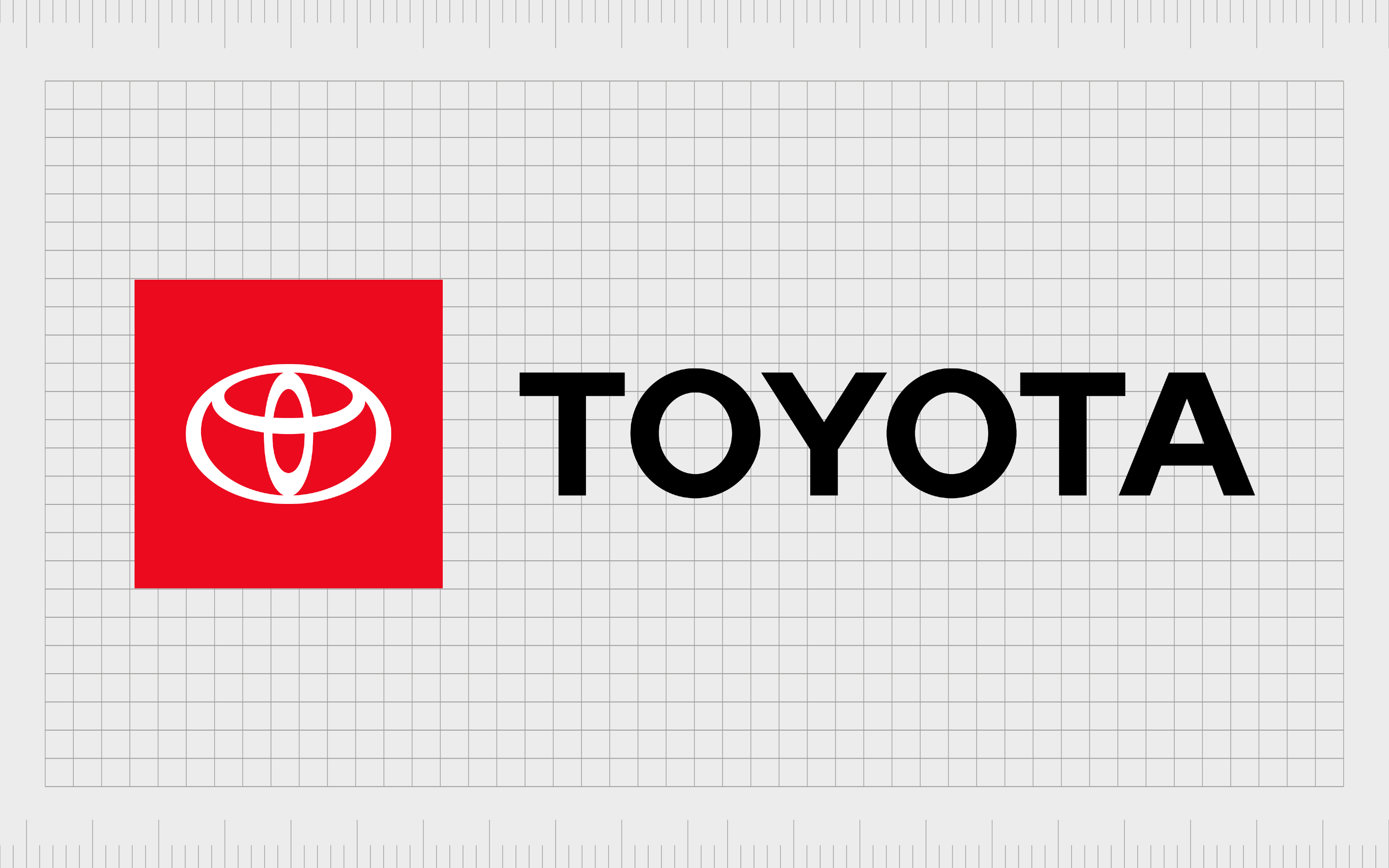
Toyota
The current logo for Toyota has been in use for a long time, making it one of the better-known car emblems on the market. The design of the Toyota symbol looks a little like the “T” from the beginning of the letter, but it actually has a lot more meaning.
The overlapping rings are supposed to symbolize the overlap between Toyota’s customers, and products.
Various designers have also noted it’s possible to create every letter from the Toyota name using the symbol, by looking at certain shapes in isolation.

Audi
Another example of the hidden meanings in logos within the automotive industry, Audi’s logo doesn’t include a selection of four overlapping rings for no reason. The four rings are actually there to represent the four companies which merged to create the Audi Auto Union.
The design helps to pull attention back to the history of Audi, and the various different perspectives which join together to create the company’s products.
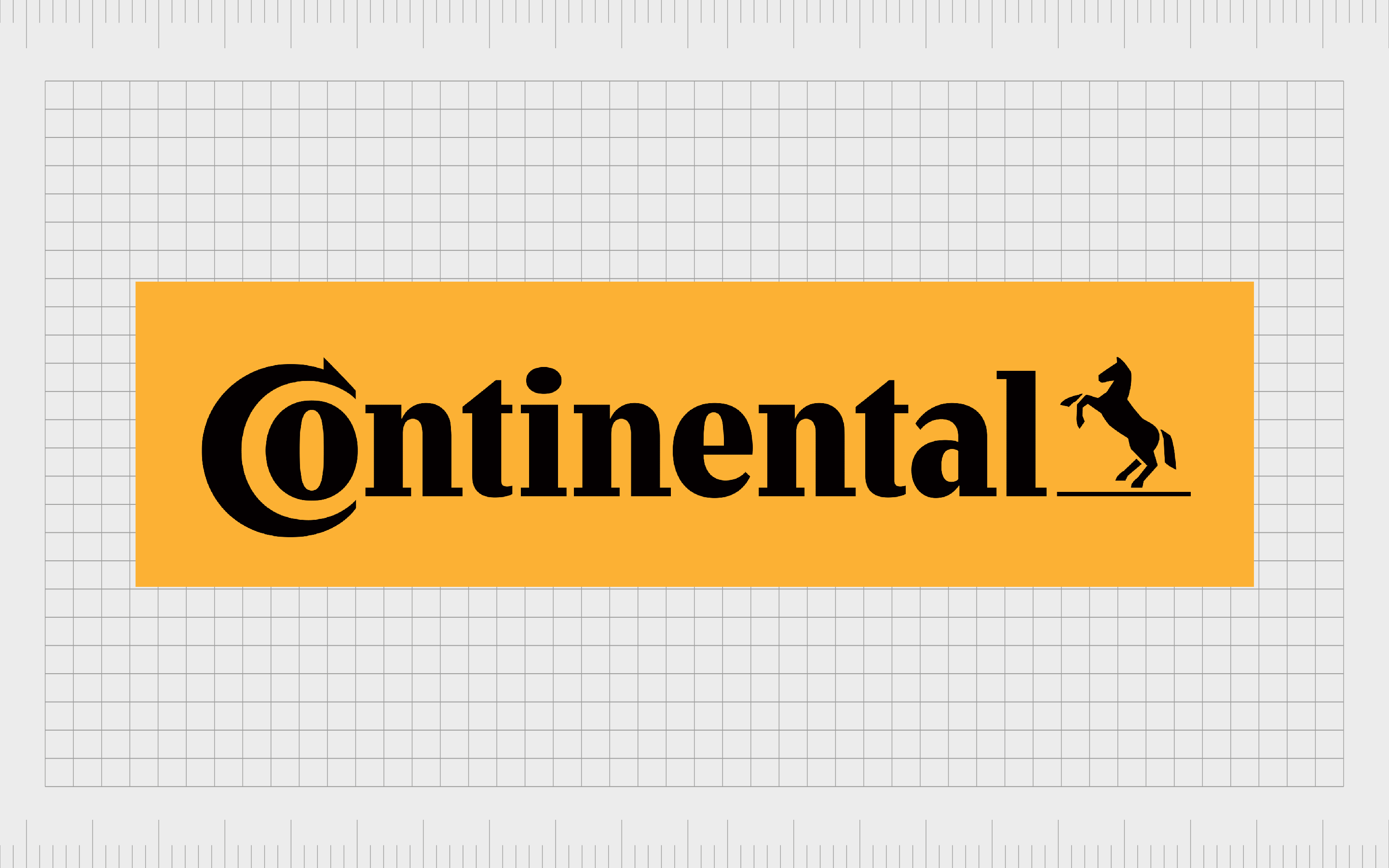
Continental
Continental shows us logos with hidden meanings can sometimes come from the way we space or use certain kinds of typography. You may notice the “O” from Continental is placed within the “C”, rather than standing alongside it.
This creates the shape of a tire, which draws attention to the focus of the brand’s product portfolio.

Apple
Apple is no stranger to the use of subtle meaning. Even the name “Apple” is intended to draw our attention back to Isaac Newton and his incredible discoveries. Today, the Apple logo is one of the most recognizable in the world.
The reason the company uses an apple with a bite taken out of it, is to reference the bite Eve took from the fruit of the tree of knowledge.
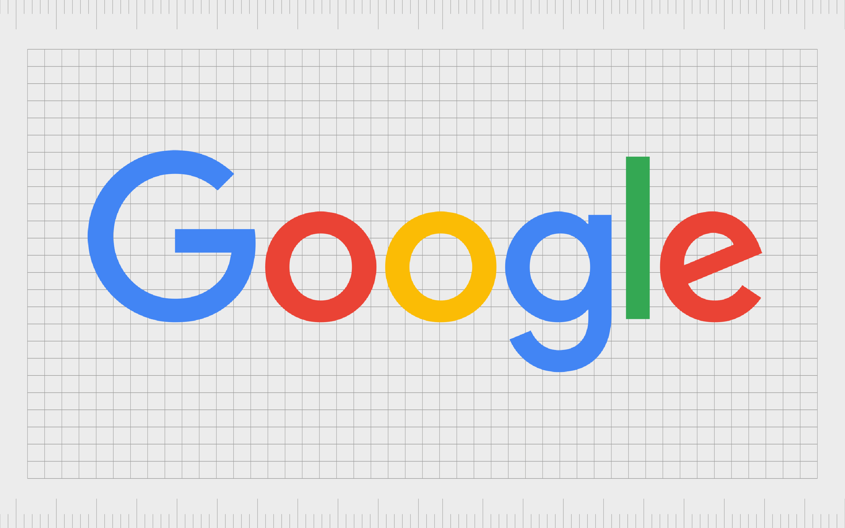
Have you ever wondered why Google’s official logo is so colorful? It’s not just a way of drawing attention to the fun and playful nature of the brand. Google’s logo is also supposed to symbolize the company’s approach to breaking the mold.
Rather than sticking completely to primary colors, Google shifts from its pattern by implementing a green “l”.
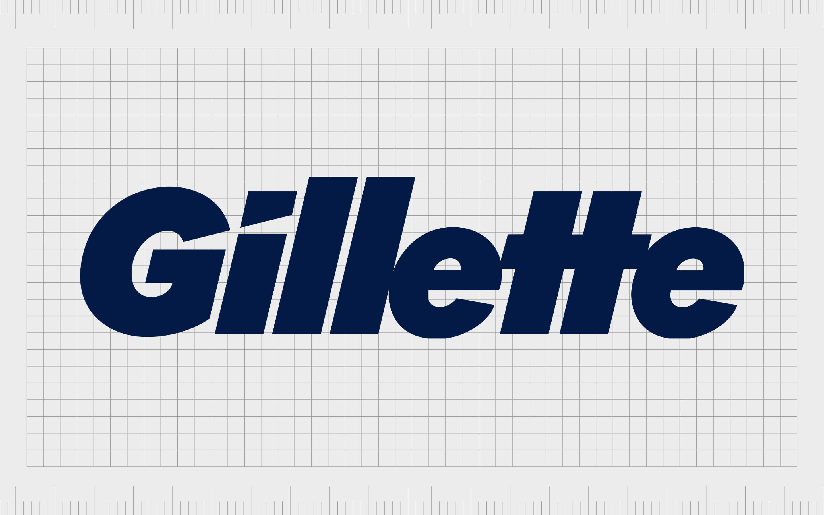
Gillette
Most people are familiar with the Gillette razor company. Though at a glance, the logo for this company just looks like another word mark, there’s a carefully-chosen detail in the “I”.
The cut in the top and bottom part of the lowercase “I” look as though they’ve been removed with a razor.
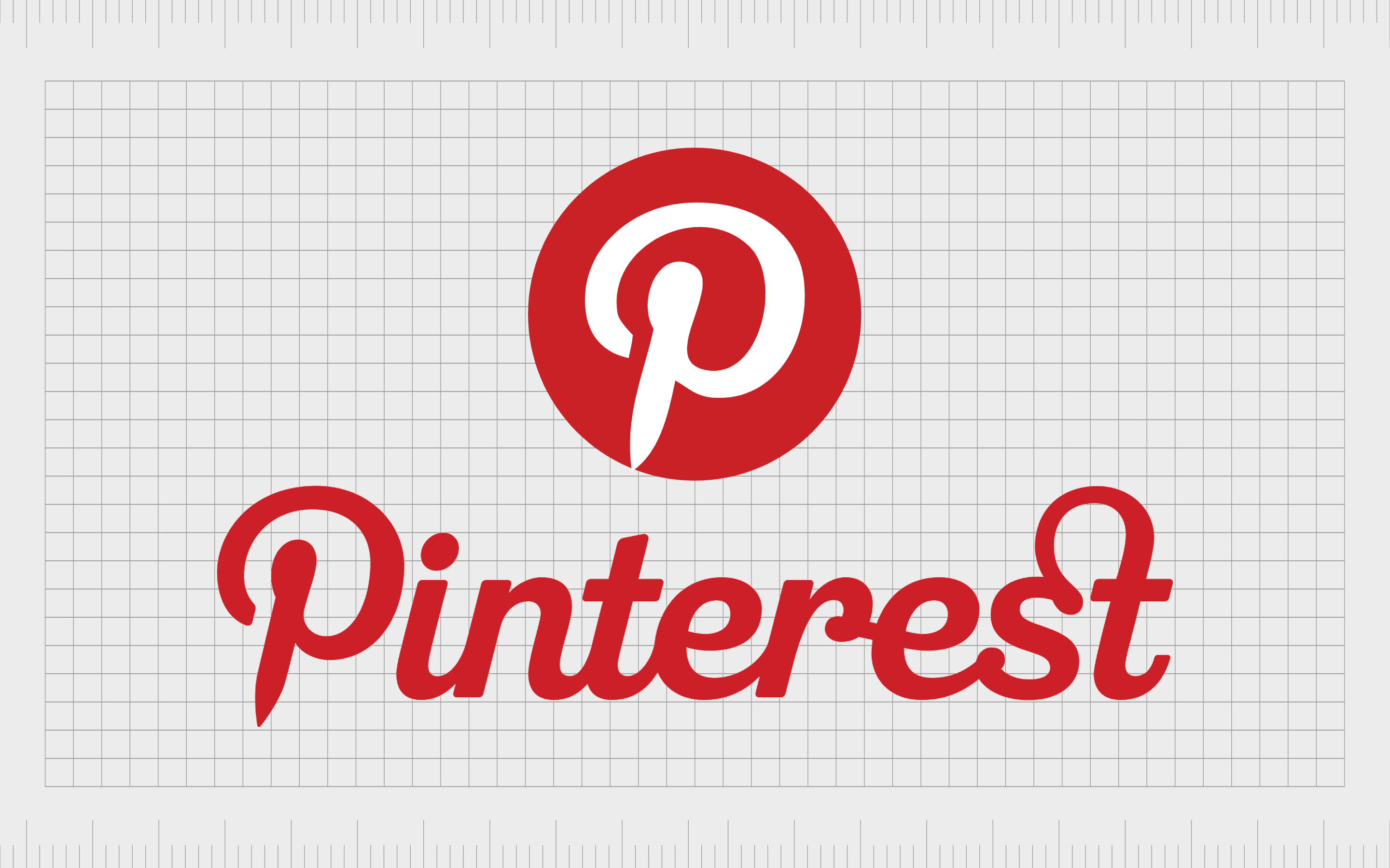
One of the most popular social sites on the web for people searching for aesthetic inspiration, Pinterest chose its name by combining the words “Pin” and “Interest”.
Pinterest’s logo specifically adds a point to the bottom of the “P”, to create the image of a tack. The image is supposed to remind us of tacking things to a wall.
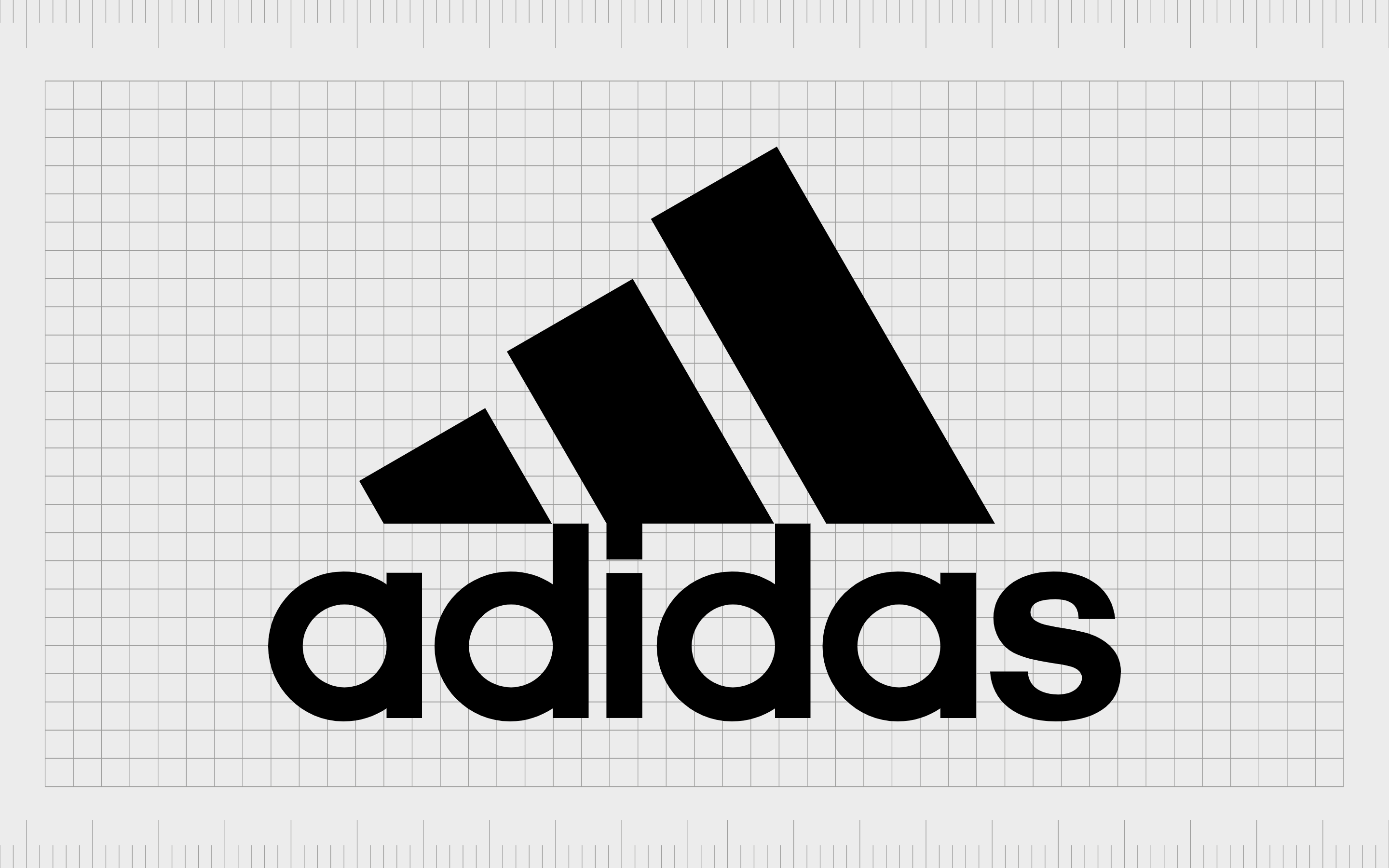
Adidas
Adidas is a popular shoe and sporting company with an interesting history. The name for the company comes from the name of the founder, Adolf Dassler. However, the design featuring the three stripes draws attention to the personality of the company.
The design is intended to look like a mountain, representing the challenges sporting professionals overcome.

IBM
If you’ve ever questioned why IBM uses stripes rather than solid letters in its logo, you’re not alone. The design isn’t just a way of making the image stand out from other similar tech emblems.
IBM wanted its white lines to look like equal signs in some areas of the letters, to create a sense of equality, and highlight the values of the brand.

Wendy’s
Often overlooked by many people viewing the Wendy’s logo, the design of the clothing around Wendy’s neck is very intentional. If you take a closer look, the design is meant to look like the word “mom”.
The reason for this was to pull attention to the family nature of the restaurant, and its commitment to creating a “home cooked” fast food experience.
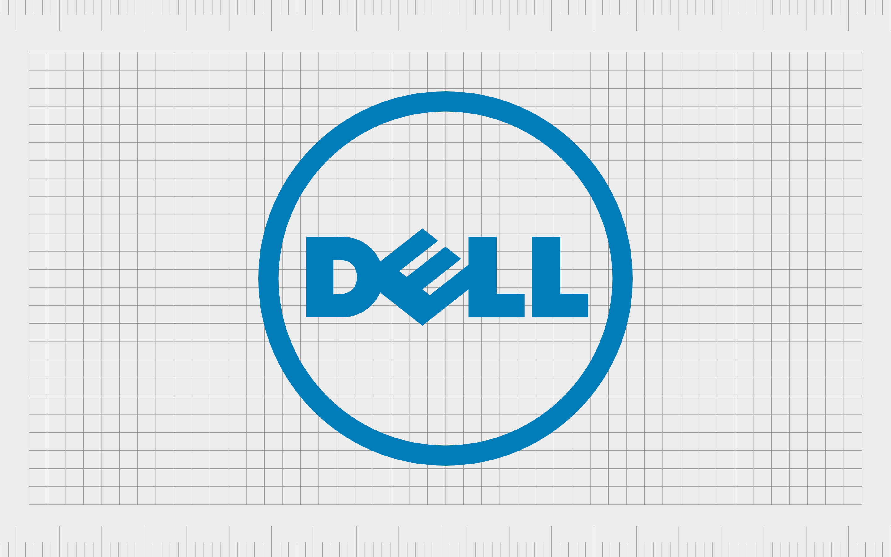
Dell
Dell’s decision to turn the “E” in its logo on its side wasn’t just a choice to make the company appear quirkier and more interesting. During the early years of the company’s growth, the founder said they wanted to “turn the world on its ear”.
The angled “E” is intended to represent this approach to changing the technology landscape.
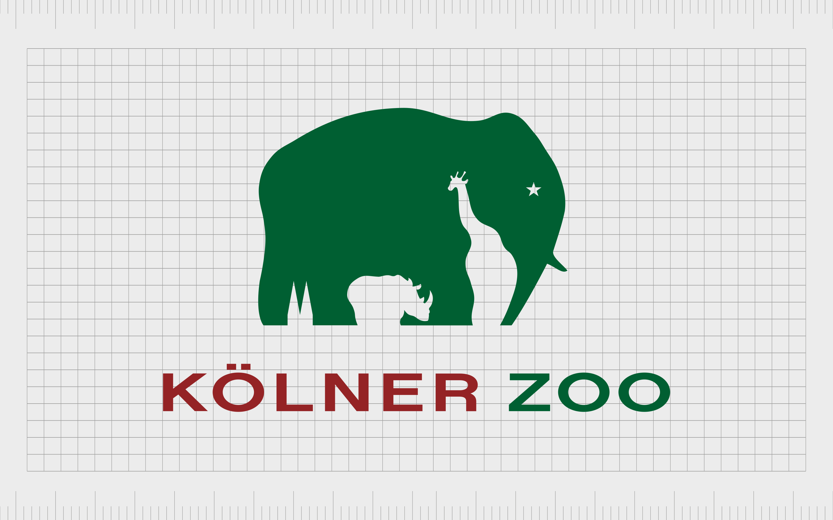
Kolner Zoo
One of the more attractive examples of a beautiful logo with hidden meaning, the Kolner Zoo logo for Germany not only shows us the image of an elephant, but also various other animals within the white space of the image.
Hidden within the contours of the elephant are a giraffe and a rhino, as well as the Cologne Cathedral, a famous landmark in the region.
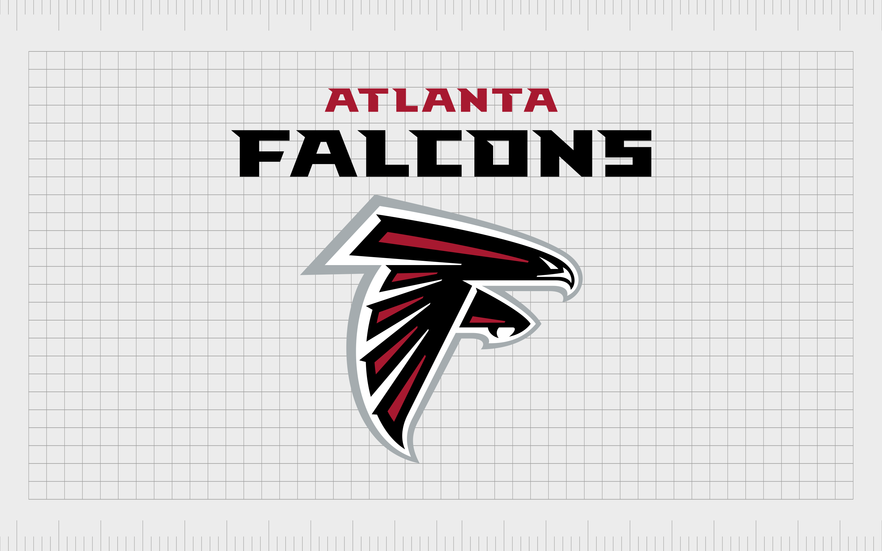
Atlanta Falcons
It’s not unusual for many athletic groups and sports teams to get a little creative with their logo design. It’s also pretty common to have animals as mascots in team sports. The Atlanta Falcons take advantage of this fact with a logo, which depicts the image of a falcon.
However, the positioning of the bird also makes it look like the letter “F”.
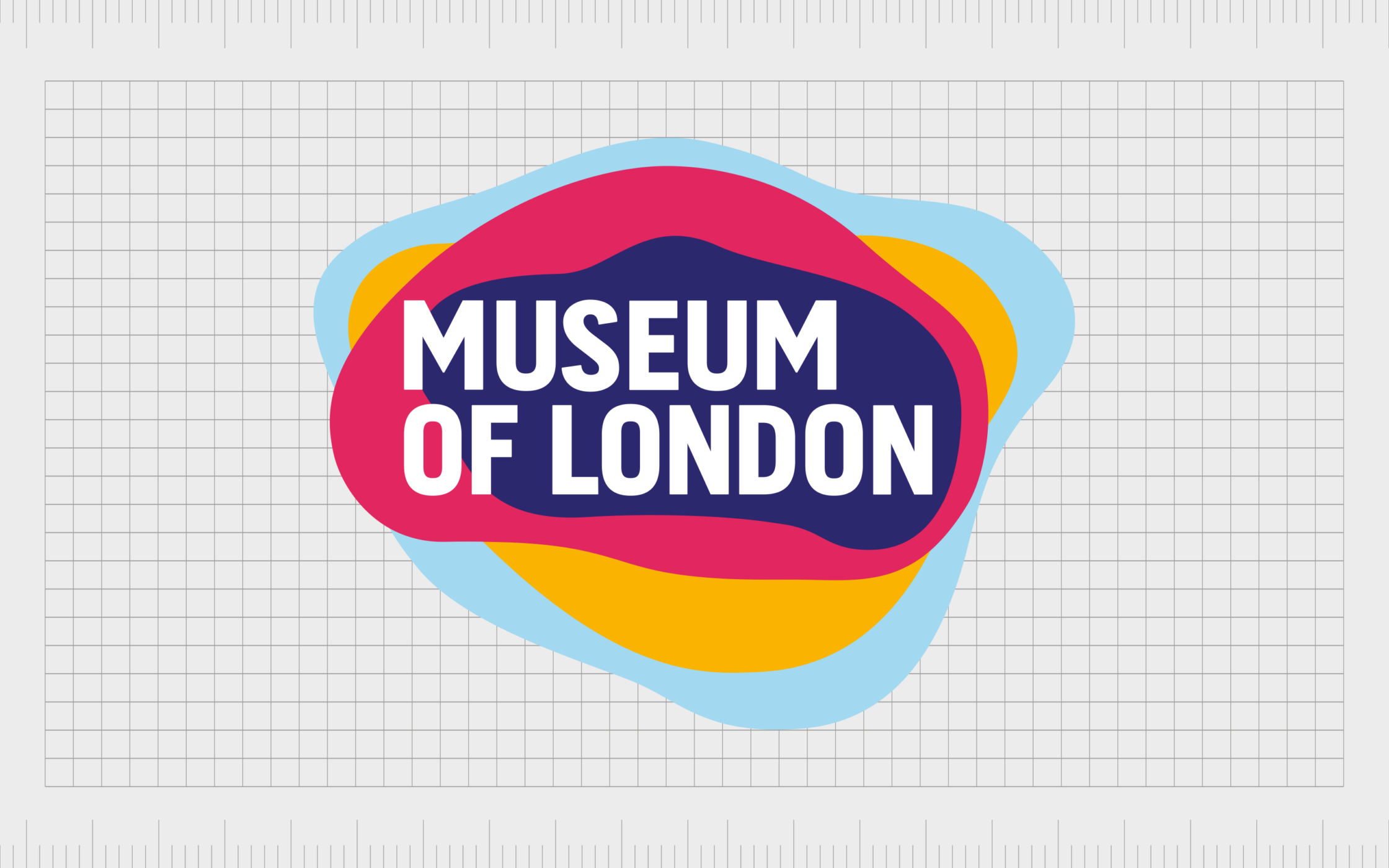
Museum of London
At first, you’d be forgiven for thinking the logo for the Museum of London was nothing more than an abstract selection of colored blobs.
However, these different shapes and colors actually represent the geography of London, and how the region has evolved over the years.
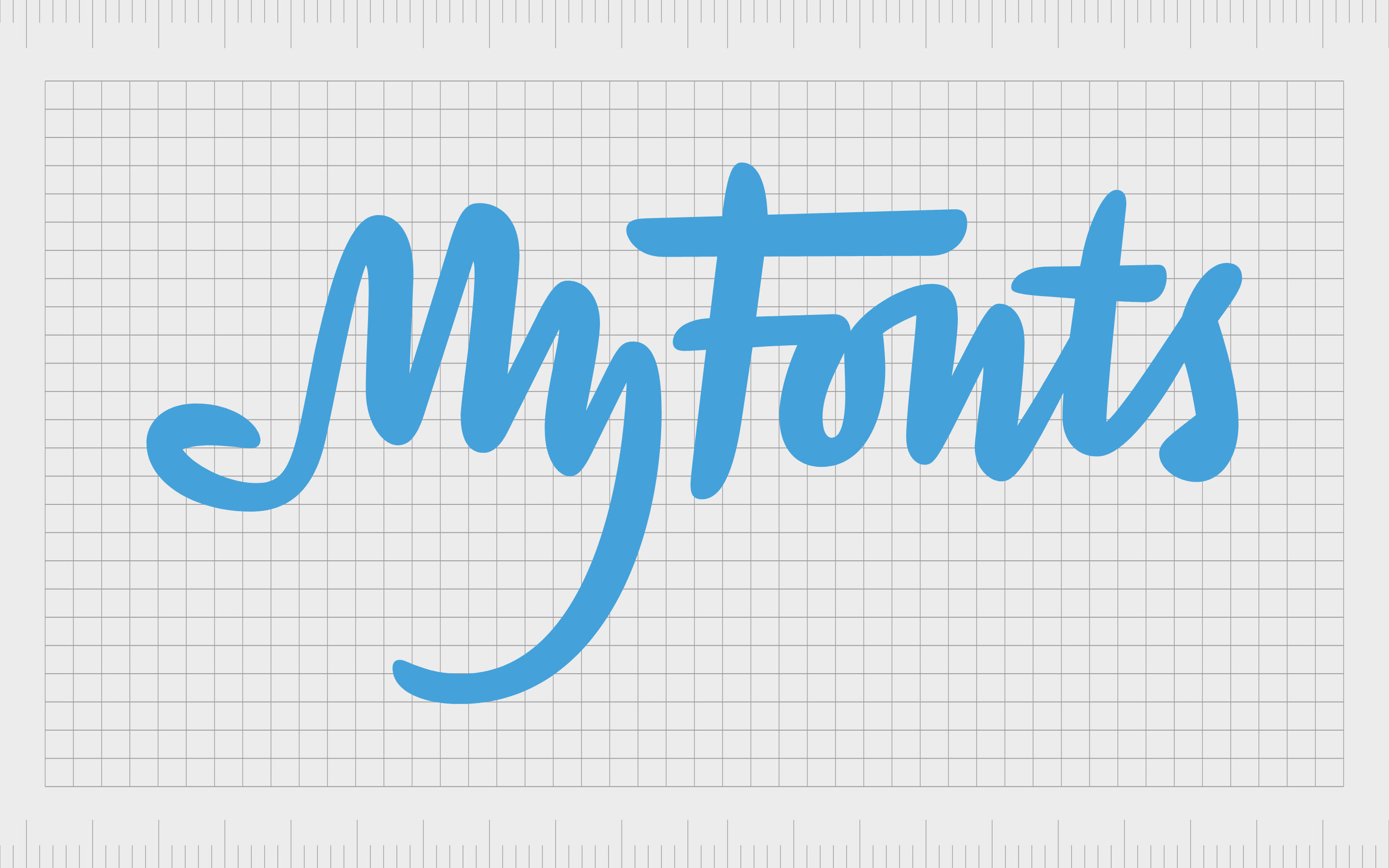
My Fonts
Simple and effective, the My Fonts logo is a fantastic example of one of the best logos with hidden meaning. This design looks like an elegant wordmark at first, but the shape of the “My” segment also looks like a hand, with four fingers and a thumb.
The hand is intended to highlight the possessive experience of being able to grab fonts whenever you like.
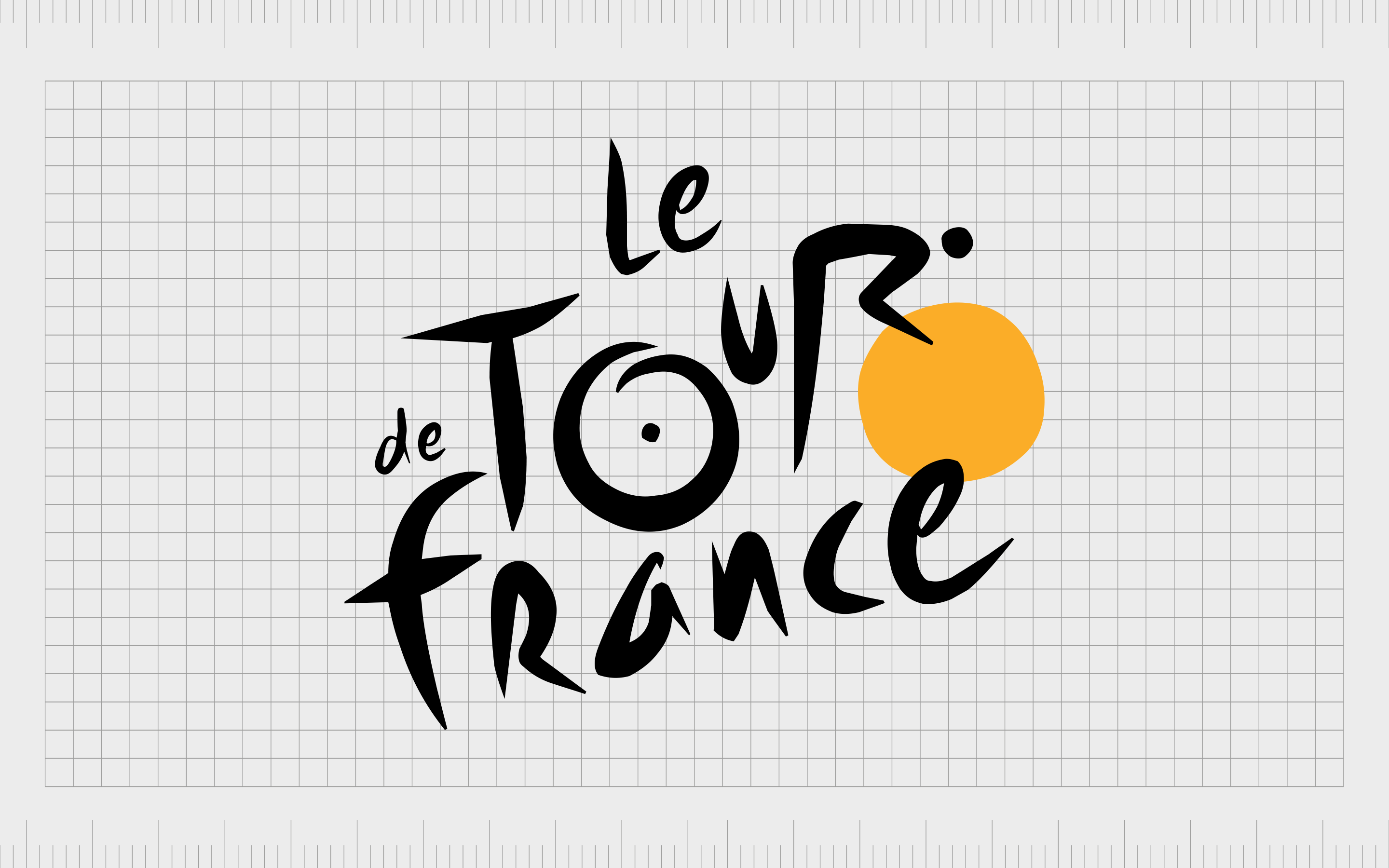
Le Tour De France
A logo instantly recognized by cycling lovers worldwide, the “Le Tour De France” logo has a couple of hidden meanings hidden within it.
First, the design of the letters in the wordmark is intended to look like a bike, with the “O” in “Tour” representing a wheel, and the “R” looking like a cyclist.
The yellow circle in the logo also acts as the bike’s second wheel, but it also highlights the daytime nature of the cycling events.
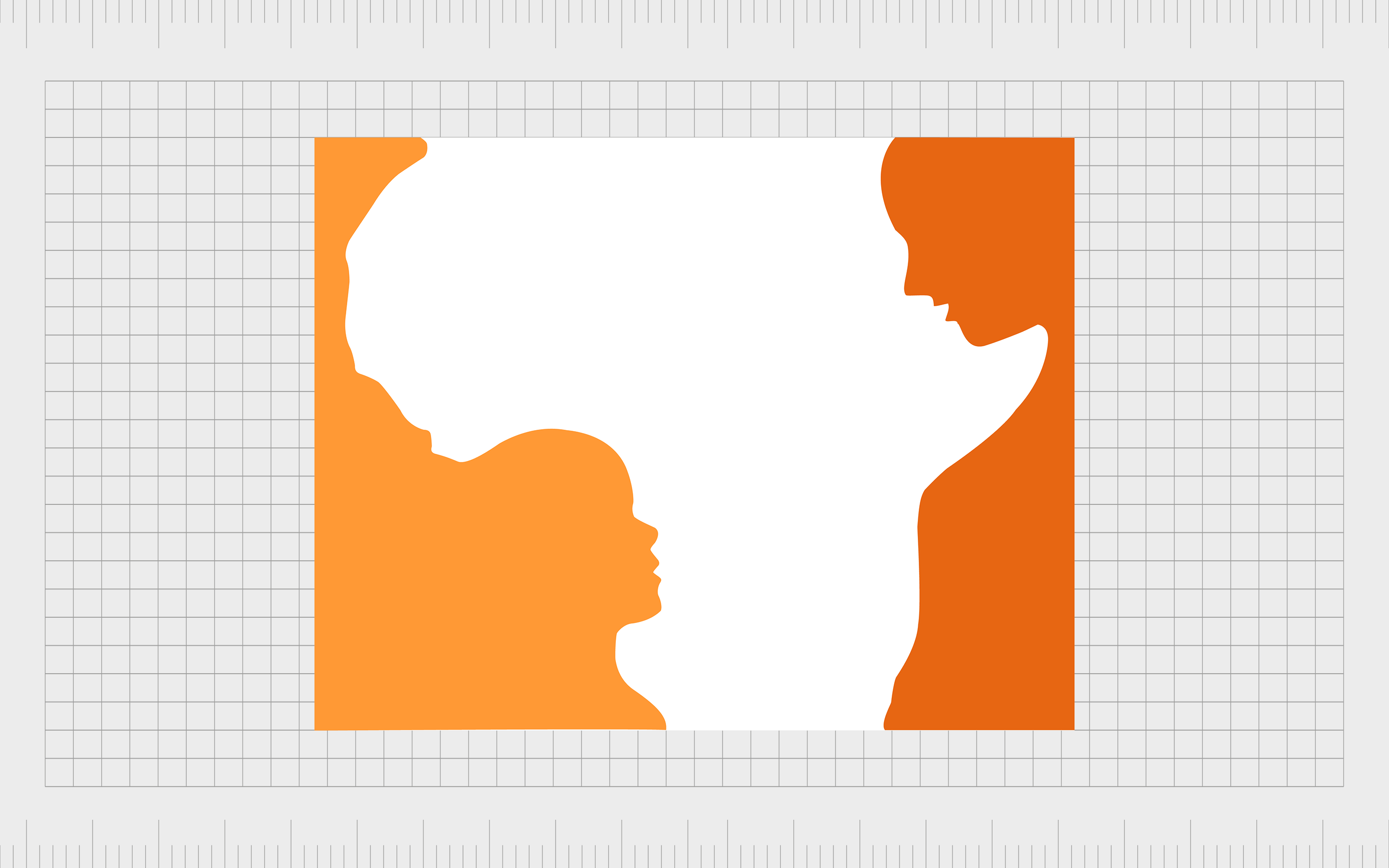
Hope for African Children Initiative
A truly emotive and meaningful logo, the Hope for African Children Initiative first looks like an outline of Africa from a world map. However, if you look more closely at the orange elements in the design, you’ll see a small child looking up to an adult.
How do I make a logo with a hidden message?
There are various ways to implement hidden meaning into a logo. You could use the colors of a flag referencing your home, and where the company first started, as was the case with BMW.
Alternatively, you can use shapes with strong cultural associations to convey meaning, like the bear shape in the Toblerone logo and its association with honey.
Usually, hidden meanings in logos are built using a combination of negative space, and carefully chosen placement. Certain colors and contrast can also help to drive more meaning within an image.
Unfortunately, for someone without design experience, leveraging negative space and other design elements can be easier said than done. It can be difficult to find the right balance between creating a subtle image, and overwhelming the design with the hidden meaning.
The best option for most businesses will be to hire a professional logo designer with years of experience working with negative space. This way, you can talk through exactly what you want your logo to convey, and make sure you’re having the right impact.
Exploring logos with hidden meanings
Logos with hidden meanings can be an excellent way to capture the attention of your target audience, engage your customers, and make a more significant impact on your industry.
Although your customers won’t always notice the hidden meaning in your logo straight away, they’re sure to feel a sense of exhilaration as soon as they see it.
With so much competition in the world today, a little hidden meaning in a logo can be all it takes to separate you from the competition, and give your business more of an impact. However, not every logo will need a hidden message.
The best way to ensure you’re getting the most out of your logo design, is to reach out to a logo designer and ask them for guidance.
We’ve made our logo memorable by creating logos for other brands. If you require a tailor-made logo, with style and substance, let’s start a conversation…
Fabrik: A branding agency for our times.

Clarity starts with a conversation.
Thanks—we’ll get back to you shortly.
Whether you're navigating a rebrand, merger, or simply need a clearer identity—we’re here to help. No hard sell, just honest advice from people who know the sector.
Let’s start with a simple question…
Prefer to email? Drop us a line.
Fabrik’s been helping organisations rethink and reshape their brands for over 25 years. We’ve guided companies through mergers, rebrands and new launches. Whatever stage you’re at, we’ll meet you there.