


Ducati logo history: Exploring the Ducati emblem and brand
How much do you know about Ducati logo history? If you’re a biking enthusiast, you may recognize a handful of vintage Ducati logos when you see them speeding past you on the motorway. However, you may not know much about where Ducati’s design choices came from.
Like most motorcycle brands, Ducati uses its brand emblem not just to differentiate itself from other leading motorbike companies, but also to capture the hearts of its audience.
For bike enthusiasts, the right vehicle is an investment in fun, freedom, and discovery. This is something companies like Ducati strive to convey with their branding.
Since launching in 1926, Ducati has emerged as one of the most famous motorcycle manufacturing brands world-wide, best known for producing bikes with immaculate design and quality.
Today, we’re going to take a closer look at the Ducati logo.
Ducati history: Introducing the Ducati brand
Ducati, otherwise known as Ducati Motor Holding, is the motorcycle manufacturing division of the larger Ducati brand.
Headquartered in Italy, this company has been in operation for almost 100 years, and is currently owned by the vehicle company, Lamborghini, which is owned by Audi, and the Volkswagen Group.
The Ducati founders, Antonio Cavalieri Ducati, alongside his three sons, Bruno, Marcello, and Adriano, first founded the Societa Scientifica Radio Brevetti Ducati company as a business dedicated to producing condensers, vacuum tubes, and radio components.
By 1935, the group had grown successful enough to open a new factory in Borgo Panigale.
The Ducati factory was unfortunately destroyed in 1944, during the second World War. Meanwhile, SIATA, a small Turinese firm, was developing a small engine, with the intention to sell this engine to the public.
After more than 200,000 of the engines were sold in 1950, Ducati decided to create its own motorcycle based on the same technology.
The first ever Ducati motorcycle was a simple 48 CC bicycle weighing 98lb, with a speed of 40 mph. As the market began moving towards larger motorcycles, Ducati responded with a new cruiser and larger scooter-style design.
In the 1960s, Ducati produced the fastest 250 cc bike available at the time. Ever since, Ducati has continued to deliver transformative technology to the motorbiking world.
Ducati logo history
Since launching in 1926, the Ducati badge has gone through a number of changes, evolving from the old Ducati logo for radio devices, into the modern emblem we know today.
The design as it stands now is intended to represent the elegance and sophistication of Italian design, while highlighting the modern nature of the brand.
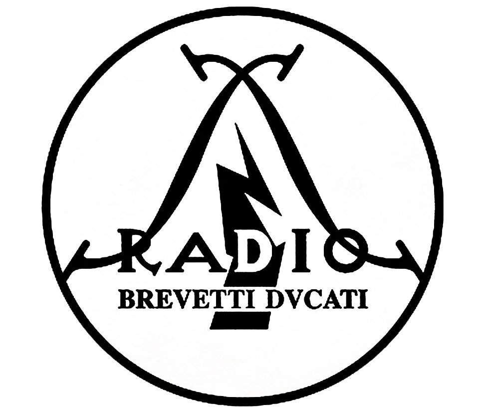
1927
Though you won’t see this vintage Ducati logo on any old motorcycles, it still offers an insight into the company’s branding history. The Ducati radio logo was chosen for the company after Ducati and his three sons first launched their brand to create components for the radio landscape.
The logo featured a circle with two crossed wires, placed either side of a lightning bolt to highlight the electrical focus of the company. A wordmark was included on the design, with the letter “V” replacing the “U” in Ducatti.
This version of the Ducatti emblem featured a monochrome palette, similar to many designs which would appear in the future.
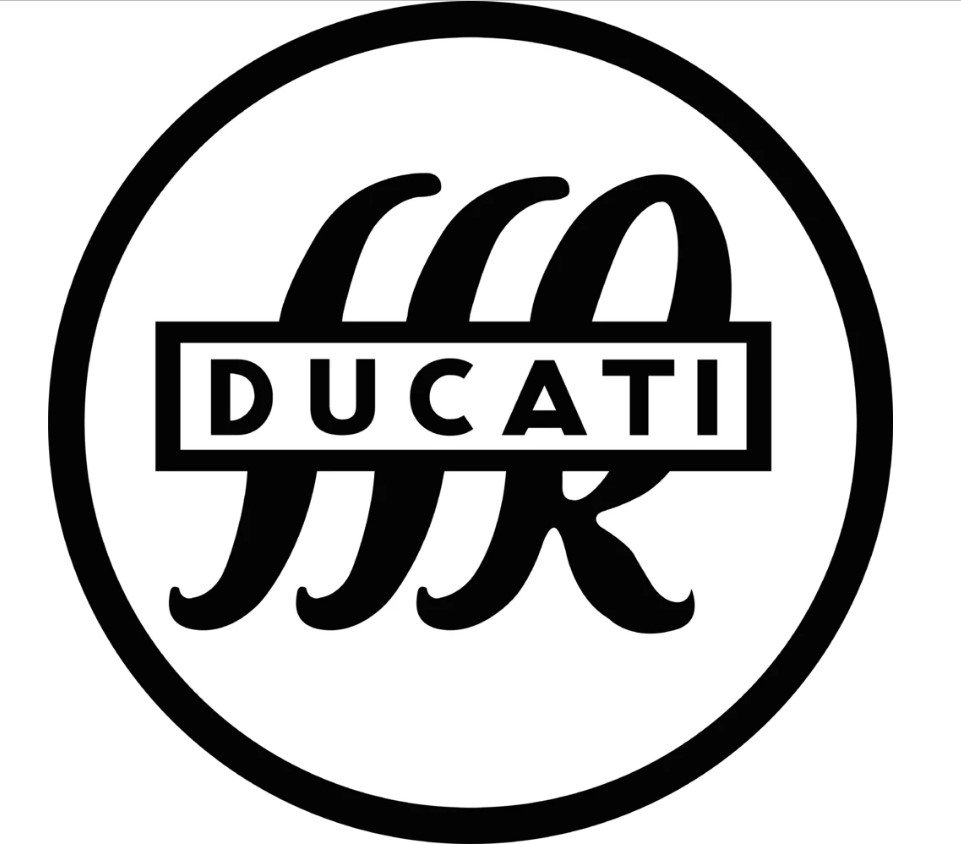
1935
When the Ducati badge was still an image representing a radio company, it has one major redesign during the 1930s. The circular shape of the symbol remained, but the wordmark was simplified, showing the word “Ducati” with all caps, as well as the cursive letters “SSR” in the background.
The color palette for this design remained the same, and continued to influence a number of Ducatti design choices over the years.
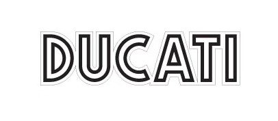
1940
In the 1940s, Ducati entered a new logo design period, focused specifically on different versions of wordmarks. All of the logos were intended to simply highlight the word “Ducati” as the main identity of the company.
One used a very modern sans-serif font, while others used handwritten styles to demonstrate a sense of elegance and sophistication.
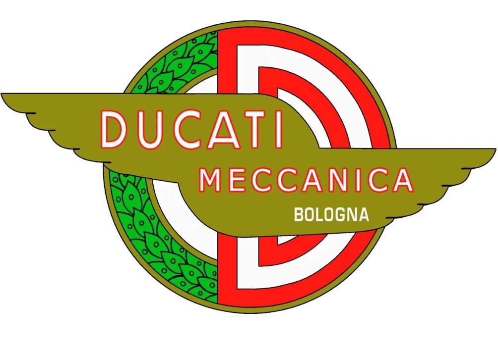
1956
In 1956, Ducati launched perhaps one of the most unique versions of its logo design as the company began splitting into two branches. The new logo featured a bright red and green circle. The green side was textured to look like leaves, while the red side depicted a large letter “D”.
The words “Ducatti Meccanica Bologna” appeared as a wordmark on top of the Ducati badge, in white and red font.
This design also featured two wings as a kind of banner for the wordmark.
1959
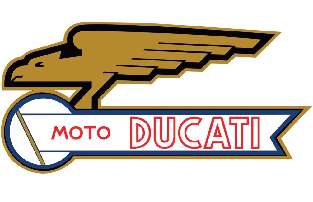
In 1959, we saw one of the most eye-catching vintage Ducati logos, with the arrival of an emblem which featured the profile of an eagle, carrying the “Ducati” wordmark.
The bird was chosen to demonstrate freedom and speed, while the overall shape of the image seemed to look almost like a motorcycle or scooter itself.
The color choices of gold, blue, white and red demonstrated sophistication, elegance and passion, all elements prized by the Ducati team.
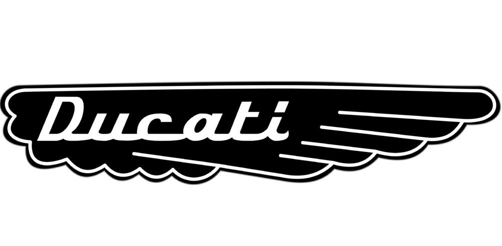
1967
In 1967, the Ducati logo was simplified, returning to its original color palette of black and white. In this variation of the logo, a script-style wordmark was placed in white on a black wing background.
This elegant and eye-catching logo was a powerful choice for the growing brand.
1975
Similar to some of the older wordmark variations of the Ducati logo, a new design was created in 1975 which focused on the brand name alone. This design was created by Giorgetto Giurgo, with a sleek and powerful design using isolated lines.
1985
In the 1980s, the brand went through an interesting period of experimentation with its image. The Ducati logo suddenly featured an elephant – a creature we hadn’t seen associated with the company before.
The elephant appeared in a sophisticated series of grey shades on the top left of a large Ducati wordmark. The font here is a bold, serif choice with a lot of clear confidence.
1997
The Ducatti logo in 1997 featured a slightly unusual design, placing an italic sans-serif wordmark alongside a circle with a line through the middle. The placement of the circle caused slightly confusion about the name of the brand, as it appeared to have a new “O” on the end.
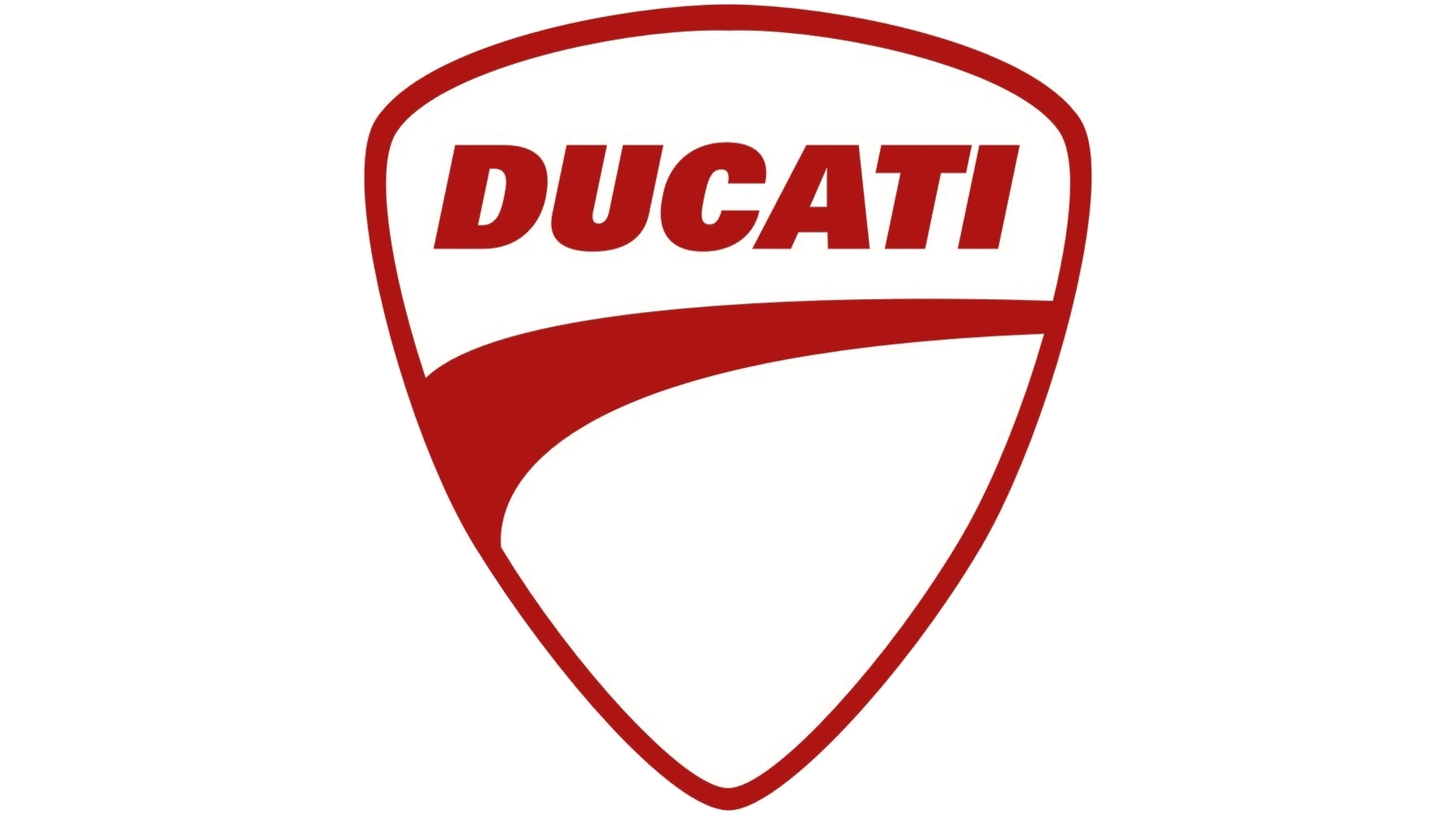
2009
The Ducatti logo today is a shield-style emblem in the shape of a plectrum, with a curved line on the top, to demonstrate grace and sophistication. The wordmark for Ducati still appears in this image, using a very similar font to the previous design, though the circle has disappeared.
The curved line underneath the Ducati wordmark could be seen to symbolize a wing, from the older versions of the Ducati logo. Alternatively, you may see it as a curving road, perfect for a motorcycle enthusiast.
The Ducati logo today: Font and colors
There have been a number of Ducati logos throughout the years, designed to help the company find its visual image and impact in a competitive marketplace.
The Ducati motorcycle logo as we know it now is a minimalist but impactful image, perfect for placing on the side of a motorcycle, on the back of riding jackets, and on countless other branded materials.
The Ducati motorcycles logo is a symbol of elegance and strength, with red coloring to depict the passion which goes into the creation of each Ducati machine.
You can find some more Ducati logo resources here:
What color is the Ducati logo?
Ducati logo colors can sometimes change from one motorcycle model to the next. There have been various examples of this logo in black and white shades, monochrome, and other colors. The most official Ducati logo color is a deep maroon, red on a white background.
Most designers call this color “mordant red 19”.
Mordant red 19:
Hex: #B00E0A
RGB: (176, 14, 10)
CMYK: 0, 0.920, 0.943, 0.309
What font does the Ducati logo use?
The Ducati logo font is a bold sans-serif typeface leaning slightly to the right to convey a sense of movement and progression. The logo is similar to Univers Extra Black.
Not only is this bold typeface excellent for capturing attention, but it also helps to highlight the strength and stability of the Ducati brand.
Celebrating the Ducati logo today
Ducati logo history is one of the more interesting branding histories for today’s motorcycle brands. The Ducati logo has gone through a number of changes over the years as the company has worked to discover the perfect brand identity.
Today, Ducati’s logo symbolizes strength and heritage, as well as passion and grace. The shield-style shape is an excellent way to demonstrate stability and history as a brand, while the bold wordmark highlights the company’s confidence.
The red coloring of the Ducati logo is perfect for demonstrating power and passion.
Fabrik: A branding agency for our times.

Clarity starts with a conversation.
Thanks—we’ll get back to you shortly.
Whether you're navigating a rebrand, merger, or simply need a clearer identity—we’re here to help. No hard sell, just honest advice from people who know the sector.
Let’s start with a simple question…
Prefer to email? Drop us a line.
Fabrik’s been helping organisations rethink and reshape their brands for over 25 years. We’ve guided companies through mergers, rebrands and new launches. Whatever stage you’re at, we’ll meet you there.