SEAT logo history, meaning, symbol and evolution
How much do you know about SEAT logo history? The chances are you’re already familiar with the Spanish automobile manufacturer – one of the largest in the industry. SEAT has been producing cars for more than 70 years (at the time of writing) and it’s unlikely to slow down any time soon.
Like many famous car logos and emblems, the SEAT symbol has gone through a handful of changes over the years. The company has experimented with a variety of different typefaces, color palettes, and even shapes to help convey a clear message to its target audience.
Today, we’re going to be taking a closer look at the SEAT car brand, the symbol that represents the company, and how it has evolved over the decades.
The SEAT car brand: What does SEAT mean?
Before we dive fully into our exploration of SEAT logo history, let’s start with an introduction to the brand itself. The SEAT brand, one of the world’s leading automotive companies, is a wholly owned subsidiary of the German Volkswagen group.
The company sells vehicles under both the SEAT and Cupra brands, and was initially founded in 1950, as a joint venture between a Spanish government group, Fiat, and Spanish private banks.
The name “SEAT” is an acronym for the words: “Sociedad Española de Automóviles de Turismo”, which translate to “Spanish Touring Automobiles Company”.
When SEAT was introduced to the automotive market, it was created to help Sapin expand into the vehicular sector. Today, Spain is one of the world’s largest automobile manufacturers. However, during the first half of the 20th century, the country’s economy was still quite undeveloped.
The country’s limited market for mass-produced vehicles was widely taken over by foreign companies, which caused Spanish banks and the government to work together on the development of a new plan, to design a Spanish vehicle brand.
For around 36 years, the SEAT company was listed as an independent automaker, but the Spanish government eventually sold the SEAT car brand to Volkswagen in 1986.
SEAT logo history: The evolution of the SEAT symbol
Now, let’s dive into the SEAT car logo. Most graphic designers split SEAT logo history into two primary periods. In the first period, the SEAT symbol was largely influenced by the Fiat company, who had helped to launch the organization initially.
In the second period, SEAT began to branch out as a more individual and unique brand, experimenting with its own imagery.

1953
The first symbol in SEAT logo history was introduced in 1953, featuring an ornate badge, with a traditional crest with a red background and a dark grey outline. The design was placed between a set of grey wings, which extended from a matching oval, spreading upwards.
The wordmark for the Spanish brand consisted of two parts. The first section displayed “SEAT” in a large grey font. Underneath this, the “Licencia Fiat” inscription appeared, surrounded by thick lines.

1960
In 1960, SEAT introduced a new logo, though various aspects from the previous version remained, including the geometric-style font for the “SEAT” wordmark, and the red and grey colors. The reference to the Fiat logo also remained on this badge.
Instead of a shield style emblem, SEAT switched to a circular design, with a thick silver outline featuring ornamental leaves. The main inscription now appeared in white, while the tagline was designed in a light silver shade.
1962
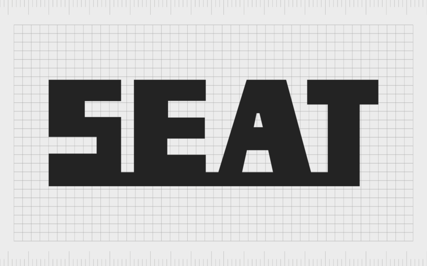
During the 60s, the SEAT logo was updated again, this time becoming more minimalistic. The only thing that remained from the previous designs was the company name, presented in a thick font, with bold, geometric letters, set on a wide horizontal stripe.

1968
Maintaining its minimalistic approach in 1968, SEAT took the grey circle with the red background from an early SEAT symbol, and made it two-dimensional. The flat red circle features bold lettering, similar to the geometric font used in previous versions.
In the red circle, there are no taglines or ornaments, but the contrast between the colors helps the image to stand out.

1970
The SEAT car logo moved in a very different direction in the 1970s. The original color palette was replaced with yellow letters, each placed within their own individual blue square. This logo was intended to represent energy, confidence, and progress.

1982
In 1982, the full brand name disappeared from the SEAT logo. Instead, the company started exploring a new visual identity, based around the stylized letter “S”. The unique character featured several white and blue diagonal stripe elements along the middle of the letter.

This logo was updated very slightly in 1990, when the company reduced the number of stripes in the design, and made the blue elements a lot thicker. The overall design symbolized development, speed and movement.

1999
In the late 90s, Seat moved back to its original color palette. A grey gradient color palette was used for the letter “S” making it appear three dimensional. The number of diagonal elements on the character was also reduced again.
The letter sat on a red background, with the full name of the company placed underneath in a red, geometric inscription.

2012
In 2012, the SEAT logo was simplified again. The “S” character remained, this time with just a single diagonal stripe through the middle of the letter. The character also appeared on a clean white background, with the SEAT name still placed beneath.
The wordmark used a similar typeface to the previous design, with sans-serif letters, though they appeared slightly thinner, and more refined.
2017
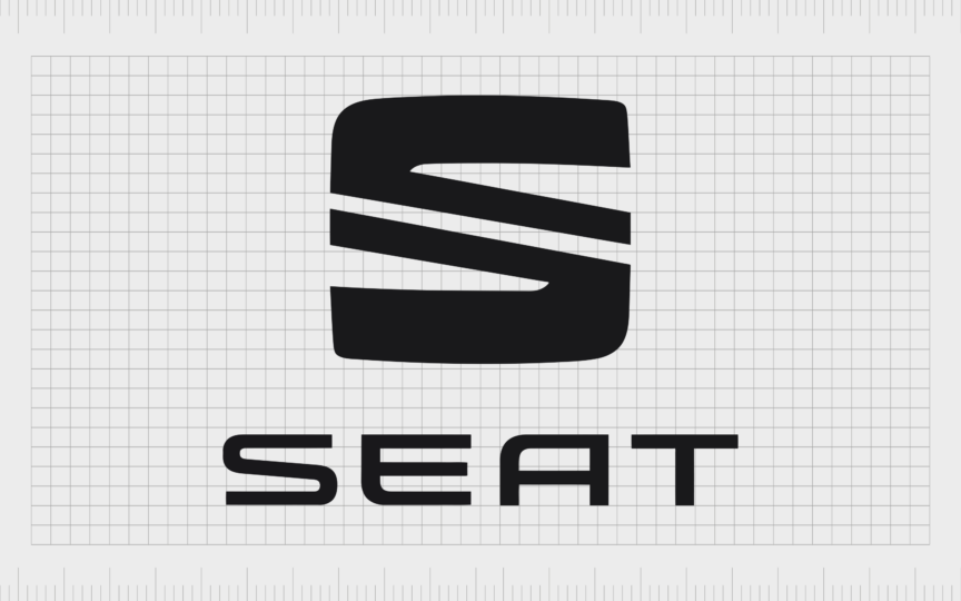
The new SEAT logo, known around the world today, was introduced in 2017. It retained many of the elements from the previous SEAT symbol, including the “S” character with its diagonal stripe, and the sans-serif inscription underneath.
The main thing that changed in this logo was the color palette. The three-dimensional design was replaced with a simple black and white image.
What does the new SEAT logo mean?
At a glance, the SEAT logo might not seem particularly evocative. The “S” in the logo clearly stands for the name of the company, as well as referencing Spain, the home of the automotive brand. However, there are some meaningful elements.
For instance, the black and white color palette signifies the companies increasing power and strength in recent years, and its focus on delivering high-quality new models of SEAT vehicles. The uppercase letters and geometric typeface used in the inscription give the company a modern appearance.
Additionally, the use of a diagonal line in the “S” character is intended to highlight ideas of speed, forward progression, and development.
The SEAT car logo: fonts and colors
Though relatively simple compared to some other car logos on the market today, the SEAT symbol is powerful and memorable. It’s a straightforward design that draws attention to the values and focus of the company, as well as its enduring strength in the automotive industry.
If you want to see the SEAT logo in more detail, you can find some useful resources linked here:
What is the SEAT logo font?
Although the SEAT font has changed a couple of times throughout the company’s history, the brand has long relied on a sans-serif inscription with geometric elements. The SEAT badge has always featured the name of the company in uppercase letters too.
Currently, the font used by SEAT is a custom typeface, similar in some ways to Controller Expanded Four, and Bitsumishi Pro Medium.
What is the SEAT color palette?
The SEAT colors used in the company logo have also changed a number of times over the years. The most common colors used by the company have been red and grey. However, it has also experimented with shades of blue and even yellow.
Today, the official SEAT colors are just black and white. The monochrome symbol is a reference to the company’s confidence, professionalism, and reliability.
Celebrating the SEAT car symbol
Throughout SEAT logo history, there have been numerous changes to the visual identity of the car company. The brand has experimented with a huge variety of shapes, designs, color palettes, and even typography choices.
Today, however, the SEAT logo is a simple and streamlined emblem, ideal for showcasing the strength and sophistication of the brand. The monochromatic symbol gives the SEAT company a sense of reliability and modernity.
Fabrik: A branding agency for our times.
Clarity starts with a conversation.
Thanks—we’ll get back to you shortly.
Whether you're navigating a rebrand, merger, or simply need a clearer identity—we’re here to help. No hard sell, just honest advice from people who know the sector.
Let’s start with a simple question…
Prefer to email? Drop us a line.
Fabrik’s been helping organisations rethink and reshape their brands for over 25 years. We’ve guided companies through mergers, rebrands and new launches. Whatever stage you’re at, we’ll meet you there.


