27 of the best production company and movie studio logos ever

Movie studio logos might not seem like the most interesting part of the cinematic experience. Often, when we watch a film, it’s the introductory music, and the title screen for the movie itself that grabs the most attention. But the production company logos can be compelling too.
The iconic logos of movie production companies are usually one of the first images we see before a motion picture begins. Used correctly, they can inspire a sense of wonder or intrigue in viewers, introduce the theme of the film, and even give the production more credibility.
Over the years, many film production company logos have become instantly recognizable. We’re all familiar with the roaring lion of MGM Studios, the globe of Universal Pictures, and even the towering mountain of the Paramount emblem.
Today, we’re going to look at some of the most unforgettable movie studio logos of all time, to determine what makes these amazing visuals so powerful.
An introduction to movie and production company logos
Movie studio logos come in a variety of shapes, sizes, and styles. In the early days of cinema, these logos were often very complex. They often combined a variety of images and wordmarks to showcase history, heritage, and reliability.
Over the years, like many brand marks, production company logos have evolved to become more simplistic and straightforward. Most companies have refined their visual brand, to connect with a younger audience, and ensure their images can expand across different media.
However, the majority of these emblems still preserve crucial elements, which help us to define the personality and mission of the brand. Each compelling production studio logo tells us something about what we can expect to see on our screen.
Some film studio logos are associated with family friendly entertainment, like the Disney logo. Others are connected with a specific genre, like the emblem of Marvel Studios.
Let’s take a closer look at some of the most amazing logos of film production companies in circulation today.
The best movie studio logos of all time
Notably, there are many different movie studios in operation around the world today. In 2020, there were around 16,000 companies involved in film and video production in the United Kingdom alone.
Today, we’re focusing on the biggest players in the movie industry.
Here are some of the world’s most reputable major studios, and their current logo designs.

1. Universal Pictures
Otherwise known as Universal Studios, Universal Pictures is an American film production company owned by Comcast. The brand was first founded in 1912, and is one of the oldest surviving film studios in the United States.
Well-known for a host of popular movies, including The new Super Mario Bros Movie, the Fast and the Furious, and The Mummy, Universal is one of the better-known film studios of all time. Its logo features a simple globe with the word “Universal” placed over the top.
The image is intended to show the versatility of the company, and its worldwide target market. Universal’s emblem tells us we’re viewing content from a highly diverse production brand.

2. Warner Bros
Another of the top movie studio logos to come from America, Warner Bros Entertainment was launched in 1923, by four brothers. The company quickly established itself as a leader in the American film industry, before expanding into animation, television, and video games .
Today, the company is best-known for a wide variety of popular movies, including The Dark Knight, Suicide Squad, and The Hobbit. The logo features a traditional emblem in the shape of a shield, with the letters “WB” in white.
The coloring and design of the logo demonstrates sophistication and professionalism, while the fun font choice gives the image a playful aesthetic.

3. Columbia Pictures
Operating as part of the Sony Pictures Motion Picture Group, Columbia Studios was first introduced in 1918, and has been growing in size ever since. The company is best-known for using a humanized version of the State of Liberty in its title card.
Responsible for well-known flicks like the Da Vinci Code, Men in Black, and Spider-Man, Columbia Pictures has become a major contender over the last few years. Its current logo demonstrates its history and heritage in the American film landscape.

4. DreamWorks Pictures
Known to most simply as “DreamWorks”, DreamWorks Pictures is an American film company, which first launched in 1994. The studio has produced more than ten films with grosses of more than $100 million each at the box office.
Well-known for its family-friendly movies, created by directors like Steven Spielberg, DreamWorks has worked on everything from Shrek to Kung Fu Panda. It’s official logo is a simple wordmark, set across two lines. However, many are familiar with the animation studio alternative.
This variant logo features a small boy sitting in a crescent moon, with a fishing rod in his hands.

5. Walt Disney Pictures
Responsible for one of the most memorable movie company logos of all time, the Walt Disney Pictures company is an icon in the film landscape. The brand was first established in 1923, and is the flagship producer of live-action films within the Walt Disney corporation.
Walt Disney Pictures is currently one of five live-action film studios belonging to Disney, and is well-known for movies like the Lion King, and the Pirates of the Caribbean franchise. The production studio logo used by the brand features an image of the famous Disney castle.
There’s also a variation of the Disney signature used in the logo, based on the handwriting of Walt Disney himself.

6. Paramount Pictures
Another of the best production company logos of all time comes from Paramount Pictures, a company which was first launched in 1912. The brand is one of the “Big Five” film studios in the United States, and is also a member of the Motion Picture Association.
Initially, the Paramount logo featured 24 stars, to represent the various actresses and actors under contract with the team. However, the stars were reduced over time to make the logo more modern.
Today, the image features a simple mountain design, with the words “Paramount Pictures” in a stylish script font, to highlight excellence and sophistication.
Find out more about the Paramount Pictures logo here.

7. 20th Century Studios
Previously known as 20th Century Fox, 20th Century Studios was launched in 1935, and is now owned by Walt Disney Studios. For over 80 years, the company has been one of the major American film studios, known by people all around the world.
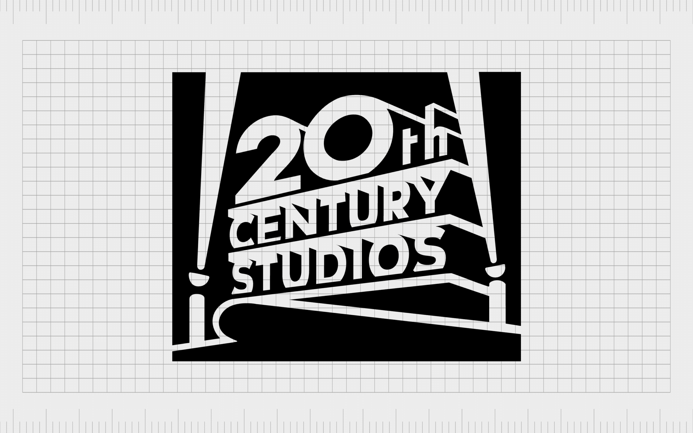
Responsible for well-known flicks like X-Men, and Avatar, this company hasn’t changed its logo much over the years. The film company logo features a bold 3-dimensional wordmark, with searchlights placed on either side.

8. Metro-Goldwyn-Mayer
Better known to most as “MGM Studios”, Metro-Goldwyn-Mayer was founded in 1924, and specializes in film and television production. You’re likely familiar with the production company logo from movies like Casino Royale, and The Wizard of Oz.
The MGM company has one of the most complex, but memorable movie studio logos on this list. It features a roaring lion head, in the middle of a golden banner.
The words “Art Gratia Artis” often appear on the banner, reminding viewers of MGM’s Latin motto and long-standing heritage.

9. TriStar Pictures
TriStar Pictures also has one of the more memorable production company logos in the world today, thanks in large part to its powerful Pegasus mascot.
First founded in 1982, TriStar Pictures was created by Victor Kaufman, and is responsible for well-known movies like Basic Instinct, Terminator, and Baby Driver. The iconic logo features a flying Pegasus, inspired by Kaufman’s love of horses.

10. Good Universe
Another relatively complex example of film production company logos throughout the years, Good Universe was founded in 2012, by two long-term partners transitioning out of Lionsgate.
The company is well-known for somewhat niche films like The Disaster Artist and Long Shot. The logo features a wordmark, with a series of children running beneath it, drawing an underline in sparks. The children are said to be representative of the youngsters of the founders.

11. Pixar
Known for its commercially and critically successful animated films, Pixar Animation Studios is a subsidiary of Walt Disney Studios. The company started out as part of the Lucasfilm computer division before it span off in 1986.
Popular for family friendly films like Toy Story and Elemental, Pixar has produced some of the highest-grossing movies of all time.
Unlike other film studio logos, the Pixar emblem is relatively simple, featuring a stylized wordmark across two lines, intended to showcase modernity and creativity.

12. New Line Cinema
First launched in 1967, New Line Cinema is a division of the Warner Bros company, best-known for movies like The Lord of the Rings, Final Destination, and Elf.
Interestingly, this company didn’t use any specific logo until the 1970s. The current emblem differentiates itself from other movie studio logos with a sleek design.
The image features two film strips over a black box, with the name of the company written in simplistic, sans-serif font beneath.

13. Legendary Entertainment
Known for movies like Harry Potter, John Wick, and Inception, Legendary Entertainment was launched in 2000, by Thomas Tull and two co-founders. The company often collaborates with a number of other major studios on big releases.
Legendary has one of the most interesting film studio logos on this list, it features the name of the company in bold, capital letters, alongside a Celtic-style symbol.
The Celtic logo is intended to reference ancient concepts, giving the company a sense of heritage and history.

14. Castle Rock Entertainment
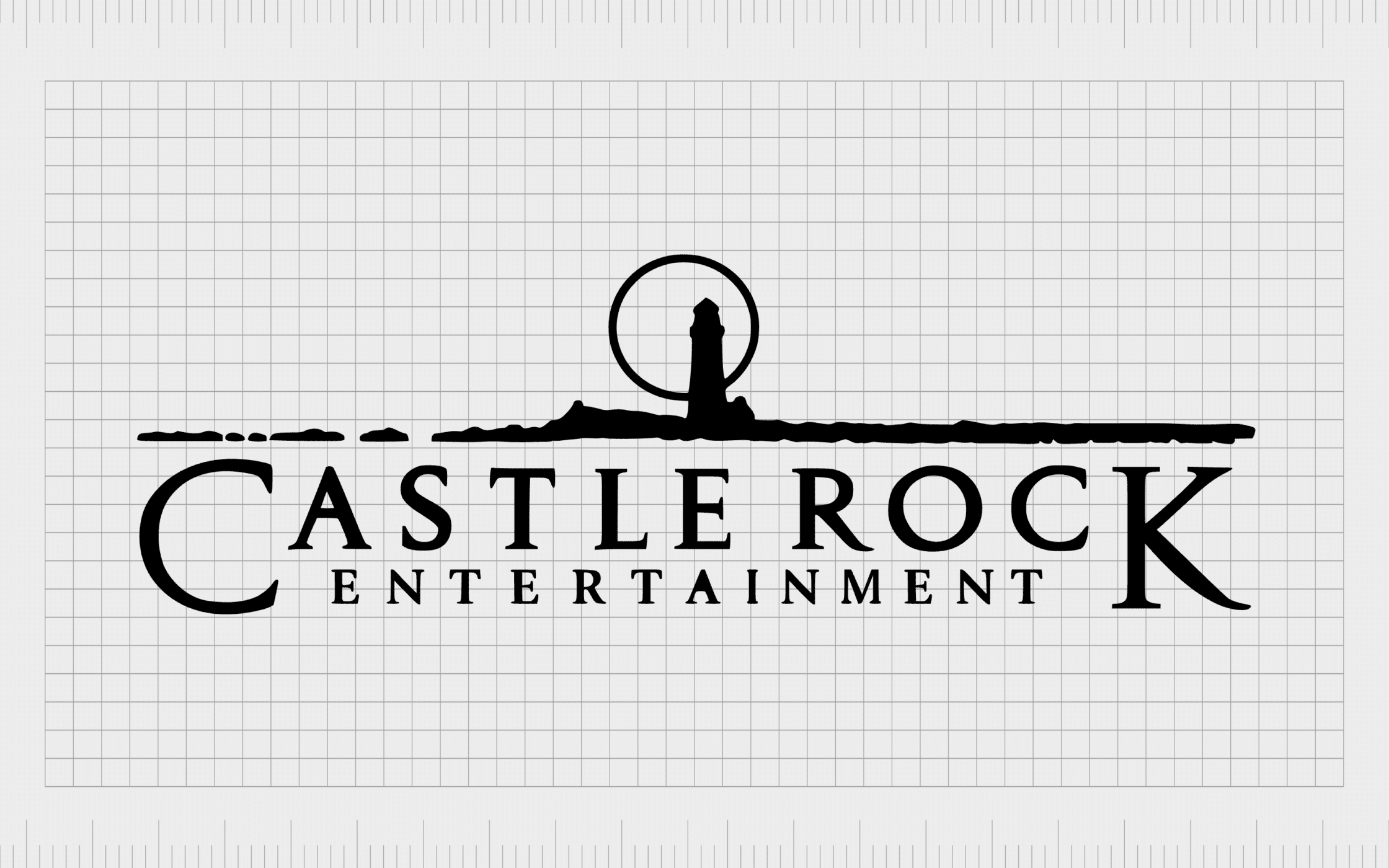
Founded in 1987, Castle Rock Entertainment is one of the subsidiary companies belonging to Warner Bros. The film production company hasn’t made many significant changes to its iconic logos over the years, using a simplified landscape in its title cards.
Alongside the seaside style image in the emblem, one of the most interesting components of this film company logo is the wordmark, which features two enlarged letters.
These design elements give the company a creative and artistic appearance.

15. Sony Pictures
Unlike other movie production company logos, Sony Pictures has a relatively modern brand mark. The company, first launched in 1987, is considered one of the “Big Five” American film studios. It’s best known for movies like The Karate Kid and Ghostbusters.
The Sony Pictures logo features a series of lines, with increasing thickness, starting from the center, intended to represent a soundwave. This is a reference to Sony’s long-standing presence in the audio production industry.

16. Eros International
Otherwise known as Eros India, Eros International is one of the biggest movie studios in India. It first launched in 1977 and is responsible for co-producing, acquiring, and distributing Indian films in various formats worldwide.
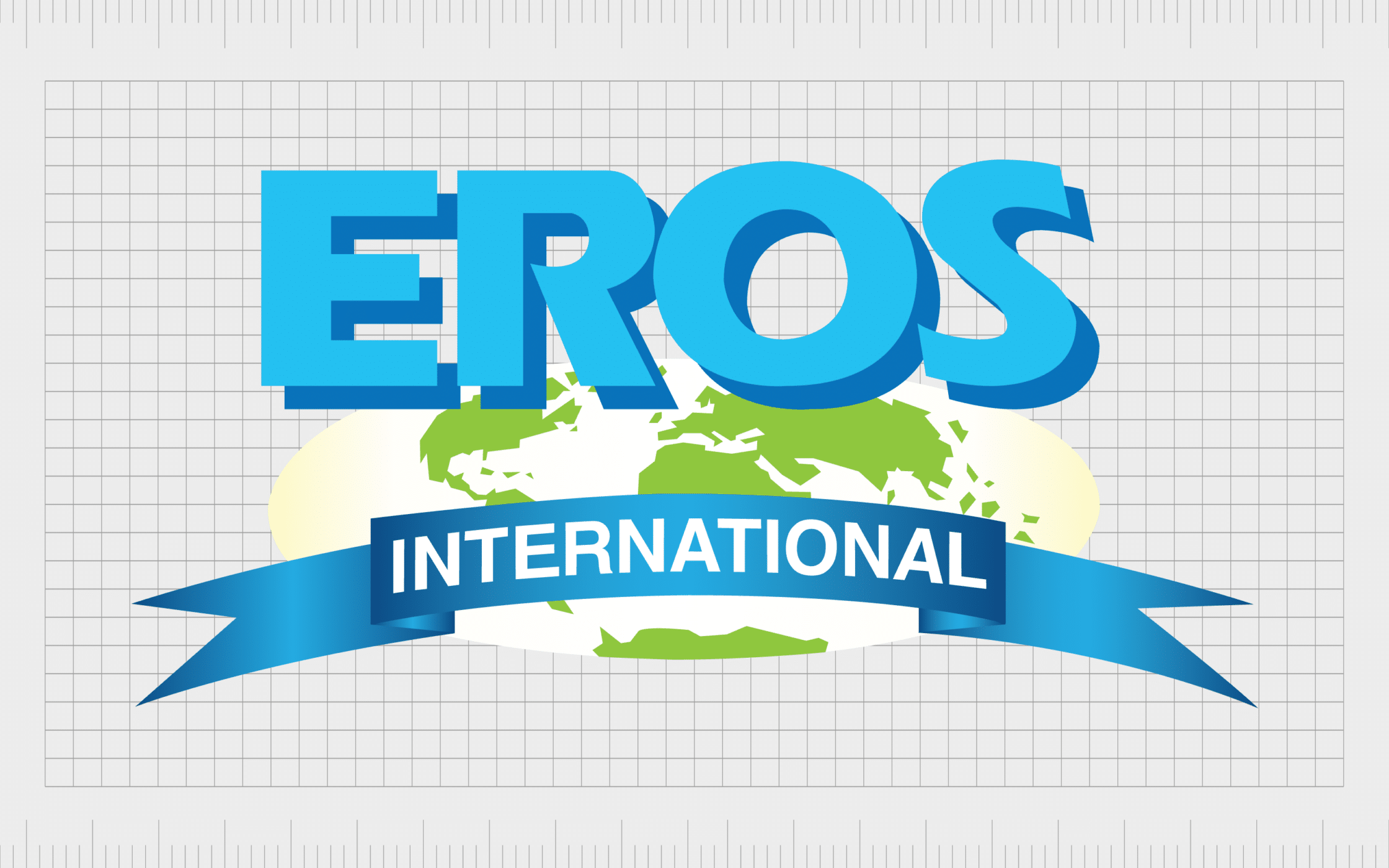
Eros has more than 12,000 films in its library, specifically designed for an Indian audience. However, the company’s logo showcases its international reach, with an oval-shaped globe.
The image also includes a bold wordmark, with carefully positioned shadowing to create a 3-dimensional effect.

17. STX Entertainment
STX Entertainment is an American entertainment and media company, created in 2014. The company merged with Eros International in 2020, although Eros remains a non-voting, minority shareholder for the brand.
STX has one of the simplest movie studio logos on this list. It features a wordmark, set across two lines, with bold, serif letters. The image is notably sophisticated, and authoritative, showing the company’s commitment to excellent entertainment.

18. Revolution Studios
Revolution Studios is an American motion picture studio, first founded in 2020. The company focuses on the distribution, sequel, and remake rights to various titles in its library. You may be familiar with well-known titles like Little Black Book, or 13 Going on 30.
Revolution Studios has a relatively minimalist logo, representative of its original films. It features an image similar to a globe, placed in grey behind a bold wordmark.

19. Lionsgate
Best-known for movies like The Hunger Games, and The Expendables, Lionsgate is one of the most recognizable entertainment companies in the world. The organization was first formed in 1997, with a $16 million investment fund.
Compared to the other film production logos on this list, Lionsgate has a relatively simple emblem. It doesn’t feature any complex components or design elements, just a simple wordmark. Despite this, the brand mark is wonderfully strong and sophisticated.

20. Lucasfilm
Now owned by the Disney Entertainment company, Lucasfilm is one of the more popular movie studios in recent years. The company is best known for creating the Star Wars and Indiana Jones franchises, which have become some of the most iconic films of all time.
The production company logo used by Lucasfilm is relatively straightforward, featuring a curved wordmark, with the letters “LTD” underneath. The image features some interesting flourishes, designed to draw attention to the creativity of the business.

21. Marvel Studios
Another well-known film production company owned by the Walt Disney brand; Marvel Studios was first launched as “Marvel Films” in 1993. The company produces the Marvel Cinematic Universe films, based on characters from Marvel Comics.
Marvel Studios has one of the most eye-catching movie studio logos on this list, thanks to its bold use of color. The image includes the two words in the name, with one half written in white on a red background, and the other written in black.

22. Bad Robot Productions
First introduced in 1999, Bad Robot Productions is a popular film and television company, responsible for movies like Cloverfield, Star Trek, and Mission Impossible.
Compared to the other production studio logos on this list, the Bad Robot emblem is quite unique. It features an almost sketch-like drawing of a robot, in black and white, placed within a simple circular border. The wordmark underneath the image includes a scratchy, stylized font.
The overall image makes the company look playful and mysterious.

23. Miramax
Otherwise known as Miramax Films, Miramax is an American television and film company, founded by Bob and Harvey Weinstein in 1979. The company was a leading independent film company before it was purchased by Disney, and then Paramount Pictures.
Miramax is well-known for famous movies like The Crow, Sin City, and Hellraiser. The organization has a relatively simplistic logo, featuring a wordmark in bold blue letters. The image gives the company a sense of versatility, so it can apply to all themes and genres.

24. Summit Entertainment
A label belonging to the Lionsgate film company, Summit Entertainment, first launched in 1991, with a focus on creating various types of movies. The production and distribution company created titles like the Twilight Saga, Hellboy, and Now You See Me.
Like many movie studio logos, Summit Entertainment uses a relatively simple color palette of just black and white. However, some versions of the logo also include streaks of silver. The official image simply includes a wordmark across two lines.

25. Focus Features
Owned by Universal Pictures, Focus Features was first founded in 2002. It distributes independent and foreign films throughout the United States, as well as internationally. The most successful film created by the company today is Downton Abbey.
Focus Features has one of the more interesting production company logos on this list. It includes a wordmark set across two lines, with a unique “O” in the word “Focus”.
The character appears to be breaking apart, made up of various pixelated circles and dots.

26. Level 1 Entertainment
Similar in some ways to the New Line film logo, the Level 1 Entertainment company logo takes advantage of film strip imagery for its emblem.
This company, launched in 2003, is still a relatively new addition to the film landscape, with a handful of well-known movies like Rendition and Detour. The company has also worked as a financial partner with various other brands.
The image for the Level 1 logo features a two-line wordmark, with spaced out letters in the word “Entertainment”, to create a sense of balance.

27. Searchlight Pictures
Previously known as Fox Searchlight Pictures, Searchlight Pictures is a film production and distribution company belonging to Walt Disney Studios. The company primarily focuses on producing, acquiring, and distributing specialty films.
You may be familiar with Searchlight Pictures for its work on flicks like Slumdog Millionaire, 12 Years a Slave, Juno, or Black Swan.
The company features a very similar image to the 20th Century Studios logo, though it takes a more two-dimensional approach.
Learning from film production logos
The movie studio logos mentioned above offer an incredible insight into how powerful the right image can be for today’s film companies. While there are some commonalities between these logos, such as the common use of black and white, many emblems feature their own unique elements.
Great movie studio logos provide a powerful insight into the company’s heritage, history, and values. Every image above comes with its own emotional impact, intended to capture the attention of an audience, long before a movie begins.
If the designs above have inspired you to create your own perfect movie studio logo, the best way to ensure you end up with an amazing design, is to work with the professionals.
An expert logo design company will be able to work with you to create a powerful image that attracts the right audience, and elevates your brand.
Fabrik: A branding agency for our times.
Clarity starts with a conversation.
Thanks—we’ll get back to you shortly.
Whether you're navigating a rebrand, merger, or simply need a clearer identity—we’re here to help. No hard sell, just honest advice from people who know the sector.
Let’s start with a simple question…
Prefer to email? Drop us a line.
Fabrik’s been helping organisations rethink and reshape their brands for over 25 years. We’ve guided companies through mergers, rebrands and new launches. Whatever stage you’re at, we’ll meet you there.


