The Android logo history: The world’s most popular mobile operating system

How much do you know about Android logo history? While you don’t need to be a technology expert to recognize the Android brand today, you may not realize that the iconic symbol associated with the computing giant has undergone a handful of changes.
Though Android has long showcased its android mascot in its logo, the design of the image has evolved through the years. Interestingly, while many tech companies have focused on making their logos more simplistic, Android has given its iconic symbol greater depth.
Today, the Android “Bugdroid” is more dynamic than ever before, with a 3D design that stands out on virtually any platform.
Today, we’re going to take a closer look at the evolution of this unique brand mark, and how it has grown to be such a recognizable element of the tech industry.
The Android icon: Introducing Android
Before we begin our deep dive into Android logo history, let’s start by briefly introducing the company. Android is the name of a technology company and mobile operating system, based on the Linux kernal, alongside other open source software.
Known for powering a variety of Google devices, including Google’s smartphones, the operating system has become one of the most popular in the world. Today, more than 70% of smartphones based on Android’s open-source technology run via Google’s ecosystem.
However, Android’s technology has also been used to develop tools for a range of electronics, including digital cameras, game consoles, and PCs. The name “Android” comes from a nickname given to be of the company’s founders, Andy Rubin.
This name also inspired the Android icon and mascot, which features a small, simplistic robot, commonly referred to as “Bugdroid”. Throughout the years, various versions of Bugdroid have appeared, accompanied by numerous “Android” wordmarks.
Android logo history: Has the Android logo changed?
While the Android symbol many consumers are familiar with today may not appear to have changed much since the company launched in 2008, the have been some subtle alterations. Android has experimented not just with its recognizable color palette, but also typography and graphics.
Let’s take a closer look at Android logo history.
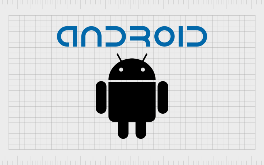
2007
Officially, the first logo introduced for the Android brand was a simple wordmark, designed in sans-serif blue font. What made the inscription unique was the decision to eliminate certain portions of the characters, such as the rear line of the letter “D”.
In 2008, the Android mascot, Bugdroid was first created by a graphic designer named Irina Bok. Using simple geometric shapes as building blocks, the designer aimed to create a universally accessible icon for the company, that would resonate with customers worldwide.
At a glance, the creature looks a little like an alien built with basic shapes, including long ovals for arms, and a semi-circle head. It also features a set of antenna on the top, to separate the image from the standard “human” shape.

Notably, there were two color variations of the Android icon introduced in 2008. While the first featured a black and white mascot (with blue font), the second presented the Bugdroid in a bright shade of green. This green coloring inspired many future versions of the Android logo.
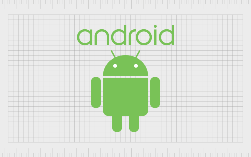
2014
During 2014, Android made a handful of changes to its brand identity. The company embraced green as its primary color palette, though switched to a slightly darker shade. The color was closer to a leaf green than the rather vibrant, yellowish shade of the previous design.
As well as updating their mascot’s coloring, the OS company also changed its typography, eliminating the somewhat complex wordmark in favor of a simple inscription.
The new font was also a sans-serif typeface, but this time there were no sections removed. The design featured broad curves and short, simple lines, for easy legibility. All of the letters were also depicted in lowercase, giving Android a friendly and youthful image.
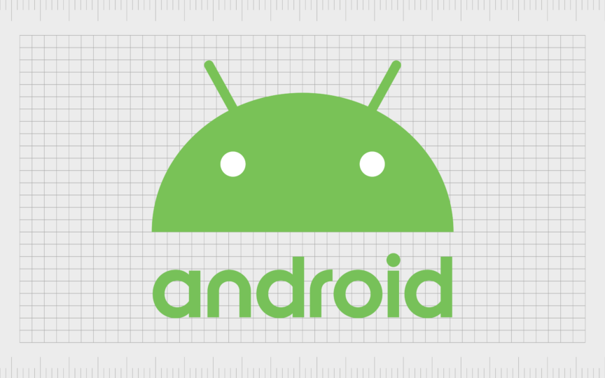
2015
Only a year after the previous design, the Android team introduced a slightly bolder version of its wordmark, still in the same shade of green. In 2017, the team started experimenting with new iterations of the Android mascot, showcasing only the creature’s head, instead of the entire body.
The coloring of the Android head was updated too, in a much more vibrant shade of green, sure to stand out on any device or screen.

In 2019, the two separate design elements were combined, with the Android face placed alongside the wordmark. The inscription’s color was changed to black, to create a higher level of contrast, however, the overall style remained very similar to the previous Android logo.
Notably, the font here is slightly thinner than in the 2015 image, although it’s not as slimline as the Android inscription from 2014.
What is the current Android logo?

Today, there are two variations of the Android logo in use. One is very similar to the brand mark created in 2019. However, in this instance, the coloring of the mascot has been darkened again, and its eyes have been switched from white to black.
Additionally, the new logo features a capitalized letter “A”, giving the brand a more authoritative image. The alternative version of the logo features a similar color palette, and the same inscription, however the Android mascot includes shadows and highlights to give it greater depth.
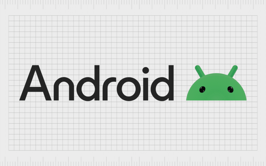
The new logo radiates a greater sense of maturity, while maintaining Android’s fun and playful personality. As flat design is common in the technology industry, Android’s decision to introduce a three-dimensional version of its mascot helps to separate it from the competition.
The bold image seems to enrich the personality of the Android character, and enhance the brand as a result. The sharp, new capitalized “A” also makes a bold aesthetic statement, while helping to align Android with Google, a company using a similar style in its wordmark.
What is the meaning of the Android logo?
Android’s unique logo may have changed somewhat over the years, but the design has always offered a useful insight into the personality and values of the technology brand. With its compelling mascot (Bugdroid), and its unique color palette, Android establishes itself as an industry innovator.
Although the logo today has some similarities with other tech emblems, such as the Google wordmark, it also helps to distinguish the Android company. The mascot, though simple, is intended to be globally accessible and recognizable.
It lacks any features that may align Android with a specific niche of customers, helping them to reach a wider potential audience. Additionally, the use of green and black in Android’s color palette demonstrates a commitment to creativity and growth.
Green is a color often associated with innovation and development, as well as wealth and nurturing, while black is linked to concepts of authority and professionalism.
The Android symbol: Colors and fonts
Following a handful of updates throughout the years, the Android logo has emerged as one of the most recognizable symbols in the technology landscape. Today, this eye-catching emblem immediately positions Android as a creative powerhouse in the technology space.
It demonstrates a combination of professionalism and authority, with a fun and youthful edge that appeals to the next generation of consumers. If you want to take a closer look at the incredible Android logo, you can find some helpful resources here:
What color is the Android logo?
While there have been various changes to the Android logo colors over the years, shades such as green and black have remained consistent in the brand’s image. Today, the color most commonly considered the official “Android logo color” is a bright green tone.
The shade is known as “UFO green” and has an almost neon essence to it. This unique shade is accompanied by black, in the Android mascot’s eyes, and the logo wordmark.
Hex color: #00df7f
RGB: 0 223 127
CMYK: 100 0 43 13
Pantone: PMS 3405 C
What font does the Android logo use?
Just as Android has made a handful of changes to its logo colors over the years, it has also explored a variety of different typefaces. The initial inscription used by the brand was rather complex, with missing components from various characters.
Since then, the design has become more simplistic. The current typography is similar to Montreal Serial Medium, although the letters have slightly more prominent curves on the bottom.
The futuristic Android logo
Throughout Android logo history, the company has shown an ongoing commitment to representing its unique personality and voice in its brand design. Although elements of the Android symbol and icon have changed over time, the brand mark has always been highly evocative.
Today, the newest version of the Android logo might seem unusual in a time when many tech companies are embracing flat, simplistic designs. However, Android’s commitment to thinking outside of the box and delivering innovation shines through in the modern emblem.
If you’re inspired by the Android logo, check out our other logofiles covering the images of leading tech companies, or reach out to Fabrik for logo design expertise.
Fabrik: A branding agency for our times.
Clarity starts with a conversation.
Thanks—we’ll get back to you shortly.
Whether you're navigating a rebrand, merger, or simply need a clearer identity—we’re here to help. No hard sell, just honest advice from people who know the sector.
Let’s start with a simple question…
Prefer to email? Drop us a line.
Fabrik’s been helping organisations rethink and reshape their brands for over 25 years. We’ve guided companies through mergers, rebrands and new launches. Whatever stage you’re at, we’ll meet you there.


