


The Aquaman logo: Exploring the origins of the Aquaman symbol
How much do you know about the Aquaman logo? If you’re a fan of the DC comic book landscape, and you’ve been keeping up with the cinematic universe, you can probably recognize this symbol.
The image started life as an emblem for a character known for his control of the aquatic world.
The Aquaman symbol is simple but effective, designed to draw attention to one of the oldest superheroes in the DC space. The character was actually introduced for the first time in 1941.
Since then, the Aquaman logos haven’t changed much.
The most significant changes we’ve seen to the Aquaman emblem began to appear in recent years, as DC expanded its cinematic universe and introduced new movies.
Aquaman history: Origins of Aquaman
Aquaman, also known as Arthur Curry, belongs to the royal family of Atlantis, often acting as their king.
Aquaman, like many superheroes, has a unique collection of powers. In this case, the character appears to be inspired heavily by gods of the sea like Neptune and Poseidon.
Aquaman has telepathic control over marine life, and can survive both in the water and on land. He also has superhuman strength, which he uses to protect human beings and his own kind.
This character also frequently appears in the Justice League, to help tackle larger threats in the DC landscape.
The oldest versions of the Aquaman logo were yellow symbols intended to look like the head of a spear. The golden coloring reminds us of the royalty of the character, while the spearhead or harpoon design pulls attention to the ocean.
The design of the shape also looks similar to an “A” which may be intended to remind us of the name of our superhero.
When was Aquaman created?
Aquaman logo history starts with the original introduction of the character back in 1941. According to experts, the half-human half-Atlantean was first introduced in 1941. The character appeared for his debut in the anthology series “More Fun Comics”.
Aquaman logo history: The evolving Aquaman symbol
The Aquaman emblem only began to change dramatically in recent years when the design was re-invented for the creation of the DC movie franchise. When Aquaman was re-introduced to the public by DC for a modern age, he saw a significant change both to his outfit, and emblem.
The DC team wanted to pull attention away from pre-conceived notions of Aquaman as an almost humorous character, and give him a new sense of strength and nobility. This meant updating the logo to something a little more dramatic.
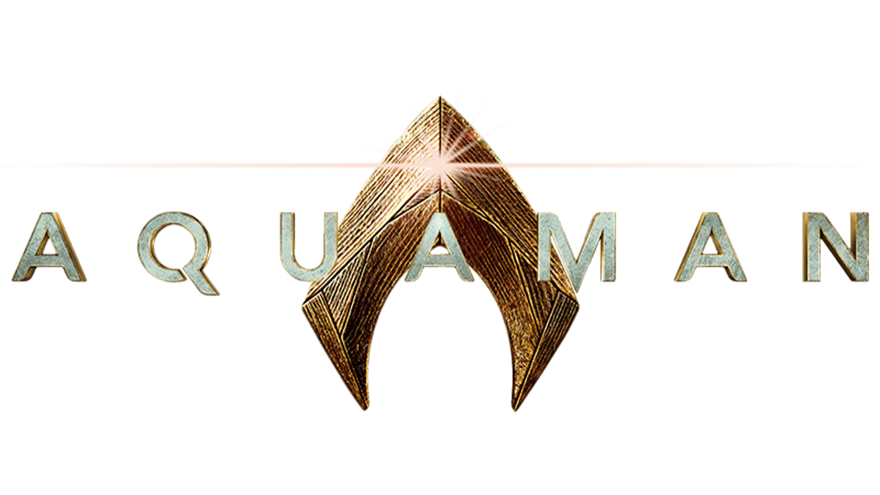
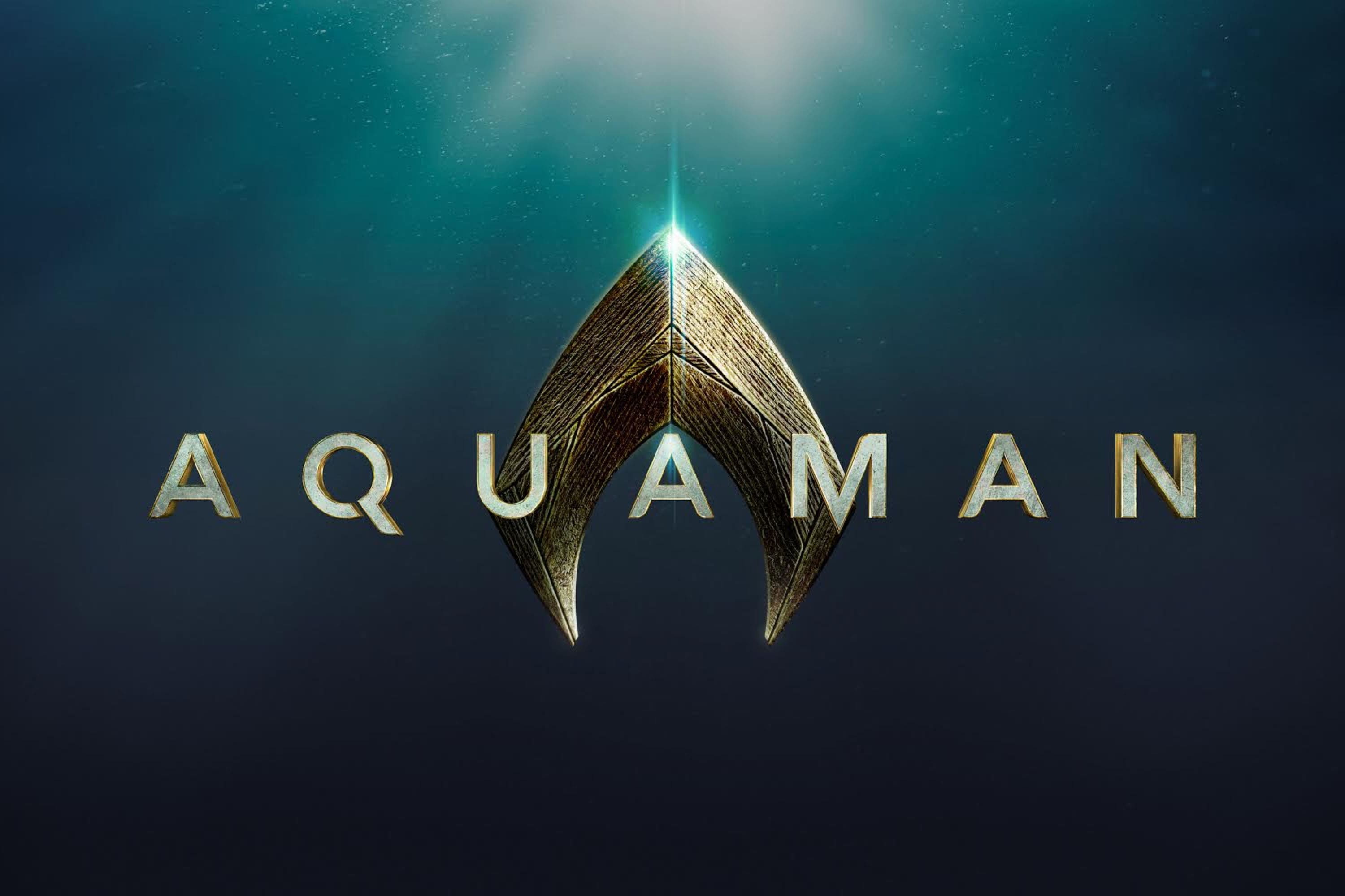
The design from 2017 was based heavily on the original golden arrowhead from the Aquaman logos in the comics. The image in this case is more three-dimensional and textured, with clear edges to remind us we’re looking at something with power.
This Aquaman logo also introduced us to a wordmark. The sans-serif wording with significant spacing between each of the letters is bold and modern. The title, written in all capital letters, appears in the same style in further Aquaman logo iterations.
Some variations of this logo placed the design on an ocean blue background, to remind us of the theme behind the movie and the character.
2018
Like with many superhero movies, DC has released new variations of the Aquaman logo with the creation of new sequels. The most recent variations of the logos change the color scheme of the symbol to various shades of blue.
In this variation, we see the “DC” emblem, reminding us of who the comic book character belongs to. The design of the arrow or harpoon head is also intended to represent crystal, glass or ice. This imagery creates a far more mysterious vibe for the design.
In the newer versions of the logo, the sans-serif font remains very similar to the typography used in previous movie title designs.
Some variations of this logo have also appeared over the years. The example above, for instance, includes the arrow shape in a deeper, teal color, rather than a light blue. There’s also a flare of yellow coloring behind the “A”, and yellow included in the “DC” emblem.
In this second variation, we also see a subheading in similar sans-serif font, outlining the name of the movie sequel.
Aquaman symbols: Design and elements
The Aquaman logo started as something very simple when the character was first introduced by Paul Norris and Mort Weisinger. At first, we saw nothing but a yellow arrow-style symbol, combined with a green and orange outfit.
Now, the Aquaman emblem has evolved to something more modern.
Fortunately, one part of the image has remained the same for over 80 years. The shape of the Aquaman symbol has consistently been an arrow or harpoon head, stylized to look similar to the “A” character from the hero’s name.
What color is the Aquaman logo?
The original Aquaman logo was a bright shade of yellow or gold. Since then, the design has taken on various new shades. The first design of the Aquaman logo for the cinematic logo drew from the initial inspiration of the original Aquaman logo.
The golden imagery reminded us of the royal nature of the character, while the textured elements highlight the rough and rugged nature of the hero.
The more recent variations of the Aquaman logo, created for newer movies, embrace the color blue, in various shades. Examples of the Aquaman logo have appeared in shades of light blue, as well as aquamarine and teal, often to symbolize the ocean.
What font does the Aquaman logo use?
The first logo created for the Aquaman comic character didn’t have any typography associated with it. However, the design of the arrowhead shape may have looked similar to an “A” to some.
The typography used in the Cinematic Universe is a custom typeface, similar to Aquawax.
The choice of a sans-serif font with various disconnected elements in letters like the “Q” of Aquaman helps to draw attention to the modernized image of the character.
You can find some other helpful resources here:
Exploring the Aquaman logo
The Aquaman logo is one of the simpler designs in the DC Universe, but it’s also an image easy to identify and remember. The shape of the logo symbol hasn’t changed much over the years, though there have been various different examples of texture and color to explore.
The Aquaman emblem today continues to evolve with the modernized design of the character, which has been updated for a new audience, and is more fitting with the DC Cinematic Universe.
Fabrik: A branding agency for our times.

Clarity starts with a conversation.
Thanks—we’ll get back to you shortly.
Whether you're navigating a rebrand, merger, or simply need a clearer identity—we’re here to help. No hard sell, just honest advice from people who know the sector.
Let’s start with a simple question…
Prefer to email? Drop us a line.
Fabrik’s been helping organisations rethink and reshape their brands for over 25 years. We’ve guided companies through mergers, rebrands and new launches. Whatever stage you’re at, we’ll meet you there.