


The Xbox logo history: A retrospective look at the Xbox symbol and its evolution
You don’t need to be an avid fan of video games to be familiar with the Xbox logo. Over the years, this iconic emblem has become a crucial symbol in the technology landscape, spanning multiple geographies and cultures. But where did Xbox logo history begin?
Today, most people know the Xbox as the primary competitor of the Sony PlayStation. Created by leading technology brand Microsoft, the Xbox has taken the world by storm as one of the biggest current gaming systems in the world.
When it comes to famous video game logos, few entities have the same market presence as Microsoft’s Xbox.
So, how did Xbox get its unforgettable X symbol? What prompted the company to experiment with colors like neon green throughout its lifespan, and why has the emblem been simplified today?
Here’s everything you need to know about the famous Xbox logo.
What made Xbox famous?
Xbox, otherwise known as Microsoft Xbox, is a video gaming brand created by the Microsoft technology company. The organization sells video game consoles, applications, an online service, and a host of streaming services.
Xbox also has its own dedicated development arm, designed to assist creators in the production of new video game titles.
The brand was first introduced by Microsoft in November 2001, as Microsoft began to look for ways to compete against the current market leader, Sony.
When Sony announced the PlayStation 2 in 1999, they positioned the product as the ultimate tool for home entertainment, capable of playing CDs, DVDs, and games at the same time.
Microsoft saw this new innovation as a potential threat to the personal computer, and four engineers from the “DirectX” team began working on a console that would compete against the PlayStation 2.
They designed a system capable of using many of the hardware components in Microsoft PCs. Numerous names were suggested for this console before “Xbox” was officially chosen.
Initially, the original Xbox only achieved modest sales, but Microsoft kept working to develop the line, making it ever more competitive. Today, Microsoft stands as one of the biggest competitors to leading brands like Sony and Nintendo.
Xbox logo history: The evolution of the Xbox symbol
Throughout Xbox logo history, there haven’t been too many changes to the innovative design chosen by Microsoft. For the most part, the company has focused heavily on the use of a logotype (wordmark) in its design, sometimes accompanied by a graphical component.
Xbox logo history officially began in 1999, when the Direct X team started to work on a solution capable of competing with the PlayStation console.
After experimenting with a range of name choices, the company settled on Xbox and designed an accompanying logo featuring the name of the business in a blocky, sans-serif font.
The lime green coloring helped to emphasize the distinction between Xbox and its competitor, Sony.
2001
Following the introduction of the first-generation Xbox, Microsoft updated the logo for its subsidiary brand. The new Microsoft Xbox logo built on the green coloring from the previous design and continued to use relatively angular, blocky font choices.
Alongside the Xbox wordmark, the company introduced an “X” symbol, made to look as though it had been cut out of the white background.
In 2005, Xbox introduced an updated version of its logo with a slightly simpler sans-serif typeface. The lime green coloring was still present here, and it also appeared on a three-dimensional “X” shape positioned on a metallic sphere.
One of the most interesting components of this logo was the elongated line in the “B” of Xbox, which remains with the business today.
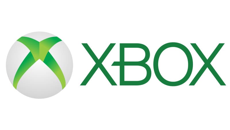
As the digital landscape evolved, the Microsoft Xbox logo transformed with it, becoming increasingly refined and modern. The color palette of the company’s visual identity was upgraded in 2010 to create a more vivid and intense image with greater contrast.
The renewed color palette aimed to highlight the innovative and pioneering nature of the brand.
In 2012, Microsoft simplified the Xbox logo to match the trend of creating more streamlined, two-dimensional emblems. The gradients were removed from the sphere shape to create a simple green circle, with an “X” cut out of the middle in white.
The green coloring was darkened, although the font choice for the brand remained the same.
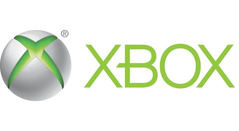
Xbox went back to its roots for a time in 2013, re-introducing the three-dimensional sphere, with lighter green gradients within the “X” for the symbol. The font style was retained from the previous logo, and it maintained its slightly darker shade of green.
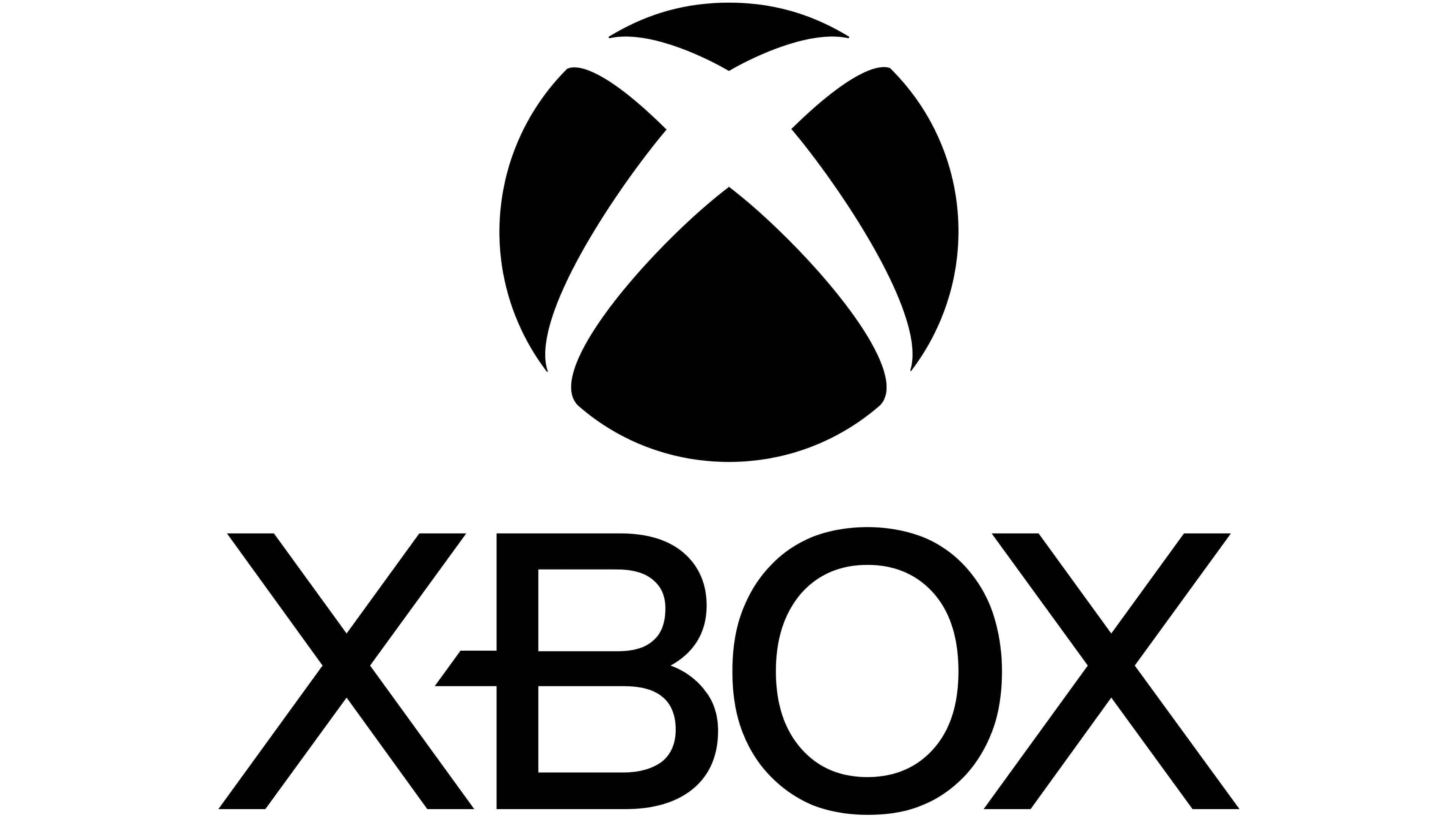
Today, the latest version of the Microsoft Xbox logo is a simplified version of many of the previous emblems. Depicted in a simple black-and-white color palette, the new logo is set across two levels, with the Xbox sphere symbol at the top and the wordmark at the bottom.
The newer logo looks modern and contemporary, although it retains a lot of the elements from the previous Xbox icons, including the unique font choice.
Xbox console logos, from 360 to Xbox One
As most video game companies focused on the console landscape, Xbox has introduced a variety of specific logos to accompany its new products. Initially, the first Xbox didn’t have much of a logo of its own and primarily used the main brand’s emblem.
However, since then, various new iterations of the Xbox logo have been rolled out for each console.
The Xbox 360 logo
The Xbox 360 logo, responsible for representing one of the most famous consoles produced by the brand, combined the official Xbox logo of the time with a few simple embellishments. The image was set across two lines, with the Xbox sphere at the top and the name of the company at the bottom.
It also included “360” in a light grey font.
The Xbox One logo
Similar to the Xbox 360 logo, the new emblem for the Xbox One built on the existing brand identity of the Xbox company, adding the word “One” to the wordmark to differentiate the console. Notably, various versions of this logo were introduced, with a variety of color palettes.
Some even used the three-dimensional Xbox sphere from the 2013 rebrand.
The Xbox Series X logo
The Xbox Series X logo and the accompanying Xbox Series S emblem are based on the most recent version of the Xbox logo. The core elements of the brand emblem are present here, alongside the word “Series,” written vertically, and the accompanying letter for each model.
The “X” and “S” are differentiated by a cut through the middle of each letter.
The Microsoft Xbox logo: Colors and fonts
The Xbox logo today is a symbol beloved by gamers all over the world. Like many video game companies and major technology brands, Microsoft has updated its logo throughout the years to make it appear more modern and refined.
Currently, the Microsoft Xbox logo we know today is one of the simplest emblems produced by the company, featuring only the colors black and white.
If you want to take a closer look at some of the elements of the Xbox visual identity, you can find some helpful resources here:
What color is the Xbox logo?
Today, the Xbox logo colors have evolved to a simple black-and-white color palette, for the most part. However, variations of the Xbox logo in its iconic green still exist. Green is perhaps the primary Xbox logo color for most people, as it has remained with the brand for most of its history.
Interestingly, according to some reports, the reason for choosing green as one of the core colors of the Xbox visual identity is simpler than most people would expect.
The co-author of the logo, Horace Luke, said he only had a lime green shade available to him at the time when he was designing, as he couldn’t find any other unique shades to work with.
What font does the Xbox logo use?
The Xbox logo font has been one of the core components of the brand’s visual identity over the decades. Today, this typeface has been simplified to create a more streamlined, professional image. The wordmark typeface is unique to the brand and is known as “X360.”
Unique components include an elongated middle bar on the “B” and sharp edges on the glyphs.
What does the Xbox logo mean? Looking back
Today’s Xbox logo symbolizes fun, innovation, and growth. The powerful yet simple symbol has captured the attention of countless consumers worldwide, making Xbox one of the best-known gaming companies in history.
Throughout the years, Microsoft consistently refined and updated the Xbox logo, making it more compelling and attractive to its evolving audience of young gamers. Today’s straightforward logo highlights the company’s focus on the future and its connection with the past.
Fabrik: A branding agency for our times.

Clarity starts with a conversation.
Thanks—we’ll get back to you shortly.
Whether you're navigating a rebrand, merger, or simply need a clearer identity—we’re here to help. No hard sell, just honest advice from people who know the sector.
Let’s start with a simple question…
Prefer to email? Drop us a line.
Fabrik’s been helping organisations rethink and reshape their brands for over 25 years. We’ve guided companies through mergers, rebrands and new launches. Whatever stage you’re at, we’ll meet you there.