


The X-Men logo: A symbol of mutants and Marvel history
Many movie fans are familiar with the X-Men logo today. If you’ve been following the comic books for some time, you might even know a little about X-Men logo history. As one of the most well-known pop culture superheroes, the X-Men have developed a strong brand identity.
Although superhero emblems may not seem the same as the logos we see attributed to companies and corporations, they still hold significant meaning. The right symbol or sign attributed to a fictional character can inspire emotional connections in audiences worldwide.
The X-Men symbol, for instance, is beloved by people all over the world, who show their support of the X-Men story with branded merchandise, clothing, and even tattoos. Today, we will examine the X-Men logo and how it has evolved over the years.
Is X-Men DC or Marvel? An introduction
The X-Men are a superhero team that appears in comics produced by Marvel. They were created initially by writer Stan Lee and artist Jack Kirby. Although the comics were initially canceled in 1970 as a result of low sales, they were revived five years later with amazing success.
Over the years, the X-Men series has become one of the most successful franchises created by Marvel Comics.
Characters from the X-Men have appeared in various books, films, and television shows over the years.
They each have their own distinctive name, appearance, and abilities. Fundamentally, the X-Men are a group of mutants, some belonging to the hero group and others to the “villain” sector. They’re born with a genetic trait that gives them superhuman abilities.
Due to their differences from most human beings, mutants have been subject to significant discrimination and prejudice in many of the X-Men stories. Over the years, the X-Men have fought against a range of enemies, from human bigots to extra-terrestrials.
Famous characters from the X-Men have even had their own appearances in spin-off movies and television shows, such as the Phoenix, Magneto, Professor Xavier, and Wolverine. Deadpool is also classed as an “unofficial” X-Men in some stories.
Introducing the classic X-Men logo
The introduction of the X-Men logo began with the wordmarks printed on the comic books introduced into the series during the 1960s. While there’s some controversy around the idea of which logo is the “original X-Men logo,” it’s worth taking a look at some of the initial designs.
.png)
b.png)
c.png)
During the first 20 years, the X-Men comics experimented with a number of different logotypes for the group. Initially, the logo introduced featured an “X” with sharp edges, followed by the -Men component in a block, sans-serif font.
Many subsequent versions of the logo added a three-dimensional element to the type and positioned the wordmark as though we were looking at it from the side.
.png)
.png)
.png)
.png)
.png)
Many of the later volumes of the X-Men comics produced by Marvel featured similar typeface options and designs to their predecessors. Some added the word “the” to the front of “X-Men” to help identify the group as a collection of people rather than one individual.
Later variations of the wordmark experimented with the positioning of the font, allowing us to look at the letters head-on rather than from the side. Some of these designs also added a shadow to the glyphs to make them appear more three-dimensional.
.png)
.png)
In recent years, the X-Men logo appearing in comic books has become more modernized and refined. It’s similar in style to the X-Men symbol commonly associated with superheroes today. The image typically features the word X-Men written in a modern, geometric font.
The “X” is much larger than the rest of the lettering, and the wording is surrounded by a circle in most cases, making it appear like a shield or emblem.
New X-Men logo designs: The movies
As the love for the X-Men has evolved over the years, Marvel has introduced them into the cinematic universe. There have been a number of different X-Men films and accompanying stories, some achieving greater acclaim than others.
The design for many of the X-Men films is based heavily on the wordmarks used in the comic books. Most of the time, the core “logo” for these films is simply a logotype depicted in a sans-serif font. The design is usually presented in silver or chrome to make it look more futuristic.
Each iteration of the X-Men logo throughout the film series has taken on slightly different elements, often connected to the plot of the film itself. However, in almost all cases, we see the same metallic font style.
In later movies, such as X-Men Apocalypse, the metal appears to be slightly rusted.
Alternatively, in X-Men’s “Days of Future Past,” the metallic font seems shiny and new. This may be a decision made by the artists to convey the position of each movie in the storyline we know for the X-Men.
Indeed, many movies jump between different points in history.
The official X-Men symbol
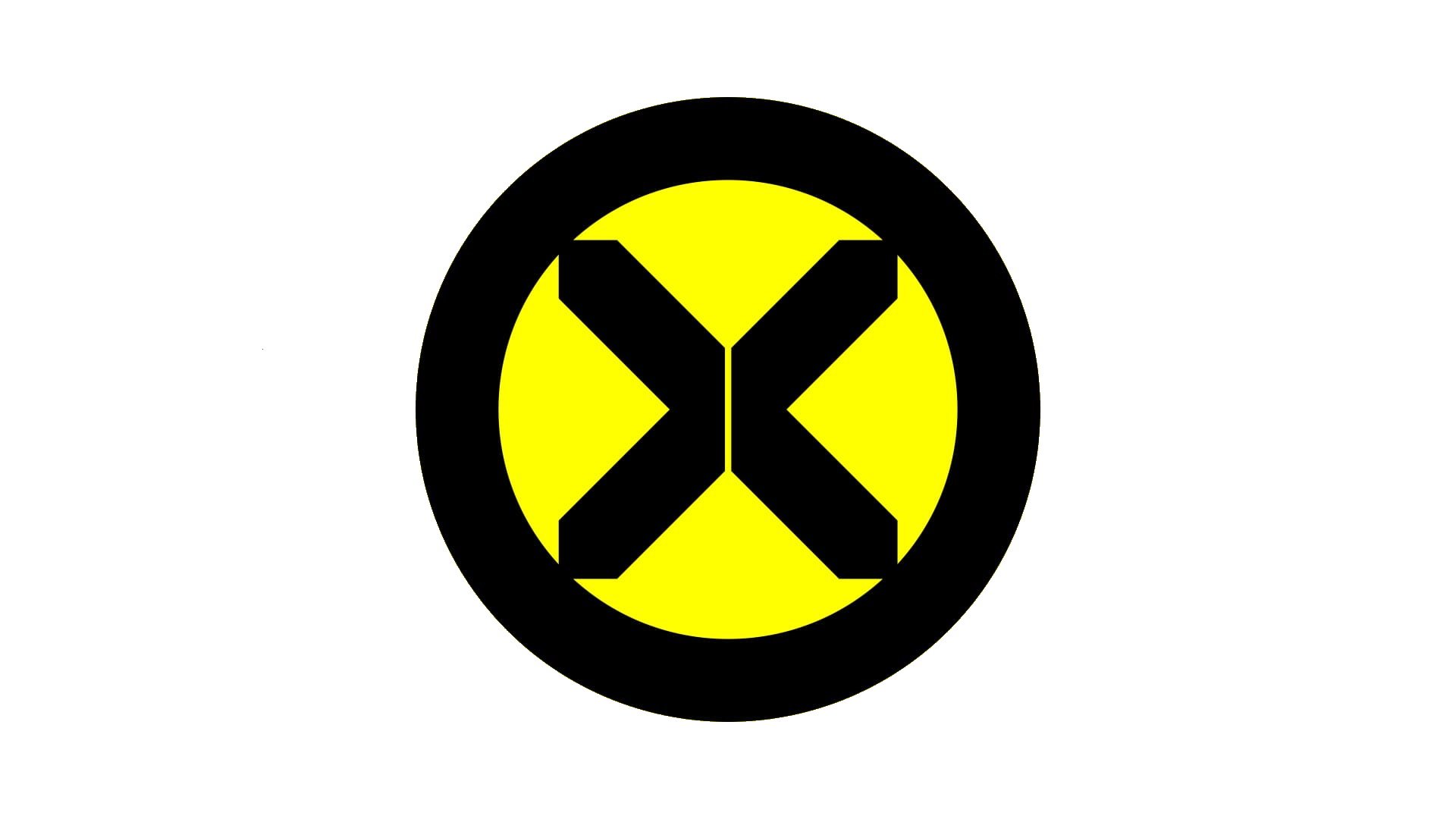
Alongside the various wordmarks associated with the X-Men, there have been a few different symbols. The most commonly-known X-Men symbol features the shape of the X, similar to what we see in the later versions of the comic books, in a bold black circle.
The background in the circle is often depicted in bright yellow.
Different versions of this symbol have appeared throughout the movies, comic books, and animated television shows created for the X-Men. Some feature a more complete “X” shape without the disconnect in the middle, as shown above.
These symbols have been shown in a range of different colors, including black on a red background, blue on a yellow background, and yellow on a red background.
The X-Men symbol we know today was created by Tom Muller in 2019. It’s based heavily on the design of the wordmark used in the latest comic book series.
The X-Men logo: Colors and fonts
While there have been a number of different logos and emblems created for the X-Men over the years, there have been some consistencies between the designs. For example, the “X” in a circle symbol is a common part of the X-Men brand, even if it doesn’t appear regularly in the cinematic universe.
The X-Men are also commonly associated with the colors yellow and black. This separates them from many other marvel characters, who are often linked to shades like red.
The X-Men logos in the comic and movie landscape typically also include a bold, sans-serif wordmark written in all uppercase letters.
If you’d like to explore the X-Men logo in closer detail, you can find some useful resources here:
What color is the X-Men logo?
Since there have been so many different designs and emblems associated with the X-Men over the years, it isn’t easy to define a specific set of X-Men logo colors. Most of the time, the colors associated with the characters are yellow, blue, and black.
However, there have been times when colors like silver and red have also been introduced.
In the X-Men movies, the most prominent color is usually metallic silver, used to depict the sans-serif wordmarks on the title screens.
What font does the X-Men logo use?
Wordmark components have been relatively common in the X-Men branding strategy throughout the years. Though the type of typography used has changed from one publication to the next, the words are almost always depicted in uppercase, sans-serif font.
The exact font used in the X-Men logos in the cinematic universe has varied too. For instance, Bank Gothic Medium is the font most commonly associated with the X-Men font for more recent movies.
The X-Men logo: An extraordinary emblem
Looking at the X-Men logo history, we can see some consistency in the way the characters have been portrayed on the page and screen. Usually, on comic book and movie title screens, the X-Men are depicted with a bold, sans-serif wordmark in all capital letters.
The color of this wordmark can vary depending on the medium.
The X-Men symbol has also evolved a few times over the years. Recently, the X in the center of the emblem has become more disconnected, to appear like two arrows facing each other. This could reference the disconnect between the X-Men and the humans.
Fabrik: A branding agency for our times.

Clarity starts with a conversation.
Thanks—we’ll get back to you shortly.
Whether you're navigating a rebrand, merger, or simply need a clearer identity—we’re here to help. No hard sell, just honest advice from people who know the sector.
Let’s start with a simple question…
Prefer to email? Drop us a line.
Fabrik’s been helping organisations rethink and reshape their brands for over 25 years. We’ve guided companies through mergers, rebrands and new launches. Whatever stage you’re at, we’ll meet you there.