


Symbols with strength: What is an emblem logo and does your brand need one?
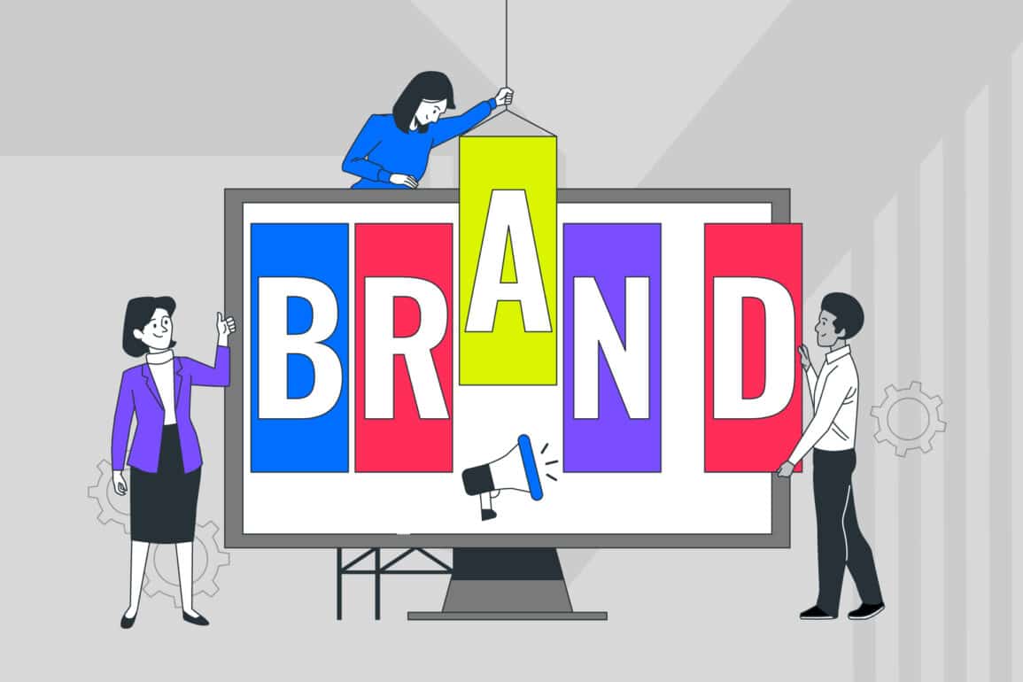
Logos are special. They’re not just a combination of shapes, text, and graphics.
There’s also another component that goes into an amazing logo: meaning. With the right mark, you convey everything your business stands for, your values as a brand, and your heritage too. Logos are distilled insights into your brand essence.
With so many kinds of logo available, from wordmarks to abstract images, it can be difficult to know where to start with your design. The best advice any design expert can give you is this: effective logos are the ones that most authentically represent your brand identity.
For some organisations, showcasing the heart of their company means going back to traditions. An emblem logo is one of the most original forms of brand mark. In a world that’s continually evolving, there’s something to be said for this sense of heritage. After all, even as new ideas emerge every day, many consumers are still more interested in what’s trustworthy and well-established than what’s “new.”
As symbols of tradition, strength, and security, the emblem style logo can spark unique relationships with your target audience. In today’s article, we’re going to dive into the history and definition of the emblem logo and determine whether it’s right for your brand.

What is an emblem and what does it mean to logo design?
You already know that your logo is a visual representation of everything you stand for.
Think of Nike and its iconic swoosh, or McDonald’s and its golden arches.
What many people don’t realise, is that just as there are various kinds of brands, there is also a multitude of logo styles used to define them. After all, a logo is how you generate the crucial first impressions that people have of your business. The same approach won’t work in every industry or niche.
Some companies find that the best way to raise brand awareness is through a font-based logo or “wordmark.” These logos make it easier to spread the name of a company far and wide, and showcase personality through typography. There are other companies that use logos which accurately describe what they do. For instance, you might have seen a painting company using the icon of a paintbrush, or a salon identified by a pair of scissors.
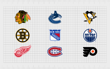
The easiest answer to the question “What is an emblem?” is “another kind of logo.” One of the things that makes the emblem logo so unique is that it’s not necessarily reserved for the corporate world. The chances are you’ve seen emblems dozens of times throughout your life, used to represent sports teams or schools. The iconic three lion’s icon for the England football team is a great example of an emblem. Another option that you may be familiar with is Superman’s logo, which is the family crest for the house of El.
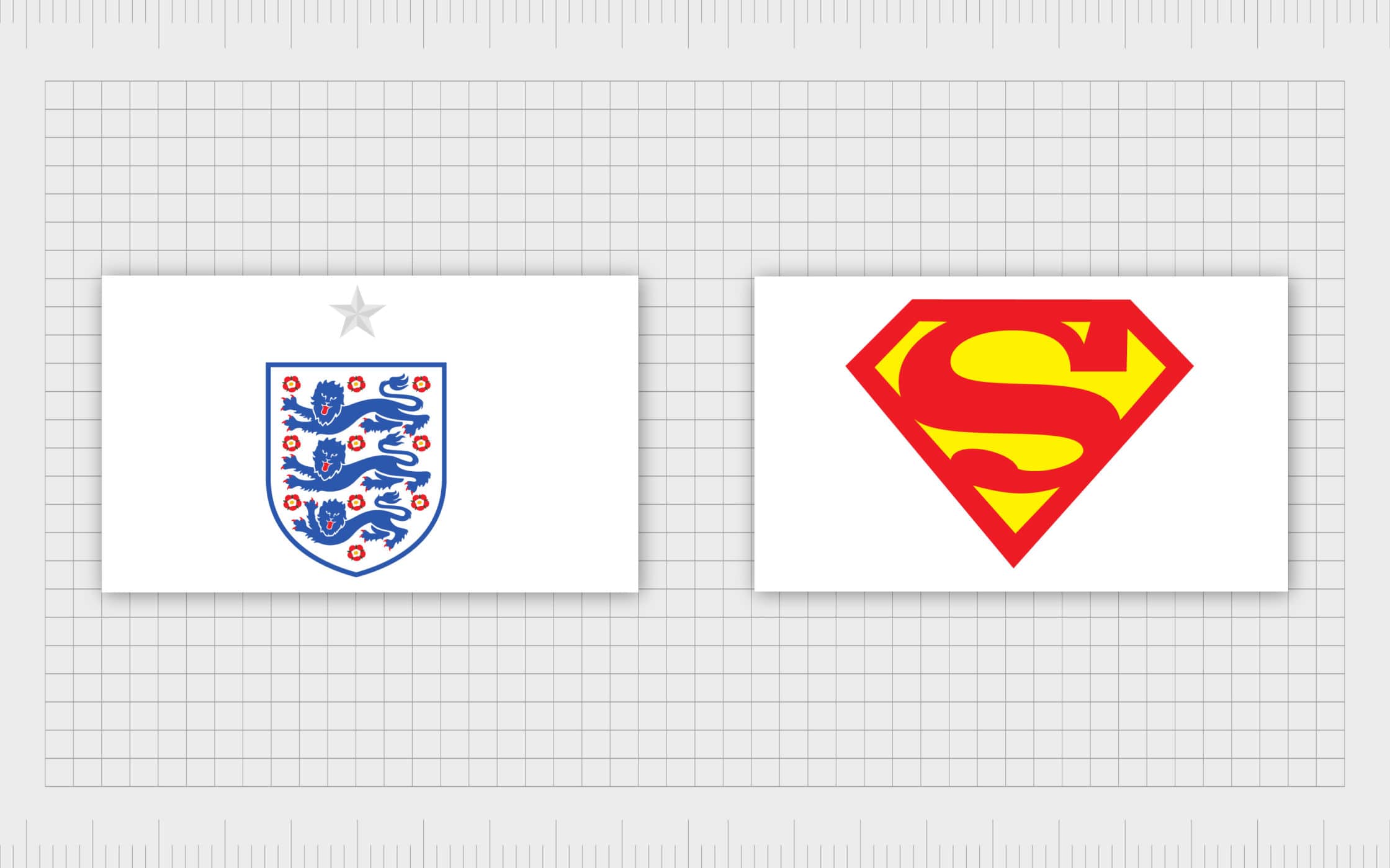
Emblem style logos can appear anywhere because they’re designed to represent powerful universal concepts. For instance, the lions in the England emblem represent strength, royalty, and heritage. Like “combination marks,” the emblem logo uses both text and symbols to convey an idea. However, while combination marks generally separate the text and graphics, the text in an emblem is usually placed inside the symbol, creating one contained shape.
The fact that all the elements in a logo emblem are contained within a single shape means that these marks are often quite compact. However, because they hold a lot of detail, emblems can be challenging to scale into smaller spaces.
Emblem vs. logo: How to choose your brand mark
When it comes to choosing the right mark for your company, the battle isn’t actually about “emblem vs. logo,” as some people think. The difference between a logo and emblem is that one is a specific class of the other. Some of the best logos throughout history have been emblems.
To help you understand the concept of the emblem style logo a little better, let’s start by examining the components of a standard logo. A logo is a combination of visual imagery that symbolizes a business. Some logos include text, some feature graphics and some have a culmination of both.
Great logos don’t just pair design elements together seamlessly – they also communicate the brand’s identity and give depth to an organisation’s status. This means that the type of logo you choose needs to be the right shape, size, and design to match the essence of your brand.
An emblem logo is one of many different styles identified under the broader umbrella term of “logo.” Other options include wordmarks, icons, and symbols. While all these versions of the brand mark contain similar components, they each provide a different look and feel for your company. Since your logo is one of the first things your customers and sponsors will see, you need to make sure you get that first impression right.
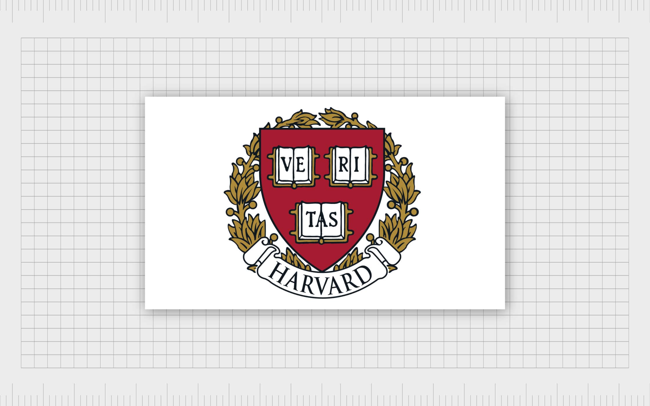
An emblem logo is a highly traditional design. Often, you’ll see combinations of font and imagery within crests, shields, or circles. The inherent heritage of an emblem means that they’re usually the go-to choice for many organisations, schools, and government agencies. For instance, Harvard has its own emblem, which contains the letters for the Latin word “Veritas,” meaning truth:
Emblems promote an instantly classic feel from your logo design. They can:
- Deliver a distinguished, prestigious and scholarly appearance.
- Juxtapose modern and traditional values.
- Create an instant connection to your company’s heritage or history.
- Make customers feel like part of a tribe.
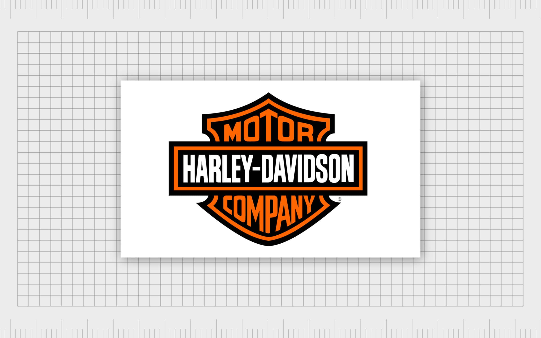
While an emblem style logo is usually traditional in its appearance, some companies have modernised the look very effectively. Think of Starbucks for instance or the Harley-Davidson crest.
The main issue that companies face with this kind of logo design is that the images are often very detailed. Because the name and symbol are so deeply entwined, they’re not as versatile as a standard graphic or wordmark. The smaller your emblem gets, the harder it will be for someone to read. As a rule of thumb, it’s handy to keep your emblem choices as uncomplicated as possible.
Which companies will fare best with a logo emblem?
So, what is an emblem logo good for? Is it the best way to represent your brand?
The simple answer is that it depends on the kind of business you’re trying to create. A logo is just one component of your entire brand identity. Usually, emblem logos are popular choices for organisations that want to evoke a feeling of heritage and nostalgia. The traditional shape and appearance of these logos make them great for communicating deep, intangible values.
If your company has been around for a long time and you want to highlight that heritage, then an emblem is a good choice. Other businesses that can benefit from an emblem style logo include:
- New organisations that want to distance themselves from the competition: If you’re new to your industry, but you want to reassure customers that you know your stuff, a logo emblem communicates this for you. Even just mimicking the style of a heritage brand can be enough to make you seem more trustworthy.
- Companies in specific industries: Emblem logos naturally work well with public agencies, schools, sports teams, and automobile manufacturers. However, virtually anyone can differentiate themselves with this kind of logo. Just look at how Starbucks transformed their image with their vintage-turned-modern emblem.
- Businesses that want to represent safety and security: One of the reasons why the emblem style logo is so popular with car companies is that it conveys a sense of safety. Shields and circles are strong shapes that make your customers feel protected. These symbols surrounding your brand name and other crucial imagery can imply that your business can be trusted. Banks, legal teams and other organisations that thrive off this sense of security may benefit from emblem logos.
As the world becomes increasingly competitive, sometimes it’s the business with heritage that stands out from the crowd. Just look at how popular Roberts Radio is with their vintage styling or Harley Davidson with their long-standing values. An emblem logo is a lot like putting a traditional “seal” on your company.
If you do choose this route, you’ll be in good company. Besides all the government organisation seals and sports teams you can think off, various highly successful companies rely on emblems too. Burger King, Volvo, Mastercard, and BMW all use the iconic emblem design.
What are the key qualities of an emblem style logo?
Need help identifying emblem style logos when you see them on your competitors?
The first thing you need to know about emblem logos is that they’re highly self-contained. As we mentioned above, everything from your text, to certain pieces of imagery go within the surrounding “badge” of the brand mark. Most emblems look a lot like an official badge or seal. Consider the Harley Davidson logo for instance:
From a design perspective, a logo emblem can be a little inflexible. Removing the font or any other elements would destroy the logo, meaning that it’s hard to refine or shrink these images down. This means that it’s important to be careful with the way that you create your emblem logos. A good graphic designer will help you to come up with something that’s as flexible as possible. However, you may still need to think about using an alternative logo if you want to eventually create a mobile app. Emblems won’t work well as tiny icons.
As mentioned above, there are many kinds of vintage and traditional emblem logos already on the market. However, you can use the concept of an emblem design in a bolder, more modern format too. The main features of an emblem are…
1. Bold, easy to read font
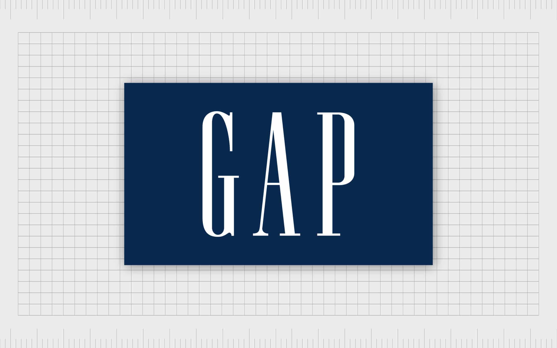
Most emblems include the name of the business within an icon or shape. Because the design is more complicated than a standard word mark, you’ll need to make sure that your typography is clear. Swirly, handwritten fonts are rare in emblems, as is anything that would be difficult to read when it’s shrunk down. A modern or sans-serif text may be the best option. Some companies will choose serif typography to convey traditionalism but be careful. A simple font like the one on GAP’s logo would be a good choice:
2. An uncomplicated image
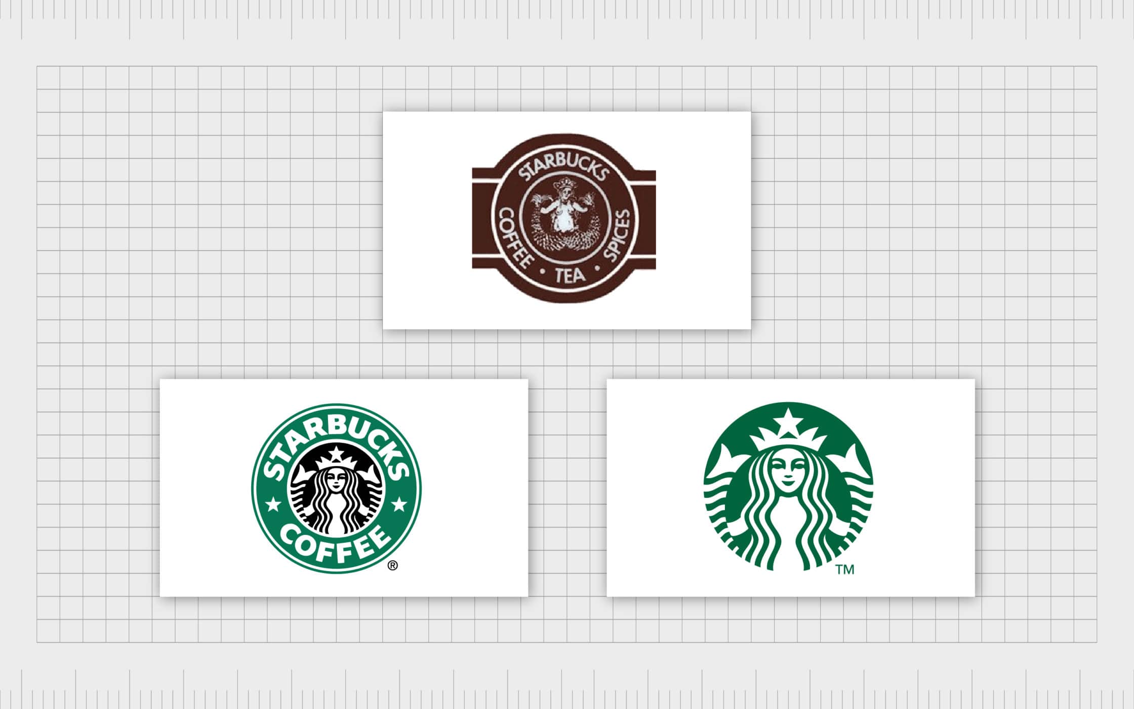
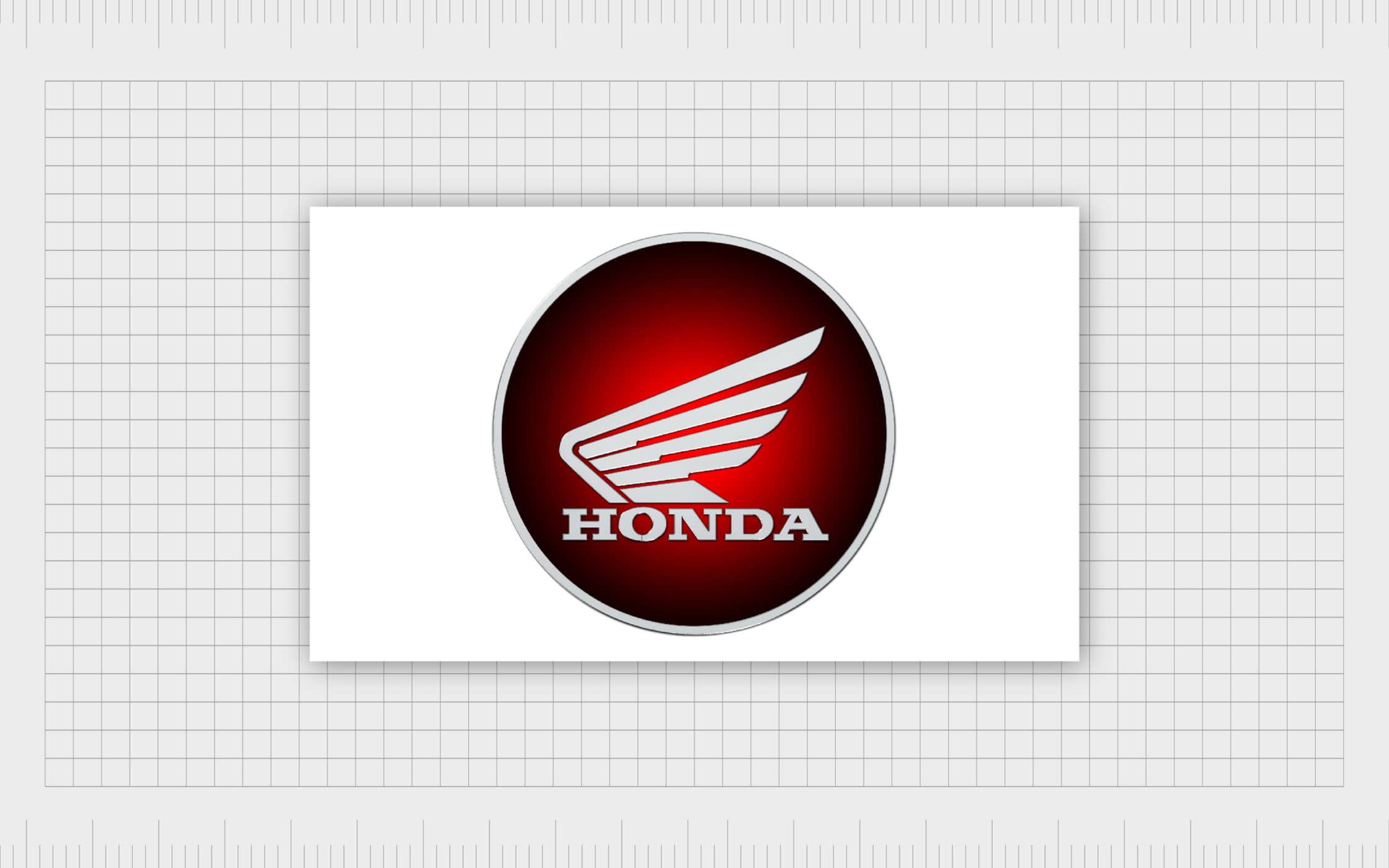
If you decide to include a graphic within your emblem logo, like the Honda motorcycle wings, they need to be as simple as possible. Don’t add any sophisticated elements or little details. This is a lesson that Starbucks learned the hard way over the years. As you look through the coffee company’s history, you’ll notice that their emblem became progressively less complicated.
As you work on your logo think about how it would look if you shrunk it down to the size of a ten pence piece (or a quarter for our US readers). If you aren’t able to see all the essential components, you’ll need something simpler.
3. Find the right colours
Bright and obnoxious colours are very unusual in emblem logos. Even if you take a modern approach to your design, you’ll still want to convey the sophistication of the emblem design. This means that neutral and more subtle shades are often a better choice. Additionally, less dramatic colours won’t distract your customers.
Remember that emblem designs give people a lot of visual information to take in at once. Make sure that the colours you choose represent the kind of company you want to be. For instance, blue shows security, trust, and loyalty.
4. A stamp or shield
Finally, emblem logos must always have an all-encompassing shape. This is the badge or shield that holds all the elements of your brand mark together. Some people choose the traditional shield; others go for a simple circle.
The only real rule is that everything needs to be contained within the same space. Keep your target audience in mind when you’re choosing your shape and remember that each option has a specific meaning. The shield conveys strength and security while a circle represents community and protection.
Emblem logo examples: 5 sensational symbols
Once you know what an emblem logo is, it’s tough to miss them on the street.
Emblems have a unique look. Many are round, and there’s a good reason for this. In the past, wax seals and rubber stamps were used as kinds of personal logos for families. The shape has stuck over the years. Emblem logos are unlikely to use images in the same way as other logos too. Most logo emblems are free from mascots or complex shapes.
Here are some of the best-known emblem logo examples to help with your education.
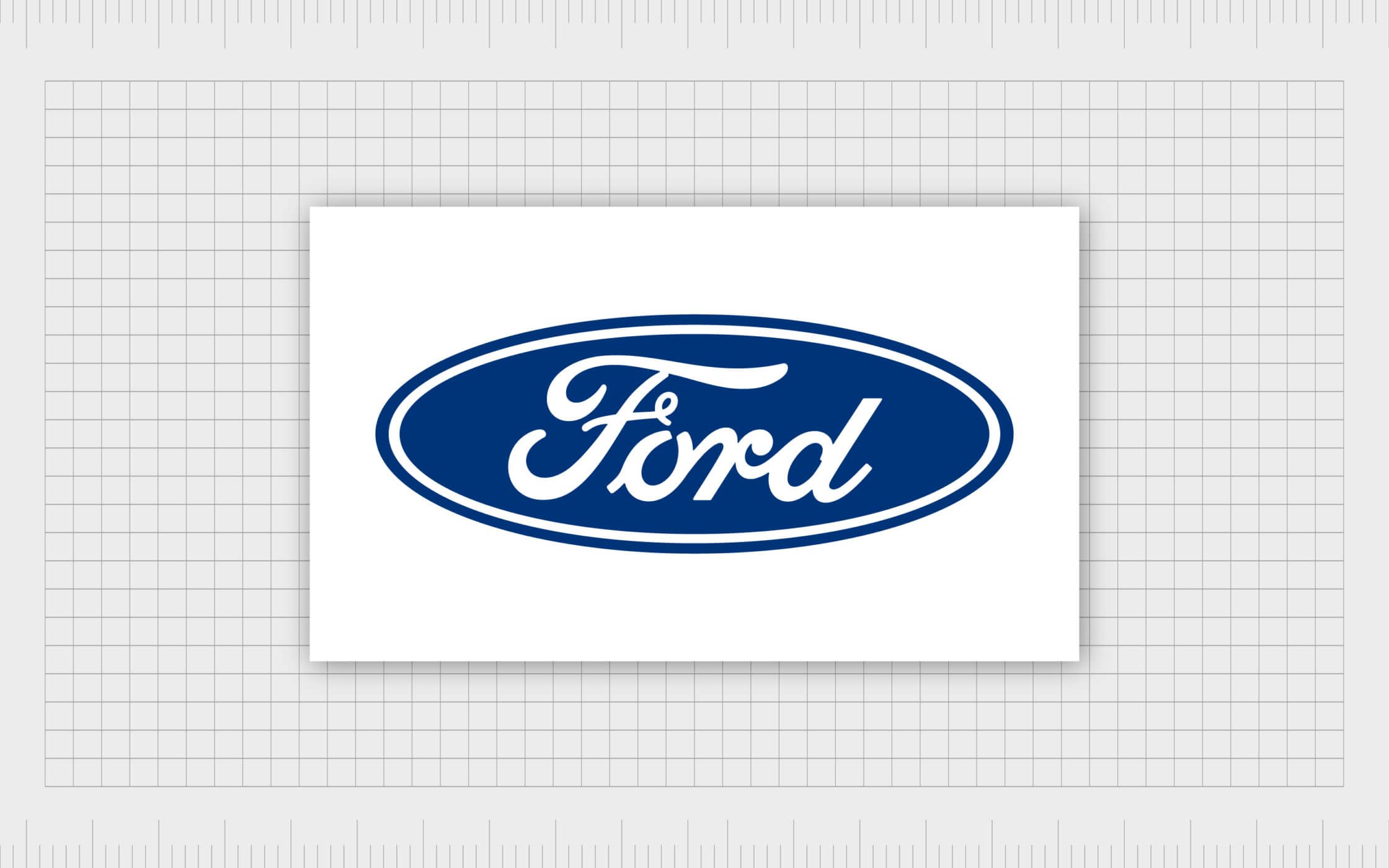
1. Ford logo emblem
Ford was the third automotive company to be founded by Henry Ford. The first company was a failure, and the second went on to become Cadillac later in life. When the first logo was designed for Ford, it was a highly decorated round icon. However, by 1927, the company decided to refine and simplify its image with a refreshed oval-shape emblem. Today, the Ford logo is still excellent at conveying sophistication and style.
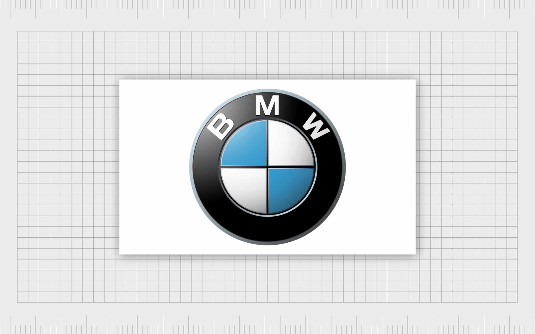
2. BMW logo emblem
You’ll notice that many of the best emblem logo examples come from automotive companies. BMW, a manufacturer synonymous with class and luxury, created its logo from a prototype originally used by the Rapp-Motorenwerke brand. The first BMW logo emblem featured two white and block sections inside a black circle. Although the image has been refined quite a bit over the years, it’s very similar to the original. The most noticeable change came in the year 2000 when the mark received a new 3D effect.
3. Honda Motorcycle emblem
Honda has a different logo for its motorcycles and its cars. The mark that we’re looking at today is the Honda motorcycle emblem. This emblem is a lot more interesting and eye-catching than the standard Honda car emblem (in our opinion). The wings within the logo are credited to Soichiro Honda – the founder of the company.
Apparently, Soichiro was inspired by the wings of the Greek Goddess Nike, the goddess of victory when designing the logo. He took her wings to form the basis of the motorcycle emblem. Since it was first designed, the emblem has jumped back and forth between using a badge format and becoming a standard combination brand mark.
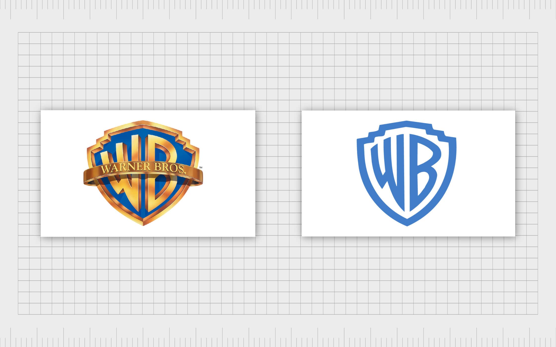
4. Warner Bros emblem
Known to cinema lovers around the world, the shield symbol of Warner Bros. has stuck with the company throughout the years. Probably one of the most widely recognised emblems in existence, the Warner Bros logo dates to 1923. At first, the upper portion of the logo included a picture of the film studio. However, as time has passed by, the organisation has gradually simplified its image. Now, even the “Warner Bros. Pictures” writing has been removed in some iterations.
5. Starbucks
Finally, Starbucks is another exceptional entry to our list of emblem logo examples. Back in 1971, the founders of Starbucks took inspiration for their brand mark from a 14th-century carving. The engraving was of a beautiful mermaid with two tails. At first, the image for the Starbucks emblem was very complicated – something that wouldn’t translate into the modern world. However, over the decades, the logo has been re-designed again and again.
Finally, we have the unique logo that’s so popular and widely spread across social media today. The Starbucks emblem is a useful insight into how bold and modern this traditional style of logo can be.
Need help designing the ultimate emblem logo?
When you first launch a company, it’s difficult to understand the importance of a logo.
However, there’s so much more to your brand mark than a combination of fancy fonts and pictures. Your logo is the most crucial visual identifier that you have. It’s how you create a tribe behind your brand through a single image. Your logo is the way that your new and existing customers identify your business. It’s even an insight into who you are and what you do.
If you think about some of your favourite logos, you’ll see just how meaningful they can be. Every logo comes with its own story, from Apple with its connections to Isaac Newton, to Nike with its goddess-inspired swoosh.
The emblem is essentially the most traditional form of logo you can have. Emblem style logos have been around for many years, since the days of letter stamps and family crests. That’s probably why these marks are still so effective at symbolising tradition and heritage.
If you believe that an emblem logo can help you to convey the history of your brand, then you’re going to need some help bringing your vision to life. Remember, designing an emblem can be tricky because they’re often so intricate. Fortunately, the team at Fabrik knows their way around every shape and style of logo.
Reach out to us today to find out how we can help your business to make its mark.
If you enjoyed this article, you might enjoy these too:
— Font psychology and typography in logo design
— The psychology of shape in the best logo design

Clarity starts with a conversation.
Thanks—we’ll get back to you shortly.
Whether you're navigating a rebrand, merger, or simply need a clearer identity—we’re here to help. No hard sell, just honest advice from people who know the sector.
Let’s start with a simple question…
Prefer to email? Drop us a line.
Fabrik’s been helping organisations rethink and reshape their brands for over 25 years. We’ve guided companies through mergers, rebrands and new launches. Whatever stage you’re at, we’ll meet you there.