


Spiderman logo history: Swinging through time with the Spiderman symbol
Are you familiar with Spiderman logo history? If you’re a movie buff, there’s no doubt you’ve probably seen the Spiderman logo at some point in recent years. The character has been recreated several different times with slightly different brand elements.
Compared to other well-known superheroes, Spiderman has perhaps one of the most iconic brand identities. Not only has the character been depicted with a range of eye-catching fonts and title cards over the years, but he’s also frequently associated with the image of a spider.
Spidey’s symbol has transformed several times throughout the decades, not just in the comic book landscape but in the cinematic world too. If you’ve ever wondered about the evolution of the Spiderman brand, you’re in the right place.
Today, we will be taking a closer look at the Spiderman emblem and all of the supporting elements associated with the Spidey brand.
Does Spiderman have a logo? An introduction
Otherwise known as Peter Parker, Spiderman, or Spiderman, is a superhero created by Stan Lee and Steve Ditko. He’s a character within the Marvel universe and occasionally a member of the Avengers. Originally, he was introduced during the “Silver Age of Comic Books” in 1962.
Peter Parker is an orphan raised by his Uncle Ben and Aunt May in New York after his parents die in a plane Crash. In his origin story, the character gets his unique powers and spider-like abilities after being bitten by a radioactive spider.
He’s capable of clinging to surfaces and ceilings and has superhuman strength, speed, and agility.
Spiderman also has a unique precognition ability known as his “spider-sense,” and he’s able to swing from webs he produces using a wrist-mounted device. After his Uncle Ben dies, Spiderman begins fighting crime throughout New York City.
Interestingly, Spiderman was quite an exciting addition to the Marvel universe. He was the first teenage protagonist to appear in the series as a main character. In recent years, movie adaptations of Spiderman have been created a number of times, featuring various iterations of the character.
Spiderman logo history: A look at the comics
To begin our exploration of Spiderman logo history, let’s start by looking at some of the wordmarks used to depict the character in the comics.
Although Spiderman’s official logo is usually considered to be the spider symbol, the title pages and comic cover designs used throughout the years are interesting to look at too.
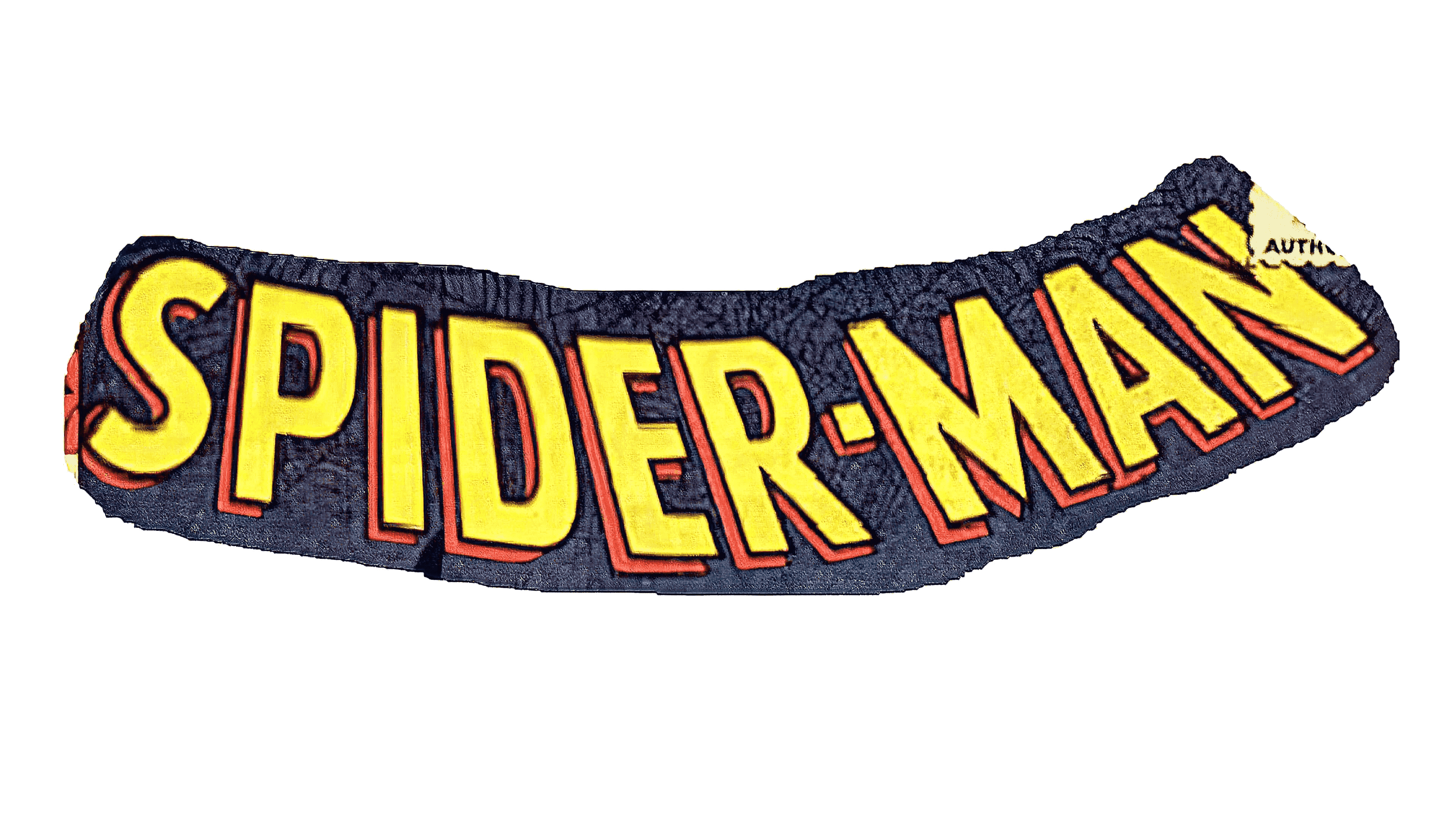
One of the first versions of the Spiderman logo for the comic book collection was introduced in 1963. This wordmark would inspire numerous versions of the design to come. The logo consisted of a single wordmark, written as “Spiderman” in capital letters.
The primary color of the font was yellow, with a red shadow-like background to give it an extra dimension.
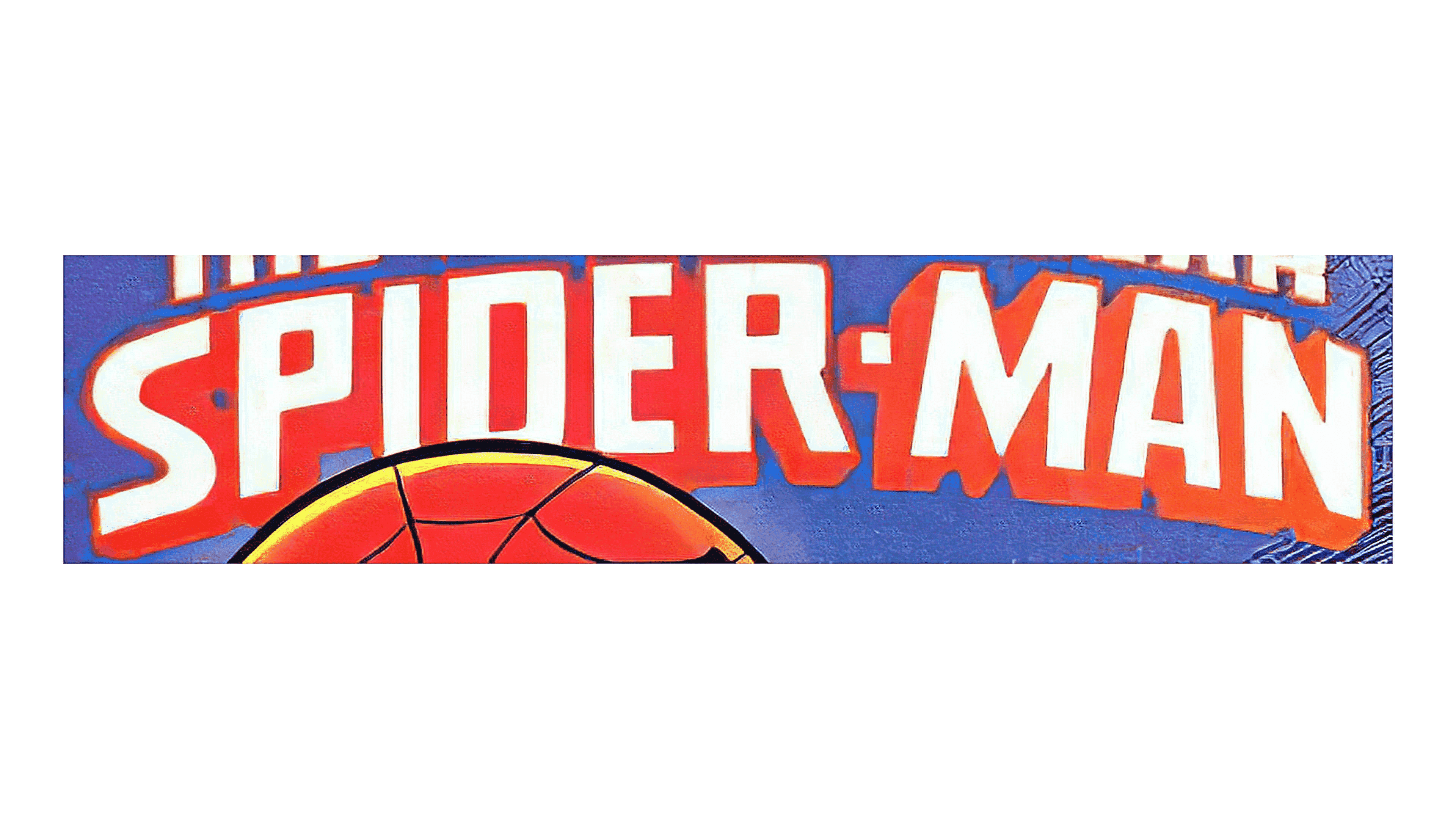
Another version of the Spiderman wordmark was introduced in 1979. The design was still relatively three-dimensional and featured a curve to the letters, which made it pop from the page. In this design, more linear shapes are used. Plus, the yellow coloring has been replaced with white.
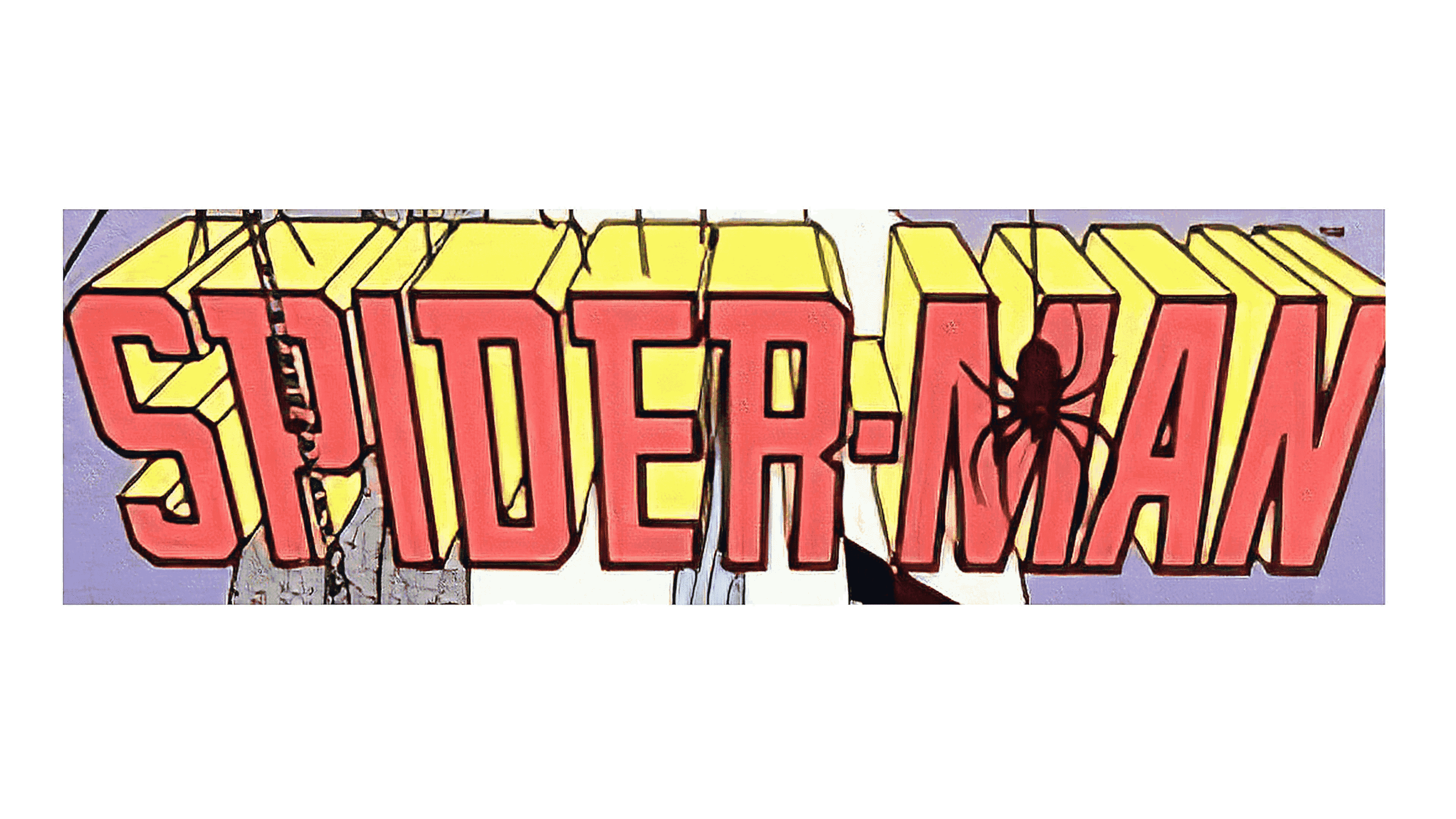
One version of the Spiderman wordmark introduced in 1985 used much bolder lines. This design was far more three-dimensional and made it appear as though we were looking at the title from above. The colors were switched back to red and yellow.
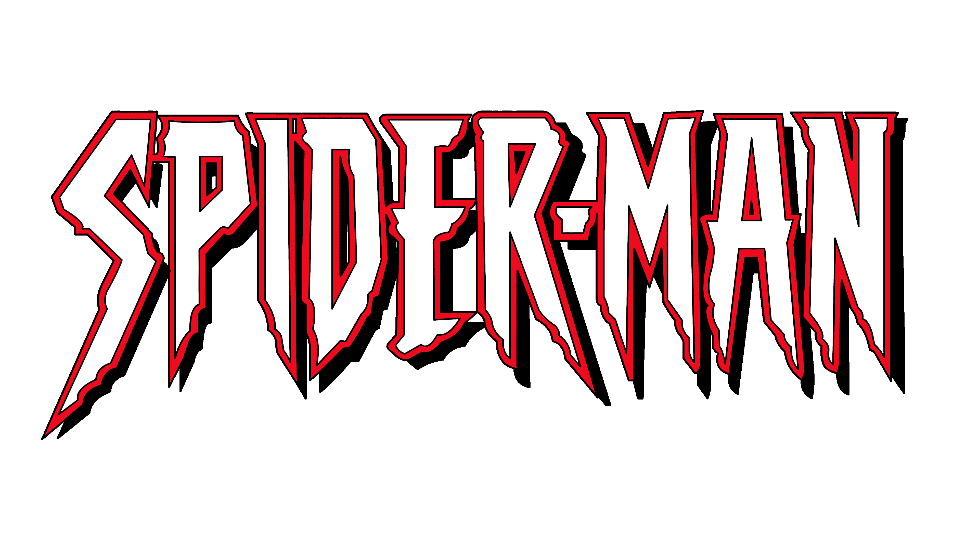
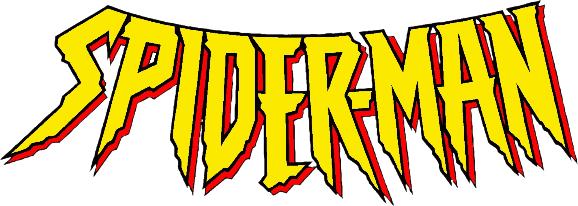
In the ’90s and early 2000s, a harsher version of the Spiderman logo was introduced for television and the character’s animated series. The jagged font choice was intended to remind us of the legs or fangs of a spider.
In some cases, this font was depicted in a straight line, with white and red coloring. In others, it appeared in a yellow and red color palette and was curved. In both instances, the letters had a thin black outline.
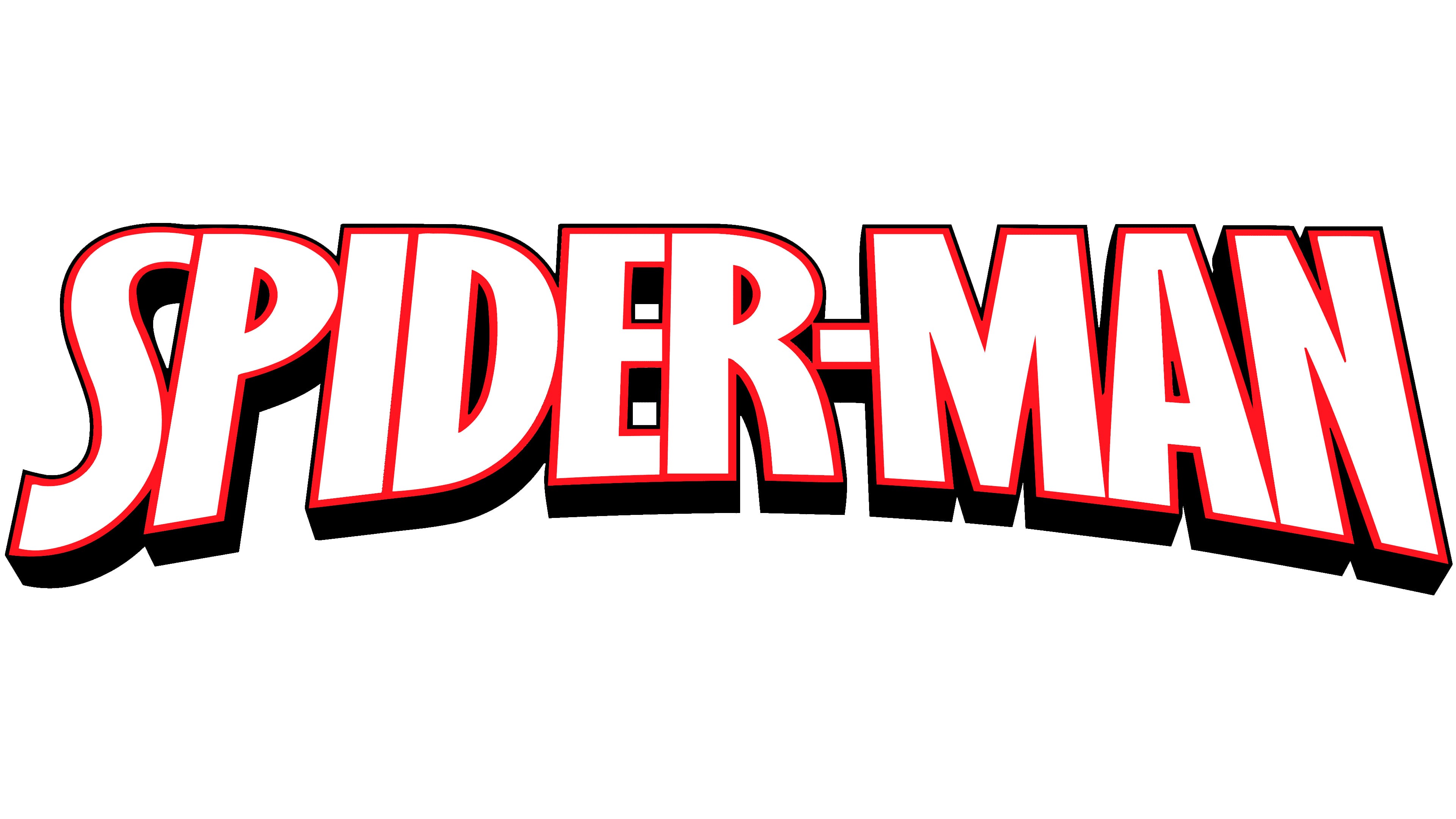
One of the most modern versions of the Spiderman logo appeared in 2005. Here, we see a far sleeker wordmark with none of the jagged edges introduced above. The font, depicted in all capital letters, appears in the colors black, red, and white.
The Spiderman spider logo
While there have been many font choices associated with the Spiderman logo over the years, perhaps the most iconic element of the character’s brand identity is his symbol. On his costume, Spiderman always bares the symbol of a spider, often placed on his chest.
The design of the arachnid has changed throughout the years. It appears in a different format depending on the person playing Spiderman in the movie landscape. There have also been different depictions of various characters in the comic landscape.
Tobey Maguire Spiderman logos
The first movie adaptation of Spiderman featured Tobey Maguire as the lead character.
The design chosen for the Spiderman symbol in these movies was very similar to that used throughout the comic book series. The spider has a very small body and long legs, sharpened at the edges to look almost like claws.
In this version of Spiderman, the title card used in the movies depicted a very minimalist, straightforward font, often in the colors of black or grey.
Andrew Garfield Spiderman logos
The second iteration of Spiderman to appear in the Marvel universe was played by Andrew Garfield. The “Amazing Spiderman” logos were a little different from their predecessors. They often featured a spider symbol with a much more detailed body and longer legs.
The back legs of the spiders appear to be almost bizarrely long.
The font chosen for the Amazing Spiderman logos was a little bolder. It featured geometric, modern glyphs with disconnected elements on the “D” and the “P”. The font was often depicted in white with a black outline or a silvery grey color. In this design, the text is slanted towards the right.
Tom Holland Spiderman logos
The most recent version of Spiderman in the movie landscape is depicted by Tom Holland. This is also the Spiderman who joined the Avengers in recent Marvel movies. The Spiderman symbol associated with Tom Holland is a lot more cybernetic and simpler.
The spider features a larger body with more geometric shapes. The angular design choices give the image a more mechanical look.
The font used in the Spiderman logos for the Tom Holland era is just as bold as its predecessor. However, it’s intended to look a little more three-dimensional. The letters are often depicted in shades of blue, white, and red. There’s also a lot of texture to each glyph.
In the Spiderman No Way Home logo, we can see the image of Spiderman’s face in the “o” of Home, which gives the design a more playful look.
The Spiderman emblem: Colors and fonts
Looking at Spiderman logo history, we can see there have been a number of changes to this character’s branding over the years. The font choices chosen for each iteration of the character have evolved to suit new tastes and styles while also offering an insight into the character.
The Spiderman symbol has also evolved over the years, intended to depict the different natures of each individual playing the titular hero.
For instance, Tom Holland’s spiderman logo looks much more technical and modern. If you’d like to take a closer look at the Spiderman logos and symbols, you can find some useful resources here:
What color is the Spiderman logo?
It’s difficult to define a specific collection of Spiderman logo colors.
Over the years, the designs introduced have included many different shades, including yellow, red, blue, and white. The most common colors associated with Spiderman are usually red, blue, and black, thanks to the unique design of his suit.
However, the Spiderman symbol is often depicted in just red or black.
What font does the Spiderman logo use?
Just as it’s difficult to define a specific Spiderman logo color, it’s hard to determine which wordmark or font choice is most associated with the character. In many cases, the Spiderman logo font chosen for the movie adaptations has been a simple sans-serif solution with three dimensions.
Which Spiderman logo is the best?
Throughout Spiderman logo history, many different fonts and symbols have been associated with the character. Particularly in the movie world, it’s common to find each fan has their specific favorite when choosing the best representation of Spiderman.
Although there have been many changes to the Spiderman visual identity over the years, there have been some consistencies. For example, the use of black and red is common in the Spiderman symbol. The symbol is always the image of a spider, though it’s depicted differently.
Additionally, many of the Spiderman logo fonts used throughout the years have been simple yet bold sans-serif options.
Fabrik: A branding agency for our times.

Clarity starts with a conversation.
Thanks—we’ll get back to you shortly.
Whether you're navigating a rebrand, merger, or simply need a clearer identity—we’re here to help. No hard sell, just honest advice from people who know the sector.
Let’s start with a simple question…
Prefer to email? Drop us a line.
Fabrik’s been helping organisations rethink and reshape their brands for over 25 years. We’ve guided companies through mergers, rebrands and new launches. Whatever stage you’re at, we’ll meet you there.