The Scarlet Witch logo history: Scarlet Witch comics to Wandavision logo
If you’re a fan of the superhero universe created by Marvel Comics, you’re probably familiar with the Scarlet Witch logo. However, while many people know of the most recent “Wandavision logo,” few have a good insight into the full Scarlet Witch logo history.
Scarlet Witch is one of the key characters in the “MCU” or Marvel Cinematic Universe. She’s best known as one of the Avengers. However, she has recently begun to develop more of a reputation as a standalone character, thanks to her transformative television series produced by Disney.
As Disney and Marvel have continued to invest in developing this unique character, interest in the Scarlet Witch visual identity has grown. Here’s what you need to know if you’ve ever wondered where the Scarlet Witch logo began.
Why is Scarlet Witch so special? An Introduction to Wanda
Scarlet Witch is a character created by the Marvel comic book company.
Her real name is Wanda Maximoff, and she was once believed to be one of the mutant children of the character, Magneto. Twin sister to “Quicksilver,” another Marvel character involved with the X-Men, Scarlet Witch, has had quite an unusual character arc over the years.
This superhero is a Romanian Transian sorceress trained by another powerful witch named Agatha Harkness. While working as one of the Avengers, Wanda fell in love with her teammate, “the Vision.”
To form a family with Vision, she used her magical abilities to create two twin boys, but her spell was later broken, and the boys vanished from existence.
Is Scarlet Witch evil?
The trauma of losing her children and her husband led Wanda down a dark path. She attacked the Avengers and went on a rampage to reform the world and bring her family back to life. At present, Wanda is presented as a villain in the Marvel Cinematic Universe.
What does Scarlet Witch stand for?
The name Scarlet Witch has uncertain origins. Initially, the Marvel universe indicated that the title was given to her by people attempting to burn her at the stake. However, in later editions of the comic book series, Wanda reveals that she chose the name for herself after she discovered she had powers.
Why does Scarlet Witch have a headpiece?
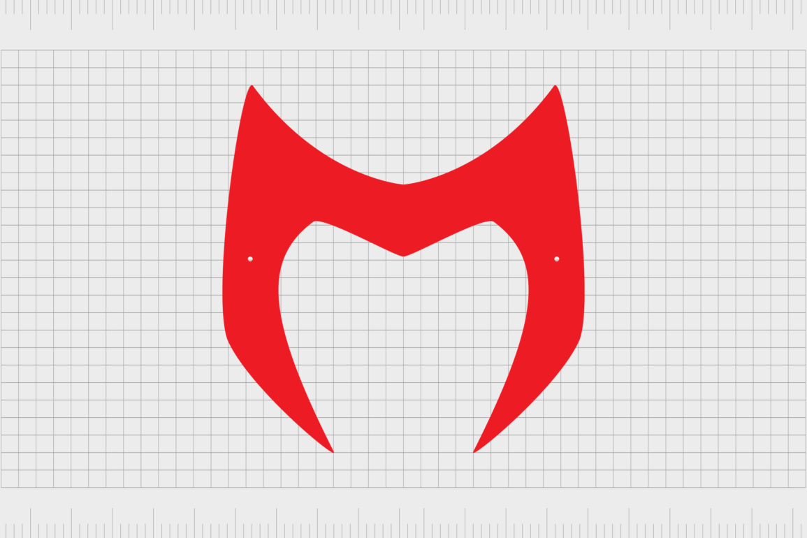
A red crown-like headpiece is one of the most common symbols associated with the Scarlet Witch character. This item is worn as part of her superhero costume, though it has no specific abilities.
Fans of the series believe the Scarlet Witch chose the crown to confirm her identity as the one “true Scarlet Witch.”
Scarlet Witch logo history: The Scarlet Witch comics logo
The Scarlet Witch has only recently begun to develop her presence within the Marvel Cinematic Universe. The character has no standalone movies, but she has a long-standing history in the comic book landscape.
Like many comic book characters created by Marvel, the Scarlet Witch didn’t have a specific symbol associated with her in published volumes. However, the character was depicted using a specific typeface, often featuring curved, stylistic, and feminine elements
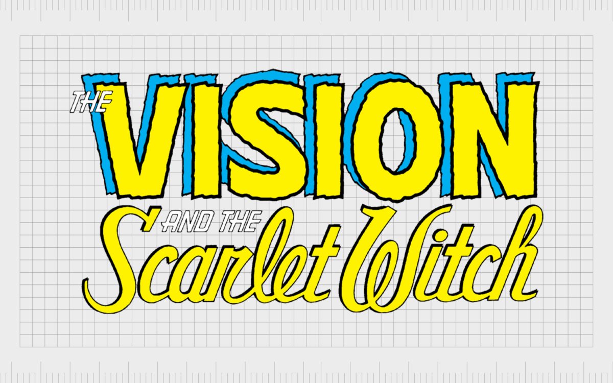
1985-1986
For a year, Comic Books about “The Vision and the Scarlet Witch” were introduced by Marvel with a unique wordmark logo. In this series, the Vision, the husband of the Scarlet Witch, was depicted in a bold, blocky font with a blue, disconnected background.
The name “Scarlet Witch” on this logo was written in a far more elegant font with bold serifs.
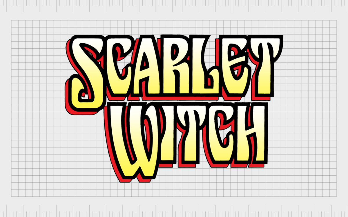
1994
In 1994, a comic book featuring just the Scarlet Witch as the primary character was introduced. The typeface chosen to represent the Scarlet Witch was very different in this edition of the Marvel story.
We still see some of the yellows from the previous design, but it includes a red background, similar to the shadowing used in the “Vision” section of the design above.
The font choice is still quite elegant and stylish, with numerous curves and large serifs. However, in this instance, the glyphs are all in uppercase.
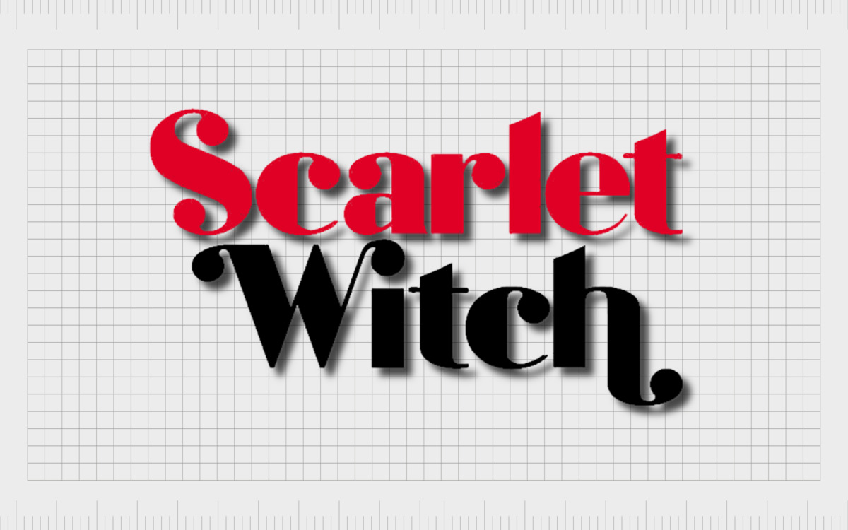
2016
In 2016, a new version of the Scarlet Witch logo was introduced for the Comic book world. Here, the character’s name returned to lowercase glyphs, with just the “S” and “W” in uppercase.
The font style still maintains its signature curves, though many serifs are softer, shaped like small circles. There’s still a slight shadow to the design, making it pop from the page.
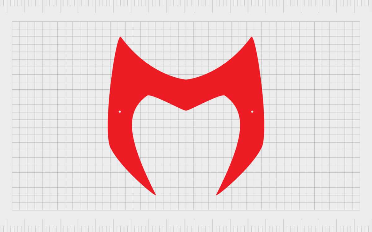
Scarlet Witch symbol: The Scarlet Witch crown logo
One symbol that has become an unofficial emblem for the Scarlet Witch over the users is the “Scarlet Witch crown logo.”
Various designs showcasing nothing but the character’s unique headpiece have been produced over the years, though none have been confirmed as an official logo by the Marvel team.
The Scarlet Witch crown symbol highlights the shape of the character’s headpiece, which curves around her face and points up at the edges, almost like a set of horns.
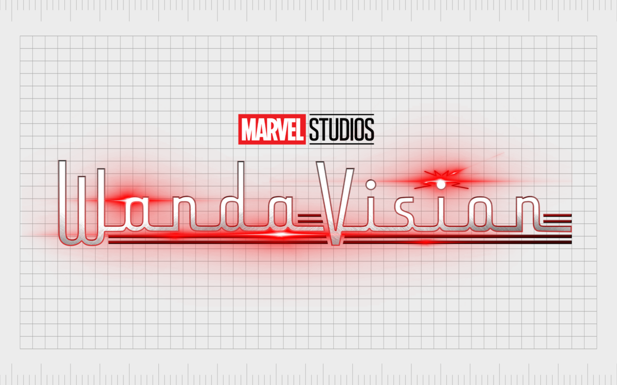
The Scarlet Witch logo in the MCU: The Wandavision logo
Unfortunately, Scarlet Witch has no history in the Marvel Cinematic Universe as a standalone character.
At the time of writing, there haven’t been any official Scarlet Witch movies produced by Marvel, so we can’t explore any movie titles from throughout the years.
However, the character’s visual identity was recently enhanced in 2021 when Wandavision was introduced to the Disney+ streaming channel. This mini-series was introduced as an official part of the MCU and helped to inspire some of the later movies produced by the company.
The name “Wandavision” was chosen in reference to the name of the Scarlet Witch’s character, Wanda, and her husband, Vision. The name is also a reference to “television.”
The series mimics several different television tropes from throughout the decades, showing Wanda and her family in different styles from one episode to the next.
The logo for the first season of the show was created in 2021 and appeared to build on the Marvel color palette of red, white, and black. Retro aesthetics inspired the font choice chosen for the design in reference to the unique plot lines of the show.
The wordmark almost looks like it would belong on the bonnet of a vintage car.
The banner with the stylized inscription depicted in red and white also featured a few red stripes throughout the design, perhaps to represent static or the Scarlet Witch’s powers. The Marvel Studios’ geometric logo is also evident in the design.
The Scarlet Witch logo (Marvel): Colors and fonts
It’s difficult to pinpoint an official Scarlet Witch logo.
While the character is associated with several symbols and wordmarks, she has yet to fully embrace a visual identity of her own. Even the Wanda vision logo appears to be designed more to reference the plot of the show rather than the character herself.
Despite this, we can see some clear examples of a consistent visual presence in many of the assets created for the Scarlet Witch. For instance, the character is frequently depicted using a stylistic font and often appears with the colors red and black.
If you’d like to take a closer look at some of the Scarlet Witch logo assets, you can find some helpful resources here:
What color is the Scarlet Witch logo?
Although many symbols and wordmarks have been associated with the Scarlet Witch over the years, the core components of the Scarlet Witch color palette have remained quite consistent.
Aside from her introductory comic books alongside “the Vision,” the Scarlet Witch has always used the colors red and black in her branding.
Even the Scarlet Witch logo color for the Wandavision design is depicted in red, white, and black. However, this may also be a reference to the Marvel logo.
What font does the Scarlet Witch logo use?
The Scarlet Witch character has been associated with several different typefaces since her inception. Most of the time, the Scarlet Witch logo font choices in the comic book world have been highly elegant, feminine, and curvaceous fonts.
However, in the Wandavision logo, we see a remarkably different style of typeface. The design is still relatively elegant, created in a cursive style, with all of the letters connected. However, it appears to be more retro in nature.
The design is similar to the font “Armstrong” but with some modified contours.
The magic of the Scarlet Witch logo
The Scarlet Witch logo is still in the process of evolving. Like many superhero characters, Wanda Maximoff doesn’t have an official symbol of her own. However, she is commonly associated with her horned crown headpiece.
Perhaps the most consistent part of the Scarlet Witch brand identity is the use of certain colors. We almost always see the shades of black and red associated with the character, both in the comic book and cinematic worlds.
Fabrik: A branding agency for our times.
Clarity starts with a conversation.
Thanks—we’ll get back to you shortly.
Whether you're navigating a rebrand, merger, or simply need a clearer identity—we’re here to help. No hard sell, just honest advice from people who know the sector.
Let’s start with a simple question…
Prefer to email? Drop us a line.
Fabrik’s been helping organisations rethink and reshape their brands for over 25 years. We’ve guided companies through mergers, rebrands and new launches. Whatever stage you’re at, we’ll meet you there.


