


The most expensive logos: Your guide to the most expensive brand logos ever!

The most expensive logos ever created often come with a shockingly high price tag. Many people see logos as a simple culmination of shapes and colors. With that in mind, it’s hard to understand why a company might choose to spend millions on just one image.
However, the reality is the right logo — even an incredibly expensive one — will often pay for itself.
In today’s competitive business world, your brand is the one key element responsible for setting you apart from the competition. No matter how great your products or services might be, your brand identity determines whether you resonate with your audience and generate loyalty.
While there’s more to a great brand than a good logo design, your symbol or business icon is often the first thing customers will see when interacting with your company. It often dictates whether clients pay attention to your brand, and if they decide to interact with your organization further.
The wrong logo design can cause you to lose customers before they’ve ever had a chance to examine your products and services. With this in mind, it’s easier to see why some major companies spend fortunes just to create the right brand image.
Today, we’re looking at the world’s most expensive logos, where they came from, and when it makes sense to spend more on your logo.
What is the most expensive logo in the world?
So, what is the most expensive logo design ever created?
Ultimately, it’s difficult to know the answer to this question for certain. Not every company will automatically share information about its branding costs. However, we can take a closer look at some branding circles to estimate how much some major logos might have cost.
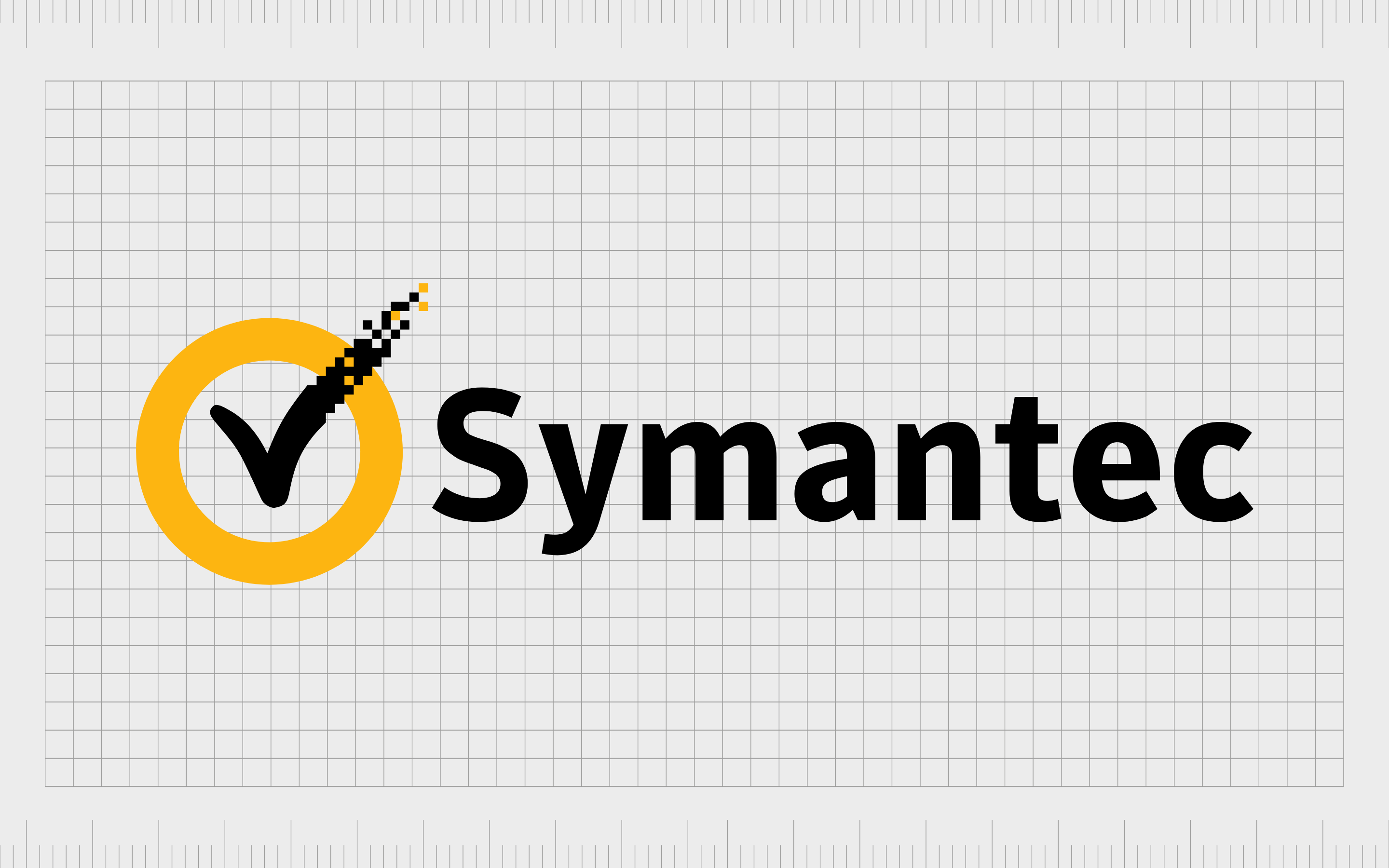
The company usually considered to have the most expensive brand logo is Symantec. People say the technology company spent a massive $1.28 billion on their current branding. However, it’s worth noting this price tag wasn’t specifically for the Symantec logo.
Rather, the number refers to the price Symantec paid for the “VeriSign” brand in 2010. When purchasing VeriSign, Symantec gained control over all of the organization’s ideas, resources, and intellectual property.
This included the existing VeriSign logo — a well-known check mark symbol.
The checkmark created by VeriSign had gained significant acclaim at the time of the buyout. Customers already associated the image with credibility and reliability, making it an ideal addition to Symantec’s branding strategy.
To strengthen their image of trustworthiness, Symantec added the VeriSign check mark to its own logo, and the new version of the brandmark was born.
Since Symantec couldn’t have used the checkmark in its branding initiative without purchasing VeriSign, it’s easy to attribute the full cost of the acquisition to the cost of the logo. However, it is worth remembering there were other elements included in this transaction.
The most expensive logos in branding history
Symantec’s story shows us there’s often more to an expensive logo than paying a designer. Some of the most expensive logos in the world cost millions to access because they came as part of a package deal.
These brand symbols were included in the purchase of an entire brand identity, or business.
While it’s not unheard of to spend thousands or millions of dollars on a logo alone, there are often other factors involved in determining how much a “brand image” might cost.
To give you a better view of some of the most expensive logos around, let’s jump into a top ten rundown of impressive, and expensive symbols.
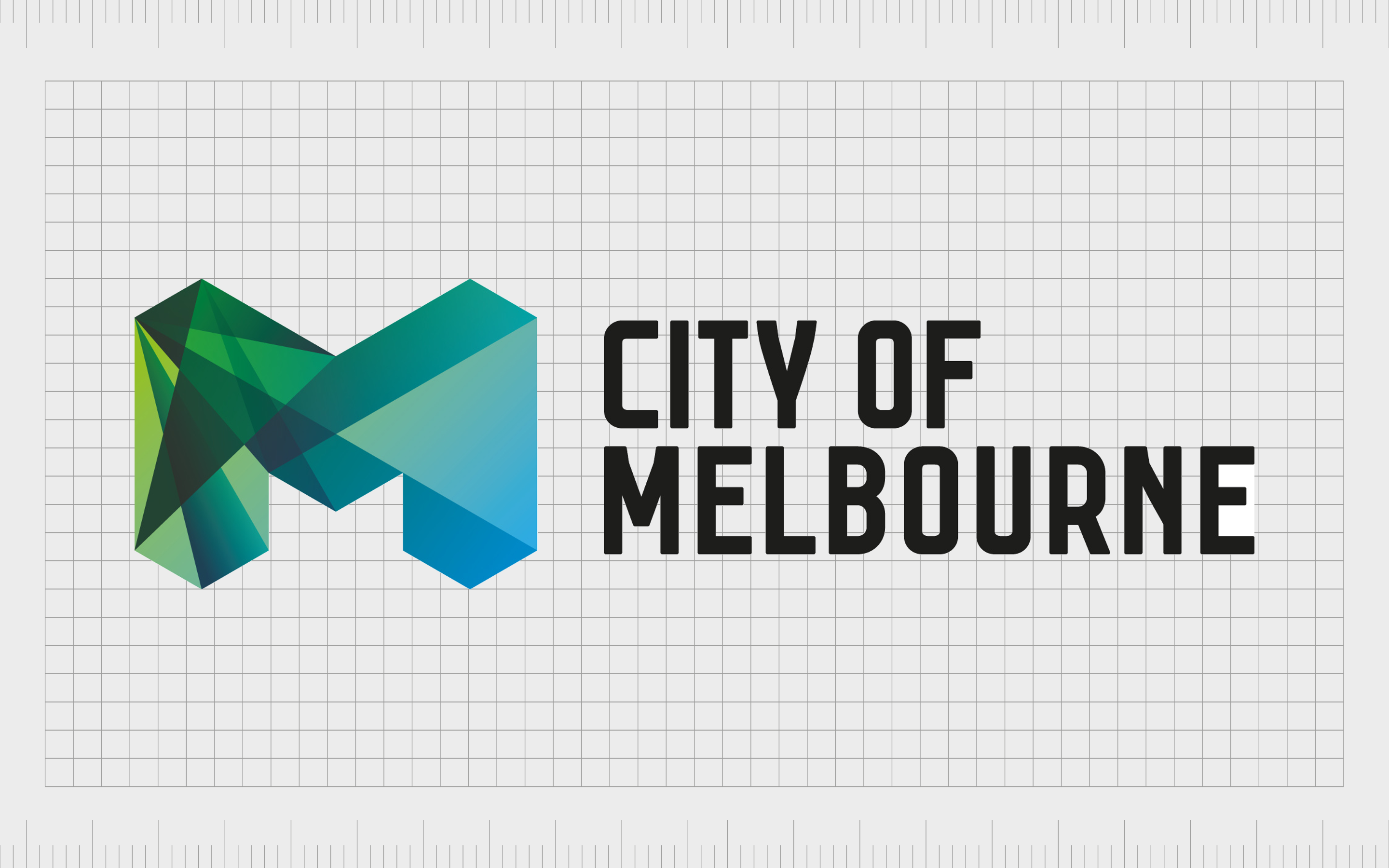
10. The City of Melbourne logo: $240,000
Towns and cities are sometimes more inclined to spend a little more on their logos. After all, the right image for your location can inspire tourism, which often generates millions in revenue every year.
Melbourne decided to update its old-fashioned logo back in 2009, with an artistic-looking “M”.
According to the government group behind Melbourne’s logo design said the city was evolving and needed a new image to help it stand out as a “trendy” and “progressive” location.
The resulting image was created by the Sydney Office of Landor Associates, and actually featured a number of different colors and patterns for the city to choose from.
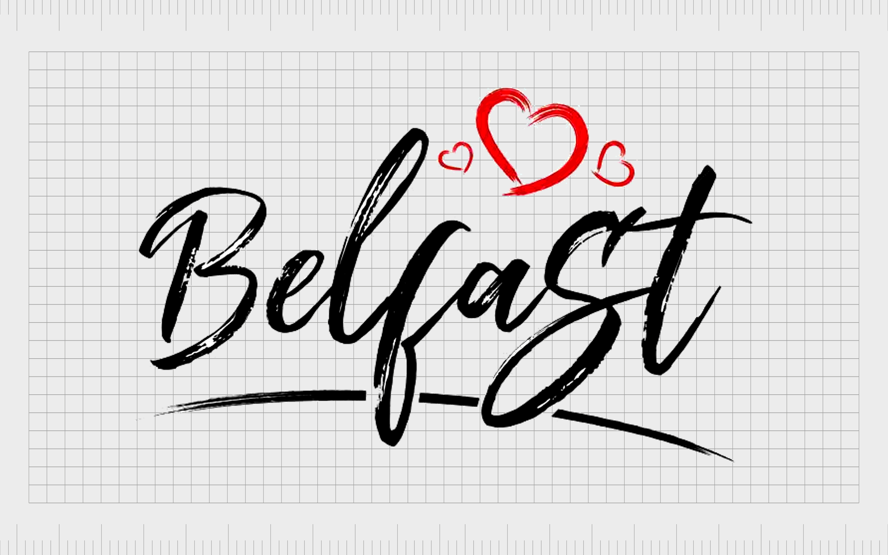
9. The Belfast Heart logo: $530,000
Another example of a city willing to spend a little more on an expensive logo design is Belfast. According to the Belfast Telegraph, the Belfast logo designed in 2008 cost around £430,000 ($530,000), and took 15 months of research.
This simple but effective image took the shape of a letter “B” and combined it with a heart to convey a welcoming and compassionate identity for the city. Notably, the design was apparently chosen as a “Plan B”, after the Lord Mayor of the city rejected the first logo.
Interestingly, Belfast has since updated its logo again. The new image now features a “starburst” shape instead of the heart.

8. London 2012 Olympics logo: $645,645
According to the Guinness Book of World Records, the London 2012 Olympics logo was the most expensive symbol ever created for the Olympic celebrations. Though the design was met with some controversy when it first rolled out, it did become an iconic image for the athletic community.
Costing a massive £400,000 ($645,645), the image was produced by brand consultants Wolff Olins. According to the creator, the inspiration behind the logo was the cubism art style famous in London.
The designer also wanted to remind viewers of the edgy and bold architecture of London. The abstract logo may not have appealed to the public, but Games organizers said it was vibrant and dynamic.
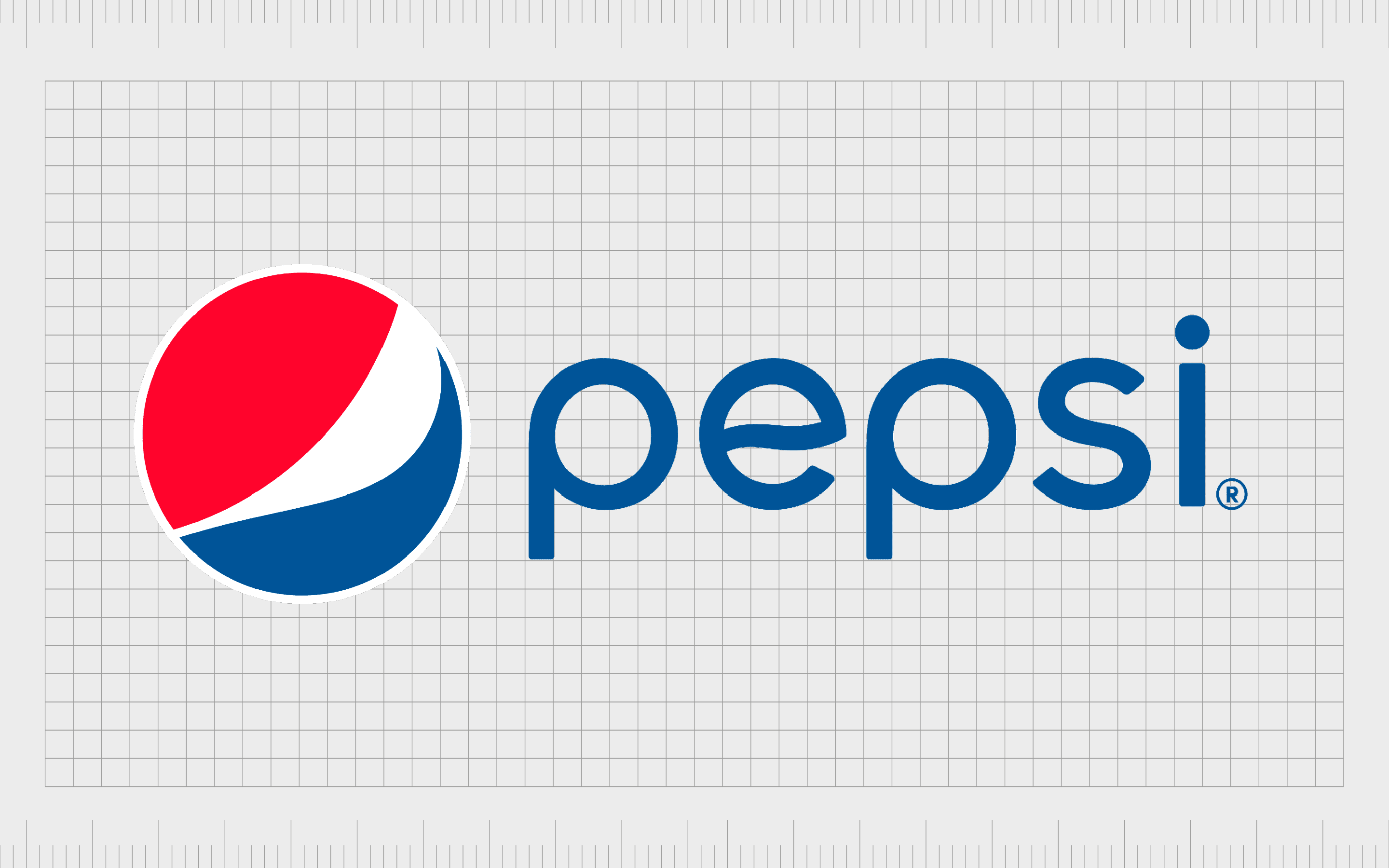
7. Pepsi logo rebrand: $1 million
Our first million-Dollar logo on this list, Pepsi’s redesign earned it one of the most expensive logos of all time.
In the fight to stand out in a crowded market dominated by other well-known organizations like Coca-Cola, Pepsi was willing to pay a lot more for the right logo. Notably, the company redesigned its logo several times over the years, experimenting with colors and styles.
The million-Dollar logo was created by Peter Arnell, from the Arnell branding group. Flat and minimalistic, the image was intended to highlight the modern and laid-back nature of the brand.
Uppercase letters were replaced with lowercase characters, and the curves of the image were refined. While Pepsi’s new logo might not have allowed it to outshine Coca-Cola, it’s widely considered to be a massive branding success.
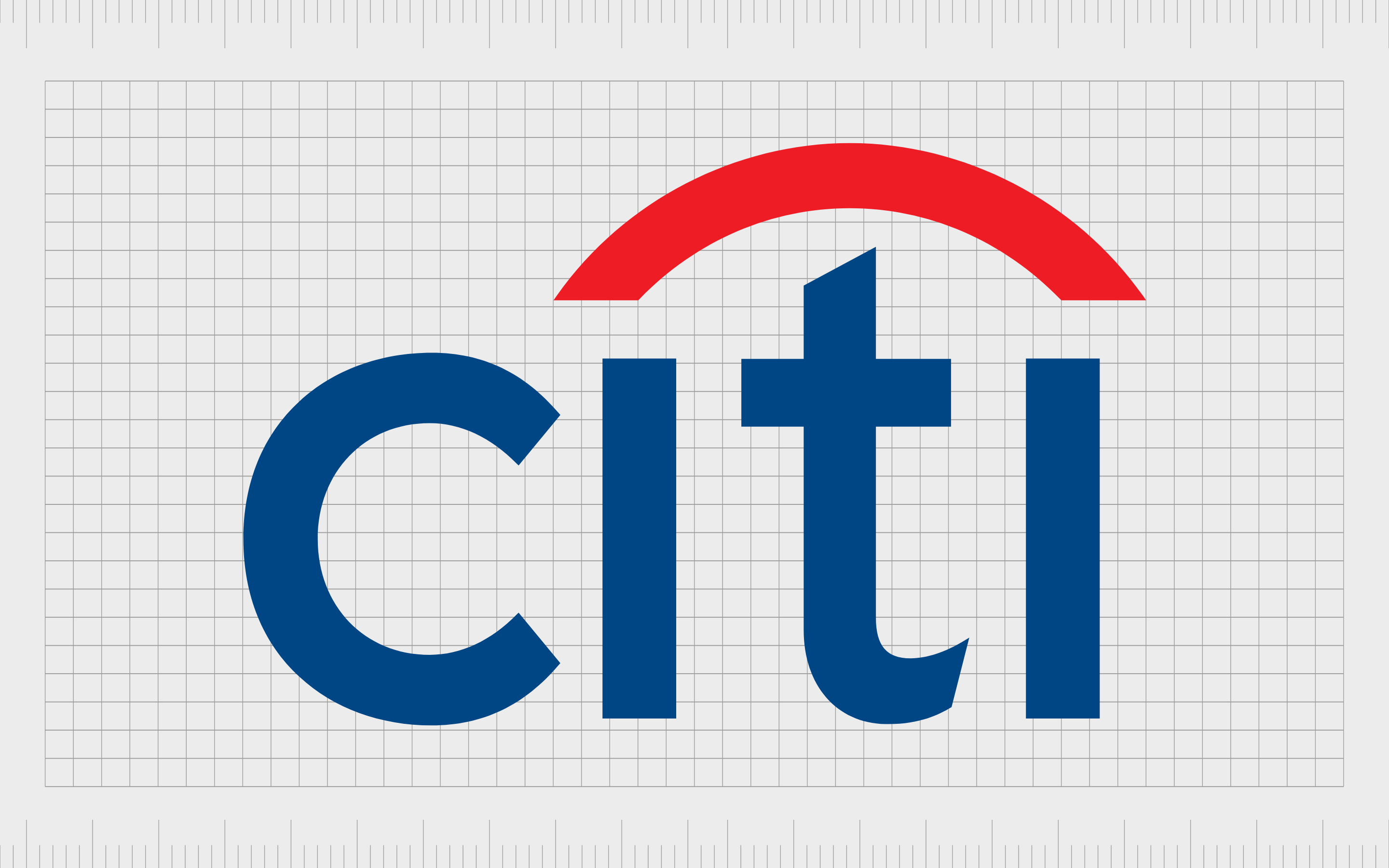
6. CitiBank logo: $1.5 million
Another of the most expensive logo designs in history, CitiBank’s current image cost the business around $1.5 million.
The organization, a sub-division of the Citigroup multinational corporation, has a massive global presence across 19 countries. With this in mind, it’s no wonder the company wasn’t willing to cut any corners on its logo design.
Interestingly, the logo purchase was part of a $10 million brand renewal budget implemented by Citibank when the company wanted to upgrade its image. The simple but effective wordmark was created by the Pentagram company.
Paula Scher initially drew the logo on a napkin, according to some stories, which led to the Citigroup company refusing to pay the hefty price tag for such a simple piece of work. However, eventually, the brand conceded and adopted the new image.

5. BBC logo: $1.8 million
It’s fair to say the British Broadcasting Company’s logo is recognizable among English-speaking citizens all over the world. While the exact price the company paid for its simplistic block-based logo is unknown, estimates range around $1.8 million.
Despite the success of this logo, the BBC actually updated its image again in 2021, spending “tens of thousands” on a refresh.
The refreshed logo, which only slightly changes the typography of the letters, and switches a black box background for a deep grey, has caused some controversy.
Many customers have argued the company shouldn’t have spent so much money on a design which looks so similar to the previous image. However, the BBC stands by its decision.
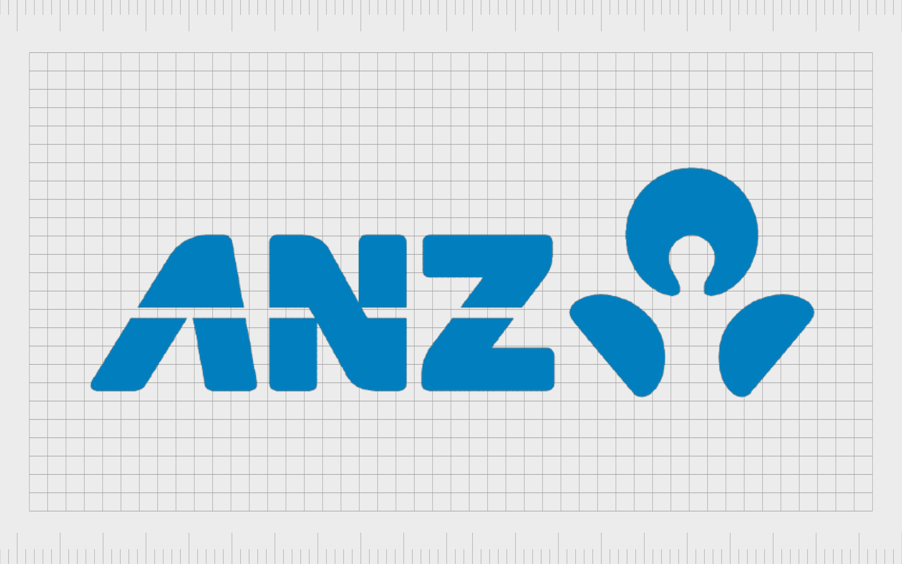
4. ANZ logo (Australian & New Zealand Banking): $15 million
Similar to the Symantec story mentioned above, ANZ’s multi-million Dollar logo was actually a result of two companies merging together.
When the Australian and New Zealand banking corporations joined forces, they needed a new brand image. The design in-use today is simple but effective, with a fun typographic element, and a clean shade of trustworthy blue.
The logo took around 18 months to implement, according to the company, and was created by identity consultant company “Re”. The image features a symbol on the right-hand side intended to look like a person.
According to the business leaders, this was a deliberate effort to make the company appear more human-centric. The organization also conducted significant research to ensure the image would work in any country around the world.
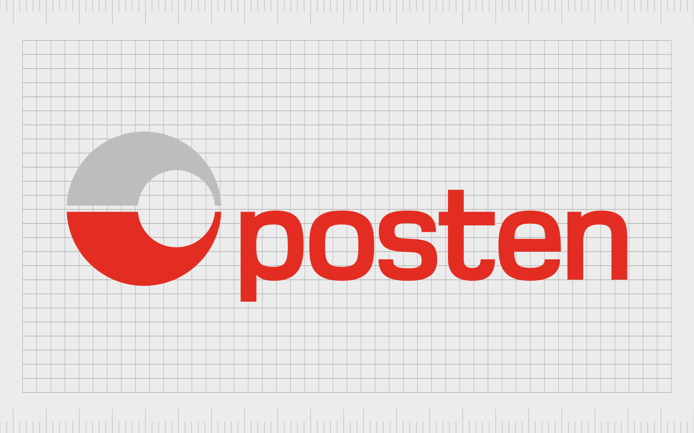
3. Posten Norge rebrand: $55 million
The most expensive logos in the world today come from all over the globe. Posten Norge, a company best-known for providing postal services in Norway, launched a rebranding initiative in 2008 to create its new logo.
The full rebranding strategy apparently cost around 300 million Norwegian Kroner and included the development of various new marketing initiatives.
Posten Norge’s new logo is a simple and clean design, with a lowercase wordmark, and a sphere shape, intended to represent global appeal.
Though many people have been shocked by the sheer price of the logo in the past, the image did successfully help to create positive brand awareness for the organization.

2. Accenture logo: $100 million
Like many of the most expensive logos ever created, Accenture’s image looks relatively simplistic at first glance. The symbol apparently cost the company a massive $100 million dollars and features the name of the business in all lowercase letters, with a tagline depicted underneath.
There’s also an arrow shape at the top of the “T”, pointing towards the right.
The image was apparently created by Landor Associates when Accenture changed its name from Andersen Consulting. The newly-created symbol is intended to highlight the organization’s focus on the future and the development of new, innovative technology.
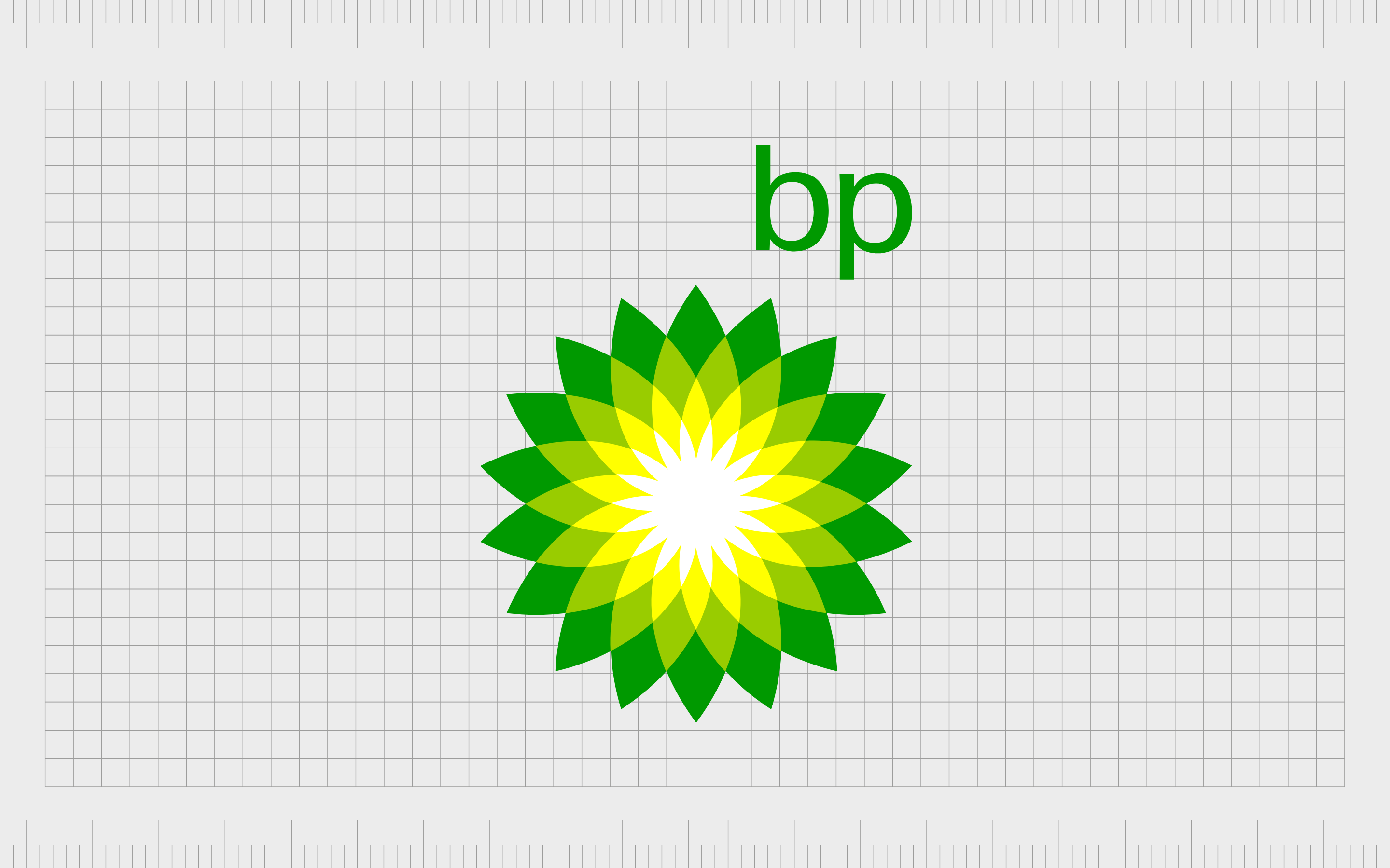
1. British Petroleum logo (and marketing): $210 million
One of the most recognizable expensive brand logos of all time, the British Petroleum logo was intended to help transform the image of the petrol company.
At a time when consumers were becoming more concerned about fossil fuels, BP needed to create an identity as an environmentally-focused and innovative brand.
The new image, which looks a lot like a green and yellow flower, was created by Landor Associates. According to the branding company, the “Helios” mark symbolizes the transformation of the organization, and its commitment to pursuing more natural forms of energy.
Why are logos so expensive?
As you can see from the list above, some of the most expensive logos in the world have cost companies millions of dollars to implement and create. However, it’s worth noting many of the more expensive images offered more to the companies in question than most people realize.
Companies like Accenture, and Symantec didn’t just pay for a new logo, they also purchased all the support, marketing guidance, and branding expertise they needed to completely transform their image.
The price of a new logo can quickly increase when it’s combined with the development of new brand guidelines, or implemented as part of a rebrand.
Expensive logos can include unique marketing strategies, intended to help deliver the new identity of the business to a specific community. Some companies also include the costs of implementing the logo into their existing brand assets in the cost.
Some of the other factors which can contribute to the cost of a logo include:
The scope of the work
Creating a new logo from scratch often requires significantly more work, research and due diligence than simply updating an existing image.
It can also be more expensive to implement a new logo when it’s introduced as part of a brand merger, a company’s decision to change its name, or another transformational initiative.
The agency
Branding agencies and design companies with significant heritage and background in the logo design space can often charge more. The company best-known for producing some of the world’s most expensive logos is Landor Associates.
In many cases, companies are paying for the credibility and expertise of their branding specialists.
The research
The time it takes to research and create a logo can also contribute to branding costs. Most agencies will require payment for all of the work they do in implementing a new branding initiative.
If a logo redesign and implementation take months or years to complete, the costs will quickly add up.
What are the benefits of an expensive symbol?
Many of the most expensive brand logos mentioned above might seem relatively simplistic at first glance, leaving many people to wonder why anyone would spend so much on branding.
While there are plenty of examples of companies with successful logos who didn’t spend a small fortune, making sure you don’t cut costs on your design can be beneficial.
Paying a little extra to work with a specialist on your brand design generates a number of advantages for companies hoping to create a recognizable image.
A well-designed logo by a leading agency can contribute to the growth of a brand, attracting a higher-paying clientele, and boosting business credibility.
Some of the major benefits of an expensive brand logo include:
Expertise
Paying a professional agency to create a logo for your company means you get access to endless expertise and experience in the branding field. You’re not just paying for an artist; you’re paying to work with someone who knows what it takes to create an effective brand.
Alongside your logo design, you’ll also get insights and support to ensure your new image has the right impression on your audience.
Research and due diligence
Experts in branding do the work to ensure your logo can thrive. They can help with making sure your image has the right impact in different parts of the world. They’ll also be able to ensure you can maintain ownership over your logo through trademarks and copyrights.
At the same time, these agencies also work with businesses to ensure they’re choosing colors and shapes which connect with their audience.
Better branding
Often, companies paying a small fortune for a new logo aren’t just paying for logo design on its own. It’s more common to purchase a full branding package, which can include everything from visual guidelines to marketing strategies.
A brand consulting agency can create a new logo, but also show you how to implement this image into a new identity for your organization. This can lead to a much stronger brand.
Multiple variations
Expensive and professional logo design agencies work with companies to create multiple variations of different logos. They ensure you’re absolutely happy with the image you create before they stop working with your team.
These professionals will also create different styles of the logo you choose intended for different formats. After all, you may need a different version of a logo for a smartphone app than you do for a store sign.
Differentiation
Cheap logo creation techniques like using a logo generator mean you generally end up using the same symbols and generic imagery as countless other companies. A truly professional design agency will create something unique, based on a deep understanding of your company and customers.
They get to know your brand, and make sure your logo has everything it takes to leave a lasting impression.
While paying more for your logo can seem difficult when you’re a newly launching business, it can be well-worth the expense. Many of the most expensive logos in the world have successfully contributed to the brand equity of the companies they represent.
Are expensive brand logos worth it?
The most expensive logos in the world have ranged from hundreds of thousands to hundreds of millions of Dollars. The question is, should you really be paying so much for logo design?
There are plenty of alternative options out there, like the Nike logo, which only cost a few dollars to create.
The reality is the cost of a logo won’t guarantee its success. Paying for an ultra-expensive logo doesn’t mean you can rest assured all of your customers will fall in love with the design.
The most important thing you can do is ensure you approach your logo design process correctly.
Forget about budget (where possible) and focus on working with a professional team capable of helping you to convey the unique values of your business in a simple image. Ensure your design is unique and specific to your company and do your due diligence.
You don’t need to buy a million-Dollar logo to be successful in today’s business world, but you do need to understand the true value of a logo, and make sure you’re prepared with the correct budget.
Fabrik: A branding agency for our times.

Clarity starts with a conversation.
Thanks—we’ll get back to you shortly.
Whether you're navigating a rebrand, merger, or simply need a clearer identity—we’re here to help. No hard sell, just honest advice from people who know the sector.
Let’s start with a simple question…
Prefer to email? Drop us a line.
Fabrik’s been helping organisations rethink and reshape their brands for over 25 years. We’ve guided companies through mergers, rebrands and new launches. Whatever stage you’re at, we’ll meet you there.