The Red Devil: Exploring the Daredevil logo history

If you’re familiar with comic books or the Marvel Cinematic Universe, you might know the history of the Daredevil logo. Daredevil is one of the better-known characters in the Marvel landscape, known for his incredible fighting skills and agility.
Similar to many famous superheroes, Daredevil doesn’t have a traditional logo in the same sense we’d expect for a brand or business. However, various symbols and wordmarks are associated with the character, thanks to his depiction in various media.
Today, we will be taking a closer look at the Daredevil logo in all formats, from the symbol on the character’s chest to the wordmark used in the Netflix series. Read on for a closer look at the visual assets of Daredevil.
Does Daredevil have a logo?
Like most superheroes, Daredevil doesn’t have a traditional logo. However, he does have a symbol associated with him, as well as a variety of different wordmarks, introduced in both the film and comic book landscapes.
Before we dive into an exploration of these symbols, let’s take a closer look at the Daredevil character.
Daredevil was introduced by Marvel in 1964. Stain Lee and Bill Everett created the character, with design help from Jack Kirby. Otherwise known as Matthew (Matt) Michael Murdock, Daredevil is a blind attorney who gained special abilities after being exposed to chemicals during an accident.
While growing up in Hell’s Kitchen, Matt Murdock is blinded by a radioactive substance, which heightens his remaining senses. He’s able to perceive what’s going on around him through sound and radar-like abilities.
Additionally, Murdock learned how to fight, often using a set of sticks as his weapons. He fights crime throughout Hell’s Kitchen and has occasionally teamed up with other characters from the Marvel universe.
Why is Marvel Daredevil called Daredevil?
According to Marvel resources, Murdock’s commitment to his studies made him the target of numerous bullies when he was younger. His bullies nicknamed him “Daredevil” when he refused to fight back.
However, the name was adopted by the character as his alias as he began fighting crime. He’s also known as the “man without fear.”
Daredevil logo history: The comic books
Since his introduction into the Marvel comics landscape during the 1960s, Daredevil has been associated with a number of different wordmarks. While the designs of these emblems have changed drastically over the years, many include recurring features.
For instance, throughout the years, the Daredevil wordmark has often used slanting and sizing strategies to convey speed and movement. Many of the designs used throughout the years have also been 3-dimensional, similar to that of many other Marvel wordmarks.
1964+
Throughout the early years, Daredevil’s comic book wordmarks didn’t have a lot of consistency. There were various different styles of the typeface used to depict the character. Many of which were three-dimensional and often included the color red, the character’s signature shade.
However, there were also instances where yellow, white, black, and many other colors were used.
In 1998, the second volume of the Daredevil comic book series started to show a little more consistency. While the wordmarks varied slightly, they almost consistently included a typeface that appeared to have sharp serifs, as well as a three-dimensional element with shadows underneath.
In a lot of the wordmarks used for the Daredevil character, the font appears to be rising up toward the right, giving the design a sense of speed and elevation.
The Daredevil DD logo
Similar to many of his superhero companions, Daredevil also has a unique symbol, often included in the costumes he wears to fight crime. The design is relatively simple here, featuring just two overlapping “Ds” in reference to the character’s name.
The font style chosen for the symbol, which appears on Daredevil’s chest throughout the comic books, has changed slightly over the years. Usually, it features a serif-style font in bright red.
The red coloring of the Daredevil DD logo means it’s often depicted as an outline on the character’s already fully-red outfit. Perhaps the most interesting aspect of this symbol is the way the serifs are depicted on the “Ds” as sharp points.
These points appear to be a reference to the horns on the cowl that Daredevil wears as part of his superhero costume. Horns are often used as a depiction of the devil.
The movie and Netflix Daredevil logo
Outside of the comic book world, Daredevil has started to appear as a cinematic character in the Marvel world. Though the character has yet to receive an official movie as part of the most recent Marvel cinematic universe, there was a film introduced in 2003.
This Daredevil movie didn’t receive a lot of positive feedback from the superhero fan community. However, it does offer an insight into the evolution of the Daredevil logo over the years.
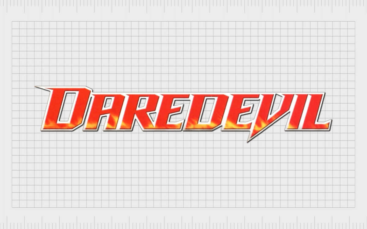
The wordmark used for the title card of the film seems to be based on some of the previous fonts chosen for the comic book character. The elongated “V” and the sharp serifs on the letters remind us of Daredevil’s signature horns.
The color red is also used in this logo, which is a shade commonly associated with the character.
In 2014, Netflix introduced a version of the Daredevil character as part of a series. The logo used for this television collection appears to be a lot closer to the most recent fonts used within the comic book landscape. The design rises up towards the right and features a very similar font.
Though there have been multiple series of the Netflix show, the title card included hasn’t changed drastically. In most cases, it also includes the geometric “Marvel” logo on the top of the wordmark, featured in white and red.
The Daredevil symbol: colors and fonts
The Daredevil symbol, logo, and wordmarks have changed significantly throughout the years. However, there have been some consistencies worth noting.
Fonts associated with Daredevil are almost always serif in style, as they allow for sharp edges on the letters. These sharp edges are often carved into points to represent the horns on Daredevil’s outfit.
Similarly, while the colors used throughout the Daredevil branding landscape have varied, red has been an almost consistent shade.
This color is the same shade used in Daredevil’s superhero costume. In almost every variation of the Daredevil wordmark, we also see a sense of motion, depicted by rising or slanted letters. This is to convey the character’s speed.
If you want to take a closer look at the Daredevil logo, you can find some useful resources here:
What color is the Daredevil logo?
As mentioned above, the Daredevil logo colors have varied somewhat throughout the years. Particularly in the comic book world, artists have experimented with a wide range of different shades. However, the most common color associated with Daredevil is a deep shade of crimson red.
The Daredevil logo color in the cinematic universe has almost consistently been a dark red, sometimes with added shading to give it more depth.
What font does the Daredevil logo use?
Most of the Daredevil logo font choices used throughout the years have maintained a few consistent elements. They’re almost always italicized to depict movement and speed. In many cases, the font glyphs appear to rise towards the end, pushing the wordmark up and to the right.
The Daredevil DD font is a simple serif font with numerous sharp lines and pointed edges. The Daredevil Netflix font is similar to Wolf’s Bane Italic, Fearless, or “The Story So Far.”
Learning from the Daredevil logo
Looking at Daredevil logo history gives us an insight into how a character’s visual identity can evolve and transform over the years. It’s clear in the most recent versions of the Daredevil wordmark that the designers took inspiration from some of the previous fonts used within the comic book series.
The Daredevil logo has transformed somewhat throughout the years, but the wordmarks have almost always conveyed a sense of movement and speed through slanting and positioning. At the same time, Daredevil is frequently associated with red, one of the key shades in his outfit.
The Daredevil symbol and many of the fonts chosen for the character also tend to include sharp serifs in reference to the horns on his cowl.
Fabrik: A branding agency for our times.
Clarity starts with a conversation.
Thanks—we’ll get back to you shortly.
Whether you're navigating a rebrand, merger, or simply need a clearer identity—we’re here to help. No hard sell, just honest advice from people who know the sector.
Let’s start with a simple question…
Prefer to email? Drop us a line.
Fabrik’s been helping organisations rethink and reshape their brands for over 25 years. We’ve guided companies through mergers, rebrands and new launches. Whatever stage you’re at, we’ll meet you there.


