


Your guide to the Mars Bar logo
The Mars Bar logo is an easily recognizable image among any confectionary or candy lover. Like many chocolate pioneers, Mars started off as a small brand. The first Mars logo was established nearly 100 years ago, in 1932. Now, Mars is a name known by fans all over the globe.
The Mars Bar logo is one of the few brand marks in the modern world which has undergone a very small number of changes during its lifespan. Even as different countries experimented with what the Mars Bar should actually be, the logo has remained largely consistent.
For those interested in the history of the Mars candy logo, we’re going to be taking a brief look at the confectionary company’s lifespan, and how the brand image has changed over the years.
Mars chocolate history: An introduction
The name “Mars” actually applies to two variations of chocolate bar, produced by the Mars Incorporated Organization. The first bar was produced in 1932 in Slough, with a little creativity from Forrest Mars Sr. The British version of the bar consisted of milk chocolate, nougat, and caramel.
In America, a different version of the same bar was eventually produced, featuring nougat, and toasted elements, covered in milk chocolate. Eventually, the American version of the Mars Bar was discontinued, after the company added caramel to the recipe.
Later, a new version of the product was introduced, under the new name “Snickers Almond”.
For most of the world, the Mars Bar is an iconic candy bar with nougat and caramel. The same “Mars” Bar most people know elsewhere in the world is actually advertised as the “Milky Way” in the US. This makes sense when we consider the origins of the Mars Bar.
The UK version of the Mars Bar was modelled by Forrest Mars Sr, son of American candy creator, Frank C Mars.
Forrest based his new creation off his father’s famous product, the Milky Way bar, which was already popular in America.
Mars logo history: Mars logos over the years
As mentioned above, though Mars has been producing confectionary items for almost 100 years, it hasn’t made many changes to its brand identity. Notably, the Mars Bar logo isn’t the same as the Mars logos used for the larger parent company “Mars Incorporated”.
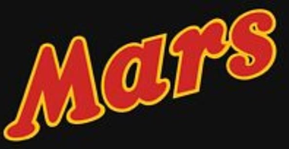
The first version of the Mars Candy logo was introduced with the initial recipe for the chocolate in 1932, and many of the elements from this brand image remain consistent in the most recent version of the logo.
1932
Although many people suggest different variations of the Mars logo may have appeared before the iconic red and yellow wordmark, it’s difficult to find much evidence of the company’s previous brand images.
For most people, the most memorable version of the brand’s image was the slanted serif wordmark, which depicted the name of the candy in bold red letters.
The red lettering with a yellow outline placed on a black background has been a consistent component of the Mars brand identity since its founding. The cursive font of the Mars logo in this variation, like many chocolate bar logos, was intended to convey smoothness and indulgence.
1988
The initial version of the Mars Bar logo remained with the company for more than 50 years. It wasn’t until 1988 when the brand decided to make a modern update to its design. Once again, the wordmark was still the primary focus of the Mars brand identity.
However, this time, the slanting of the letters was reduced, though the word did still angle slightly up and too the right.
The redesign in 1988 adjusted the font slightly, reducing some of the more eye-catching flourishes around the serifs of the letters. The rectangular black banner behind the Mars typography was also replaced by a thick black outline.
Elements of shading were added to the yellow border around the red lettering, to convey a 3D effect.
To give greater impact to the overall logo, the Mars branding team also added a tri-color underline to the wordmark, creating an air of strength and confidence.
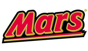
2002
The Mars Bar logo changed for the final time in recent history in 2002. Once again, the company altered the font choice for their wordmark. This time, the serif font was replaced with a more laid-back handwritten typography, intended to look similar to Comic Sans.
The playful and energetic lines of the new Mars typography were enhanced with the addition of more golden gradients around the red of the word mark, with black accents to add further depth and dimension to the letters.
Once again, the black background of the Mars nameplate transformed slightly, this time appearing as a clean black oval.
The resulting brand image created by the Mars team in 2002 is a playful and accessible one, with elements of luxury and indulgence. According to the branding teams, the oval behind the wordmark is intended to have a “cosmic” impact, reminding people of outer space.
Mars Candy logo elements: Mars font and colors
The Mars Bar logo is an iconic brand image for a reason. Though the visuals of the Mars brand identity haven’t changed much over the decades, they’ve successfully adapted to appeal to their chosen target audience, year after year.
Every element of the Mars Bar logo today is carefully chosen to have an emotional impact. The central red font of the wordmark depicts passion and strength, with an air of luxury added via the use of a golden outline.
The playful handwritten typography is excellent for making the Mars Company seem more approachable, while the bold color choices create a sense of power and timelessness.
You can find some great additional Mars Candy logo resources here:
What font does the Mars bar logo use?
The Mars Bar logo font is one of the most important aspects of the overall brand identity. Since its initial introduction into the confectionary marketplace, Mars has relied on a wordmark for its visual identity.
The Mars font has always aimed to show the playful nature and confidence of the brand, while creating a sense of boldness and power.
The font used by the Mars chocolate bar logo today is custom typography created specifically for the confectionary brand. The design is intended to look natural, authentic, and hand-drawn – like someone’s signature.
It’s similar in style to Comic Sans with its playful and bouncy nature, and angles slightly upwards and towards the right.
This carefully-chosen typography is an excellent insight into the Mars brand identity, brimming with fun and creativity. Additionally, the flowing letters help to remind us of the velvety smooth chocolate, silken caramel, and soft nougat within a Mars Bar.
What color is the Mars logo?
The Mars Bar colors have remained quite consistent over the last several decades. Although the exact shading of the Bars Bar logo colors has changed slightly to accommodate a new, more modern landscape, the company has always used variations of red, yellow, and black in its brand identity.
Each Mars Bar logo color was chosen with a focus on creating a specific emotional response in the customers Mars wanted to appeal to. The passionate, brightly-colored red creates feelings of excitement, while the yellow tones convey joy and happiness.
The gold elements in the more recent Mars color palette create a sense of luxury, while the surrounding black oval reminds us of space, and the “out of this world” experience a Mars Bar can offer.
Mars Red
Hex: #bc2731
RGB: (188, 39, 49)
Gold
Hex: #dfad32
RGB: (223, 173, 50)
Celebrating the Mars Bar logo today
Today, the Mars Bar logo is an excellent insight into how a brand can develop, refine, and optimize its identity over the years. Though the Mars Chocolate logo hasn’t changed much in almost 100 years, it has consistently created a powerful and memorable image for the company.
The Mars Bar logo today is simple, strong, and brimming with emotion. Built on bold and powerful color combinations and confident lines, the Mars logo is a wordmark most people will never forget.
Make sure you check out our other Logofiles for more insights into memorable logos.
Fabrik: A branding agency for our times.

Clarity starts with a conversation.
Thanks—we’ll get back to you shortly.
Whether you're navigating a rebrand, merger, or simply need a clearer identity—we’re here to help. No hard sell, just honest advice from people who know the sector.
Let’s start with a simple question…
Prefer to email? Drop us a line.
Fabrik’s been helping organisations rethink and reshape their brands for over 25 years. We’ve guided companies through mergers, rebrands and new launches. Whatever stage you’re at, we’ll meet you there.