Last.fm logo history: A symbol of music discovery

If you’re a fan of the music and streaming space, you’re probably familiar with the Last.fm logo. One of the better-known music websites in the United Kingdom, Last.fm gives consumers access to personal music profiles. But, how much do you know about Last.fm logo history?
The Last.fm emblem has only undergone a handful of changes since first launching in March 2002. What’s more, one of the alterations to the emblem design was so slight, many fans didn’t notice a difference.
However, if we look back through the evolution of the Last.fm symbol, we can see the design has become increasingly more refined over the years.
If you’ve ever wondered where famous streaming platforms got their logos, or how these companies develop a compelling visual identity, you’re in the right place.
Today, we’re going to share everything you need to know about the Last.fm logo design.
The Last.fm symbol: Introducing Last.fm
Before we explore Last.fm logo history, it’s worth examining the brand itself, and its origins. Otherwise known as Last.fm Limited, Last.fm is a music website first launched in the United Kingdom, during 2002.
It was created by Felix Miller, Michael Breidenbruecker, Martin Stiksel, Richard Jones, and Thomas Wilomitzer.
Designed to provide music lovers with access to endless amounts of content, Last.fm uses a recommendation system named “Audioscrobbler” to build a detailed profile of each user’s musical preferences.
The technology collects details about the tracks users listen to on internet radio stations, and portable music devices, to help each individual find the best music for their tastes.
The site previously offered a radio streaming service, but this was discontinued in 2014. Additionally, the ability to access large catalogues of music was replaced with links to Spotify and YouTube streams.
The current site operates as both a music recommendation and social networking service, allowing users to build their own personal profiles to share on the web.
Last.fm logo history: The evolution of the Last.fm logo
So, has the Last.fm logo always looked the same, or has it changed over time? Looking back at Last.fm logo history, we can see there haven’t been many changes to the company’s visual identity.
The most significant alteration to the symbol occurred in 2015, when Last.FM completely changed both the style and coloring of its emblem.
However, there was another, more subtle update to the design which took place during 2008, when the music brand decided to refine its wordmark, and adjust the typeface.
2002
The first Last.fm logo created for the music streaming website was a lot more complex than the one we know today. Rather than sleek, streamlined letters, the company chose to construct characters out of a series of black squares.
Each letter looked as though it was made of individual pixels, giving the overall brand aesthetic a somewhat unusual, and blocky vibe.
The decision to use only squares, with no curved elements, also led to some problems with the design of each letter. The “S” in “Last” is a little difficult to identify at a glance. The “M” is even worse, with one side of the character appearing to disappear into the rest of the shape.
2005
During 2005, Last.fm thankfully decided to change it’s logo, opting for a far more sophisticated wordmark. The blocky font from the previous design was switched with a simplistic, sans-serif font, depicted entirely in a bright shade of red, to convey passion and vitality.
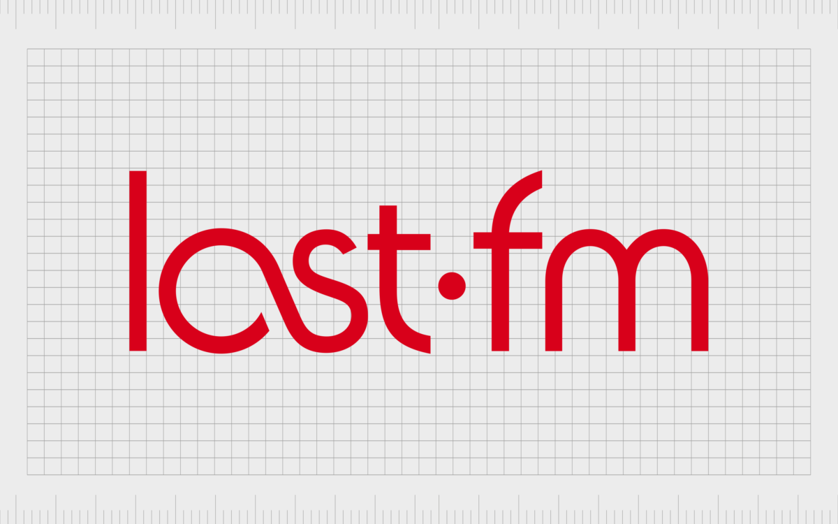
The most interesting part of the emblem was the “as” section in “Last” where the two letters seem to join together to create a unique shape. This symbolizes connectivity, highlighting the social nature of the Last.fm website.
2008
Finally, in 2018, Last.fm made a small, but important change to its logo design once again. In this version of the logo, the typeface has been refined even further. The majority of the letters are still depicted in a simple sans-serif format, although the “m” has an extended line on the left side.
The contours of the letters are a little thicker, and the curves are more pronounced, making each character look a little smoother and more modern. The connected “a” and “s” still remain in this emblem, but the “a” is a little smaller, allowing for greater balance in the wordmark.
Last.FM created a version of this emblem in both black and white, and it’s iconic red color palette. Additionally, the company also produced a favicon for its app, which features only the “as” element in white on a red background.
For a brief time in 2012, a 10th anniversary version of the logo was also introduced, which placed the “as” symbol in the middle of a bubbly depiction of the number “10”.
The Last.fm logo: Colors and fonts
Sleek and creative, the Last.fm logo many of us know today is a world apart from the company’s original emblem. While the first Last.FM logo was blocky and a little difficult to read, the new design is far more refined, modern, and elegant.
It highlights the company’s commitment to connectivity and community, while showcasing ideas of passion and vitality in the red and white color palette.
Though the logo might seem simple at a glance, it’s an excellent insight into the personality and focus of the brand. The connected letters and the smooth shape tell customers they can expect to get a socially focused and streamlined experience from Last.fm.
If you want to take a closer look at the logo, you can find some amazing resources here:
What color is the Last.fm logo?
The current Last.fm logo is available in a couple of different color palettes. The official Last.fm colors are red and white, with the wordmark for the company usually presented in red on a white background.
However, variations of the logo also exist in a monochrome palette, with black lettering on a white background.
There are also instances when these colors are inverted, displaying a white font on a red background. This is the case with the Last.fm favicon logo, for example.
The official Last.fm logo color of red is a deep, evocative color, intended to represent passion and strength. It’s similar to the “Rosso Corsa” shade, with the following attributes:
PANTONE: PMS 2347 C
HEX COLOR: #D51007
RGB: (213, 16, 7)
CMYK: (0.0, 0.924, 0.967, 0.164)
What font does the Last.fm logo use?
The Last.fm logo font is unique to the brand, and one of the most compelling parts of the company’s emblem.The design is unique because it blends two letters together, the “A” and the “S” in “Last” to create a unique shape. This is the same connected shape showcased on the company’s favicon.
The closest you can get to the Last.fm logo in terms of overall visual appeal is the National from Klim font. However, this doesn’t have the exact same features.
What does the Last.fm logo represent?
Looking back through Last.fm logo history, we can see how the iconic music and social media brand has refined and modernized its image over the years.
The wordmark used by the company today might look simplistic at a glance, but it’s a far more elegant and versatile symbol than the brand’s original logo. Additionally, it sends some important messages about the brand.
The red coloring connects with concepts like passion and strength, demonstrating the company’s commitment to helping people pursue their love of music. The connected characters in the wordmarks symbolize community, which is a big part of the Last.fm business model.
Overall, the powerful symbol effectively differentiates Last.fm from the other vendors in the audio space, and introduces us to the company’s unique personality.
Fabrik: A branding agency for our times.
Clarity starts with a conversation.
Thanks—we’ll get back to you shortly.
Whether you're navigating a rebrand, merger, or simply need a clearer identity—we’re here to help. No hard sell, just honest advice from people who know the sector.
Let’s start with a simple question…
Prefer to email? Drop us a line.
Fabrik’s been helping organisations rethink and reshape their brands for over 25 years. We’ve guided companies through mergers, rebrands and new launches. Whatever stage you’re at, we’ll meet you there.


