Capcom logo history: From 8-Bits to modern gaming

If you’re a fan of arcades and gaming, you’re probably familiar with the iconic Capcom logo. A bright, vivid, and engaging symbol of fun and adventure, this logo has captured the hearts of fans for decades. But where did Capcom logo history begin?
Today’s Capcom logo is one of the most recognized emblems in the video gaming industry. Associated with some of the world’s favorite arcade titles, the symbol has become a beacon of fun for gamers worldwide.
However, like many brands, Capcom did spend some time experimenting before it found its unique visual identity.
The Japanese video games developer and the publisher have held onto the same logo since the 1990s, but what happened before then? Here’s everything you need to know about the history of the Capcom logo and its evolution throughout the years.
What does Capcom stand for? Introducing Capcom
Capcom is a Japanese video game developer with a presence across the globe. Launched originally in 1979, this brand is best-known for a number of multi-million-selling franchises. Some of the most successful titles include Resident Evil, Mega Man, Monster Hunter, and Street Fighter.
Mega Man himself, a video game character, currently acts as the official mascot of the brand.
The predecessor to Capcom, the I.R.M corporation, was founded by Kenzo Tsujimoto in 1979 while he was also working for the Irem corporation.
Capcom was brought to life through a collaboration between I.R.M and a Japanese brand known as Capsule Computers, which were both devoted to building electronic gaming machines.
Together, the two brands chose the name “Sanbi” for their new organization. However, in 1983, Tsujimoto established Capcom Limited for the purpose of taking over the internal sales sector of the business.
The name Capcom comes from “Capsule Computers” – a term coined by one of the previous brands for the arcade machines it sold in earlier years.
The first product created by Capcom was the coin-operated arcade game Little League, followed by the brand’s first arcade game, Vulgus. Beginning with the Nintendo Entertainment System, the company eventually ventured into the world of home console video games.
Capcom logo history: The evolution of the Capcom symbol
Despite a relatively lengthy history, Capcom hasn’t made too many changes to its logo over the years. For the most part, the business has relied heavily on the use of a wordmark as its core visual identity.
However, three different designs have been introduced throughout the brand’s history, using different color palettes and updated font choices.

1983
While the typeface for the original Capcom logo in 1983 was similar to the one we know today, the logo was a lot simpler overall. The minimalist banner included bold black writing on a white background with a simplistic black outline.
All of the letters in the word were capitalized, with unusual round elements and thick serif lines.

1988
In 1988, Capcom introduced a slightly more colorful logo, switching its palette from black and white to white and red. The typeface was refined slightly, with letters that appeared slightly somewhat thinner and more elegant.
The font was presented in white on a rectangular red background, with a high degree of contrast. A classic black and white version of the logo was introduced at the same time, similar to the previous design.

1990
The third version of the Capcom logo is the one most people will be familiar with today. This new emblem introduced an entirely different color palette to the previous two.
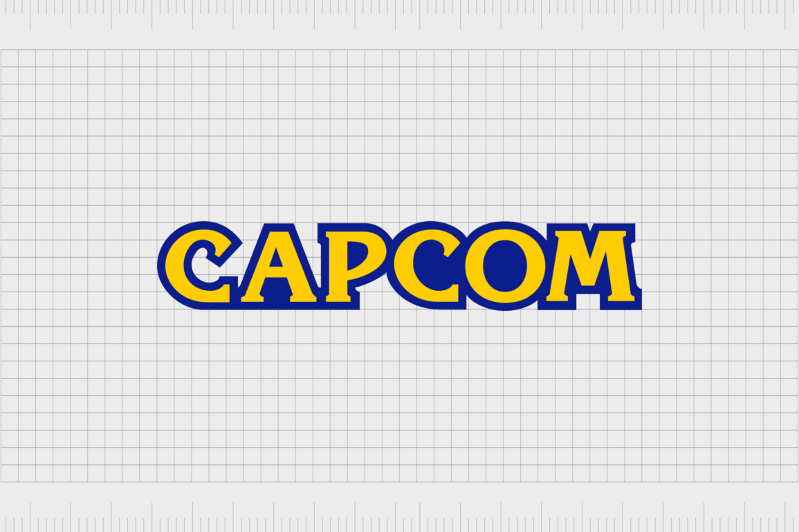
The letters of the “Capcom” wordmark maintained their unique structure, with a little extra refinement, but they were depicted in yellow. The yellow glyphs were then surrounded by a dark blue outline.

Capcom logo variations: The Marvel vs Capcom logo
Alongside the Capcom logos mentioned above, some gaming fans will also be familiar with slightly different designs which have been introduced for specific Capcom products. One of the most famous franchises owned partially by Capcom today is the Marvel vs Capcom game series.
In this gaming series, players have the opportunity to choose characters from either Marvel or Capcom franchises to fight against each other in one-on-one battles.
The logo for this franchise includes both the logos of the Marvel and Capcom brands, presented in a three-dimensional format, with a small amount of shadowing behind each emblem.
The Capcom logo: Fonts and colors
Today, the Capcom logo is a bright, playful, and fun emblem intended to convey the quirky nature and unique personality of the brand. The bright coloring of the yellow font can be connected with ideas like happiness, energy, and joy.
The dark blue coloring, aside from providing contrast, gives the business a sense of credibility and trustworthiness.
If you want to explore the Capcom logo in closer detail, you can find some useful resources for the emblem here:
What color is the Capcom logo?
Although the visual identity of the Capcom logo has only gone through a handful of changes over the years, the business has experimented significantly with its color palette. The Capcom logo colors started off relatively simple, with just a white and black wordmark.
After this, the brand began exploring more vivid color options, such as bright red.
The official Capcom logo color palette today combines a bright shade of yellow with a deep tone of royal blue. The yellow coloring reflects the company’s commitment to energy, creativity, and joy.
The blue outline provides an excellent contrast while also evoking ideas of credibility, trustworthiness, and professionalism.
What font does the Capcom logo use?
The Capcom logo font is one of the core elements of the Capcom symbol design, which has remained relatively consistent throughout the years. The typeface we know today is a refined variation of the very first font introduced for the brand.
It’s similar in style to the Korinna serif typeface, a modern and blocky font with sharp edges and unique curves.
The font choice highlights Capcom as being a highly professional and sophisticated brand with a fun and creative edge. While the serif elements highlight a sense of authority, the quirky elements help to distinguish Capcom as a business attempting to reach a younger audience.
The incredible Capcom emblem
Looking back at Capcom logo history, we can see the famous video game brand underwent several changes over the years before eventually finding the right visual identity.
Although many aspects of the Capcom logo have remained consistent, the brand has frequently updated and enhanced its logo to make it more unique and eye-catching.
Today, the Capcom logo is one of the most recognizable emblems in the video gaming landscape. The bright color palette and the interesting font style, helps to distinguish the company as a highly creative and innovative brand.
Capcom’s logo instantly evokes joy and energy and works well across various platforms and mediums.
Fabrik: A branding agency for our times.
Clarity starts with a conversation.
Thanks—we’ll get back to you shortly.
Whether you're navigating a rebrand, merger, or simply need a clearer identity—we’re here to help. No hard sell, just honest advice from people who know the sector.
Let’s start with a simple question…
Prefer to email? Drop us a line.
Fabrik’s been helping organisations rethink and reshape their brands for over 25 years. We’ve guided companies through mergers, rebrands and new launches. Whatever stage you’re at, we’ll meet you there.


