From graffiti to glam: The story of the Urban Decay logo

The Urban Decay logo is one of the most recognizable emblems in the cosmetics and beauty landscape today. A world apart from many of the elegant and sophisticated designs we tend to see in this space, the badge has helped to distinguish Urban Decay as a forward-thinking, unique, and alternative brand. But where did Urban Decay logo history begin?
Since launching in the 1990s, the Urban Decay brand has maintained a distinctive visual presence, choosing edgy, textured, and somewhat grungy designs to represent their company.
The aesthetic of the company not only helps to differentiate it from other organizations, but positions Urban Decay as a free-spirited personality in the cosmetics world.
If you’ve ever wondered how Urban Decay came up with its compelling brand logo, or you want to know more about how the design has changed over the years, you’re in the right place. Today, we’re going to look at the origins and evolution of the quirky Urban Decay emblem.
What does the name Urban Decay mean?
Introducing Urban Decay
Before we begin exploring Urban Decay logo history, let’s take a closer look at the brand itself. The Urban Decay business, sometimes referred to as “UD”, is an American cosmetics brand, and a subsidiary of the larger French cosmetics company, L’Oréal.
The business first launched in 1996, when Sandy Lerner, a co-founder of the Cisco Systems company, joined forces with Patricia Holmes. The pair decided they wanted to create a beauty company that stood apart from the other competitors in the space, with a grungier, edgier appearance.
Choosing dark color palettes for their logo, as opposed to the pinks and reds common in the landscape, the founders developed a unique identity for Urban Decay.
The name was chosen as a reference to the urban landscape, and aims to draw attention to the beauty we can find in unexpected places.
Not only does the Urban Decay name and logo differentiate the brand, but the company’s color palettes, and the names chosen for each product were unusual too. The first line included a variety of lipsticks and nail polishes, with names like “Oil Slick” and “Rust”.
Today, Urban Decay is well-known as a cruelty-free beauty brand, selling products across a variety of countries worldwide, both online, and through stores such as Sephora, Macy’s and Ulta.
What is the Urban Decay slogan?
Urban Decay has used a variety of different mottos and taglines in its marketing and branding campaigns over the years. Some of the initial logos produced by the brand featured the phrase, “Beauty with an edge”, to highlight the company’s outlandish attitude.
The current motto for the organization is “Pretty Different”.
Urban Decay logo history: The Urban Decay symbol
Over the years, Urban Decay has produced a variety of logos, often focusing on developing distinctive emblems, which set them apart from the other, more refined beauty organizations in their space. The majority of the logos feature wordmarks, produced with bold, blocky letters.
However, in recent years, Urban Decay has begun focusing on more stylish logos, with gothic monograms.
1996
The initial Urban Decay logo produced in 1996 featured blocky, textured white lettering on a black background. The emblem was depicted on two levels, with the “Urban Decay” name on top, and the words “lips and nails” underneath.
The two components of the design featured the same font style, with significant spacing between each word.
1999
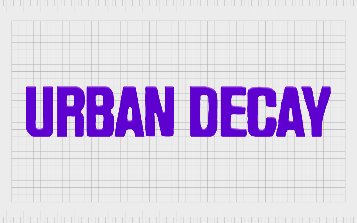
In the late 90s, Urban Decay updated its logo to something brighter, but equally provocative. The letters in the wordmark remained bold, though they were a little larger, and closer together, this time depicted in all uppercase.
The tagline underneath the name of the company was removed, and the color palette was changed to a bright violet on a white background.
The almost neon shade of purple was intended to emphasis modernity, youth, and mystery. This color palette, combined with the textured letters of the new wordmark, helped Urban Decay to retain its identity as a forward-thinking, alternative brand.
2000
Only a year later, in 2000, Urban Decay updated its logo again, refining the contours of the uppercase letters, and switching their color to black. The wordmark was depicted on a soft purple background, with a yellow star shape in between the two words.
In this variation of the logo, Urban Decay also added the word “Cosmetics” beneath their name, spreading the letters out for a sense of balance.
When Urban Decay updated its logo again in 2008, they retained the star image between the two words, but roughened the lines of their letters again, making the wordmark look grungier and more dilapidated.
The color palette was updated once more, featuring both the words, and the star in the same shade of bright purple.
2010
Finally, Urban Decay unveiled its new logo in 2020, with two different color palette options. The design featured the name of the company in a much slimmer style of serif font, with no rugged elements.
The serif typeface gave the company an air of elegance and professionalism it hadn’t had before, particularly when combined with the gothic-style monogram placed above.
The sharpened components of the letters, combined with the flicks and curves in both the “UD” monogram, and the “R” in Urban, gave the business a refined look. This logo now appears both in shaders of dark purple on a white background, and black on white.
In some cases, the colors are also inverted for product packaging and signage.
The Urban Decay logo: Fonts and colors
Looking back at Urban Decay logo history, we can see that while the design of the company’s emblem has changed, its overall essence has remained relatively consistent. The Urban Decay brand has always stood for individuality, self-expression, and controversy.
Over the years, Urban Decay has refused to adhere to the norms of logo design in the cosmetic industry, and encourages its customers to break free from stereotypes too.
The most recent Urban Decay logo combines the company’s edgy streak with a focus on elegance, sophistication, and excellence, helping it to thrive in an evolving market.
You can find some great examples of the Urban Decay logo here:
What color is the Urban Decay logo?
The Urban Decay logo colors have changed a few times over the years. However, for the most part, the company is best-known for its use of the color purple, in various tones and shades.
The official Urban Decay logo color palette can switch between black and white, or purple and white, depending on the situation. In some cases, these colors are also inverted.
For the most part, the color of purple used in the Urban Decay emblem is similar to Russian Violet:
PURPLE
Hex color: #2c1b47
RGB: 44 27 71
CMYK: 38 62 0 72
Pantone: PMS 2695 C
What font does the Urban Decay logo use?
The Urban Decay logo today features two different font styles, one for the iconic monogram, and another for the wordmark. The Urban Decay logo font for the monogram is unique to the company, and appears in a gothic style, similar to the Fette Fraktur font.
The typeface used for the wordmark underneath the “UD” icon is similar in some ways to the Venetian 301 Bold font, though it’s a little sleeker and more refined. It also features an elongated component on the leg of the “R”.
The edgy logo of Urban Decay
Though various designs have been created throughout Urban Decay logo history, the majority of the emblems produced for the brand have focused on highlighting its unique and edgy nature.
The company’s eye-catching and distinctive logo sets it apart from the other more elegant and refined beauty emblems on the market today, while still giving it a clear essence of sophistication.
With its unique color palette, attractive font choices, and compelling positioning, the Urban Decay emblem is a symbol of independence, originality, and confidence.
Fabrik: A branding agency for our times.
Clarity starts with a conversation.
Thanks—we’ll get back to you shortly.
Whether you're navigating a rebrand, merger, or simply need a clearer identity—we’re here to help. No hard sell, just honest advice from people who know the sector.
Let’s start with a simple question…
Prefer to email? Drop us a line.
Fabrik’s been helping organisations rethink and reshape their brands for over 25 years. We’ve guided companies through mergers, rebrands and new launches. Whatever stage you’re at, we’ll meet you there.


