Stila logo history: Sleek and minimalistic branding

Around the world today, the Stila logo is an icon popular among makeup fans, influencers, and celebrities. Sleek, simple, and inherently authentic, the Stila emblem instantly sets the company apart from the competitors in its space.
But what inspired the Stila Cosmetics wordmark, and where did Stila logo history begin?
The Stila Cosmetics logo shares many similarities to well-known makeup and cosmetics brand emblems worldwide. Like many companies, the organization chose a unique wordmark to convey its personality to its customers.
However, the compelling typeface and overall Stila aesthetic have effectively positioned the brand as an innovator in its space.
The Stila brand is best known worldwide as a company committed to empowering women and helping every individual discover their inner beauty.
Today, we will be taking a closer look at the Stila brand identity and the organization’s unforgettable logo.
What is Stila known for? An introduction
Before we begin discussing Stila logo history, let’s start with an introduction to the company. The Stila Cosmetics brand is an American makeup company first founded in 1994. The organization quickly captured the attention of the beauty market, thanks to its famous founder.
Makeup artist, Jeanine Lobell, created the Stila company with a vision that every woman’s makeup should be as unique and individual as her own signature. The name “Stila” was derived from the Swedish word “Stil,” which often translates to mean “Style.”
In 1999, the Stila brand was purchased by another major cosmetics company, the Estee Lauder Corporation.
However, Estee Lauder quickly sold the venture to the Sun Capital Partners group. In 2009, Stila switched hands again after being purchased by the Lynn Titon brand before it was finally sold to the private equity fund Patriarch Partners.
Stila has made a name for itself as an innovator in the beauty space, working in collaboration with a range of other organizations over the years. In 2013, Stila worked with Woodbury University to create the Neo-Tribes runway event intended to inspire actors, influencers, and other creators.
These days, Stila positions itself as a highly authentic and transparent company committed to producing modern, non-intimidating beauty products that anyone can use.
Is Stila a high-end brand?
Stila has never positioned itself as a luxury brand in the cosmetics space, despite previously being owned by high-end companies like Estee Lauder. The company believes in producing products with luxury ingredients available for affordable prices.
However, the organization has worked alongside various well-known designers and influencers on impactful collections.
Stila is a green, clean, and cruelty-free company committed to working with sustainable suppliers and minimizing the use of chemicals in its products. The cosmetics line is popular in regions around the world, though Stila still identifies itself as an American company, first and foremost.
Stila logo history: The eye-catching Stila emblem
Since launching in 1994, Stila has only produced a single official logo, which has never been significantly changed or updated. However, various variations of this emblem have appeared throughout the company’s branding and marketing campaigns.

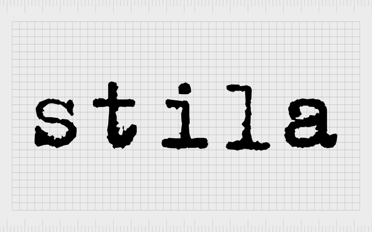
The Stila Cosmetics logo features the name of the company, written in all sans-serif characters in lowercase. The letters are somewhat textured in most cases, replicating the style you might expect to see on an old-fashioned typewriter.
Each character has been positioned carefully to deliver an exceptional level of balance and a sophisticated finish.

In most cases, the Stila Cosmetics logo appears in black on a white background, with no accompanying elements. However, there have been instances of the logo produced for packaging and branding purposes, which convert the black wordmark into a golden emblem.

When using a golden color palette, the company retains the texture in the letters of its wordmark but gives them a slight gradient, intended to make the characters look as though they’re shining.
Variations of the Stila logo have also been developed with letters that make the wordmark look almost three-dimensional, although each letter has been crafted from liquid metal.
Certain variations of this logo have also included slogans or taglines, such as the words “Smart, Beautiful, Original,” often depicted in a contrasting script-style font.

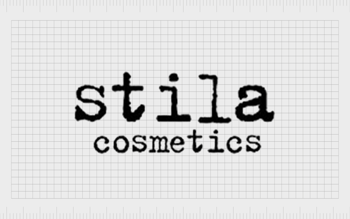
In some instances, the Stila logo also features the word “Cosmetics” underneath the primary wordmark to help identify the company.
Usually, the Stila Cosmetics logo features the word “Cosmetics” in a matching typeface to the primary wordmark. However, there have also been variations of this logo produced, which use a contrasting sans-serif type.
The Stila logo: Fonts and colors
Although there have been numerous variations of the Stila Cosmetics logo produced throughout the years, the official emblem of the company has remained consistent.
Since the brand began, the word “Stila” has always appeared in a gritty, sans-serif font, intended to replicate the style of letters produced by an old-fashioned typewriter.
The carefully balanced characters in the wordmark, combined with their unusual, textured appearance, help to distinguish the brand as an innovative, creative company.
The Stila wordmark looks beautiful authentic, and modern, giving the company an edgy aesthetic that appeals to a younger audience.
You can see some examples of the Stila logo in the resources below:
What color is the Stila logo?
Officially, the Stila logo color palette used in most of the company’s branding and marketing assets consists only of black and white. The black-and-white color palette is a common choice for many professional beauty and cosmetics brands because it conveys sophistication and elegance.
These colors are also easy to convert into a range of different mediums, making them great for packaging.
While the Stila logo typically uses black font on a white background, there are numerous versions of the emblem which also invert these colors. You may see the Stila wordmark in white on a black background used on lipsticks and other beauty products.
The official Stila logo colors can also include shades of gold. Many products feature the Stila wordmark in a metallic gold shade.
What font does the Stila logo use?
The Stila logo font is perhaps the most interesting component of the beauty brand’s visual identity.
The font style is similar to something we’d expect to see produced by an old-fashioned typewriter. All of the characters are depicted in lowercase, with plenty of spacing between them and textured edges.
While the Stila Cosmetics font is unique to the brand, there are various typewriter-style fonts that can create a similar effect, such as the FF Trixie typeface or IHOF Typewriter.
The Stila Cosmetics logo: A lesson in minimalism
While other beauty and cosmetics brands focus heavily on conveying sophistication and professionalism in their logos, Stila has taken a different approach. This company’s eye-catching emblem uses a gritty, textured font to give the brand an edgy aesthetic.
The typewriter-style font in the logo makes the company look more authentic and friendly while also helping to distinguish it from the other wordmarks in the cosmetics space.
Fabrik: A branding agency for our times.
Clarity starts with a conversation.
Thanks—we’ll get back to you shortly.
Whether you're navigating a rebrand, merger, or simply need a clearer identity—we’re here to help. No hard sell, just honest advice from people who know the sector.
Let’s start with a simple question…
Prefer to email? Drop us a line.
Fabrik’s been helping organisations rethink and reshape their brands for over 25 years. We’ve guided companies through mergers, rebrands and new launches. Whatever stage you’re at, we’ll meet you there.


