The SoundCloud logo: An iconic emblem of music discovery

Around the world, countless music fans are familiar with the SoundCloud logo. A symbol of discovery and creativity, this compelling emblem has captured the attention of audio aficionados since 2007. However, throughout SoundCloud logo history, there have been a few slight changes to the overall appearance of the SoundCloud brand.
Ranked among the most popular music streaming and audio sharing platforms in the world, SoundCloud has quickly become one of the biggest digital brands of all time. Today, the service is available in more than 190 countries and territories, and attracts over 76 million users per month.
While various factors have contributed to SoundCloud’s phenomenal success, the company’s compelling logo is a large part of what makes it so memorable. Today, we’re going to be taking a closer look at the SoundCloud emblem, and how it has evolved through the years.
When was SoundCloud created? An introduction
Before we begin our adventure into SoundCloud logo history, it’s worth learning a little more about the music streaming brand. SoundCloud, first founded in 2007 by Eric Wahlforss and Alexander Ljung, is a German music streaming service. It allows users to promote, upload, and share audio with a huge global audience.
Originally, the website was created as a platform where musicians and creators could collaborate, facilitating the sharing of recordings. However, as time passed, the company evolved, and SoundCloud became a publishing tool for music distribution, supporting users all over the world in the discovery of new sounds.
In fact, soon after its inception, SoundCloud quickly began to challenge other popular music distribution platforms in the industry, including Myspace. Though the popularity of SoundCloud has risen and fallen over the years, the company still remains a powerful presence in the music industry.
SoundCloud’s interactive platform helps new creators to gain followers, and connect with music fans anywhere.
Today, SoundCloud offers both free and paid membership options to customers, available for mobile, Xbox devices, and desktops. The company describes itself as an “entertainment company”, committed to transforming the way we listen to music.
SoundCloud logo history: The evolving SoundCloud emblem
There have only been a handful of visual adaptations made to the SoundCloud emblem over the decades. Looking back through SoundCloud logo history, we can see the organization has retained a relatively consistent image, often using combination marks to capture the attention of audiences.
However, while many components of the official SoundCloud logo have stayed the same, from the cloud icon to the sans-serif wordmark, the image has been refined. Let’s take a closer look at how the SoundCloud logo has changed.

2008
The iconic cloud symbol used in the SoundCloud logo has been a part of the company’s identity since its inception. However, when the business was first introduced, this graphic was a lot larger and more enhanced than it is today.
The very first version of the SoundCloud logo was created in a simple monochrome color palette of black and white.
This design featured the cloud symbol, with thirteen wide vertical stripes, all with rounded ends on the left-hand side. The block coloring on the left of the image helped to separate it from the rest of the image.
At a glance, it almost looks like a love heart turned on its side. Beneath the cloud, we see the inscription of the SoundCloud name, with thick, sans-serif letters, conveying modernity.

2010
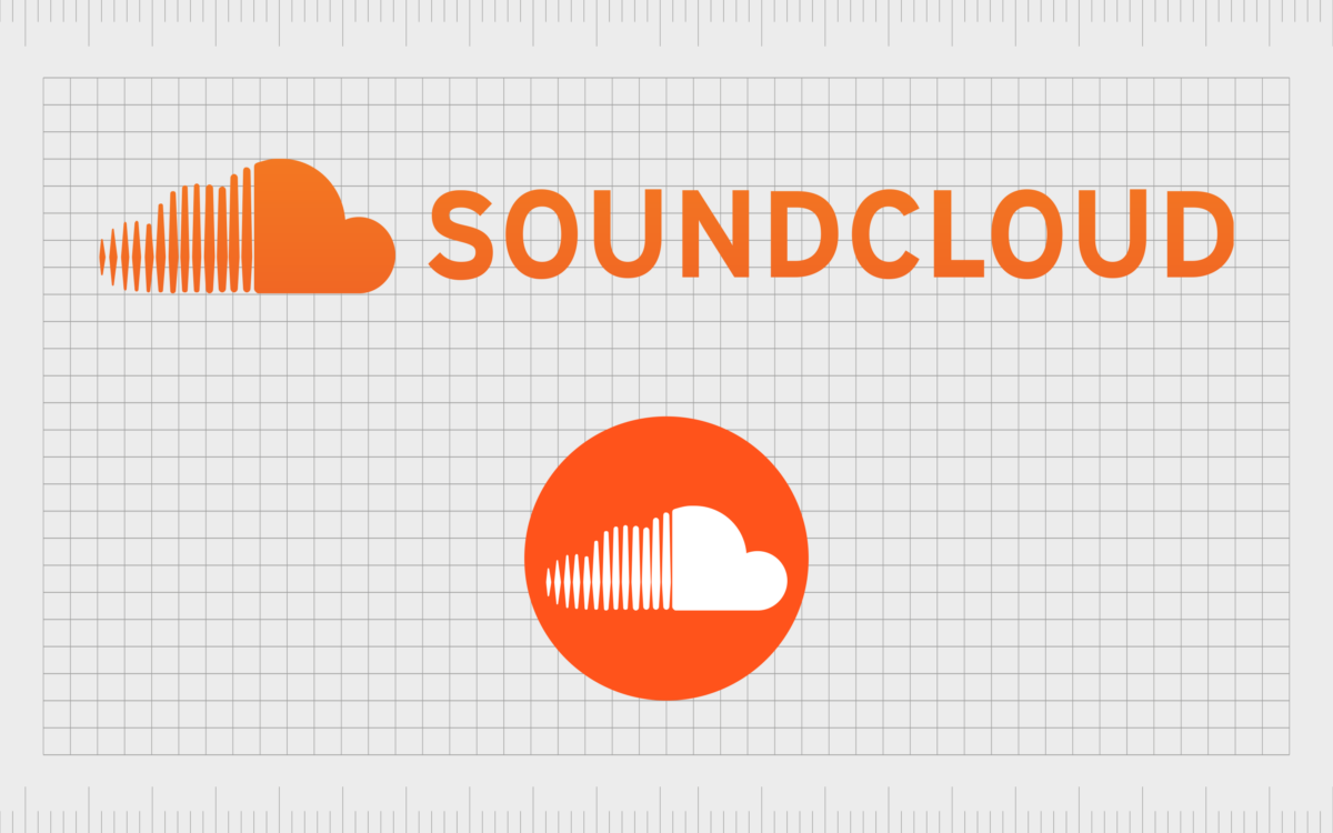
In 2010, SoundCloud updated its logo for the first time, introducing the color palette that would come to be known as “SoundCloud orange”.
While the majority of the logo components remained the same during the redesign, the color palette was significantly brightened. The vibrant orange coloring showcased creativity and innovation, separating SoundCloud from its competitors.
You may also notice the orange coloring in the cloud design has a slight gradient to it, appearing lighter at the top than it does on the bottom.
Additionally, the lines on the left of the cloud image have been refined too, with some of them now taking on an almost diamond shape. This was a deliberate decision by the company to make the lines look more like waves of sound.

Alongside the new color palette, SoundCloud also introduced a number of different variations of its logo. A new inscription was created, placing the SoundCloud inscription alongside the cloud image, rather than underneath.
The company also developed a favicon or icon it could use on smartphones and website browser tabs. This image features just the cloud image, with no wordmark.
The favicon also inverts the colors of the SoundCloud palette, placing a white cloud on an orange background, to make it more eye-catching.
The SoundCloud logo: Fonts and colors
At a glance, the SoundCloud logo looks simple, creative, and modern. The carefully-chosen icon in the design aims to draw attention to the company’s focus on the technology world, and the cloud, as well as its commitment to sharing music with listeners around the globe.
The stylized lines in the cloud represent volume, and audio, while making the image more distinctive.
The white and orange color palette also has a fantastic impact on the overall memorability of the SoundCloud emblem. It distinguishes the brand from other streaming services with simpler, monochrome logos, and exudes feelings of joy and optimism.
If you want to take a closer look at the unique components of the SoundCloud logo, you can find some fantastic resources here:
What color is the SoundCloud logo?
The SoundCloud orange shade is perhaps the most compelling aspect of the company’s emblem. Although the SoundCloud logo colors started relatively simple, featuring just black and white, the company quickly decided to look for a new way to differentiate itself.
Keen to convey ideas of joy, creativity, and optimism, the brand chose a warm and vibrant shade for its new palette in 2010. Today, the SoundCloud logo color instantly grabs the attention of customers around the world, and helps to make the business more memorable.
The exact shade of orange used for the SoundCloud logo has the following attributes:
Hex color: #f26f23
RGB: 242 111 35
CMYK: 0 54 86 5
Pantone: PMS 1585 C
What font does the SoundCloud logo use?
Notably, there are instances of the SoundCloud emblem which don’t use any typography at all. In some cases, the cloud image is used as a standalone representation of the brand, such as in the company’s favicon or app icon.
However, the official SoundCloud logo font still appears on many instances of the design, used throughout the company’s assets.
The font is very similar to the Interstate Bold typeface, created by Tobias Frere-Jones for the Font Bureau foundry. This sleek and sophisticated sans-serif font showcases modernity, and works well across a range of platforms, offering excellent legibility.
Transcending branding: The SoundCloud logo
Looking back through SoundCloud logo history, it’s clear to see the company has retained a relatively consistent image over the years. The compelling cloud icon used in the brand’s emblem has been a part of the business identity since its inception, highlighting the core values of the organization.
Though the colors used in the SoundCloud design have evolved over time, the most significant components of the logo have remained largely the same. Indeed, the SoundCloud emblem is an excellent example of how a simple, modern logo can evolve and grow with a brand.
SoundCloud also shows us that sometimes even in the simplest change, like an updated color palette, can be enough to take a brand’s image to the next level.
Fabrik: A branding agency for our times.
Clarity starts with a conversation.
Thanks—we’ll get back to you shortly.
Whether you're navigating a rebrand, merger, or simply need a clearer identity—we’re here to help. No hard sell, just honest advice from people who know the sector.
Let’s start with a simple question…
Prefer to email? Drop us a line.
Fabrik’s been helping organisations rethink and reshape their brands for over 25 years. We’ve guided companies through mergers, rebrands and new launches. Whatever stage you’re at, we’ll meet you there.


