The Quest Diagnostics logo history: 50 years of healthcare excellence

If you’re familiar with the world of healthcare, you might recognize the Quest Diagnostics logo. Evocative and engaging, this simplistic combination mark aims to immediately showcase ideas of growth, vitality, and nourishment. But where did Quest Diagnostics logo history begin?
Unlike many healthcare and medical companies, the Quest Diagnostics brand hasn’t made many changes to its visual identity over the years. While the company’s emblem has been modernized and refined, the logo in use today shares many similar characteristics with the very first design.
Since it was first launched in 1967, Quest Diagnostics has utilized strategies in color and shape psychology to connect with consumers, and position itself as a leader in its industry.
Today, we’re going to be taking a closer look at the transformation of the Quest Diagnostics logo, and the meaning behind the eye-catching emblem.
What was the previous name of Quest Diagnostics?
Before we look at the two designs to emerge throughout Quest Diagnostics logo history, let’s introduce the brand itself. Quest Diagnostics is a clinical laboratory, based in America, and a Fortune 500 company.
It operates across the US, Mexico, Brazil, and Puerto Rico primarily, and holds collaborative agreements with clinics worldwide.
Originally, the company was founded as the “Metropolitan Pathology Laboratory” in 1967, by entrepreneur and doctor, Paul A. Brown. The initial lab experimented with a variety of name changes, exploring options like “MetPath Inc”, and Corning Clinical Laboratories”.
The “Quest Diagnostics” moniker was chosen when the company span-off from the Corning brand in 1996. Kenneth Freeman took over as CEO, and Quest began a strategy of strategic acquisitions and mergers for growth.
By 2020, the company had expanded into a massive organization, with $7.7 billion in revenue, and over 48,000 employees.
Today, Quest Diagnostics is best-known for its innovative medical testing, clinical chemistry, and molecular diagnostics services. The brand offers diagnostic testing services for cardiovascular disease and cancer, as well as COVID-19 and neurological disorders.
The company’s vision is to “empower better health” with insights offered by diagnostics. The team is committed to discovering new ways to discover and treat diseases, connect doctors and patients, and ensure individuals get the care they need.
Quest Diagnostics logo history: Evolving through the years
While Quest Diagnostics had many different identities before 1996, the logos associated with its previous names are no longer available online.
However, we can look at Quest Diagnostics logo history as it began with the name change, to provide an insight into the transformation of the brand’s visual identity.
Since choosing its new name, the Quest Diagnostic company has only made one significant change to its logo design.
While the new logo today is a world apart from its predecessor in terms of typography and imagery, the essence of the emblem remains in the use of a green color palette, and the decision to use a combination of text and graphics.

1996
When Quest Diagnostics spun out as a separate brand from the Corning group in 1996, they utilized a logo which features a lot of similar components to the wordmark we know today. The image features an icon on the left-hand-side, and a two-level wordmark on the right.
The inscription, created in a stylish serif-style font is intended to showcase the sophistication and professionalism of the logo. The letters feature thin lines and sharp serifs, ideal for showcasing confidence, and heritage.
Interestingly, the wordmark appears slightly above the icon on the left-hand side, which makes the image look a little imbalanced.
The oval icon, which inspired the image used in the Quest Diagnostics logo today, is far more complex in this variation. It creates almost a landscape image with the use of a “Q” turned on its side, and a starburst effect in the background.
The design is intended to symbolize energy, and renewal.
The initial logo also featured a relatively simplistic color palette, combining a bright green shade with white, for a fresh look, with connections to concepts like health and vitality.

2015
The first and only major change to the Quest Diagnostics logo design took place in 2015, when the image was updated and refined for a modern audience. First, the typeface used for the right-hand portion of the logo has been transformed into a sans-serif inscription.
The upper portion of the wordmark is written in a thicker, blockier font, with angled edges on the lines.
The “Diagnostics” portion underneath features a much slimmer version of the typeface, with simpler letters, and even kerning between each character. Notably, the wordmark has also been repositioned slightly, to align perfectly with the icon on the left-hand side.
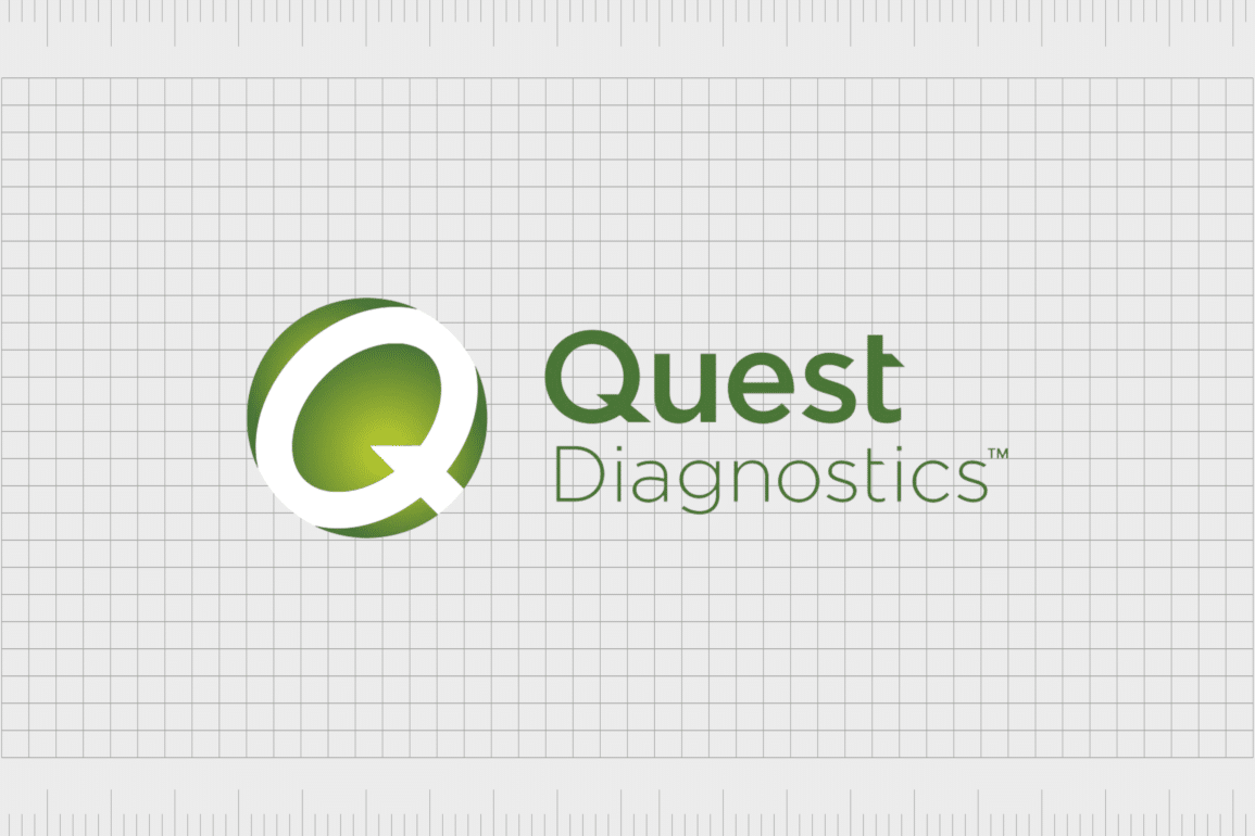
The memorable Quest Diagnostics icon has been enhanced here too. The additional decorative elements in the badge shape have been replaced with a large “Q” character, in a block font, matching the design of the logo’s inscription.
The oval has been expanded to look more like a circle, conveying ideas of community and connectivity. Additionally, a yellowish gradient has been added to the center of the background, making the image glow with life and energy.
The Quest Diagnostics logo: Fonts and colors
Though there haven’t been many significant changes to the Quest Diagnostics logo throughout the years, the significant update in 2015 was a positive move for the company. The previous logo seemed a little cluttered and disjointed, while this new variation is more sophisticated, refined, and balanced.
The Quest Diagnostic logo today takes inspiration from the previous design, while adhering to the design trends and preferences of a more modern audience.
The change to the positioning of the elements, the color palette, and even the typeface makes the company appear more confident, reliable, and authoritative.
You can see some examples of the Quest Diagnostics logo here:
What color is the Quest Diagnostics logo?
Although the Quest Diagnostics logo colors have always featured shades of green and white, the overall palette has been updated in recent years. The initial logo featured a more consistent color palette, with bright green and dark green variations available online.
The current Quest Diagnostics logo color palette has a lot more depth. The subdued green color seems more natural, connected with the organic world and the medical landscape. The gradient used in the middle of the circular badge gives the image a bright and illuminated feel.
The almost golden hue is symbolic of happiness, energy, and wealth.
Middle Green
Hex: #498e46
RGB: 73 142 70
CMYK: 49 0 51 44
Pantone: PMS 348 C
Metallic Gold
Hex color: #d2b044
RGB: 210 176 68
CMYK: 0 16 68 18
Pantone: PMS 7752 C
What font does the Quest Diagnostics logo use?
The typography update in the Quest Diagnostics logo is one of the most significant changes worth noting throughout the company’s visual history.
The typeface originally used by the brand was a traditional serif font, which showcased traditionalism and heritage, but failed to leave a lasting impact on audiences in the modern world.
Today, the current typeface is much simpler. The Quest Diagnostic logo font used today is unique to the brand. It’s a custom sans-serif font, with angled edges on some of the letters, to give the company a more innovative and creative appearance.
The typeface appears in two weights, with a bolder word on the top, and a lighter font on the bottom.
What does the Quest Diagnostics logo mean?
Looking back at Quest Diagnostics logo history, we can see the company has attempted to preserve some of the core elements of its visual design throughout the years. Although the current logo is far more refined and modern, it does take inspiration from the shapes and colors of the previous logo.
The current Quest Diagnostics logo aims to showcase the company’s authority in the healthcare and diagnostics space, with bold, confident letters, and a stunning color palette. The shades of green and gold convey ideas of growth, nurturing, and health.
Additionally, the circular badge used for the “Q” character demonstrates a commitment to community.
The refined logo of the Health Diagnostics company in use today is eye-catching and professional, without being overwhelming or cluttered. It’s an excellent tool for highlighting the company’s commitment to innovation and care.
Fabrik: A branding agency for our times.
Clarity starts with a conversation.
Thanks—we’ll get back to you shortly.
Whether you're navigating a rebrand, merger, or simply need a clearer identity—we’re here to help. No hard sell, just honest advice from people who know the sector.
Let’s start with a simple question…
Prefer to email? Drop us a line.
Fabrik’s been helping organisations rethink and reshape their brands for over 25 years. We’ve guided companies through mergers, rebrands and new launches. Whatever stage you’re at, we’ll meet you there.


