Morphe logo history: The impactful Morphe Cosmetics logo

If you’re a fan of the beauty and cosmetics industry, you’ve probably seen the Morphe logo before. This sleek, sophisticated, and contemporary emblem was designed to highlight the organization’s innovative focus on bringing new products to the beauty space.
But, even if you’re familiar with the design today, you may not know much about Morphe logo history.
Like many famous beauty brands, Morphe has refined its visual identity over the years, focusing on finding impactful ways to connect with its target audience. Though Morphe is a relatively young organization in the cosmetics landscape, it has earned a lot of attention in recent years.
Today, the company has filed for bankruptcy, so we may not see any new logos introduced for the organization in the years ahead. However, we can still look back through Morphe’s branding journey to learn a thing or two about how beauty brands connect with their customers.
Let’s explore the history and evolution of the Morphe logo.
What brand owns Morphe? An introduction to Morphe
Previously known as “Morphe Brushes,” Morphe, or Morphe Cosmetics, is a beauty manufacturer based in Los Angeles that first emerged in the marketplace in 2008. The brand specializes in the digital retail landscape, concentrating on connecting with consumers in the online world.
However, throughout various parts of the US, Morphe stores have also emerged.
Morphe also partnered with a number of authorized retailers over the years, including Ulta.com and the BDirect Online Amazon store. Initially, the organization gained significant attention thanks to its partnerships with influencers in the social media space.
Unfortunately, these partnerships also led to significant issues for the company, as many influencers ended up embroiled in controversy.
In 2019, Morphe Holdings, the previous parent company of the business, announced a new partnership with General Atlantic, which acquired a majority stake in the brand. As of the time of writing, General Atlantic still owns the Morphe cosmetics company.
While the Morphe website and other locations are still in operation at the moment, Morphe announced on social media in January 2023 that all of its stores in the United States would be closing. This announcement followed nationwide criticism of the store’s working conditions.
Only a week later, the brand filed for bankruptcy.
Morphe logo history: The Morphe Cosmetics logo
As a relatively young brand in the cosmetics space, Morphe’s logo history doesn’t extend back very far. The business has only created two official logos since launching in 2008.
The first drew attention to the company’s focus on creating accessories and utensils for the beauty space. The secondary logo, developed in 2018, was intended to modernize the company and demonstrate its growing portfolio.

The initial Morphe logo was a relatively simplistic wordmark produced using sophisticated, uppercase letters with short serifs.
The emblem was divided into two three sections. On the left-hand side of the emblem, we see the large letter “M” depicted in a bright shade of red, connected with passion and vitality. Next to this, the rest of the logo is split across two lines.
The “orphe” section of the company’s name is positioned above the word “Brushes,” using the larger “M” for alignment. The Morphe wordmark uses a slightly different typeface to the “Brushes” section, though both are serif-style fonts.
The “Brushes” component is slightly stretched to create a sense of balance between the name of the company and the smaller, descriptive term.

When the Morphe logo was updated in 2018, it eliminated the “Brushes” element of the logo completely, drawing attention to the rapidly expanding product portfolio offered by the organization. At this time, Morphe was moving away from its focus on brushes.
The company was actively partnering with social media influencers on the creation of unique palettes and colorful makeup products.
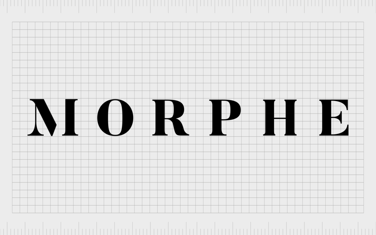
The new logo, created to enhance and refine the company’s visual identity, continued to use a serif-style font with thicker vertical lines and thinner horizontal elements.
The characters in the wordmark were spaced evenly to create a sense of stability and balance. The company also updated its color palette, removing the red “M” for a consistent white inscription, often depicted on a black background.
The Morphe logo: Colors and fonts
When Morphe updated its logo, it did so with the goal of strengthening its position in the wider beauty and cosmetics landscape.
Although the organization continued to produce signature tools, such as brushes and blending sponges, it also explored a variety of additional products created through collaborations.
The updated Morphe logo was intended to give the company an aesthetic that showcased credibility, strength, and authority in the cosmetics space.
The sophisticated typeface was chosen to highlight elegance and credibility, with a mixture of thin and thicker lines and short serifs.
If you want to take a closer look at the Morphe logo, you can find some useful resources here:
What color is the Morphe logo?
Initially, the Morphe logo colors were chosen to convey the professionalism and passion of the brand. The color black, combined with a bright shade of red, gave the organization an energetic appearance, which helped to distinguish it from other well-known beauty brands.
The wordmark for the company was often depicted on a white background for optimal contrast.
When Morphe updated its logo, it inverted its color palette, switching to a white font on a black background and removing the red elements. This helped to refine the organization’s identity and position it as a more modern, contemporary cosmetics company.
What font does the Morphe logo use?
The Morphe logo font had only changed once during the Morphe logo history when the company updated and refined its branding for the modern market. Throughout its lifespan, Morphe has used serif-style logos in an effort to convey professionalism.
The company initially started off selling high-end beauty tools to professionals and consumers alike.
Today, the Morphe font is an elegant serif font, similar in some ways to a bold version of Times New Roman. The characters appear bold and strong, with thick vertical lines and thinner horizontal bars. Subtle flicks on the serifs demonstrate the creativity of makeup artists.
Defining beauty with Morphe Cosmetics
Although there haven’t been many changes to the visual identity of the company throughout the Morphe logo history, we can see how the organization’s alterations to its emblem influenced its growth.
Moving away from the more complex “Morphe Brushes” logo allowed the organization to focus more heavily on its broadening portfolio of products.
The updated Morphe logo, as it stands today, is a modern and compelling wordmark intended to demonstrate artistry, sophistication, and power. The eye-catching emblem can also appear in a range of different colors.
While in most cases, the Morphe inscription appears in white on a black background, it can also be inverted to show black font on a white background.
Morphe logo FAQ
Why is Morphe shutting down?
At the time of writing, Morphe is still operational online, but it closed all of its US stores immediately following controversy about its employment practices.
The Gen-Z-focused makeup brand officially announced that it was closing its stores to focus on its wholesale and e-commerce operations. However, the business has since filed for bankruptcy.
Is Morphe considered high-end?
Morphe is often considered an “affordable” high-end brand. Although its products are more expensive than some of the other options on the market, Morphe aims to provide customers with access to more affordable, professional tools and palettes.
How can you tell a fake Morphe palette?
Original Morphe palettes tend to include a firm clasp that closes securely, while fake alternatives don’t close as well. The original products also come in dark black packaging, while many fake alternatives will be slightly grey in color.
The Morphe logo may also appear to be bolder and more refined on a real palette.
Fabrik: A branding agency for our times.
Clarity starts with a conversation.
Thanks—we’ll get back to you shortly.
Whether you're navigating a rebrand, merger, or simply need a clearer identity—we’re here to help. No hard sell, just honest advice from people who know the sector.
Let’s start with a simple question…
Prefer to email? Drop us a line.
Fabrik’s been helping organisations rethink and reshape their brands for over 25 years. We’ve guided companies through mergers, rebrands and new launches. Whatever stage you’re at, we’ll meet you there.


