Minecraft logo history: Evolution of the Minecraft symbol

How confident are you in your knowledge of Minecraft logo history? You might recognize the Minecraft logo at a glance today, but do you know what the original Minecraft logo was, or how the symbol began and evolved?
Minecraft is currently one of the most popular games in the world, earning 140 million active players since the original release in 2011. What started as a simple sandbox game quickly became an immersive world for gaming enthusiasts, constantly updating, and evolving over the years.
Today, we’re going to be taking an in-depth look at the Minecraft logo, and how the image has evolved to suit a modern audience.
Minecraft logo meaning: Understanding the Minecraft symbols
When it comes to hidden depth, the Minecraft symbols’ meaning is relatively basic. The Minecraft logo has always attempted to represent the nature of the game.
Blocky fonts and the use of various in-game textures throughout Minecraft logo history help to convey the experience users can expect.
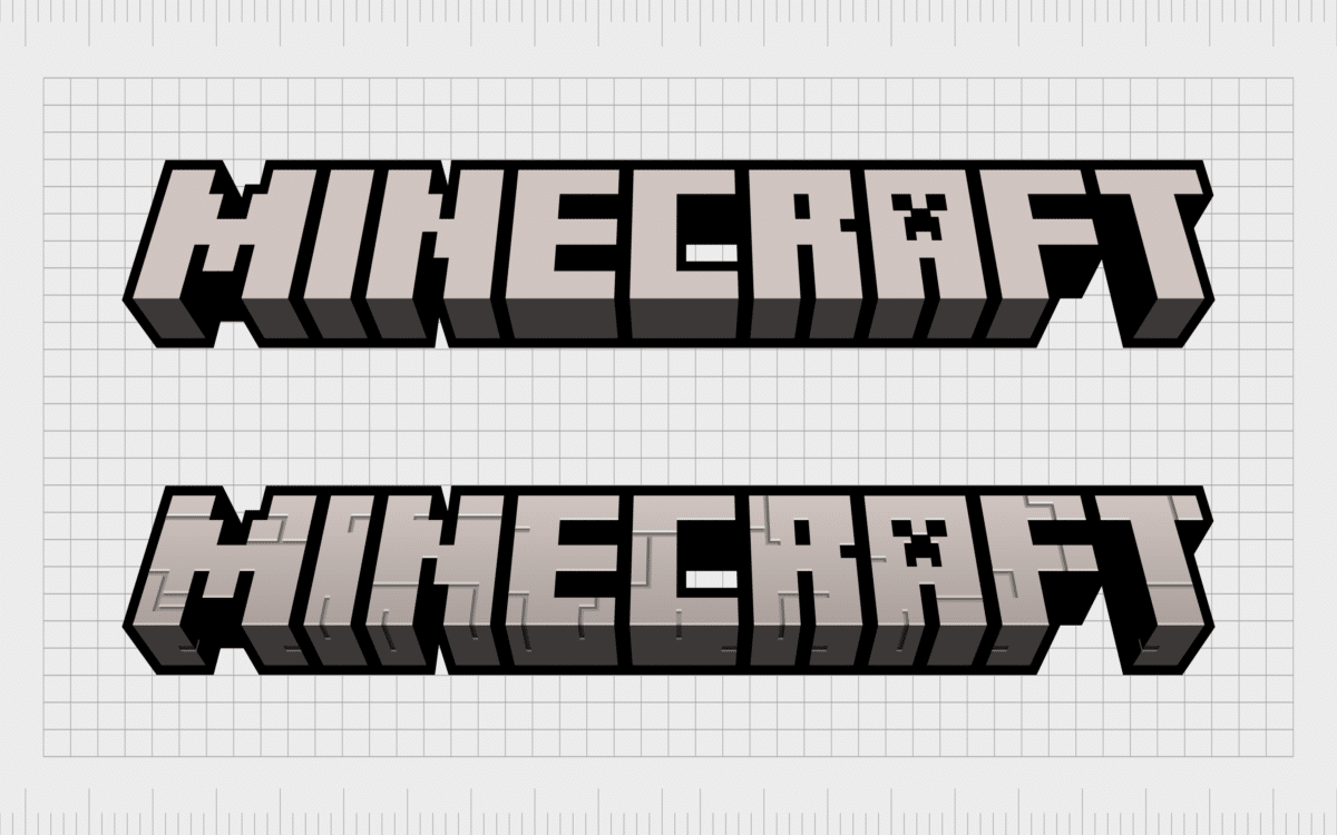
The Minecraft gaming logo today is relatively straightforward, using gray as the primary color, with a thick, black-shaded font outlining the name.
Notably, the Minecraft logo used today also has an “alternate” version which includes a little more texture than the primary image. This aims to further represent the kind of visuals you’ll see within the game.
The textured version of the logo appears frequently in international marketing, and also in certain “editions” of Minecraft, like “Console Edition”.
Minecraft also has the “Story Mode” logo, which builds on the current Minecraft symbol in use today, with a secondary headline placed in an almost 3D format beneath the game’s name.
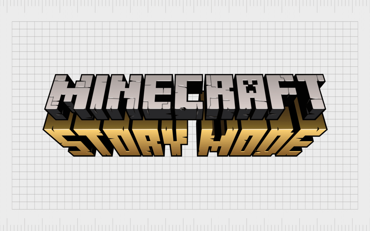
The design of the “Story Mode” logo creates an experience similar to seeing building blocks stacked on top of each other.
Minecraft logo history: The Minecraft logo evolution
Minecraft logos have evolved a few times over the years, to suit the changing marketplace, and reflect the capabilities of the digital age. Today, the new Minecraft logo is clean, slick, and beautifully well-rendered. The old Minecraft logo might seem a little basic in comparison.
Let’s have a look at some of the Minecraft logos over the years…
2009
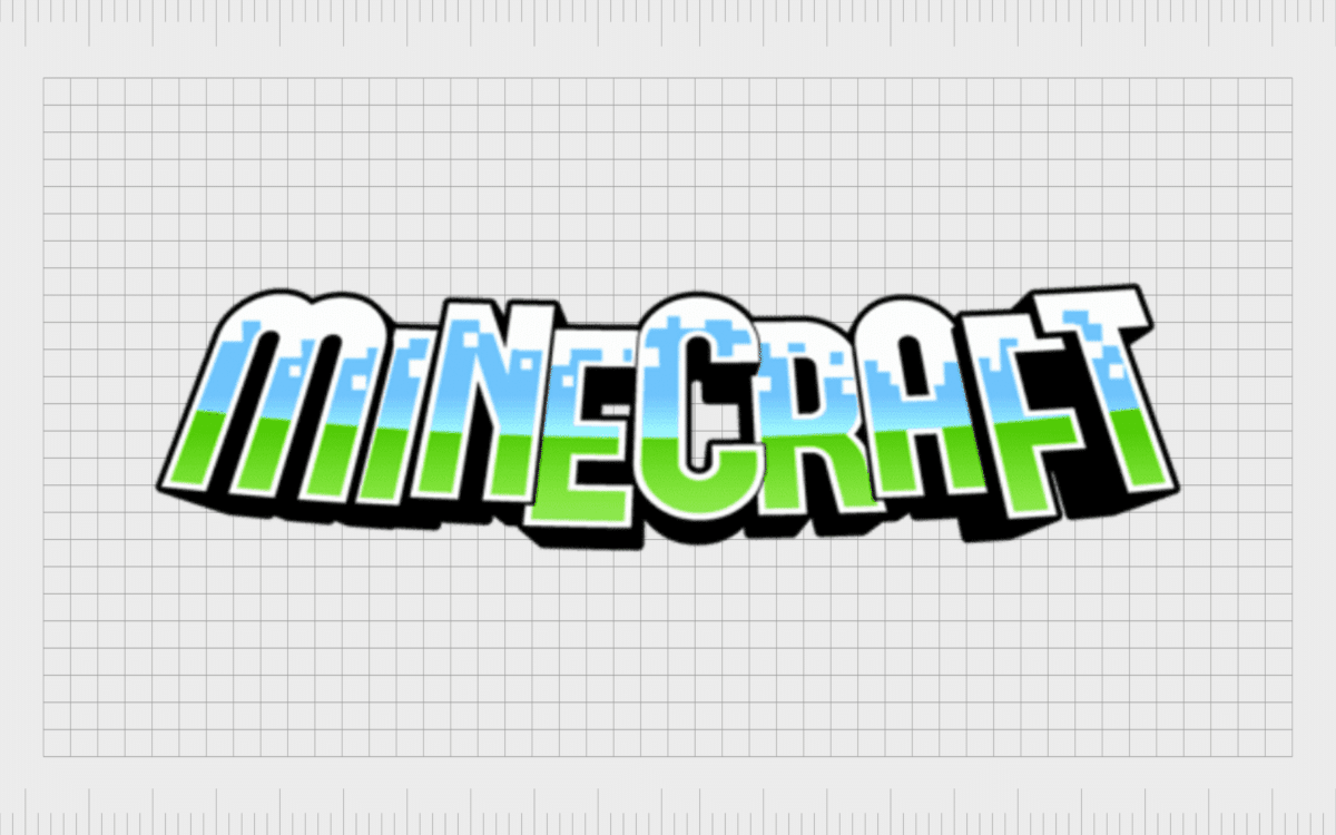
The “original” Minecraft logo, designed by Hayden Scott-Baron, was never actually used by the brand. The design featured a curvy sans-serif wordmark with dynamic, jumping letters, all connected to each other.
The letters featured green for earth, and white / blue for sky and clouds within the font.
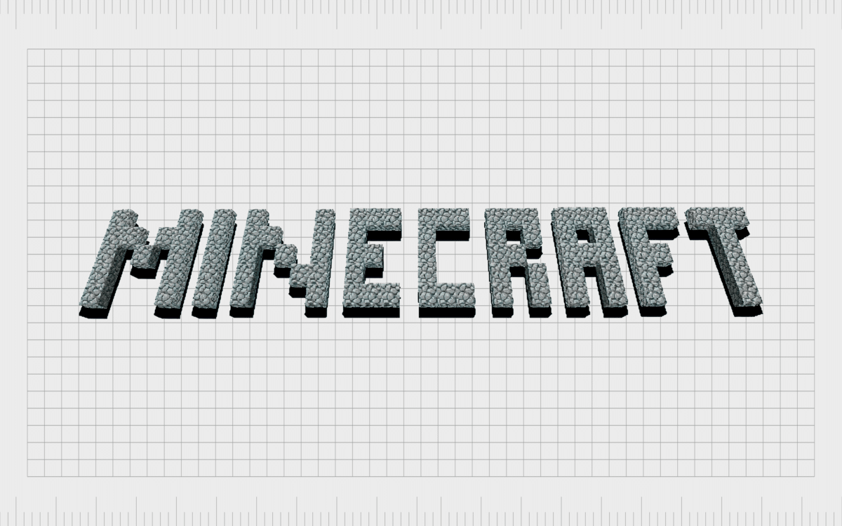
The official logo for the Minecraft game was a world away from Hayden Scott-Baron’s design, featuring a blocky, grey logotype, designed in the “cobblestone” texture from the game. The geometric contours highlighted the cuboid nature of the game.
2011
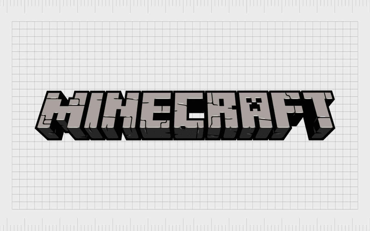
In 2011, Minecraft updated the logo somewhat, refining the pattern significantly, with thicker, chunkier, and cleaner text. Gray and black were still the primary colors of the logo, but the overall image was a lot more professional.
This logo helped to inspire the future Minecraft symbols which came to define the company today.

2012
The Minecraft emblems since 2011 have only changed slightly, featuring more refinement, and slightly more texture over time. Gradient shades appeared in the message, and the “creeper face” within the “A” of the logo became more defined.
The new version of the Minecraft logo is much sleeker, and there’s also a version with no “cracks” in the wordmark, as shown above.

Minecraft emblem and icon
The Minecraft logo today is an instantly recognizable emblem for a lot of gaming fans.
One of the most popular games in the world, Minecraft has successfully crossed over from the PC to various consoles, allowing for smooth, simple play, without the standard issues many new gamers would struggle with in the digital world.
Minecraft was designed by Markus Persson (Notch), in the Java programming language, and belongs to the Swedish Mojang Studios. The first public version of the game appeared in 2009 before it officially arrived on the market in 2011.
The blocky 3D generated world is one of the most endearing parts of Minecraft, which is why the company chose to use this in its logo design.
Minecraft has been critically acclaimed throughout the years, winning a number of impressive awards, and earning a position as one of the greatest video games of all time.
Parodies, adaptations, social media, merchandise, and Minecon conventions have all helped to increase the popularity of the game, and the awareness of the Minecraft symbol.
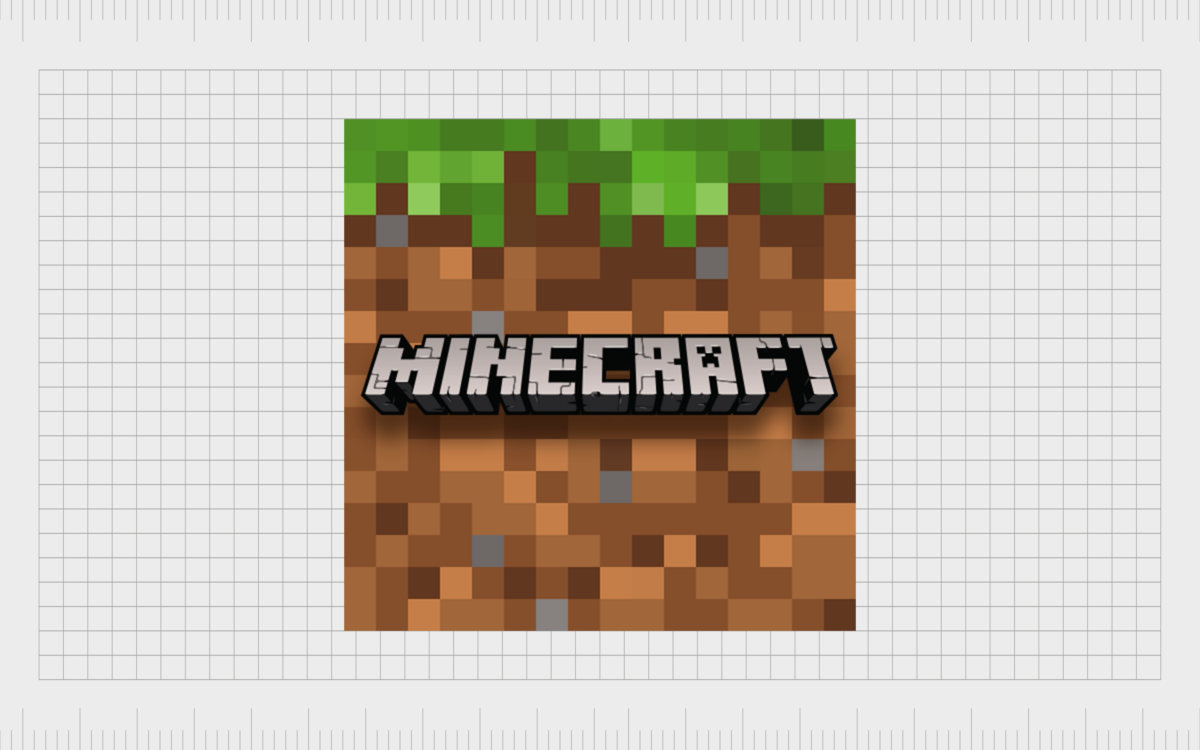
Even the icon accompanying the Minecraft logo for the game app has a “block” image. The app used to feature a simple three-dimensional block but has since updated to feature a version of the Minecraft logo on the textured “dirt” background from the game.
Here are some excellent resources for the Minecraft logo:
Minecraft logo font: What font does the Minecraft logo use?
The Minecraft logo font was created from scratch by the company Madpixel Designs. You may be able to find some generators producing similar fonts for entertainment purposes, but there aren’t really any similar fonts online for public use.
The unique typeface is called “Minecrafter” and uses a combination of geometric angles and textures to convey the experience of the Minecraft game. There’s a face shape evident within the “A” of Minecraft, which represents the face of one of the most well-known creatures from the game.
Minecraft’s logo features a lot of sharp angles, no serifs, and a three-dimensional appeal, which helps to highlight the nature of the game. This wordmark seems to be designed to look more like a picture than a standard logotype.
There’s also a specific font type within the game called Stgotic which was designed for low-res screen devices and enables the chat function today. This font is also the one used to provide players with information and alerts.
Minecraft gaming logo color
Minecraft’s logo features a number of shades of grey throughout the surface of the wordmark, providing a sense of depth and dimension. The color gray has always been the central shade for the Minecraft emblem, even in its original form.
If you’ve heard people talking about the Blue Minecraft logo, or the Green Minecraft logo in the past, they may have been referring to the original logo created by Hayden Scott-Baron. However, this version of the Minecraft emblem was never officially implemented by the brand.
Outside of the central gray of the Minecraft logo, the other primary color in the image is black. It’s also possible to find a black and white version of the Minecraft logo if you need it for article or press release purposes.
In most cases, it’s best to check the brand guidelines.
Celebrating the Minecraft logo
The Minecraft emblem today stands as an absolute champion of the gaming world. It’s hard to find anyone with an interest in computer games who isn’t familiar with the blocky, simple, but effective design of the Minecraft wordmark.
Although the early versions of this logo might have seemed a little basic, they quickly gave way to a highly refined and compelling design. The current Minecraft logo is a wonderful, stylized wordmark, available in two versions depending on your needs.
The most common version of the Minecraft logo is sleek and clean, while the secondary option features cracks across the three-dimensional letters.
The Minecraft logo as we know it today is also present in a host of other games since created by the company, including the console version of the title, and the Story Mode game.
Fabrik: A branding agency for our times.
Clarity starts with a conversation.
Thanks—we’ll get back to you shortly.
Whether you're navigating a rebrand, merger, or simply need a clearer identity—we’re here to help. No hard sell, just honest advice from people who know the sector.
Let’s start with a simple question…
Prefer to email? Drop us a line.
Fabrik’s been helping organisations rethink and reshape their brands for over 25 years. We’ve guided companies through mergers, rebrands and new launches. Whatever stage you’re at, we’ll meet you there.


