L’Oréal logo history: The impact of the L’Oréal logo on the beauty industry
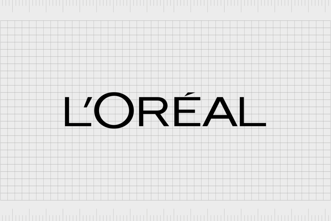
The L’Oréal logo is easily one of the most recognizable emblems for those familiar with the beauty and cosmetics industry. Simple and sleek, this iconic wordmark has captured the attention of countless consumers worldwide. But how much do you know about L’Oréal logo history?
Like many long-standing beauty brands, L’Oréal has updated its emblem a handful of times over the years, adapting to the interests of an ever-changing audience.
In the last century, the L’Oréal logo has grown increasingly more professional, sophisticated, and eye-catching, cementing the brand’s position as one of the authorities in the cosmetics space.
Today, most people are familiar with the L’Oréal logo introduced during the mid-90s. However, we’ll dive further into the brand’s origins to explore how the symbol has evolved over the decades.
Here’s everything you need to know about the L’Oréal Paris logo.
What does L’Oréal mean? An introduction to L’Oréal
Today, L’Oréal is one of the world’s biggest cosmetics and beauty brands. Not only does the company serve customers around the world under its own name, but it owns a variety of well-known subsidiaries too.
Well-known companies such as Garnier, Maybelline, and Kiehl’s all operate under the larger L’Oréal umbrella.
According to the L’Oréal group, the word “L’Oréal” was derived from an Ancient Greek word: ωραίος (oreos), which translates to “beauty.”
During the early 20th century, a man named Eugène Paul Louis Schueller from France developed a formula for hair dye he named Oréale, based on this same Greek term.
He sold the formula to Parisian hairdressers initially before registering his own official company, the name “Safe Hair Dye Company of France.”
The guiding principles of the newly developed company, which would one day become L’Oréal, were innovation and research in the beauty field.
Over the years, the team continued to grow, and the products produced by the organization evolved. L’Oréal began experimenting with body and skincare items, hair styling, makeup, and fragrance options.
Today, L’Oréal owns 36 brands and has registered almost 500 patents (as of 2021). Although the company’s portfolio of products has changed over the years, the organization is still dedicated to research and development, with laboratories located across the globe.
L’Oréal logo history: The evolution of L’Oréal
L’Oréal logo history officially began in 1909, when the company was first created as a simple hair dye brand selling solutions to hairdressers in France. Initially, when the business was still experimenting with name choices, it selected a relatively traditional logo for the era.
Over the years, as L’Oréal transformed, it continued to use a wordmark as its primary emblem but explored a variety of different font options.
Let’s take a closer look at the L’Oréal logo over the years.

The first L’Oréal logo appeared in 1909 when L’Oréal designers were still focused heavily on the hair dye industry. The symbol was relatively simple, featuring a large, dark brown oval with the inscription “L’Oréal” written within it in a softer peach/rose shade.
The sans-serif wordmark was bold and eye-catching, with a small “l” at the beginning, followed by characters of varying sizes designed to fit into the oval perfectly.
Very shortly after producing its first logo, the L’Oréal company chose to experiment with something more sophisticated and professional. The new emblem switched the sans-serif typeface to a more traditional serif font.
The nameplate lost its brown background and featured only black letters, evenly spaced and positioned on a straight line.
One year later, in 1911, the L’Oréal logo was updated again, this time featuring slightly thicker, bolder characters. The typeface was more or less the same as in the previous inscription. However, the bolder letters gave the design a sense of confidence.

In 1914, L’Oréal returned to a sans-serif font choice, perhaps to make the emblem more legible. The most interesting part of this design was the fact that the majority of the letters were the same size.
However, the “O” was made much larger, making it stand out from the rest of the inscription.
This version of the L’Oréal logo was extremely successful, to the point where it stayed with the organization for almost 50 years.

Finally, in 1962, L’Oréal introduced the most recent version of its logo. The sans-serif font choice remained, but each letter was made thinner and more elegant. The straight lines of the logo were enhanced by the use of uppercase characters throughout the emblem.
Additionally, the “O” was made slightly smaller, though it was still larger than the rest of the characters.
This year, a variation of the L’Oréal Paris logo was introduced, which also included the “Paris” inscription underneath the primary wordmark. This variation was intended to remind consumers of the origins of the company.
At the time, Paris and France were often associated with beauty and elegance among global consumers.
In the L’Oréal Paris logo, all of the letters of “Paris” are depicted in uppercase, except for the “I,” which appears in a lowercase font.
The L’Oréal Paris logo: Fonts and colors
Compared to other well-known logos from throughout the cosmetics and beauty industry, the L’Oréal Paris logo might seem a little simplistic. There are no graphical elements designed to specifically draw the eye.
Instead, the company chose a sophisticated and minimalistic design in an effort to highlight its professionalism.
Despite its somewhat simplistic appearance, the L’Oréal logo is a powerful emblem, capable of highlighting the unique values of the brand and its focus on innovation. The bold, uppercase letters convey strength and reliability.
You can find some examples of the L’Oréal logo here:
What color is the L’Oréal logo?
Similar to many beauty company logos, the L’Oréal logo colors are relatively simple. For the majority of the company’s life, the emblem has retained a simple monochrome color palette of black and white.
In most cases, the primary L’Oréal logo color is black, used to depict the wordmark of the organization on a white background. However, there are instances in which this logo’s colors are inverted, showing a white font on a black background.
In some product packaging strategies, the L’Oréal team has also altered the color palette, using shades such as gold and white to symbolize elegance, wealth, and purity.
What font does the L’Oréal logo use?
The L’Oréal logo font has changed a few times throughout the history of the company. During the early years, the organization experimented with various sans-serif and serif-style typography choices, often changing the sizing of each letter within the wordmark.
Today, the L’Oréal logo font is a simple sans-serif typeface with a slightly enlarged “O.” The design is discreet and simplistic, designed to easily capture customer attention. The font is similar in some ways to the ITC Blair, Adequate, and Trade Gothic Extended fonts.
The iconic L’Oréal logo
Looking back at L’Oréal logo history, we can see the company’s visual identity has evolved a few times over the years as the organization experimented with its emblem. While the font choices and color palettes evolved, the core component of the logo – a wordmark, remained the same.
Throughout the decades, L’Oréal focused on simplifying and refining its logo to convey a professional and sophisticated image. Today, the L’Oréal logo may be simple, but it’s also one of the most recognizable emblems in the beauty industry.
L’Oréal logo FAQ
What does the L’Oréal logo mean?
The L’Oréal logo doesn’t have any hidden meanings or messages. It’s a simple wordmark containing only the name of the brand. However, this iconic minimalistic logo is intended to symbolize balance, style, and elegance.
The black and white colors add to the professional visual identity.
Is it Loreal or L’Oréal Paris?
Officially, the name of the company is L’Oréal S.A. However, many people refer to the beauty brand as L’Oréal Paris because the Paris component sometimes shows up in the branding and product packaging used by the organization.
Is L’Oréal owned by YSL?
No, it’s actually the other way around; L’Oréal purchased the YSL beauty brand in May 2008 for a total cost of $1.8 billion, and the YSL company makes up a component of the L’Oréal luxury beauty sector, alongside organizations like Kiehl’s.
Fabrik: A branding agency for our times.
Clarity starts with a conversation.
Thanks—we’ll get back to you shortly.
Whether you're navigating a rebrand, merger, or simply need a clearer identity—we’re here to help. No hard sell, just honest advice from people who know the sector.
Let’s start with a simple question…
Prefer to email? Drop us a line.
Fabrik’s been helping organisations rethink and reshape their brands for over 25 years. We’ve guided companies through mergers, rebrands and new launches. Whatever stage you’re at, we’ll meet you there.


