The Lancôme logo: A tale of French elegance and femininity

If you’re familiar with the beauty industry, you’ve probably encountered the iconic Lancôme logo. One of the best-known cosmetics brands in the world, Lancôme has taken the world by storm with its sophisticated, high-end products. But where did Lancôme logo history begin?
Unlike many well-known beauty brands that have frequently updated their visual identity over the years to create a more modern aesthetic, the Lancôme Paris team has remained relatively consistent with their emblem choices.
The brand’s long-standing logo pays homage to the heritage of the organization, demonstrating elegance, sophistication, and reliability.
If you’ve ever found yourself wondering about the origins of the Lancôme logo, or you want to learn more about the designs used by famous beauty brands, we’re here to help. Today, we’re going to take a closer look at the iconic Lancôme logo and its origins.

What is Lancôme famous for? An introduction to Lancôme
Before we explore Lancôme logo history, let’s look at the company behind the emblem.
Lancôme, otherwise known as Lancôme Paris, is a French luxury cosmetics and perfumes brand known for distributing products on an international basis. Part of the wider L’Oréal company, Lancôme focuses on high-end, indulgent products for bigger spenders.
The company was initially founded in 1935 by Armand Petitjean and Guillaume d’Ornano. The name Lancôme was taken from the forest of Lancosme, located within the Indre Valley in the region of Brenne in France. Elisabeth d’Ornano, Guillaume’s wife, chose the name.
Additionally, the rose often used in the symbolism of the Lancôme Paris logo was inspired by the flowers growing in the area.
When Lancôme launched, it introduced five fragrances at the Brussels World Fair before gradually moving into the luxury skincare market, creating products like Nutrix, followed by skincare, cosmetics, and makeup.
Today, the most famous products produced by Lancôme include their mascaras, their Visionnaire range, and their wide variety of skin creams and perfumes. In 2021, the “Lash Idol” mascara became the company’s best-selling product, receiving a Choice Beauty award.
Lancôme logo history: The Lancôme rose logo
As mentioned above, despite its long-lasting history in the beauty industry, Lancôme hasn’t made many changes to its visual identity. The company has retained a relatively consistent image in an effort to build credibility with its target audience as a dedicated luxury brand.
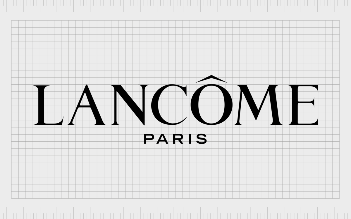
The trademark logo for the company is based on its name and is often set across two lines. The first section of the wordmark includes the name “Lancôme” in a sophisticated and picturesque serif font.
Longer lines and sharp serifs give the characters a sense of timeless elegance and reliability.

On the second line of the logo, which doesn’t always appear in the company’s signage and branding assets, we see the word “Paris,” referencing the origins of the French company. The “Paris” element of the logo has been created in a contrasting sans-serif typeface to balance the overall composition.
The use of both sans-serif and serif fonts together gives the company a sense of sophistication and creativity or modernity all at the same time.
While the Lancôme wordmark is the core component of the company’s logo, the emblem is frequently accompanied by a variety of symbols. The best-known design includes a golden rose, which is apparent in the skincare products across the Lancôme range.
In other products, Lancôme leverages different images, such as a simplified angel for cosmetics (makeup) and a lotus for the perfume collection. As mentioned above, the unique golden rose is inspired by the rose which grew in the forests, which contributed to the brand’s name.
The Lancôme Paris logo: Colors and fonts
The Lancôme Paris logo is a relatively simple and minimalistic design, even when combined with the various symbolic elements used across product packaging.
While other companies in the beauty landscape have frequently updated their logos to adapt to changing trends and market styles, Lancôme has remained reliably consistent, demonstrating its strength in the beauty arena.
Today, the Lancôme logo is a symbol of elegance, sophistication, and stability. The carefully chosen typefaces in the wordmark work well across a variety of mediums, translating into different packaging options and signage choices for the company.
The rose, lotus, and angel graphics added to the packaging of different products are aligned perfectly with the primary wordmark design.
If you’d like to see the Lancôme Paris logo in more detail, you can find some useful resources listed here:
What color is the Lancôme logo?
Simple elegance is one of the core factors that make the Lancôme logo so appealing, and this shines through in the company’s carefully chosen color palette. The official Lancôme logo colors are a monochrome palette of black and white.
Typically, we see black lettering on a white background, representing elegance, stability, and sophistication.
However, there are instances where the colors are inverted to a white typeface on a black background or a white sign on a transparent background. The white coloring often aims to convey concepts of beauty and professionalism.
The additional elements of the Lancôme color palette often appear in gold. The rose, lotus, and angel graphics can appear in a combination of gold, white, or black, depending on the rest of the packaging. The golden choices are used to symbolize luxury.
What font does the Lancôme logo use?
There are two Lancôme logo font choices currently in use today. The primary typeface most people are familiar with is the one used for the Lancôme wordmark.
This typography, designed in the 1930s for the brand, is similar to the Carlson Family and Bell Pro Regular fonts, with a delicate sign above the letter “o” in the name.
On the second line of the Lancôme wordmark, we see a slightly different inscription, using a more modern and bold sans-serif typeface.
The characters are similar to those from the Agatho Regular Caps collection, with slightly more angular elements and thicker lines. The combination of the two fonts helps to connect the brand with both modernity and tradition.
The elegant Lancôme logo
Although the Lancôme logo history hasn’t delivered many different changes to the company’s visual identity over the years, the Lancôme Paris logo still remains an iconic and compelling emblem. The consistency of the design only adds to the organization’s reliability and credibility in its space.
When used as a standalone wordmark or combined with the iconic images of the rose, lotus, or angel, the Lancôme logo is highly sophisticated and elegant. It’s a symbol of the company’s strength in the industry and its commitment to bringing beauty to the world.
Lancôme logo FAQ
What is the Lancôme logo?
The official Lancôme logo is a simple two-level wordmark featuring the words “Lancôme” and “Paris.” In many branding and product packaging initiatives, the Lancôme wordmark is combined with an additional image, such as a golden rose, lotus, or angel design.
Is Lancôme a luxury brand?
Yes, Lancôme is one of the high-end brands belonging to the L’Oréal company today. Its products are designed to be luxurious and can be a little more expensive than other L’Oréal products. The sophistication of Lancôme products shines through in its branding.
Who is the face of Lancôme Paris?
Currently, the official face of Lancôme Paris is Emma Chamberlain, an influencer who is active on YouTube, podcast channels, and more. She’s also a staple at fashion weeks around the world and an entrepreneur in the coffee industry.
What does Lancôme mean?
The name Lancôme was derived from the name of a Forest in France, where an abundance of roses grew, giving way to the use of the rose symbol in many Lancôme products. The name is based on “Lancosme,” a forest in the French region of Brenne.
Fabrik: A branding agency for our times.
Clarity starts with a conversation.
Thanks—we’ll get back to you shortly.
Whether you're navigating a rebrand, merger, or simply need a clearer identity—we’re here to help. No hard sell, just honest advice from people who know the sector.
Let’s start with a simple question…
Prefer to email? Drop us a line.
Fabrik’s been helping organisations rethink and reshape their brands for over 25 years. We’ve guided companies through mergers, rebrands and new launches. Whatever stage you’re at, we’ll meet you there.


