Kiehl’s logo history: How a simple design became an icon

Kiehl’s logo will likely be an instantly recognizable symbol for those familiar with the beauty and cosmetics industry. Simple but effective, this legacy logo has helped capture customers’ attention for centuries. The question is, where did the Kiehl’s logo history begin?
Kiehl’s is one of the best-known American cosmetics brands in the world. Despite launching over a century and a half ago, the Kiehl’s brand has retained its powerful presence in the marketplace over the decades.
Currently, it belongs to the L’Oréal group, but the organization still maintains its unique brand strategy and visual identity.
Today, we will be taking a closer look at the origins of the Kiehl’s logo, why the company’s image has remained consistent over the years, and how the brand began. Read on for your complete guide to the Kiehl’s visual brand identity.
What does Kiehl’s mean? An introduction to Kiehl’s
Before we explore Kiehl’s logo history, it’s worth taking a closer look at the company and its unique origins. Kiehl’s is a major American cosmetics brand specializing in hair, skin, and body care products.
It started life as a simple pharmacy in Manhattan, created by the owner, John Kiehl. The name “Kiehl’s” is based on the founder’s second name.
Kiehl developed a homeopathic pharmacy in the East Village of New York in 1851 and served customers from this location for several decades.
However, in 1921, the company was purchased by a man named Irving Morse, an individual who was already involved in creating various Kiehl’s products. Irving’s son took over the store in the 1960s.
For some time, Kiehl’s remained just a single store, though it sold products through a variety of high-end retail locations too. In 2000, the L’Oréal company acquired Kiehl’s for a price of around $100 to $150 million. The larger beauty brand had been pursuing this purchase for a number of years.
With the purchase, L’Oréal stated it was planning on increasing the brand’s presence in the years ahead.
However, it was also committed to maintaining Kiehl’s identity as a high-end luxury retailer rather than a mass-market cosmetics company.
Kiehl’s logo history: The memorable Kiehl’s symbol
Unlike many cosmetics and beauty brands throughout the years, Kiehl’s has only ever had a single logo. The carefully chosen emblem has evolved with the company throughout the years, preserving the organization’s identity of history, heritage, and luxury.
Although slight changes have been made to the coloring of the logo in some cases, and the slogan, which states “Since 1851” before the wordmark, the primary design has remained consistent.
The organization has retained its handwritten script-style wordmark and the elegant stroke underneath the name, which appears as though it was penned by a real person.
The Kiehl’s logo features two components today. The first is the wordmark, inscribed in stunning, handwritten script font. The curves and curls of the letters make the emblem look more graceful and elegant.
It also allowed the company to connect with its customers at a time when people were searching for more handmade cosmetics.
Underneath the script-style wordmark, we see the simple tagline “Since 1851”. Once again, this draws attention to the heritage of the brand. To coincide with the script wordmark, the underlying tagline has been produced in a simple sans-serif font in all uppercase letters.
In most instances, the Kiehl’s logo simply appears in black font on a white background. However, variations have been introduced throughout the decades with different color choices, such as blue on a white background or white on a blue background.
Throughout the years, Kiehl’s has also added various elements to its logo from time to time, such as small hearts to represent a Valentine’s Day promotion. However, for the most part, the core logo hasn’t changed.
Additionally, on some banners and signs, Kiehl’s may occasionally change the positioning of the “Since 1851” component, placing the two elements on either side of the script-style wordmark rather than underneath.
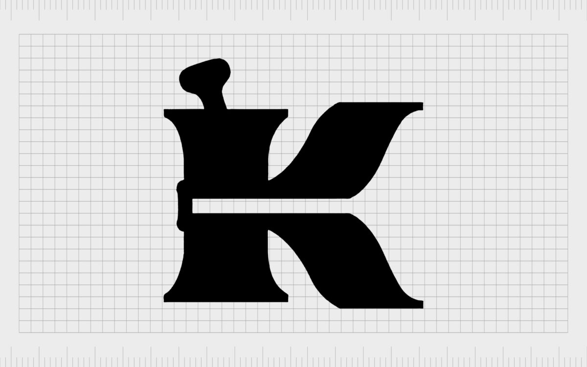
Kiehl’s also has a unique icon it uses in some of its branding, including on its website. This features a large capital “K” in bold font, with a handle protruding from the top of the first line in the “K.” This is intended to represent a pestle and mortar traditionally used for grinding ingredients.
The Kiehl’s logo: Fonts and colors
As we can see from the short Kiehl’s logo history mentioned above, the company is focused heavily on the concept of heritage and sophistication. Over the years, the brand has retained the same visual identity in an effort to preserve its impact on the hearts and minds of customers.
Even the simple tagline included in the logo, mentioning the founding date of the organization, creates trust among audiences. It shows the long-standing history of the brand and highlights the credibility of the company as a sturdy and reliable venture.
If you want to take a closer look at the timeless Kiehl’s logo, you can find some useful resources here:
What color is the Kiehl’s logo?
As mentioned above, the Kiehl’s logo colors have remained primarily the same since the introduction of the initial legacy brand. The main Kiehl’s logo color is black, chosen for the font, which is usually presented on a white background.
However, in some instances, this color palette is inverted, featuring the Kiehl’s script in white on a black background.
The simple but sophisticated color palette highlights the values of the brand, showcasing elegance, power, and consistency. The design is also extremely versatile, allowing Kiehl’s to create signage, products, and various other items with its logo in any landscape.
What font does the Kiehl’s logo use?
The Kiehl’s logo font is a handwritten typeface designed specifically for the brand.
It was intended to look as though it was written in ink during the early days when the company was first launched. The design is similar in some ways to the Adine Kinberg Script. However, there are various distinctive elements in the Kiehl’s logo, such as thicker lines.
The typeface used in the tagline beneath the Kiehl’s logo wordmark is a simple, sans-serif font, depicted in all uppercase letters and designed to contrast with the primary logo.
The design of this typeface is similar to EB Garamond and was chosen to give the design of the logo a more humanistic and inviting quality.
The sophisticated Kiehl’s logo
The Kiehl’s logo history proves that a compelling logo can stand the test of time. Even after almost two centuries in the cosmetics and makeup industry, Kiehl’s has never had to significantly update its visual identity.
The company retains its heritage and sophistication with a beautiful, script-style wordmark designed to connect with its target audience.
Elegant and compelling, the Kiehl’s logo tells us instantly about the company’s commitment to excellence, creativity, and beauty.
Kiehl’s logo FAQ
Is Kiehl’s a high-end brand?
Kiehl’s has always positioned itself as a luxury brand. Even when L’Oréal purchased the company, it maintained its presence as a high-end retailer. The company leverages the power of nature and innovative technology to create unique skincare formulations.
What font is Kiehl’s logo?
The Kiehl’s logo font is a handwritten, script-style typeface designed to show creativity, humanity, and elegance. It’s similar in some ways to the Adine Kinberg Script font. The tagline font underneath the main wordmark is similar to EB Garamond.
What is Kiehl’s brand slogan?
Kiehl’s current brand slogan is “Let Us Change Your Skin.” However, the organization has also used the line “Nature within since 1851” in the past.
Fabrik: A branding agency for our times.
Clarity starts with a conversation.
Thanks—we’ll get back to you shortly.
Whether you're navigating a rebrand, merger, or simply need a clearer identity—we’re here to help. No hard sell, just honest advice from people who know the sector.
Let’s start with a simple question…
Prefer to email? Drop us a line.
Fabrik’s been helping organisations rethink and reshape their brands for over 25 years. We’ve guided companies through mergers, rebrands and new launches. Whatever stage you’re at, we’ll meet you there.


