The history and evolution of the McKesson logo in healthcare

The healthcare industry is brimming with impressive emblems, like the McKesson logo, designed to capture the attention of customers and demonstrate both authority and compassion. Throughout the years, these designs often evolve, as companies refine their brand identity.
Looking back at McKesson logo history, we can learn a thing or two about the importance of logo refinement.
Like many logos in the medical and healthcare space, the McKesson emblem today uses a combination of carefully chosen typography and color to send a specific message to US consumers.
The pharmaceutical company uses its visual identity to tell its audience it’s both trustworthy, and innovative, focused on delivering excellent experiences to clients.
If you’ve ever wanted to learn more about how medical companies have transformed and enhanced their logos through the decades, you’re in the right place. Today, we’re going to take a closer look at the McKesson brand, and it’s evolving emblem.
What is McKesson most known for? An introduction
Before starting our exploration of McKesson logo history, let’s begin with an introduction to the corporation itself.
The McKesson company, otherwise known as McKesson Corp, is an American company best-known for distributing pharmaceuticals, health technology, and medical supplies to care providers across the globe.
First launched in 1833, by John McKesson and Charles Olcott, the business began life as a distributor, importer, and wholesaler of botanical drugs.
Over the years, the business model grew, thanks to strategic mergers and acquisitions. In 1999, the company acquired the medical information systems firms, HBOC, and even updated its name for a short time.
By 2014, McKesson had become one of the biggest health care companies in the world, earning more than $179 billion in annual revenue after the acquisition of Celesio. Today, McKesson has more than 78,000 employees, and is responsible for creating a third of all the pharmaceuticals in North America.
The organization also strengthened its presence in the healthcare market during the COVID-19 pandemic, expanding on its credentials as a vaccine distributor, to deliver hundreds of millions of vaccine doses for the pandemic.
In 2021, McKesson achieved the number 7 spot on the Fortune 500 list of the largest US corporations, with revenues of around $238.2 billion.
What is the McKesson slogan?
McKesson’s slogan is a significant part of its branding strategy, which revolves around a commitment to true compassion and care. The slogan, “It’s not just a package, it’s a patient,” demonstrates the brand’s focus on putting human lives first.
McKesson logo history: The evolving McKesson symbol
Though the McKesson company first started life in 1833, nearly 200 years ago, information about the brand’s logo history is somewhat limited.
Today, many of the earliest logos connected with the brand come from the late 1900s, when the business began growing significantly in its industry.
Since then, McKesson’s visual identity has evolved to become more colorful and impactful.

1983
One of the very first McKesson logos still available to access from the healthcare brand, was introduced in 1983. The design is relatively simplistic, but innovative.
Rather than relying exclusively on a basic wordmark, like many other healthcare brands, McKesson chose to enhance its emblem with the use of strategically placed white space.
The “C” appears within the section between the “M” and the “K” of the wordmark, making the company appear more modern and intuitive.
The monochromatic color palette of black and white was chosen to establish McKesson as an authority in its field, showcasing credibility and sophistication.

1999
As mentioned above, after McKesson purchased the HBOC brand, it also briefly updated its brand name, to highlight the inclusion of the new company. The title for the organization became “McKessonHBOC”, and an additional acronym was added to the logo.
The new emblem was a world apart from the previous logo, though it still utilized a bold, sans-serif font. The white space design was removed, and the color palette was updated to blue and white, symbolizing trustworthiness and reliability.
An oval design, made of two curved lines was also added to the wordmark, connecting the two “O’s” in the design, to convey ideas of unity and collaboration.

2001
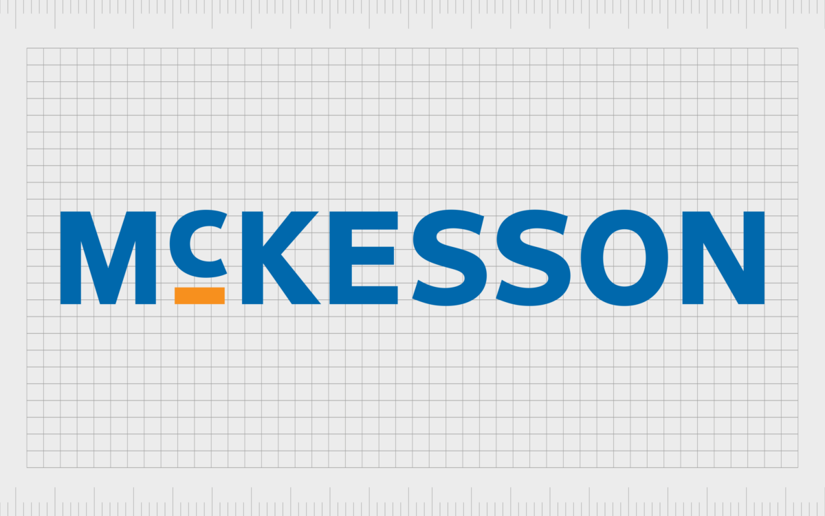
Shortly after changing its name and emblem, McKesson reverted back to its original moniker. The logo design was simplified to a single wordmark once again. Here, the “C” stands out in the inscription, but for a different reason to the original logo.
The smaller “C”, elevated by a yellow line, intends to showcase ideas of innovation and elevation. McKesson used the brightly colored line in the image to draw attention to its warm, friendly, and creative nature. The rest of the color palette consists of a blue wordmark on a white background.
These color choices are common in the healthcare industry, as they’re often connected with reliability, trustworthiness, and fresh ideas.
The McKesson logo: Fonts and colors
Though simple, the McKesson logo acts as a great example of how a simple wordmark can elevate a company’s visual identity. The carefully chosen color palette instantly conveys some of the core characteristics of the McKesson company, highlighting ideas of creativity and trust.
The color accent added to the logo in the form of the orange/yellow line beneath the “C” helps to make the design look more contemporary and modern. The bright shade is warm and friendly, particularly when combined with the contrasting blue and white shades.
You can find some excellent examples of the McKesson logo here:
What color is the McKesson logo?
The McKesson logo colors have been updated a few times over the years. Initially, the company used a simple black and white color palette, similar to many other pharmaceutical brands.
Eventually, however, the primary McKesson logo color was updated to blue, a shade frequently associated with credibility and professionalism.
In the most recent version of the McKesson logo, we also see a bright orange/yellow accent, in the form of a line below the “C”. This adds a bright and vibrant touch to the overall emblem.
Yale Blue:
Hex: #174EA0
RGB: (23, 78, 160)
CMYK: 0.856, 0.512, 0, 0.372
Cadmium Orange:
Hex: #F29130
RGB: (242, 145, 48)
CMYK: 0, 0.400, 0.801, 0.050
What font does the McKesson logo use?
Throughout McKesson logo history, the company’s emblem has consistently relied on the use of bold, sans-serif typefaces, to convey modernity and strength. The current McKesson logo font is similar in style to Neue Frutiger Com Black, and features thick lines, and balanced spacing.
In some cases, when the McKesson tagline, “Empowering Healthcare” appears beneath the logo, this is depicted in a similar font style, reminiscent of Neue Frutiger Com Italic.
The transformation of the McKesson brand
Though minimalistic in style, the McKesson logo is an excellent insight into how a compelling wordmark, and the right color palette can transform a brand’s identity. The eye-catching McKesson emblem immediately tells potential customers everything they need to know about the brand.
The bold sans-serif font is friendly, but modern, with an authoritative air. The blue shade used throughout the inscription tells us the business is reliable, and trustworthy. At the same time, the orange underline beneath the “c” gives the McKesson logo a warm and creative vibe.
McKesson logo FAQ:
What company owns McKesson?
McKesson Corp isn’t owned by anyone officially. It’s a public company, with various investors. The company is responsible for managing a variety of subsidiaries, however, such as McKesson Europe, Uniprix, Health Mart, and Rexall.
What is McKesson’s new name?
Technically, “McKesson” is the newest name belonging to the brand. Before this, the company was known as McKessonHBOC for a short time. It also held various other names throughout history, such as McKesson & Robbins, Olcott & McKesson, and Olcott.
What is the symbol of McKesson corporation?
The symbol of the McKesson corporation is a simple but compelling wordmark, depicted in a sans-serif font, with a color palette of blue and orange on a white background. The image is both authoritative, and creative at the same time, highlighting the brand’s unique personality.
Fabrik: A branding agency for our times.
Clarity starts with a conversation.
Thanks—we’ll get back to you shortly.
Whether you're navigating a rebrand, merger, or simply need a clearer identity—we’re here to help. No hard sell, just honest advice from people who know the sector.
Let’s start with a simple question…
Prefer to email? Drop us a line.
Fabrik’s been helping organisations rethink and reshape their brands for over 25 years. We’ve guided companies through mergers, rebrands and new launches. Whatever stage you’re at, we’ll meet you there.


