The art of music: The story of the Deezer logo

For music fans, the Deezer logo is more than just a memorable emblem, it’s a symbol of versatility, freedom, and entertainment. Created back in 2007, Deezer is one of the many music streaming companies which helped to transform the way we consume music. But, how much do you know about Deezer logo history, and the company’s brand identity?
At a glance, the Deezer logo has a lot of similarities with many of the emblems produced by major audio streaming companies over the years. The powerful combination mark consists of an eye-catching graphic, combined with a wordmark, intended to highlight the company’s brand identity.
The colorful and vibrant design of the Deezer icon is part of what makes the company stand out so effectively in an increasingly competitive landscape. However, it’s worth noting the Deezer emblem has changed somewhat since it was first developed in 2007.
Here’s everything you need to know about the evolution of the Deezer logo.
Does Deezer still exist? An introduction to Deezer
Deezer is an online music streaming service, first established in France during 2007. The service allows users all over the world to listen to a variety of different types of audio content.
Alongside 90 million licensed tracks, users can also explore a variety of 30,000 radio channels, 100 million playlists, and countless podcasts from creators worldwide.
With around 16 million monthly active users, Deezer isn’t quite as big as some of the other well-known audio streaming solutions in the world today, such as Apple Music or Spotify. However, it is a popular choice for many listeners across Europe.
The service is available for a variety of operating systems, and offers both free and premium services.
Deezer was started by a man named Daniel Marhely, who established the first version of the solution, “Blogmusik” in Paris, to help deliver access to music to listeners around the world.
Unfortunately, the first version of the business was charged with copyright infringement, forcing it to close down and rebrand as “Deezer”. Over the years, as Deezer grew, its footprint spread across multiple countries worldwide, accessing a huge number of premium listeners.
Deezer logo history: The Deezer symbol
Despite a relatively long life in the music industry, there haven’t been many changes to the Deezer emblem throughout Deezer logo history.
In fact, the official logo has only been redesigned once, although it retained the original concept of the first design chosen by the company. Let’s take a closer look at the transformation of the Deezer logo.
2007
The first Deezer symbol was created in 2007, with the launch of the new brand. It shares many similarities to the logo most people will be familiar with today. Bright, but minimalistic, the logo of the French streaming service featured two distinctive elements.
On the right-hand side of the emblem, we see the “Deezer” wordmark, depicted in block, sans-serif letters.
The characters of the emblem are all written in uppercase, demonstrating strength and confidence. The letters are also slightly narrower than usual, to allow for visual balance on a range of platforms.
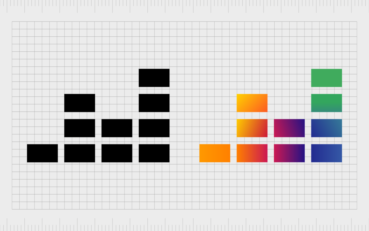
On the left of the logo, we see five pillars of horizontal lines, featuring various colors in different gradients. The lines are intended to look like sound or volume bars, showcasing the company’s focus on audio.
The bright and compelling color palette draws attention to the fun and friendly nature of the business, as well as the diversity of the music selection on the platform.
2019
In 2019, Deezer updated its logo with a focus on simplification. While the style of the logo remained the same (it’s still a combination mark), many of the elements were refined.
The black logotype now includes slightly wider letters, shown in a sans-serif font, all in lowercase. The switch from uppercase to lowercase characters highlights the friendliness of the Deezer brand.
The pillars of color on the left-hand side of the logo are still bright and eye-catching, but the colors have been blended together slightly, creating a more unified appearance. There are now four pillars, instead of five, and fewer lines in each segment, allowing for a more simplified aesthetic.
The Deezer podcast logo variations
Notably, there are various versions of the Deezer podcast and audio logo worth mentioning. Alongside the primary logo shown above, Deezer also utilizes a version of the logo in a monochrome color palette.
There’s also a stacked version of the emblem available, where the colorful lines consume more visual space than the Deezer wordmark.
Additionally, Deezer also has two icon options available for users leveraging its visual identity for app stores and phone downloads. These icons just showcase the graphic from the Deezer emblem, both in a colored version, and a black and white (monochrome) alternative.
The Deezer logo: Fonts and colors
Bright and dynamic, the Deezer logo is a fantastic example of a minimalistic emblem with a lot of personality. The eye-catching logo immediately draws attention to the focus of the brand, and its commitment to sharing versatile music and audio experiences with its audiences.
Both the full Deezer logo and the simplistic icon help to differentiate the Deezer brand from its competitors, and strengthen its connection with its target audience.
Every element of the logo, from the simple sans-serif font, to the varied pillars of the graphic showcase a modern, forward-thinking business. Here are some great examples of the Deezer logo to check out:
What color is the Deezer logo?
The Deezer logo colors have always been bright and vivid, intending to capture the attention of a diverse audience with a compelling and fun visual identity. Though the wordmark for the company’s logo has always been shown in a simple black and white color palette, the icon itself is more vibrant.
The Deezer logo color palette includes orange, purple, blue, and green gradients, intended to reflect the wide variety of music compositions, styles, and genres available on the platform.
The colors are bright and intense, giving energy and dynamism to the logo, and ensuring the company can appeal to customers from a range of different backgrounds.
What font does the Deezer logo use?
The Deezer logo font has only changed slightly in the company’s lifetime. At the beginning of Deezer logo history, the organization used a sans-serif font in all uppercase letters. As the company evolved, it switched the Deezer logo font to a similar sans-serif typeface, this time in lowercase.
Though the font choice is unique to the brand, it’s similar in many ways to various minimalistic, yet bold sans-serif typefaces. The closest option is likely to be the Futura SH Demibold font, although the contour of the letter R has been modified, with an elongated and arched horizontal bar.
The colorful Deezer logo
Looking back through Deezer logo history, we can see even a simple change to an emblem can help to enhance the visual identity of a brand.
Although the components of the Deezer logo have remained relatively consistent throughout the years, the visual identity of the organization has changed somewhat, to match the trends and styles of the current landscape.
Today, the Deezer logo blends well with the styles chosen by many audio streaming companies to capture the attention of their target audience. However, the colorful components of the Deezer emblem also ensure the brand can stand out from competitors in its field.
Fabrik: A branding agency for our times.
Clarity starts with a conversation.
Thanks—we’ll get back to you shortly.
Whether you're navigating a rebrand, merger, or simply need a clearer identity—we’re here to help. No hard sell, just honest advice from people who know the sector.
Let’s start with a simple question…
Prefer to email? Drop us a line.
Fabrik’s been helping organisations rethink and reshape their brands for over 25 years. We’ve guided companies through mergers, rebrands and new launches. Whatever stage you’re at, we’ll meet you there.


