Cadbury logo history: Exploring the Cadbury chocolate logo

How much do you know about Cadbury logo history? You don’t have to be an expert in the origins of chocolate to be familiar with the swirling wordmark of the Cadbury symbol. However, few people can actually identify where this logo came from.
Today, the Cadbury logo is one of the better-known confectionary logos in the world. The image appears on a host of Cadbury products worldwide and immediately evokes ideas of luxury, indulgence, and deliciousness.
The question is, where did this incredible icon begin? What’s the story behind the Cadbury chocolate logo, and how did it come to take on such significance among chocolate lovers?
Today, we’re going to dive into the history of Cadbury chocolate, to find out a little more about the brand.
Cadbury chocolate history: An introduction
Formerly “Cadbury’s,” the Cadbury brand is a British multinational confectionary company currently owned by the Mondelez International brand. The second largest confectionary company worldwide (following Mars), Cadbury has a presence across more than 50 countries worldwide.
The company first appeared in the industry in 1824, thanks to the incredible innovation of John Cadbury, a Quaker known for selling drinking chocolate, coffee, and tea.
With his brother, Benjamin, John decided to develop his own chocolate business, which he eventually passed down to his sons, George, and Richard.
George developed the Bournville estate, a model village which would give the workers of the company better living conditions. In 1905, Dairy Milk chocolate appeared for the first time, using a higher portion of milk in the recipe than competing products.
By 1914, this substance became the company’s best-selling product.
The Cadbury logo was chosen to represent the name of the founder, and the company itself. Cadbury earned its first Royal Warrant from Queen Victoria in 1854 and has been holding a Royal Warrant from Elizabeth the second since 1955.
Cadbury logo history: Cadbury logos over the years
The Cadbury chocolate logo is a wordmark based on the company’s name, which came from the name of the brand’s original founder.
Though the name of the company has remained the same since its original establishment in 1824, the design of the logo has changed somewhat to match the style and audience of the age.

1824
The first version of the Cadbury Chocolate logo was a wordmark written in a simple serif font, designed with bold, rounded letters.
The pronounced serifs and the playful curving of the font’s positioning on Cadbury Chocolate wrappers helped to convey an idea of both sophistication and fun.
The spaces between the letters in this version of the logo were quite pronounced, perhaps in an effort to make the word easier to read.

1866
In 1866, the Cadbury logo evolved to feature a more elaborate wordmark. Each letter included a host of decorative details, and was depicted in capitals rather than lowercase. There were a number of circles and extended elements in this logo, similar to the image we know today.
The spacing between the letters remained somewhat significant, to ensure the wordmark was still completely legible on smaller pieces of chocolate packaging.

In 1866, Cadbury also introduced a second version of its logo which was a little simpler. The letters were still unique in this variation but were far less decorative. Notably, the second version of the logo placed a creamy white font on a brown background – reminiscent of chocolate.

1876
During 1876, Cadbury started to explore with a more playful font again, reintroducing various swirls and unique serifs into a lower-case version of the wordmark. The design was sensual and playful, with a lot of curves and decorative strokes.
In this design of the Cadbury logo, the positioning of the word was also changed, with the end of the company’s name raised up and pointed towards the top-left corner.

1900
The start of a new century brought with it a brand-new logo for the Cadbury brand. This version returned to the use of all capital letters, depicted in bold red font on a pink background. The letters were very thick in this font, but still featured a number of decorative elements.

1905
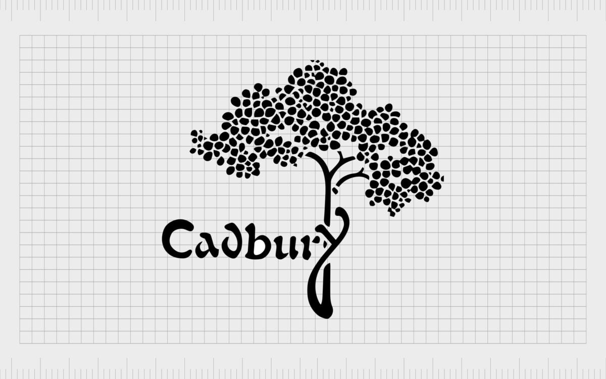
Perhaps one of the lesser-known logos in Cadbury history, the Cadbury emblem featuring a cocoa tree was commissioned from Georges Auriol by William Cadbury. The “Y” of the brand-name in this design also connects with the tree, helping to link the brand to its “roots”.
In this version of the Cadbury logo, the wordmark wasn’t quite as significant as in previous, and later designs. Although the lettering was unique, it lacked some of the distinctive flourishes in other Cadbury logos.

1921
In the 1920s, Cadbury introduced something a lot closer to the design many of us are familiar with today. According to some experts, the script for this wordmark was based on the signature of William Cadbury, which helps to add a sense of heritage to the overall design.
The original script was a little less refined than the one we know today, but it did include the iconic purple coloring, which became very well-known among Cadbury fans later.
In 1960, the style of the writing changed very slightly, removing some excess curls, and updating the coloring to a slightly lighter shade.

2003
In 2003, Cadbury modernized and refined its logo for a new audience. The design was clearly still based on the previous script taken from William Cadbury’s signature. However, this design was more straightforward and simplistic, with fewer flourishes.
The purple variation of the Cadbury logo is still the design many customers are familiar with today. In some cases, you can continue to see this logo on various pieces of Cadbury branding.

2020
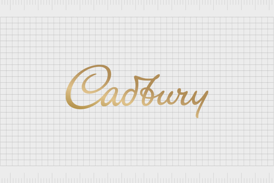
During 2020, Cadbury updated its logo yet again, this time stretching the font ever so slightly, to make it look more elongated and luxurious. Other than changing length slightly, the script remained more or less the same as previous variations.
The biggest difference to the Cadbury logo in 2020 was the introduction of the metallic gold coloring. The gradients throughout the gold make it look as though the logo is shining.
Cadbury chocolate logo elements: Colors and fonts
The Cadbury logo is a symbol of luxury and elegance. Though the design of the emblem today is said to be based on the handwriting of William Cadbury, there are other meaningful elements to it as well.
For instance, the swirling in the “C” of Cadbury is usually represented as the swirl of milk in a chocolate recipe.
Cadbury’s decision to use an eye-catching script wordmark as the heart of their brand image was an intelligent one. The handwritten styling of the font makes the company seem more approachable and human. At the same time, the swirls show the creativity and luxury of the brand.
You can find some helpful Cadbury logo resources here:
What font does the Cadbury bar logo use?
As mentioned above, the Cadbury bar logo font is based on the handwriting of the son of the creator of Cadbury, William Cadbury. This variation of the font we know today is a lot simpler and more refined than the initial wordmark, but it still maintains a lot of similarities.
There are a handful of typography experts who have attempted to recreate this font in the digital world over the years. For instance, you can find a similar design to the Cadbury font in the form of the Brush Script Regular type.
The choice of a handwritten, script-style font for the Cadbury logo is excellent for conveying a sense of excellence, creativity, and passion.
What color is the Cadbury logo?
Cadbury bar colors and Cadbury bar logo colors can change depending on a number of factors. Currently, the official color for the Cadbury logo is gold, designed in a gradient format to make it look as though the wordmark is shining.
The Cadbury bar logo colors include:
University of California gold
HEX: #B9861F
RGB: (185, 134, 31)
Pantone: PMS 7556 C
Spanish violet:
HEX: #482683
RGB: (72, 38, 131)
Pantone: PMS 268 C
Celebrating the Cadbury logo
When it comes to chocolate brands, the Cadbury logo has a distinct presence in the hearts and minds of fans worldwide. Though the Cadbury logos might have changed a number of times over the years, the design has become an icon of all-things luxury for many enthusiasts.
Today, the Cadbury logo is an excellent insight into how the right brand mark can transform the way customers feel and think about your company. The Cadbury symbol instantly evokes ideas of luxury and indulgence in anyone who sees it.
Fabrik: A branding agency for our times.
Clarity starts with a conversation.
Thanks—we’ll get back to you shortly.
Whether you're navigating a rebrand, merger, or simply need a clearer identity—we’re here to help. No hard sell, just honest advice from people who know the sector.
Let’s start with a simple question…
Prefer to email? Drop us a line.
Fabrik’s been helping organisations rethink and reshape their brands for over 25 years. We’ve guided companies through mergers, rebrands and new launches. Whatever stage you’re at, we’ll meet you there.


