The 22 best (and most famous) coffee chain logos

Some coffee chain logos are recognizable all over the world. You’re probably familiar with leading global coffee shop chains like Starbucks, Dunkin’ and even Tim Hortons. Others are more popular in specific regions, like the Dutch Bros’ coffee brand in the US.
Wherever you’re located, it’s almost guaranteed that a specific image jumps to mind whenever someone mentions venturing out for a latte or cappuccino. After all, coffee is one of the most popular beverages in the world, with the average person drinking 2 cups a day.
Like any business, popular coffee shop chains need to find ways to differentiate themselves in an extremely competitive market. While each coffee house has its own unique products and blends to offer, it’s often the coffee chain logo that first captures our attention.
Today, we’re looking at some of the most memorable, and iconic coffee shop logos in the US, and around the world, and how they engage our senses.
Introduction to coffee shop brands and coffee chains
The best coffee shop chains know the right logo is key to not only capturing the attention of their audience, but differentiating themselves from other leading brands. There are dozens of coffee retailers located in the US alone, not to mention hundreds of global coffee companies.
While a great coffee shop logo doesn’t guarantee success, it’s one of the best ways for any business to engage customers, and inspire brand loyalty.
All of the coffee shop logo designs we’re going to review today have something unique to offer, whether it’s an evocative color palette, or a unique design. They also each take their own unique approach to branding, choosing wordmarks, icons, and combination marks for their identity.
However, one thing you’ll notice about all of the top coffee brands, is their commitment to creating a memorable brand. Whether it’s Starbucks’ iconic siren, or Dunkin’s colorful inscription, each brand knows how to capture the interest of its potential customers.
The top coffee chain logos in the US
Behind bottled water, coffee is the second most popular drink in the United States. It’s probably no surprise then, that many of the top coffee chain logos in the world today come from the US.
Many of these famous coffee shops have expanded over the years, appearing in multiple states and regions. Let’s take a closer look at the top national coffee chains in the US.
1. Philz Coffee
Based in San Francisco, California, Philz Coffee was first launched in 2003. It’s known for helping to popularize “third wave coffee”- a movement committed to highlighting premium quality beverages. Philz Coffee specializes in “pour-over coffee”, and has 69 locations within the US.
Philz is named after co-founder, Phil Jaber, who created his store with his son Jacob. The company now sells coffee and drinks, as well as merchandise and bagged coffee blends.
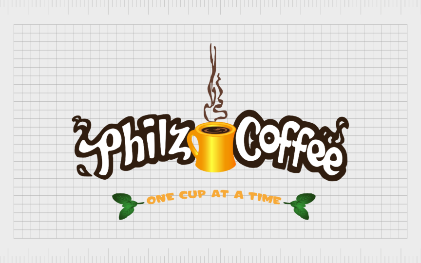
The Philz coffee logo is relatively old-fashioned, featuring a dynamic wordmark, with a coffee cup placed between both words. It also showcases the tagline “one cup at a time”.

2. Dutch Bros
One of the top coffee chains in the US, Dutch Bros’ was established by Dane and Travis Boersma in 1992. The pair moved into the coffee industry after struggling to make a profit with their third-generation dairy farm, after changes in environmental regulations.
Though Dutch Bros is headquartered in Oregon, the local coffee chain has locations in various environments throughout the US. It specializes in “drive-thru coffee” options.
Unlike other famous coffee chain logos, Dutch Bros is quite colorful and modern, it’s intended to capture the attention of customers looking for quick access to coffee on the move.
3. Black Rifle
The Black Rifle company, otherwise known as “BRCC”, is a well-known local franchise, based in Salt Lake City, Utah. Though the coffee brand launched in 2014, it earned a number of loyal customers in 2017, after pledging to hire 10,000 veterans.
The Black Rifle Coffee Company was launched by former Green Beret, Evan Hafer, who initially sold his “Freedom Roast coffee” online.
The Black Rifle Coffee company logo is relatively straightforward, featuring a wordmark spread across two lines, in thick, sans-serif font. There’s also a circular emblem, featuring the first letter of each word in the company’s name.
4. Peet’s coffee
San Francisco-based specialty coffee house, Peet’s coffee was initially founded in 1966, by Alfred Peet, a man whose father owned and operated a wholesale coffee bean grindery in the Netherlands. The company introduced the US to some of the first dark roaster Arabica coffee bean blends.
As of 2021, Peet’s coffee had over 200 stores in the United States. Additionally, the company’s products are sold in more than 14,000 grocery stores throughout the region.
In the Peet’s coffee logo, we see a stylized letter “P”, placed alongside a retro-style wordmark, with letters that seem to bounce around the page, showcasing vitality and movement.

5. Biggby Coffee
Founded in Michigan, during 1995, Biggby Coffee, or “Big B”, is an American franchise with a significant presence throughout the United States. By 2022, the company had more than 280 locations throughout America, all known for selling unique coffee blends.
In 2011, Biggby coffee was named the fastest-growing coffee chain in America by CNBC, and the brand name became a staple in many homes.
The Biggby coffee logo is clean and bold. On the left, there’s a large letter “B” placed in an orange rectangle. On the right, we see the Biggby Coffee name, depicted in a friendly, sans-serif font.
6. Dunn Brothers coffee
Slightly smaller than some of the other coffee shop brands on this list, Dunn Brothers is one of the most popular coffee places in Minnesota. It was founded in 1987, by Ed and Dan Dunn, and named after its co-founders.
The coffee franchise sells a range of iced and hot beverages, as well as baked goods, in 57 locations throughout the United States. It also roasts its coffee beans in-store.
Sleek and simple, the Dunn Brothers’ logo features a three-level wordmark. The first two words are depicted in a red font with strong serifs, while “Coffee” appears in a thin, sans-serif font.

7. Caribou Coffee
One of the most interesting coffee shop logos on this list comes from Caribou Coffee, an American coffee chain founded in Edina Minnesota in 1992. The company grew rapidly throughout the world, and now has 603 locations globally.
Caribou Coffee gained a lot of attention in the modern market, with its focus on selling Rainforest Alliance certified coffee to eco-conscious customers.
The logo is quite interesting, featuring a number of abstract shapes and lines, placed over a blue shield-style emblem. The name “Caribou” is depicted in a handwritten, cursive font, making the company seem more human and friendly.

8. La Colombe Coffee Roasters
Another extremely popular brand among coffee lovers in the United States, La Colombe is best-known for selling coffee drinks at grocery stores. However, the brand also runs a popular chain of coffee shops throughout the United States.
The company was founded in 1994, in Pennsylvania, and has various locations across the United States. It’s best known for its focus on high-quality and organic coffee.
The La Colombe coffee shop branding is quite simple. The trademarked logo is a simple wordmark, with various styles of typography used to showcase sophistication, quality, and strength.
9. PJ’s Coffee
PJ’s Coffee of New Orleans, otherwise just known as “PJ’s Coffee” is an American chain of retail coffee houses. Initially, the company was founded with just one shop in New Orleans in 1978. Phyllis Jordan wanted to create a new coffee store for local customers.
Over the years, PJ’s spread throughout the Greater New Orleans landscape, with a range of company-owned outlets. The first franchise in 1989 was followed by a range of new franchises in other parts of the United States.
PJ’s Coffee uses a rectangular logo, in purple, with the letters “PJ’s” taking up most of the space in the icon. The curve of the letter “J” also helps to shape the image of a coffee mug.
Famous coffee shops: Top international coffee chains
While there are certainly plenty of popular coffee chains in the US, it’s worth drawing attention to the coffee retailers that thrive in other parts of the world too. Some of the best-known coffee shop logos have spread overseas, to connect with consumers all over the globe.
Here are some of the top global coffee companies, and their logos.

1. Starbucks
When it comes to listing the most famous coffee chain logos, it’s impossible to ignore the enduring image of the Starbucks company. Though it started life in America, Starbucks is now the world’s largest coffee chain, with stores in more than 80 countries worldwide.
Initially founded in 1971, Starbucks is responsible for the second wave of coffee culture. The company sells a huge range of products, and was apparently named after a character from the Herman Melville novel, Moby Dick.
The Starbucks founders based their logo on the image of a siren from Greek mythology. Over the years, the evolution of the Starbucks logo made the image simpler, removing the “Starbucks coffee” wordmark and accompanying components.
Find out more about the Starbucks logo here.

2. Tim Hortons
Commonly known as “Tim’s” or just “Hortons”, Tim Hortons is a Canadian multinational coffee house, and a popular restaurant chain. The brand is the largest quick-service restaurant chain in Canada, and also has restaurants in more than 15 countries.
The business was initially founded by Tim Horton, who named his company after himself, in 1964. Over the years, Tim Horton’s has expanded beyond the coffee landscape, to sell a wide range of foods and beverages to global consumers.
One of the simplest coffee shop logos on this list, Tim Hortons’ logo features a cursive wordmark, in red, to symbolize vitality and passion. It almost looks like a signature, giving the company a human aesthetic.

3. Dunkin’
Previously known as “Dunkin’ Donuts”, Dunkin’ was initially launched in 1948, in Massachusetts. The company is one of the best-known coffee chains in the world, with 12,900 locations in more than 42 countries. It also sells products in grocery stores.
Dunkin’ has an eye-catching coffee logo design, which has become much simpler over the years, appealing to a younger generation of coffee consumers.
The color scheme of orange and pink used in the Dunkin’ logo helps to draw attention to the company’s fun and friendly brand identity.
4. McCafé
Launched in 1993, in Melbourne Australia, McCafé is a coffee-house food and beverage chain, owned by the McDonald’s company. The brand was initially conceptualized to help McDonald’s expand into new environments in the food and beverage industry.
By the end of 2002, the chain spread across 13 countries, with dedicated stores opening outside of McDonald’s locations.
McCafé uses a simplistic wordmark for its logo, featuring an interesting font, intended to look like human handwriting. The brown color scheme draws attention to the concept of coffee, while the unique wordmark makes the brand look fun and creative.
5. Blue Bottle Coffee
Roaster and retailer, Blue Bottle Coffee, is currently owned primarily by Nestlé, but it still stands as a major player in the world of third-wave coffee. The brand was launched in 2002, in Oakland California, and stands out for its focus on single-roast beans.
Blue Bottle quickly expanded to locations and cafes around the United States, and even began to branch into areas outside of the US, in regions like Tokyo and Hong Kong.
One of the key elements of the logo used by the Blue Bottle Coffee company is the simplified image of a blue bottle, placed at the top of its logo design. The logo also features a relatively simple wordmark, depicted in all uppercase letters.
6. Costa Coffee
Costa Limited, better known as Costa Coffee, is a British coffee house chain first founded in 1971, by Sergio Costa. The company initially focused on selling roasted coffee to specialist shops and caterers before it branched into creating its own chain.
The Costa Coffee brand is now present in 31 countries, with 3,401 stores around the world. The company also has a number Costa Express vending machines located in supermarkets and stores in different regions.
Costa coffee uses a dual-level wordmark as its logo. The most interesting part of the coffee brand logo is the “S” character, which looks a little like rising steam from a coffee cup.
7. Caffé Nero
Headquartered in London England, Caffé Nero is one of the better-known European coffee chains in the world. It was established in 1997, by founder Gerry Ford, who led a small group of investors in the purchase of various London coffee houses.
Over the years, the Nero brand expanded overseas, with more than 1,000 locations appearing in regions like Sweden, Turkey, the UAE, and even the United States.
The coffee shop logo of Caffe Nero features a bold wordmark, depicted in a soft yellow color, or black, surrounded by a golden outline, to symbolize quality.
8. Luckin Coffee
Chinese coffee chain, Luckin Coffee was founded in Beijing in 2017. It became one of the fastest-growing brands in the industry, with more than 9,351 stores throughout the region in 2023. Alongside cafes, the company also operates shops, stores, and kiosks.
Interestingly, customers need to download a specific app to pay for drinks online with the Luckin’ brand. Today, Luckin’ has more stores than even Starbucks in China and Singapore.
Luckin Coffee uses a simple wordmark in sans-serif font, accompanied by an emblem featuring the outline of a deer on a blue circle. This unique design was chosen to form an emotional connection with customers in search of natural coffee products.
9. Hudsons Coffee
Best-known in Australia, Hudsons Coffee launched in 1998. The company name comes from one of the co-founders, Ros Hudson. Although the brand isn’t as large as some of the coffee retailers on this list, it still has 67 locations across Australia, and one in Singapore.
According to the founders, the name for the coffee shop was chosen to give the business a friendly and “international” feel.
The simple logo of Hudsons coffee features the coffee shop name in different weights, in a sans-serif font. Above this, we see a heart shape, with one side designed to look like the steam rising from a good cup of coffee.
10. Coffee Beanery
Launched in 1976, The Coffee Beanery, otherwise known just as “Coffee Beanery” had humble origins, starting as a basic coffee café in Michigan. The founders now make most of their money selling equipment and franchises to other entrepreneurs.
Currently, the Coffee Beanery has locations in the United States, as well as Asia. There are around 131 franchises in the US, as well as 25 in other countries. Unfortunately, around 100 of the company’s initial franchises have failed.
The Coffee Beanery logo features a simple wordmark, in geometric, sans-serif font, accompanied by an emblem which uses the letters “C” and “B” to create the image of a coffee cup.
11. Gloria Jean’s Coffees
Gloria Jean’s Coffees, better known as “Gloria Jean’s,” is an American-Australian coffee house, first launched in 1979. The company was named after the founder, Gloria Jean Kvetko, who started her venture with a small coffee and gift shop in the Chicago area.
The company quickly grew, with 50 locations appearing throughout the United States after it started selling franchising rights to the “Coffee People” chain. Today, there are more than 599 Gloria Jean’s stores in 40 countries worldwide.
Like many of the top coffee chain logos, Gloria Jean’s emblem is relatively simple, featuring a script font, similar to handwriting, placed inside of a circular border.

12. Joe & The Juice
Danish brand of juice bars and coffee shops, Joe & the Juice was launched initially in 2002. It was first based in Copenhagen, in Denmark, and focused on selling healthy products, including coffees, teas, sandwiches, smoothies, and fresh juices.
Though the company competes with well-known shops like Starbucks, it focuses in developing an “edgier” vibe in its coffee locations. Today, it has 383 stores located worldwide.
The company has one of the most complex logos on this list, featuring the image of a silhouetted man, drinking a cup of coffee, within a pink circular badge. The company’s name appears in sans-serif font above the image, and is accompanied by a strapline.

13. The Coffee Bean and Tea Leaf
The coffee and tea shop, “International Coffee & Tea”, is better-known as the Coffee Bean & Tea Leaf. The American chain was first founded in 1963, and now has more than 1,000 self-owned and Franchised stores in the United States and 31 other countries.
The brand was inspired by founder Herbert Hyman’s desire to import, roast, and sell gourmet coffee in the Los Angeles area. Over the years, the company invested in many innovations, including selling whole beans to customers.
To create the perfect logo, the company chose a simple circular badge, similar to the stamps one might see on imported coffee products. The essential elements include the image of a tea leaf, and a coffee bean, as well as a wordmark, all depicted in purple.
Celebrating the leading coffee shop logos
As you can see from the coffee chain logos above, creating the right image for your coffee chain is crucial to capturing the attention of the right audience. Coffee shop owners around the world have worked carefully to produce the perfect visual identity for their ventures.
Each logo mentioned on this list has something unique to offer, whether it’s a depiction of a mug of hot coffee, or a carefully chosen selection of brand colors.
Creating a good logo design isn’t simple, but many of the most iconic coffee brands have perfected the art of showcasing their personality, through simple design elements, from the right typography to simple shapes and graphics.
If you’re thinking of starting your own coffee shop, or franchise, reach out to Fabrik Brands today to see how we can help you create the perfect image for your business.
Fabrik: A branding agency for our times.
Clarity starts with a conversation.
Thanks—we’ll get back to you shortly.
Whether you're navigating a rebrand, merger, or simply need a clearer identity—we’re here to help. No hard sell, just honest advice from people who know the sector.
Let’s start with a simple question…
Prefer to email? Drop us a line.
Fabrik’s been helping organisations rethink and reshape their brands for over 25 years. We’ve guided companies through mergers, rebrands and new launches. Whatever stage you’re at, we’ll meet you there.


