


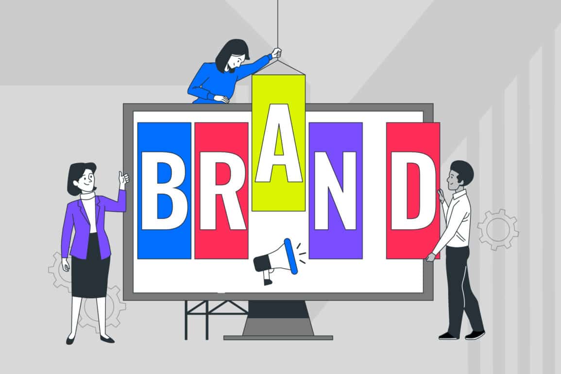


What is visual identity—and why does it matter?

Picture this: you’re scrolling through your phone, and within milliseconds, you recognise a brand without even reading the name. That instant recognition? That’s visual identity at work—and it’s far more sophisticated than most people realise.
A comprehensive brand design system isn’t just about having a pretty logo or picking nice colours. It’s a strategic approach to brand expression that shapes perceptions, builds trust, and creates the kind of instant recognition that makes customers choose you over competitors.
For senior marketing professionals and brand managers, understanding this as a complete system rather than a collection of design elements is crucial for driving brand growth and differentiation.
The most successful companies treat their brand visual identity as a strategic asset. They understand that every visual touchpoint—from website headers to business card layouts—contributes to a larger narrative about who they are and what they represent.
This systematic approach to visual branding creates compound effects that amplify brand impact across all customer interactions.
At Fabrik, we’ve seen how strategic visual brand expression transforms businesses—turning forgettable brands into memorable ones that customers actively seek out.
Defining visual identity: More than just a logo
When most people think about brand visuals, they picture a logo. But that’s like describing a symphony by humming just the opening notes.
A truly strategic approach is a comprehensive brand design system that orchestrates multiple elements into a cohesive brand experience that resonates across every customer touchpoint.
Modern businesses require more than standalone design elements—they need integrated visual frameworks that adapt seamlessly across digital platforms, print materials, environmental spaces, and emerging media channels.
This comprehensive approach ensures that whether customers encounter your brand on a smartphone app, a conference banner, or a product package, they experience consistent visual communication that reinforces your core brand message.
Visual identity as a complete system
Comprehensive brand design systems encompass every aesthetic element that represents your brand: logos, typography, colour palettes, imagery styles, layout principles, iconography, and even the way these elements interact with each other.
Think of it as a visual language that speaks consistently across every touchpoint, from your website to your business cards to your social media presence.
The magic happens when these elements work together as a cohesive whole.
Your colour palette isn’t just about looking good—it’s about evoking specific emotions that align with your brand positioning.
Your typography doesn’t just need to be readable—it needs to reflect your brand personality and speak to your target audience’s preferences and expectations.
When these components are strategically aligned, they create powerful visual brand expression that communicates your values before anyone reads a single word.
This systematic approach ensures that whether someone encounters your brand on LinkedIn, in a presentation, or on a billboard, they experience the same visual language.
That consistency is what transforms casual viewers into brand advocates who actively seek out and recommend your products or services.
The difference between visual identity and brand identity
Here’s where many marketing professionals get tangled up: these concepts aren’t the same thing, though they’re closely related.
Brand identity is the complete ecosystem of how your brand presents itself to the world—it includes your values, personality, voice, positioning, and yes, your visual elements.
The visual component is specifically the aesthetic dimension within that broader brand identity framework. It’s how your brand looks, while brand identity encompasses how your brand thinks, speaks, and behaves.
Your brand visual identity translates abstract concepts like “trustworthy” or “innovative” into concrete design elements that people can see and remember.
Think of brand identity as your brand’s DNA, and the visual component as how that DNA expresses itself aesthetically. One informs the other, but they serve different strategic purposes in building a cohesive brand experience.
Understanding this distinction helps marketing teams allocate resources appropriately and ensures that visual decisions support broader strategic objectives rather than existing in isolation.

Why visual identity matters to your brand
The question isn’t whether visual branding matters—it’s how much competitive advantage you’re willing to leave on the table by treating it as an afterthought.
In today’s visually saturated marketplace, strategic brand personality expression through cohesive visual elements can be the difference between blending in and standing out as an industry leader.
Building instant recognition
In our attention-deficit world, you have roughly three seconds to make an impression. Strategic approaches to brand recognition create instant recall that cuts through the noise.
When customers can identify your brand at a glance, you’ve achieved something invaluable: mental availability.
Consider how Apple’s clean, minimalist aesthetic immediately signals innovation and premium quality, or how Coca-Cola’s distinctive red and flowing typography creates instant recognition across cultures and languages.
This isn’t accident—it’s the result of consistent, strategic visual branding that’s been refined over decades.
For your brand, developing this instant recognition means customers don’t have to think twice when making purchasing decisions. Your visual approach becomes a mental shortcut that associates your brand with specific qualities and experiences.
This cognitive efficiency is particularly valuable in crowded marketplaces where decision fatigue can lead customers to default to familiar choices.
Expressing your brand personality
Visual elements are emotional triggers that communicate personality traits faster than words ever could. Colours evoke feelings, typefaces suggest characteristics, and imagery styles communicate values.
This is how your brand personality becomes tangible and memorable to your audience.
A fintech startup might use sharp, geometric typography and a bold colour palette to communicate precision and innovation. Meanwhile, a wellness brand might choose organic shapes, soft colours, and flowing typography to suggest calm and natural balance.
These aren’t just aesthetic choices—they’re strategic decisions about how you want customers to feel about your brand.
When your visual approach authentically reflects your brand personality, it creates emotional connections that go beyond functional benefits. Customers don’t just buy your product; they buy into what your brand represents.
This emotional resonance is particularly powerful in sectors where functional differentiation is minimal—your visual personality becomes a key competitive advantage.
Ensuring brand consistency across touchpoints
Here’s where many brands stumble: they create beautiful brand guidelines, then fail to maintain consistency across different channels and applications. Inconsistent visual approaches confuse customers and dilute brand recognition.
Effective brand consistency means your visual system works seamlessly whether it’s displayed on a smartphone screen, printed on packaging, or projected in a presentation.
This requires thinking beyond individual design elements to consider how your visual system adapts across different contexts while maintaining its core characteristics.
Consistency builds trust. When customers encounter the same visual language across all touchpoints, it signals professionalism and reliability.
Inconsistency, on the other hand, suggests a brand that doesn’t have its act together—hardly the impression you want to make.
Research shows that consistent brand presentation can improve revenue by up to 33%, making this more than just an aesthetic consideration.

What makes an effective visual identity?
Creating impactful brand design systems requires more than aesthetic sensibility—it demands strategic thinking that balances creative excellence with practical application.
The most successful flexible design systems emerge from a deep understanding of brand objectives, audience needs, and the realities of implementation across diverse channels and contexts.
Strategic foundation, not just style
The most effective visual identities aren’t born from aesthetic preferences—they’re rooted in brand strategy and deep audience insights.
Before choosing colours or typefaces, successful brands understand who they’re speaking to, what they want to communicate, and how they want to differentiate themselves in the marketplace.
This strategic foundation means every visual decision serves a purpose.
Your colour palette isn’t chosen because it’s trendy; it’s selected because it resonates with your target audience and supports your brand positioning.
Your typography doesn’t just look modern; it reflects the personality traits you want customers to associate with your brand.
At Fabrik, we always start with strategy before moving to creative execution.
Understanding the ‘why’ behind visual choices ensures that your visual identity works to achieve business objectives rather than just looking impressive in award submissions.
Scalable systems for real-world use
Beautiful design that doesn’t work in practice is just expensive decoration. Effective approaches create flexible design systems that maintain their impact whether they’re applied to a massive digital billboard or a tiny social media avatar.
This scalability requires thinking systemically about how visual elements interact and adapt. Your logo needs to work in full colour, single colour, and reversed out applications.
Your colour palette should include primary and secondary options for different contexts. Your typography system should specify hierarchy and usage guidelines for different content types.
The goal is creating cohesive brand visuals that empower your team to maintain consistency without requiring a designer for every application. When your visual system is truly scalable, it becomes a tool that accelerates rather than complicates your marketing efforts.
Tools that ensure consistency
The most brilliant visual approach falls apart without proper implementation tools. Brand guidelines, asset libraries, and template systems are crucial for maintaining consistency as your brand scales and evolves.
These tools transform your visual system from a static presentation into a living framework that guides decision-making across your organisation.

Fabrik’s perspective: visual identity as a strategic advantage
Developing a strategic visual identity requires balancing creative inspiration with commercial reality. Our approach treats visual brand expression as an integral part of business strategy, not a decorative addition.
Through collaborative workshops and multidisciplinary expertise, we create brand guidelines that serve as practical tools for building cohesive brand visuals that drive measurable business outcomes.
At Fabrik, we approach visual identity as a strategic advantage rather than a creative afterthought.
Our process balances strategic clarity with creative excellence, ensuring that every visual decision supports broader business objectives while creating distinctive, memorable brand experiences.
We believe in collaborative, multidisciplinary development that brings together strategists, designers, and client teams in co-creation workshops.
This approach ensures that visual identity systems aren’t just aesthetically strong—they’re strategically sound and practically implementable.
Our work with Amplius demonstrates how strategic visual identity can unify complex merger scenarios, while our collaboration with Paragon shows how visual systems can elevate B2B brands in competitive markets.
Meanwhile, Slamcore’s visual identity perfectly balances technical credibility with approachable innovation.
Each project reinforces our belief that visual identity isn’t decoration—it’s a strategic tool that drives recognition, differentiation, and business growth.

Why your visual identity can’t be an afterthought
Strategic visual approaches are far too important to leave until the end of your brand development process. They’re strategic tools that shape perceptions, build recognition, and create emotional connections with your audience.
When treated as an integrated part of your brand strategy rather than a cosmetic enhancement, comprehensive brand design systems become powerful drivers of business growth.
The most successful brands understand that visual approaches aren’t about following design trends—it’s about creating strategic visual brand expression that authentically represents who you are and resonates with the people you serve.
In an increasingly crowded marketplace, that strategic approach to brand visuals isn’t just nice to have—it’s essential for standing out and staying relevant.
Your brand visual identity is an opportunity to differentiate, engage, and grow. The question isn’t whether you need one—it’s whether you’re ready to approach it strategically.
Fabrik: A branding agency for our times.

Clarity starts with a conversation.
Thanks—we’ll get back to you shortly.
Whether you're navigating a rebrand, merger, or simply need a clearer identity—we’re here to help. No hard sell, just honest advice from people who know the sector.
Let’s start with a simple question…
Prefer to email? Drop us a line.
Fabrik’s been helping organisations rethink and reshape their brands for over 25 years. We’ve guided companies through mergers, rebrands and new launches. Whatever stage you’re at, we’ll meet you there.