


Ubisoft logo history: A story of hidden message and evolution
For fans of the gaming landscape, the Ubisoft logo is sure to be a familiar icon. Though the brand hasn’t been around as long as some other major gaming companies, such as Nintendo or Sony, it has impacted the industry.
The brand’s most recent emblem may seem slightly simplistic compared to previous designs introduced throughout the Ubisoft logo history. However, this monochromatic and minimalist logo is more meaningful than you think.
Like many of the most famous video game logos, it helps convey the brand’s unique personality and its vision for the gaming space.
If you’ve ever found yourself marveling at the swirling design of the Ubisoft logo and wondering how the company chose its memorable emblem, you’re in the right place. Here’s everything you need to know about the Ubisoft logo and its history.
What does Ubisoft mean? An introduction to Ubisoft
Ubisoft, formerly known as “Ubi Soft,” is a French video game company with development studios distributed across the globe.
Responsible for producing some of the world’s most popular franchises, including Assassin’s Creed, Watch Dogs, and Far Cry, Ubisoft has earned quite a reputation in its industry over the years. It’s also among the most profitable video game brands out there.
Ubisoft started with relatively humble origins. The Guillemot family, a well-known group of entrepreneurs and innovators in the French landscape, were responsible for the introduction of Ubisoft.
The five brothers in the family decided to launch their own business in 1984, known as Guillemot Informatique. The brand quickly became popular, selling computer hardware and tools to companies throughout France.
As demand for technology continued to grow, the brothers realized video game software was becoming a lucrative opportunity in their industry. They decided to build a new company, Ubi Soft Entertainment, in 1986. The name “Ubi Soft” was meant to stand for “Ubiquitous Software.”
Over the years, the Ubi Soft company evolved, producing a range of video games that would eventually target fifth-generation consoles such as the PlayStation.
By 1993, Ubi Soft had become the biggest distributor of video games in France. In the years ahead, the company changed its name to “Ubisoft” and introduced a new logo to celebrate, now known as the “swirl.”
Ubisoft logo history: The evolution of the Ubisoft symbol
The Ubisoft logo history started in 1986 officially. Despite only being in the gaming industry for a handful of years compared to some competitors, Ubisoft has made a number of changes to its logo.
However, the core “swirl” element of the logo has remained consistent since the brand changed its name, removing the space between “Ubi” and “Soft.”
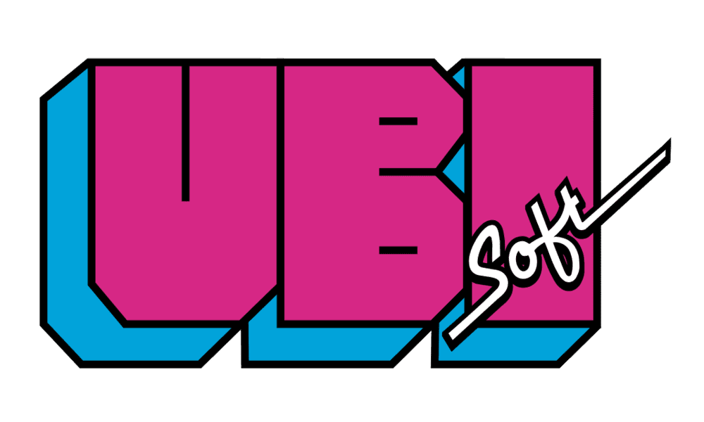
Designed to correspond with the fashion landscape of the time, the original or old Ubisoft logo was one of the brightest and boldest created by the company. The fun and youthful design combined the large word “UBI” in all capital letters with a much smaller inscription for “Soft.”
The colors blue, purple, and white were used, with black borders on the letters.
1989
Shortly after introducing its first logo in 1986, Ubisoft chose a slightly more refined, professional emblem in 1989. The new design gives equal focus to both of the words in “Ubi Soft,” with a bold, serif-style font. An Italicized tagline was also added below for “Entertainment Software.”
In this design, the only colors used were black and white. The more sophisticated emblem was reminiscent of an old Microsoft logo at the time.
1993
Four years later, in 1993, Ubisoft once again started from scratch with their logo design, exploring a highly geometric emblem with diamond and square shapes used throughout. The word “Ubi” had its glyphs separated into different colored boxes.
Each letter was written in a serif, italicized font, in black. The word “Soft” appeared underneath on a red block background, in all uppercase letters.
This interesting logo design combined the professional nature of the Ubisoft team with a fun and playful vibe. While the typeface indicated sophistication, the color choices were intended to attract the attention of a younger audience.
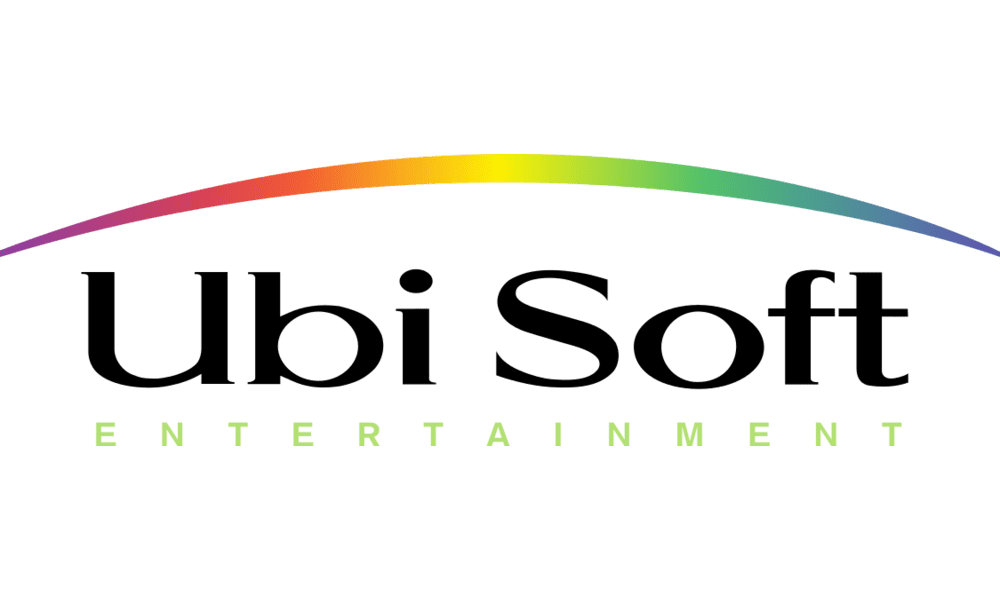
After one year with their new geometric logo, Ubisoft changed its design again, celebrating the launch of the new Rayman game. This time, the logo featured a rainbow swipe across the top of the image, with the name “Ubi Soft” underneath in simple, serif font.
The word “Entertainment” also appeared in soft green font, in a sans-serif design. The new image was intended to represent the company’s desire to make its games universally appealing.
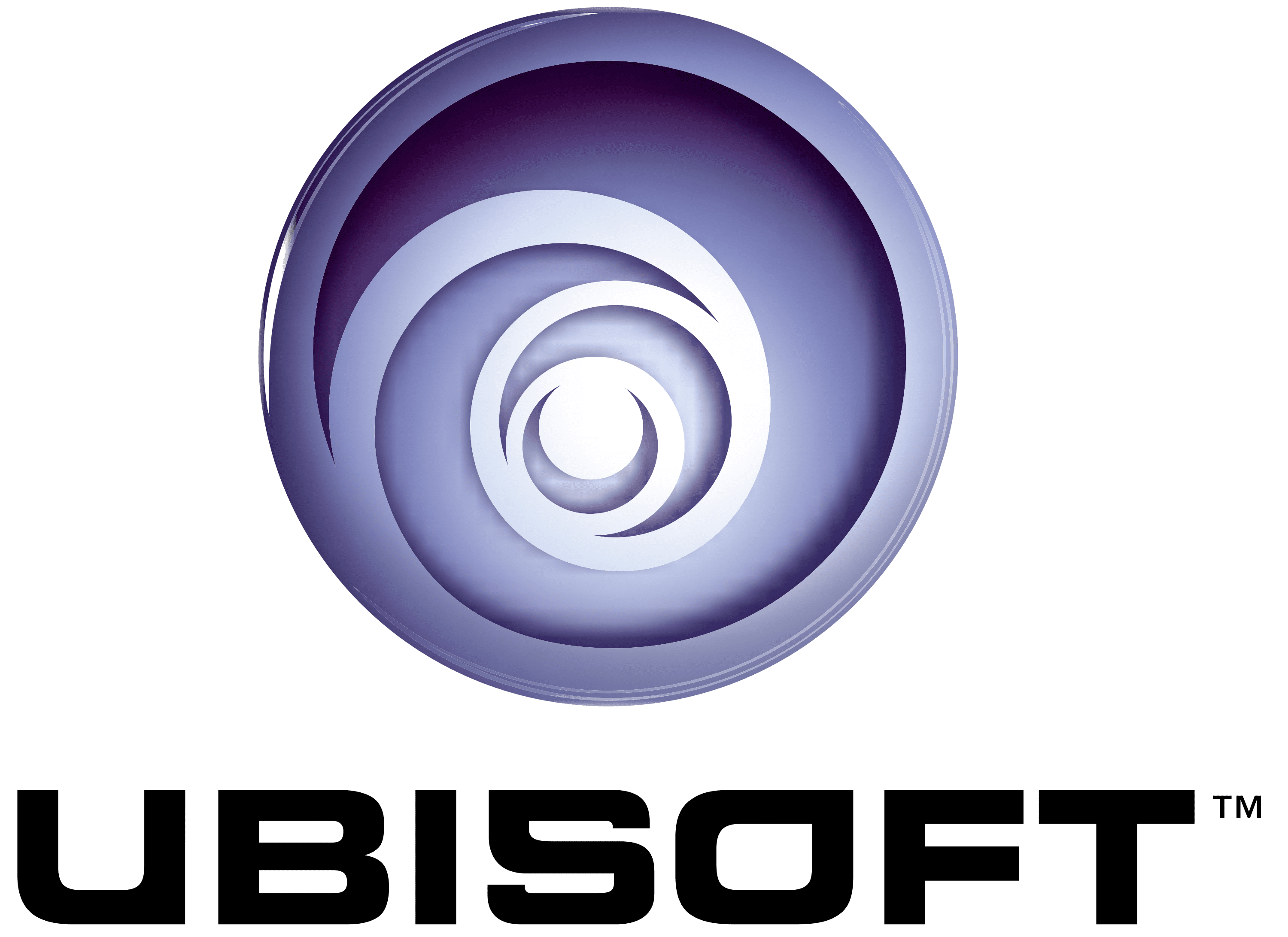
Marking perhaps the most important logo change in Ubisoft’s history, the new emblem introduced in 2003 showcased the spiral design for the first time. The new logo was created after Ubisoft acquired the Tom Clancy franchise.
The space between the words in the company’s name was removed, and the wordmark was depicted in a block, sans-serif font.
The famous spiral image, with an eye in its center, was intended to convey infinity, innovation, and creativity. The various shades of blue highlighted the company’s commitment to delivering a reliable, trustworthy service.
Why did Ubisoft change its logo?
In 2017, Ubisoft made the first change to its logo in 14 years, simplifying the original swirl design and creating a more minimalistic visual. The iconic swirl symbol remained, but the coloring was removed entirely, to leave behind and black and white icon.
The new emblem also introduced a change to the wordmark for “Ubisoft,” which now featured a disconnected “O” in the 5th letter. According to the company, the new logo was designed to be minimalist and modern.
Both the letter “O” and the swirl were deliberately created to remind users of hand-drawn shapes and convey human qualities of curiosity and enthusiasm.
Ubisoft said it wanted its new logo to demonstrate its passion and creative nature, with just a touch of “grain de folie” (or a hint of madness). Though the new emblem is devoid of color, it still has a lot of energy in it, thanks to the unique use of the curved swirling shape.
The Ubisoft logo: Colors and fonts
Today, the Ubisoft logo is an unforgettable emblem meant to represent the fun, quirky, and often creative nature of the brand.
Throughout the years, the Ubisoft logo has gone through a multitude of changes, reflecting not just the evolution of the brand’s identity but the changing design and visual trends in the marketplace over the years.
Currently, the most recent Ubisoft logo helps to connect the brand to the modern landscape while still paying homage to its heritage. If you want to take a closer look at the components of the unique Ubisoft logo, you can find some useful resources here:
What color is the Ubisoft logo?
The Ubisoft logo colors have gone through various changes over the decades as the company has explored and refined its visual identity. The brand is no stranger to experimenting with color palettes, including almost every color in the rainbow in its emblem throughout the years.
However, today, the official Ubisoft color palette is much simpler than it once was.
Currently, the Ubisoft icon and wordmark are presented in simple black on a white background, although there are instances when this combination is inverted. What’s more, various colors have been added to animations for Ubisoft loading screens and marketing assets.
What font does the Ubisoft logo use?
The Ubisoft logo font is perhaps one of the most compelling components of the company’s emblem design. The typeface, now known as “Ubisoft Sans,” is a sans-serif font with some unique elements.
The disconnected “o” is intended to represent the humanity of the company and its playful nature. Outside of the special “o,” much of this font looks similar to the standard Arial typeface.
Discovering the magic of the Ubisoft logo
Looking at the Ubisoft logo history, the company has freely experimented with its visual identity over the years, exploring new ways to showcase its personality to its target audience.
While the Ubisoft logo might seem relatively simple to today’s audience, it aims to represent a combination of modernity, creativity, and even a touch of madness.
The most recent Ubisoft logo symbolizes innovation and fun, created to capture audiences’ attention and separate the brand from its competitors.
Fabrik: A branding agency for our times.

Clarity starts with a conversation.
Thanks—we’ll get back to you shortly.
Whether you're navigating a rebrand, merger, or simply need a clearer identity—we’re here to help. No hard sell, just honest advice from people who know the sector.
Let’s start with a simple question…
Prefer to email? Drop us a line.
Fabrik’s been helping organisations rethink and reshape their brands for over 25 years. We’ve guided companies through mergers, rebrands and new launches. Whatever stage you’re at, we’ll meet you there.