Texaco logo history: The evolution of the iconic red star

Easily one of the most recognizable emblems in the modern world, the Texaco logo has pervaded the fuel and automotive landscape for over 100 years. Easily identifiable, this compelling symbol captures the hearts and minds of its audience, demonstrating a combination of passion, excellence, and authority. But how much do you know about Texaco logo history?
At a glance, the Texaco logo might seem relatively simplistic. However, the symbol is extremely effective at helping the company to connect with its audience on an emotional level.
The five-pointed star is a universal symbol of achievement and quality, used throughout the branding world. The bold typeface demonstrates the brand’s strength, while its color palette of red and white symbolizes passion, caliber, and merit.
The question is, where did this memorable symbol come from, and how has it evolved over the years? Here’s everything you need to know about the transformation of the Texaco logo.
Are Chevron and Texaco the same? Introducing Texaco
Before we dive into our adventure throughout Texaco logo history, let’s learn a little more about the brand. Texaco Inc, is an American oil brand, owned and operated by the Chevron Corporation.
This means while Texaco belongs to Chevron, it’s not exactly the same business. Chevron focuses on the wider automotive market, while Texaco concentrates on fuel.
The name “Texaco” is a conglomeration of the words “The Texas Company”. The business was originally founded in 1902, as the “Texas Fuel Company”, operating primarily out of Beaumont Texas.
Initially, the company was formed from the assets of a previous organization, known as “Texas Fuel”. However, as the company expanded over the years, it purchased a wider number of oil brands, to contribute to its evolving footprint.
Interestingly, the original Texas Fuel company didn’t have the resources required to produce crude oil or drill wells itself. It relied exclusively on the acquisition of other fuel company assets to serve its customers.
Despite this, Texaco became one of the “Seven Sisters” of the fuel landscape, responsible for dominating the global petroleum industry from the 1940s, through to the 70s.
The flagship product of the business is the “Texaco with Techron” product, sold under the iconic red and white Texaco banner, with its five-pointed star.
The company even created taglines based around its symbol, such as: “You can trust your car to the man who wears a star”, as well as “Star of the American Road”.
Texaco logo history: What is the Texaco symbol?
Since launching in 1902, Texaco has produced a number of famous symbols for its visual identity. However, while various aspects of the designs have changed over the years, there’s a lot of consistency throughout Texaco logo history.
For instance, the colors of red and white have been present within the brand since the beginning, alongside the five-pointed star symbol.
1901
One of the very first symbols ever produced by Texaco was a simple red star on a white background. The iconic, five-pointed star was a symbol of excellence, but it didn’t provide consumers with much information about the brand. As a result, Texaco quickly decided to update its image in 1907.
1907
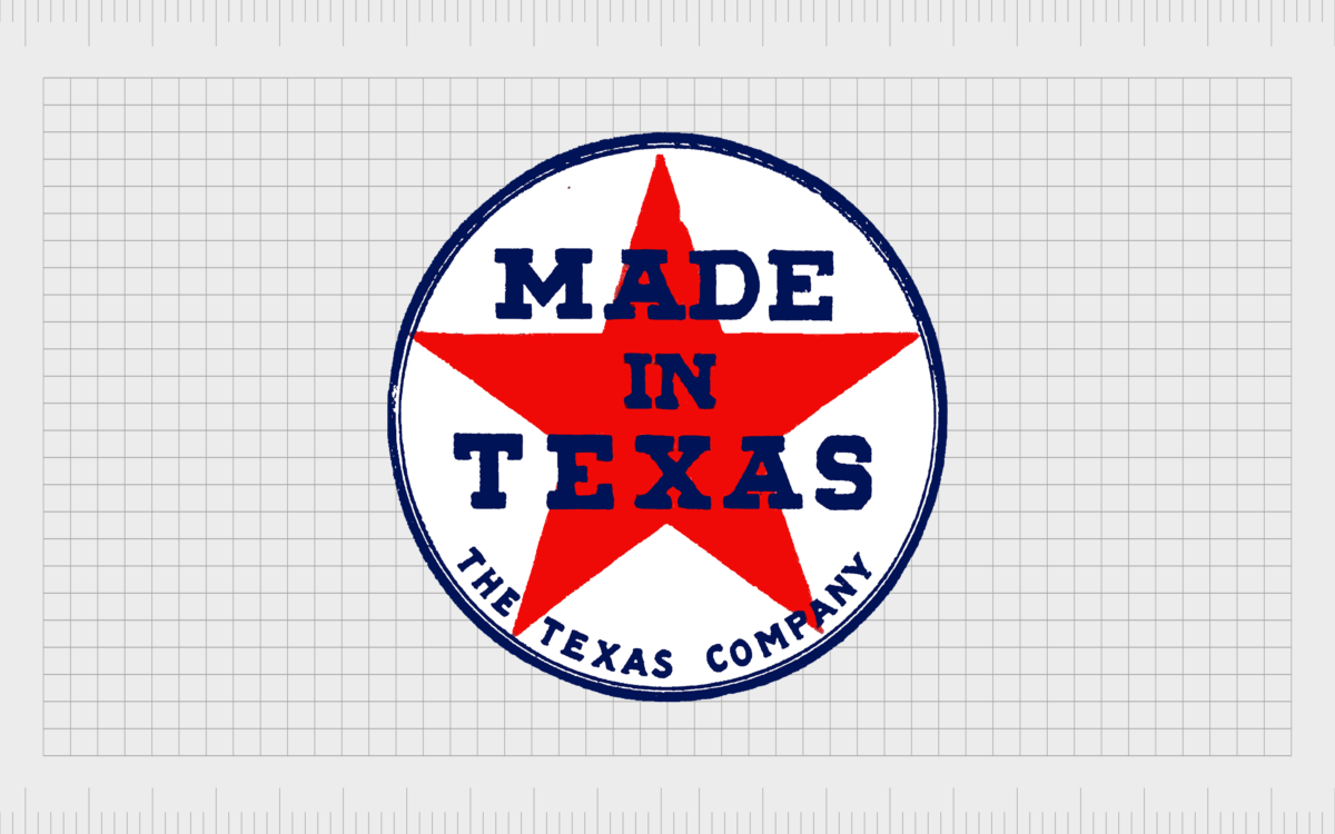
The second logo introduced by Texaco featured the original name of the company “The Texas Company”, alongside the phrase “Made in Texas” in large letters with a blocky serif font.
The words were imposed over the original five-pointed red star, and the full badge was enclosed in a dark blue circle. The red, white, and blue color palette was likely chosen as a symbol of patriotism.
1909
2 years later, Texaco removed a lot of the additional elements of its logo, reverting back to using its star as the most significant component of its symbol. The color of the star brightened slightly, and a green “T” was placed in the center, to represent the name of the brand.
1913
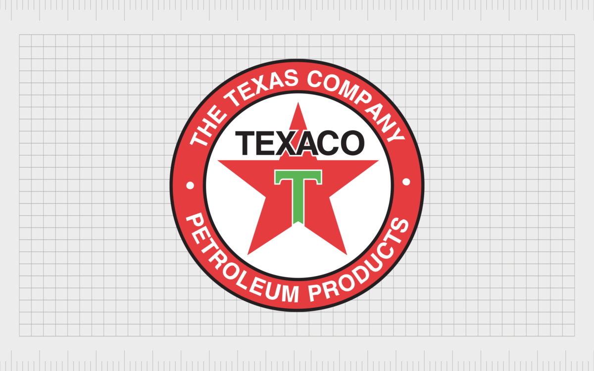
Feeling a need for extra detail in its emblem, Texaco returned to the badge-style format, this time placing the red star within a circle with a thick red and black border. In the border, we see the words “The Texas Company” at the top, and “Petroleum Products” at the bottom.
The green “T” remains in this version of the logo, though the color is a little lighter, and the letter has adopted a more balanced, sensible position. The name “Texaco” also appears in uppercase, sans-serif letters, over the top of the symbol.
1936
Several years later, in 1936, the Texaco logo was updated again. The red and black border was replaced with a simple black outline.
The five-point star and the “Texaco” wordmark were enlarged, taking up more of the visual space within the badge. Additionally, the “T” in the middle of the star adopted a white outline, to improve contrast levels and visibility.
1962
The start of the 60s marked the beginning of a very different approach to Texaco emblem design. The circular badge was replaced with geometric banner, featuring thick red outlines.
The name of the company became the center focus of the emblem, depicted in bold, black letters. At the bottom of the name, we see a small red star in a black circle, with the “T” now depicted in white.
1981
In the 1980s, Texaco brought its memorable star back into the spotlight, reducing the size of the wordmark, and placing it underneath the larger emblem. This time, the star was depicted in white, on a solid red background, with the “T” in the middle sporting a matching shade of red.
Unfortunately, some people felt this symbol looked too similar to the design used by the Soviet communist party at the time.
1999
Finally, the most recent version of the Texaco logo was introduced in 1999. We can clearly see the inspiration from the old Texaco logo in this design, although the banner has been modernized significantly.
The white star on the black circle with its central “T” remains. However, the Texaco wordmark has been repositioned, appearing to the right of the badge.
The font chosen for this wordmark is also very similar to that used in previous emblems, with a bold, sans-serif design. However, the letters now appear in a matching shade of red.
The Texaco logo: Colors and fonts
Though the Texaco logo faced some controversy over the years, from consumers who believed it was too similar to the Soviet communist symbol, it served as a powerful emblem for the brand.
Over the decades, Texaco only made a handful of significant changes to its design, consistently conveying excellence and expertise with its five-pointed star.
Today, the Texaco logo can appear in a range of formats. Commonly, for branding and marketing materials, the Texaco wordmark and symbol appear in unison.
However, it’s also possible to see the star symbol as a standalone design. If you’d like to take a closer look at the Texaco logo, you can find some useful resources here:
What color is the Texaco logo?
Texaco experimented with a few different color palettes over the years. While the most common and consistent Texaco logo colors have always been red and white, they have occasionally been joined by shades of black, blue, and green.
Today, the Texaco logo color palette is simple but effective. The red shade conveys passion and power, while the white highlights the company’s commitment to quality and excellence. The color is similar to the “Maximum Red” shade:
Hex color: #d52b1e
RGB: 213 43 30
CMYK: 0 80 86 16
Pantone: PMS Bright Red C
What font does the Texaco logo use?
While Texaco did use a few different typefaces in its logo designs, most of the font choices made by the brand were for bold, powerful sans-serif types.
The current Texaco logo font is a bold, simple typeface, with clean straight lines and distinctive cuts. The choice helps to further enhance Texaco’s image as a powerful, stable, and authoritative brand.
Although the typeface is unique to the brand, it’s similar to a range of modern, simplistic fonts, such as Genera Alt Heavy and TT Hoves Black.
A shining star of logo design: The Texaco emblem
Although some parts of Texaco logo history were marred in controversy, it’s worth noting that the company’s iconic visual identity has remained strong throughout the years.
While the Texaco branding team certainly experimented with the image of the company from time to time, many of the core elements of the Texaco logo have remained consistent.
The iconic five-pointed star has always been the core symbol of the brand. Additionally, the red and white color palette has constantly demonstrated the company’s focus on passion and quality.
Fabrik: A branding agency for our times.
Clarity starts with a conversation.
Thanks—we’ll get back to you shortly.
Whether you're navigating a rebrand, merger, or simply need a clearer identity—we’re here to help. No hard sell, just honest advice from people who know the sector.
Let’s start with a simple question…
Prefer to email? Drop us a line.
Fabrik’s been helping organisations rethink and reshape their brands for over 25 years. We’ve guided companies through mergers, rebrands and new launches. Whatever stage you’re at, we’ll meet you there.


