Stray Kids’ logo history and meaning

Even as a fan of the band, you may not know much about Stray Kids’ logo history and the meaning behind the group’s iconic symbol. The Stray Kids’ Korean band is one of the younger additions to the music scene, but it has still managed to grab attention with its logo choice.
The emblem for the Stray Kids’ logo is based on the group’s name, which in turn comes from the name of the reality show which spawned the pop band. The group, made up of eight boys, was formed initially in 2017 and released its first album in 2018.
In 2017, stakeholders also revealed the band’s visual identity, which helped the group to gain several followers long before an official album was released.
Let’s explore the history of the Stray Kids’ logo…

Stray Kids’ logo history: The Stray Kids’ symbol today
The Stray Kids’ band was born as a result of a reality “survival” show, created by JYP entertainment and Mnet in 2017. The eight-member band quickly captured the attention of fans across the globe, with hit songs like “Go Live”, “Grow Up” and “One Day”.
Similar to many musicians, Stray Kids based its logo on its name, using a unique word mark to capture the attention of listeners. There has only been one logo and one official “symbol” for the brand so far, though various colorways for the images have been introduced.
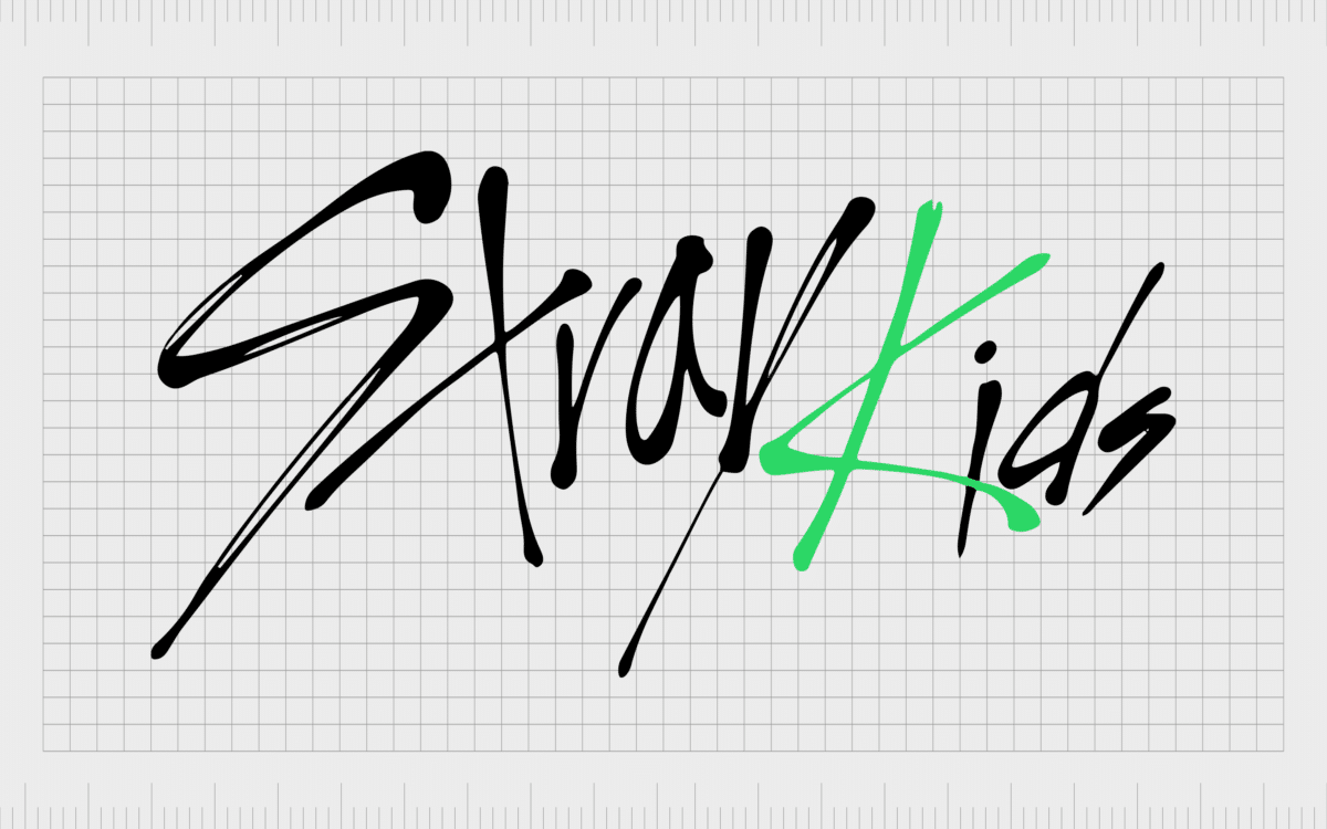
The Stray Kids’ logo was created by Bang Chan, who drew the design himself, using sweeping, scratchy, and haphazard handwriting. The unique handwriting style helps to convey the youth and rebellion of the group.
Various aspects of the font also resemble shapes. The “R” in Stray Kids almost looks like a “V”, or a triangle, similar to the “Y”. The “K” of “Kids” looks a little like a star, while the “T” of “Stray” is similar in style to a cross.
This unique wordmark is filled with meaning and emotion. Unlike other band wordmarks over the years, Stray Kids wanted to create a sense of rawness and authenticity in their image. The group hoped for their symbol to showcase a band looking to find their own way.

Stray Kids’ symbol: SKZ
The scribble-style wordmark is just one component of the Stray Kids’ logo. Due to the somewhat lengthy nature of the band’s name, the group also adopted a more compact emblem. This symbol is ideal for formats where the full wordmark of the brand may not be appropriate.
The circular logo features a shortened version of the band’s name popularized by fans “SKZ.” Though there’s technically no “Z” in “Stray Kids”, the “Z” is chosen to represent the “S” of “Kids” and give the image a more youthful vibe.
The “K” in Stray Kids’ symbol, like in the wordmark, usually features a contrasting color, like red or yellow, depending on the placement.
Together, the combined wordmark and symbol allow for a comprehensive identity for the Stray Kids’ brand, capable of stretching across multiple forms of media. The wordmark is unique and eye-catching, similar to many of the unique handwritten logos which came before it.
The design elements are easy to remember, but impactful. Designed to represent the unique, youthful, and playful personality of the band, these logos appeal directly to the group’s target audience.
The sharp angles and shapes, combined with the circle symbol (representing inclusion), help to draw in a large crowd looking for both belonging, and understanding.
The latest iteration of the “SKZ” logo ties in to the style of that in the primary Stray Kids logo. The “K” is now green to match.
What color is the Stray Kids’ logo?
The Stray Kids’ logo colors can vary depending on where you see the band’s image. The most common colors used for the wordmark are black and red. However, the red shading on the “K” of Stray Kids’ logo can sometimes switch to yellow, particularly for the circular symbol.
Though official hex colors haven’t been released for the SKZ or wordmark logo, we can still take a lot from the group’s use of these three central shades.
Black
Green
Red
The color of black is usually intended to convey mystery, power, and authority. It can also have a somewhat intimidating presence in some circles. Red is all about passion and energy, it’s also intended to point to violence and danger.
The use of black and red give the Stray Kids’ logo an almost anarchist vibe, which is unique for a boyband.
The decision to occasionally use yellow within the circular Stray Kids’ logo also builds on the underlying identity of the brand. The use of black and yellow together is often intended to mean caution.
However, yellow on its own can also convey happiness and positivity.
What font does the Stray Kids’ logo use?
The Stray Kids’ logo font may seem completely hand-drawn, but it actually uses a specific typeface, known as Xtreem. This font is indicative of the creative and youthful nature of the brand.
The choice of the font is extremely telling, as it highlights the unique appeal of the boyband. This logo doesn’t look carefully constructed, but instead conveys idea of chaos and passion. In many ways, the use of this font also highlights the meaning behind the name “Stray Kids”.
Though the name of the band may have been chosen from the reality television show which spawned the act, it’s also an insight into the kind of personality the Korean group wants to create. The group want to be seen as youths venturing off the “beaten path”.
The use of a somewhat aggressive font helps to differentiate Stray Kids’ from many of the other rising Korean boybands on the scene at the moment. The scratchy font helps to give the group a bit of an edge, rather than allowing them to become a traditional, family-friendly band.
Stray Kids logo elements
If you’re a fan of the Stray Kids’ band, the logo is likely to be an appealing part of this group’s identity for you.
Whether you’re looking for the circular Stray Kids’ symbol, or you want to create something using the Stray Kids’ wordmark, here are some resources to help:
For any fan of Korean boy bands, the Stray Kids’ logo is a symbol of creativity and passion. The group’s unique choice of hand-drawn wordmark and circular symbol has captured the attention of music lovers all around the globe.
Fabrik: A branding agency for our times.
Clarity starts with a conversation.
Thanks—we’ll get back to you shortly.
Whether you're navigating a rebrand, merger, or simply need a clearer identity—we’re here to help. No hard sell, just honest advice from people who know the sector.
Let’s start with a simple question…
Prefer to email? Drop us a line.
Fabrik’s been helping organisations rethink and reshape their brands for over 25 years. We’ve guided companies through mergers, rebrands and new launches. Whatever stage you’re at, we’ll meet you there.


