


Sonic the Hedgehog logo history: A tribute to the classic video game and symbol
You don’t need to be an avid follower of the video game industry to be familiar with the Sonic the Hedgehog logo.
The emblem and the character have become icons of the pop culture landscape over the years, inspiring everything from television shows and movies to comic books and various other forms of merchandise.
Sonic the Hedgehog, one of Sega’s best-known intellectual properties ever produced, transformed the gaming landscape as we knew it.
The character was first designed for the Sega Genesis in the early 90s but has evolved throughout the decades to appeal to new generations and audiences, year after year.
If you’ve ever wondered how famous video game logos were developed or how they’ve transformed over the years, you’re in the right place. Today, we will examine the Sonic the Hedgehog symbol and its evolution.
An introduction to Sonic the Hedgehog
What is Sonic’s real name?
Before we dive into Sonic the Hedgehog logo history, let’s start with an introduction to the character and franchise. Sonic the Hedgehog, otherwise known as Ogilvie Maurice Hedgehog to some die-hard fans of the series, was first developed in 1991, by Sega, for the Sega Genesis console.
Initially, Sonic was intended to be Sega’s main competitor for Mario, Nintendo’s mascot at the time. The success of the Sonic franchise helped Sega to become one of the top video game companies in the world during an era known as the fourth generation of gaming consoles.
Over the years, numerous Sonic the Hedgehog games have been developed for a variety of different consoles, including third-party consoles from PlayStation, Xbox, and even Nintendo.
While each Sonic game generally comes with unique stories and game mechanics, they also feature recurring elements, such as fast-paced gameplay and a ring-based health system.
As the Sonic the Hedgehog franchise has evolved, new characters have also been introduced, including Miles (Tails) Prower and Knuckles the Echidna. Additionally, Sonic characters have crossed over with numerous other video game franchises in titles like Mario & Sonic.
Sonic the Hedgehog logo history: The classic Sonic logo
While there have been numerous different box designs and title cards created for different Sonic the Hedgehog games over the years, the official logo for the franchise has remained relatively consistent.
Since Sonic the Hedgehog logo history began, the designers of the franchise have preserved many of the unique components of the emblem, including the font used for the “Sonic” title.
1991
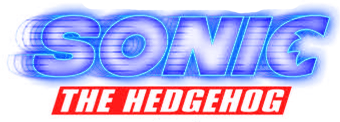
The original Sonic the Hedgehog logo was produced in two variations, one for the Japanese market and one for the international landscape. The Japanese version of the logo was a lot more simplistic than its global counterpart, featuring only the colors of bright blue and white.
In the original design, we see the word “Sonic” in large, bold letters, with a stylized “O,” which appears to tilt towards the right, representing Sonic’s unique dash move. The C also looks a little unusual, designed to match the style of the “O.”
The international version of the Sonic the Hedgehog logo featured the same font type as the Japanese variation for “Sonic.” However, the color palette was different, with a gradient-style orange/yellow border and a much darker central blue.
The biggest difference between the two logos appears in the “The Hedgehog” section of the emblem, which features a lot more movement thanks to bouncy, bold letters. The design is also depicted in red, with a shadow background to help it leap from the page.
1999
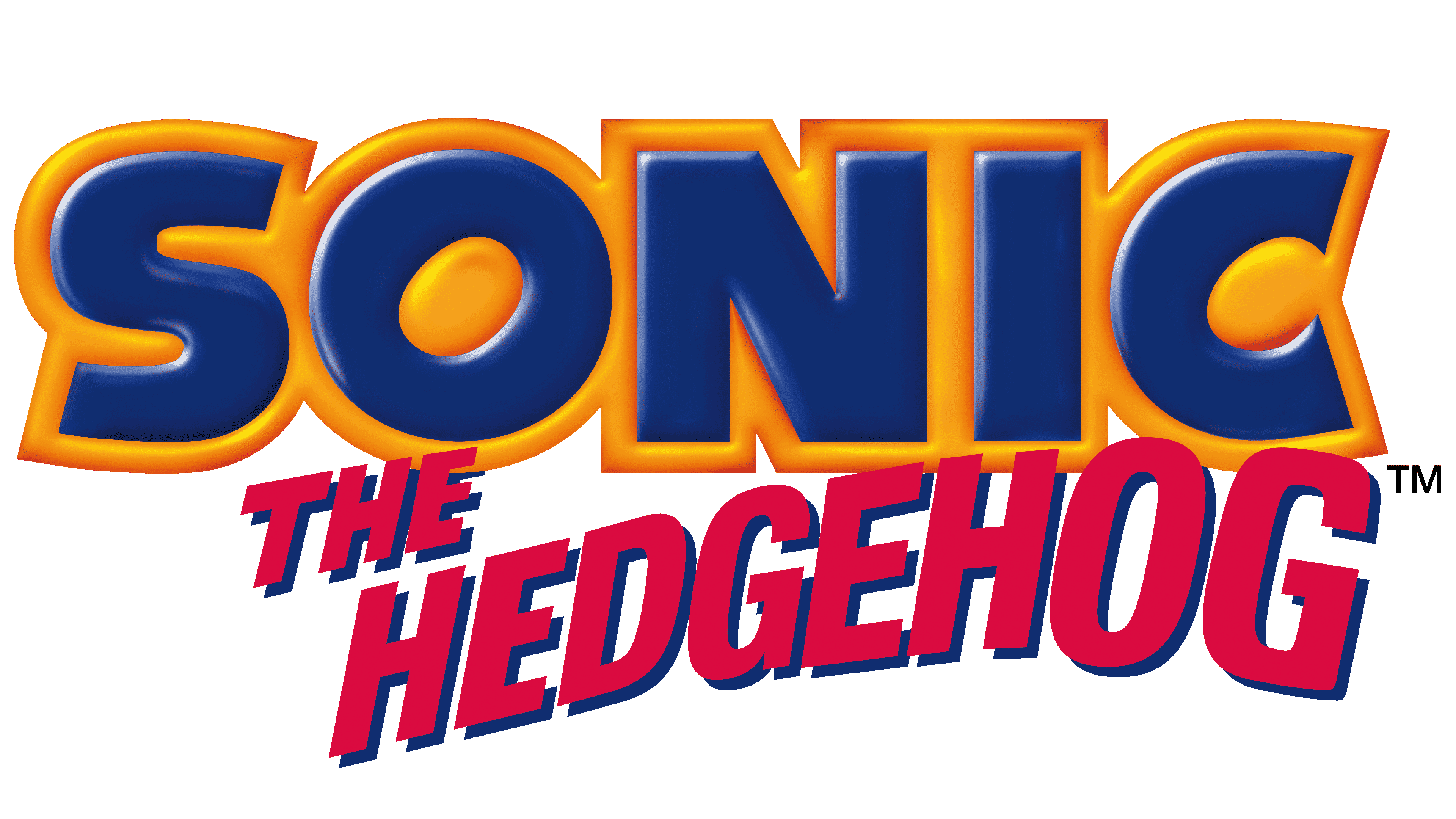
The only major change made to the Sonic the Hedgehog logo took place in 1999, with a major alteration to the emblem’s core color palette. The letters of the “Sonic” wordmark, still depicted in a similar font to the original logo, were now presented in gold with a dark blue border.
Underneath the main part of the logo, the component for “The Hedgehog” remains but has been simplified. The letters are all uniform, written in a white sans-serif font on a dark red background.
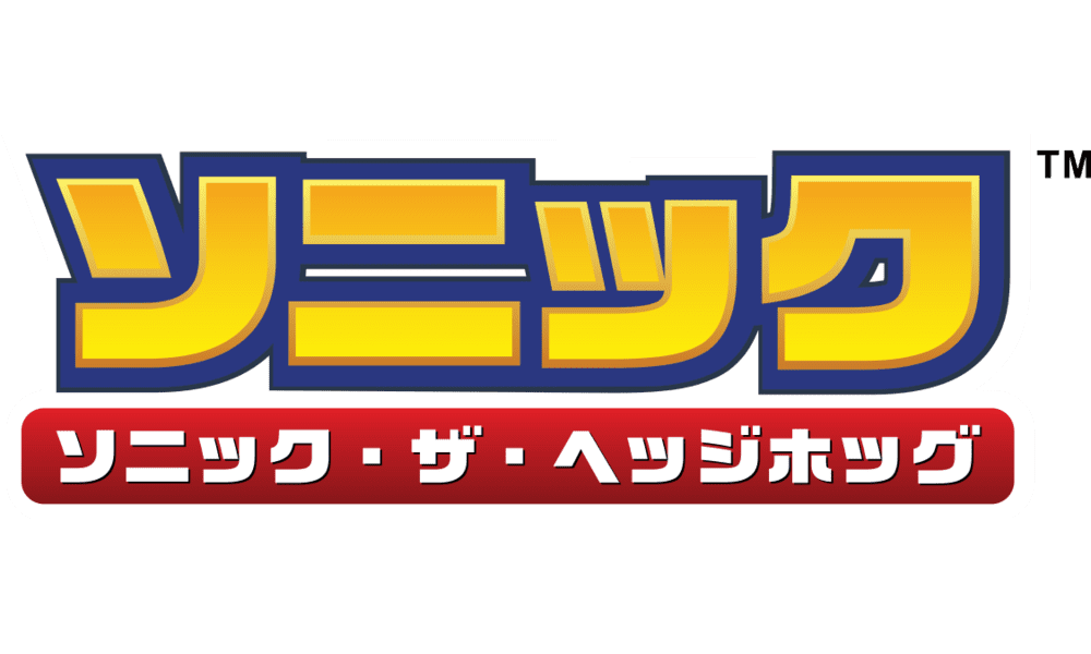
A variation of the Sonic the Hedgehog logo for the Japanese market was also produced in 1999, featuring the same color palette as the international variation. The only real difference between the two logos is the use of a different language.
The Sonic movie logo: Evolution of the Sonic symbol
As mentioned above, the success of the Sonic the Hedgehog franchise helped to inspire a number of spin-off assets in the multi-media world, including a collection of Sonic the Hedgehog movies. As of 2023, there have been two additions to the movie collection featuring slightly different logo styles.
The first Sonic the Hedgehog movie logo features many of the core colors of the Sonic franchise, including blue, white, and red. The wordmark has been altered slightly from the game logo design and includes an interesting “C” shape, with the head of Sonic cut out of the character.
The phrase “The Hedgehog” appears in white on a red banner, similar to the game logo design.
2022
In 2022, the Sonic team introduced a secondary movie with a similar title design to the first movie. This logo features a lot less white than the previous design and uses black to make the blue outline of the letters really stand out.
The most interesting addition to the logo is the stylized “2”, which features the two tails of the character, Tails the Fox, in yellow.
Sonic the Hedgehog logo: Fonts and colors
The Sonic the Hedgehog logo is one of the most iconic emblems in video game history today. Using a combination of carefully chosen colors and stylized wordmarks, the Sonic the Hedgehog team has created an eye-catching emblem capable of standing the test of time.
Although aspects of the emblem used across different media and games have changed over the years, the Sonic team has maintained a relatively consistent visual identity. Today, everything from the bold block letters of the Sonic logo to the unique color palette is well-known around the globe.
If you want to take a closer look at the Sonic the Hedgehog logo, you can find some useful resources here:
What color is the Sonic the Hedgehog logo?
The Sonic the Hedgehog logo colors remain the same across both the international and Japanese markets today. The collection of colors chosen for the emblem is meant to represent some of the core components of the game and the character himself.
For instance, gold represents the rings that give Sonic health, blue symbolizes his unique color, and red is taken from the shade of Sonic’s shoes. Some people also align the colors with the three main characters from the franchise: Sonic the Hedgehog, Knuckles, and Tails.
The Sonic the Hedgehog logo color palette includes bright, eye-catching shades, perfect for grabbing the attention of a younger audience.
What font does the Sonic the Hedgehog logo use?
The Sonic the Hedgehog logo font is unique to the company, chosen to represent the motion and speed in the games. The emblem combines two different typefaces. The first design for the “Sonic” wordmark is a simple sans-serif font with a stylized “O” and a rotated “C.”
The secondary line in the emblem features a basic, sans-serif wordmark depicted in white, bold font.
Celebrating the Sonic the Hedgehog logo
Representing one of the most iconic video game characters of all time, the Sonic the Hedgehog logo has captured the hearts and minds of countless fans around the globe.
Over the years, while the design of the Sonic games and even the character himself have changed, the Sonic emblem has remained relatively consistent.
Today, the Sonic the Hedgehog symbol conveys a sense of speed, excitement, and youthful fun to a wide audience of fans across the globe.
Fabrik: A branding agency for our times.

Clarity starts with a conversation.
Thanks—we’ll get back to you shortly.
Whether you're navigating a rebrand, merger, or simply need a clearer identity—we’re here to help. No hard sell, just honest advice from people who know the sector.
Let’s start with a simple question…
Prefer to email? Drop us a line.
Fabrik’s been helping organisations rethink and reshape their brands for over 25 years. We’ve guided companies through mergers, rebrands and new launches. Whatever stage you’re at, we’ll meet you there.