


Sega logo history: A look at the evolution of the Sega symbol
Are you familiar with Sega logo history? Most video game fans will agree the Sega brand is one of the best-known in the world, responsible for introducing famous characters and consoles.
However, like many organizations, Sega’s visual identity has undergone several changes over the years, growing increasingly more modern in recent decades.
Today’s Sega logo is frequently associated with characters like Sonic the Hedgehog and Virtua Fighter. Still, Sega was also responsible for producing some key consoles that introduced the world to the concept of at-home video entertainment.
If you’ve ever wondered about the evolution of the Sega logo, or you’d simply like to learn more about how famous video game logos were designed, you’re in the right place.
Here’s everything you need to know about the transformation of the Sega symbol.
What does Sega stand for? Introducing Sega
Sega, or the Sega Corporation, is a Japanese multinational video company headquartered in Tokyo. It also has a series of international branches located throughout the US and Europe.
First founded in 1960 as “Nihon Goraku Bussan,” the business was introduced at a time when the console industry was still just getting started.
Martin Bromley and Richard Steward, the Sega founders, purchased the assets of the brand’s predecessor, Service Games of Japan, to form a new brand. The name “Service Games” was eventually shorted to “Sega.”
Initially, Sega acquired Rosen Enterprises and became an importer of various coin-operated games for arcades. It developed its own arcade game, Periscope, in 1966. After being sold to Gulf and Western Industries in 1969, Sega stayed relatively silent for a while.
After a slight downturn in the arcade industry, the company began producing its own consoles, starting with the Master System and SG-1000. However, it struggled to fight against competitors like Nintendo.
In 1988, Sega released the “Genesis” console, also known as the Mega Drive, outside of Northern America. While Genesis initially had a hard time capturing the attention of fans, the release of Sonic the Hedgehog in the 90s skyrocketed its success.
Throughout the years, Sega has produced various multi-million-selling franchises in the game landscape. Sonic the Hedgehog still stands as the core mascot for Sega Enterprises.
Sega logo history: The Sega symbol throughout the years
Despite a relatively long history in the gaming landscape, Sega has only made a handful of changes to its logo over the years. The relatively simplistic logo has become an icon of the organization’s brand identity, and it’s now globally recognized around the world.
The official Sega logo history timeline began in 1945 when the brand was still known as “Service Games.”
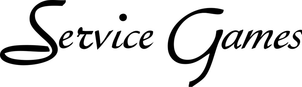
When Sega was first introduced, it was as “Service Games.” The earliest Sega symbol represented this full name in a stylistic, elegant font. The wordmark was almost hand-drawn in style, which matched a lot of the similar branding components from other major brands at the time.
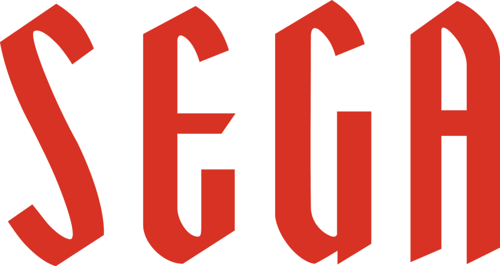
After Sega updated its name, it also refreshed its logo to highlight the shortened title in all uppercase letters. This wordmark has remained in uppercase ever since, although the official name of the brand is still just “Sega.”
The new logo was depicted in stylish, serif-style font, with harsh angles on the top and bottom of the letters. Initially, the design was introduced in red, sometimes with a black outline.
Although there are limited variations of this logo still in variation, some still include the wordmark in a black-and-white color palette.
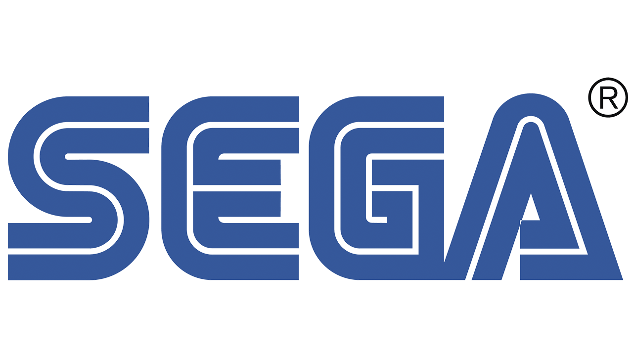
In 1975, a version of the Sega wordmark most people will be familiar with today was introduced. The typeface was updated to a multi-layer font choice, with two blue components and a white stripe in the middle.
The design of the glyphs almost makes them look like wires, which could be a reference to Sega’s electronic video game components.
Another version of the same Sega logo, in a slightly darker shade of blue, was introduced in 1976. While this design is still in use in some regions around the world today, it alternates with the previous, brighter blue option.
Aside from the basic color change, the core elements of the Sega emblem have remained almost entirely the same.
Sega console logos: From Saturn to Dreamcast
Alongside a range of core logos for the overall brand, Sega also introduced dedicated logos for each of the famous console systems it created. Some of the most memorable logos throughout the years were produced for the Sega Genesis, Saturn, and Dreamcast.
Sega Genesis logo
The Sega Genesis logo is a relatively modern design, despite being introduced several decades ago. The emblem featured the Sega iconic wordmark, in black and white, placed above the word “Genesis” in sharp, blocky glyphs. The overall design was surrounded by a geometric banner.
Sega Saturn logo
The Sega Saturn, one of the earliest consoles introduced by Sega, featured a far more traditional logo at the time. The image included the name “Sega Saturn” with a different typeface to the one used for the standard Sega brand.
The blocky font was intended to look fun and youthful. The design next to the wordmark is a 3D blue sphere with a silver line wrapped around it in an “S” shape.
Sega Dreamcast logo
Another logo for a Sega console that didn’t include the official Sega emblem, the Dreamcast logo, featured a simple black wordmark written in a thin, serif-style font. Above the wordmark was a swirl intended to convey mystery and imagination.
The swirl appeared in a range of different colors over the years, including red, blue, and purple.
What is the logo of Sega? Fonts and colors
The logo of Sega has remained almost exactly the same since the 70s, capturing the hearts and minds of video game lovers across the globe. Though relatively simple, the iconic Sega logo has a strong impact on its target audience.
The color blue not only connects with ideas of trustworthiness and credibility but reminds us of the company’s core mascot character, Sonic.
The double-layer font choice, created specifically for the Sega brand, also helps the company to appear modern and futuristic, even years after it was originally created. The letters almost look like the wires or circuits inside of a game’s console.
If you want to take a closer look at the Sega logo, you can find some useful resources here:
What color is the Sega logo?
The Sega logo has gone through a number of color changes over the years. Initially, the official Sega logo colors were simply black and white before the company started experimenting with brighter hues like red and, eventually, blue.
Since switching to the blue color palette, there have been various darker and lighter colors used by the brand for different marketing purposes.
The official Sega logo color is a kind of cobalt blue, which contrasts well with the white in the middle of the glyphs and the surrounding background.
COBALT BLUE
Hex color: #0060ac
RGB:0 96 172
CMYK:100 44 0 33
Pantone: PMS 2945 C
What font does the Sega logo use?
The iconic Sega logo font has been a core part of the company’s brand identity for a number of decades now. Specially designed for the Sega company, the typography appears to be derived from the Yagi double typeface, which was extremely popular at the time.
The company did make some modifications to this font choice, however, adjusting the squared-off edges of the letters.
The unforgettable Sega logo
While the Sega logo hasn’t undergone as many changes as some other well-known video game emblems, its history is still worth exploring.
Examining Sega logo history, we can see how the brand transformed and developed over time, finding its unique identity in a relatively competitive space.
After finding its visual vibe, Sega has stuck with almost the same emblem for several years.
Today, the Sega symbol is one of the best-known logos in the world.
Fabrik: A branding agency for our times.

Clarity starts with a conversation.
Thanks—we’ll get back to you shortly.
Whether you're navigating a rebrand, merger, or simply need a clearer identity—we’re here to help. No hard sell, just honest advice from people who know the sector.
Let’s start with a simple question…
Prefer to email? Drop us a line.
Fabrik’s been helping organisations rethink and reshape their brands for over 25 years. We’ve guided companies through mergers, rebrands and new launches. Whatever stage you’re at, we’ll meet you there.