


PlayStation logo history: An emblem of gaming culture
Few people are fully familiar with the PlayStation logo history and how the design has changed to adhere to modern standards and trends. Today, we’re going to take a closer look at the history of the PlayStation logo and how it has transformed over the decades.
These days, you don’t need to be a gaming fanatic to be familiar with the Sony PlayStation logo. The emblem has become one of the most recognizable symbols in the world and an icon of modern culture.
Like many famous video game logos, the PlayStation emblem was designed to capture the attention of a budding audience of avid entertainment lovers.
Competing against major brands like Nintendo and Microsoft’s Xbox, PlayStation needed to create a visual identity capable of engaging its audience across every device and medium.
Fortunately, they had little trouble coming up with a great design.
In fact, while some components of the PlayStation logo have definitely evolved over the years, the overall design has remained relatively consistent.
The Sony PlayStation logo: An introduction to PlayStation
Created by the Sony Interactive Entertainment company, PlayStation, or “PS,” is a video gaming brand with a total of five home gaming consoles to its name. The company also sells its own smartphone, media center, and a set of handheld gaming devices.
Ken Kutaragi was the man responsible for introducing the world to PlayStation consoles. He was an executive for Sony, who managed one of the engineering divisions in the hardware segment of the company.
Before 1991, Sony hadn’t had much involvement with the video game industry, although it did supply components for leading consoles like Nintendo.
The first PlayStation console appeared on the market at a time when interest in gaming was blossoming. Launched in 1994, the original console was the first to ship more than 100 million units in less than a decade.
The following console, the PlayStation 2, quickly became the best-selling home console of all time. Over the years, like its competitors, PlayStation has consistently updated and enhanced its portfolio with new technology and innovations.
Since 1994, the brand has released a range of different products designed to appeal to gamers, capturing the attention of audiences with specialist controllers and even exclusive game titles.
PlayStation also has its own gaming network, an online service with more than 110 million registered users, which offers access to digital versions of multimedia products.
When Sony decided to create its own console brand, it knew it needed an eye-catching logo capable of competing with the existing visual designs in the market. Thus, the original PlayStation logo was born.
PlayStation logo history: A look at the old PlayStation logo
PlayStation logo history began in 1994 when the official new console division of Sony was created to compete with existing brands like Nintendo and the emerging Xbox.
The history of the product actually goes back a little further, to 1988, when Nintendo and Sony were said to be working together on a new collaborative product. Nintendo eventually broke the deal, as the two companies couldn’t agree on how revenue should be divided.
1994
The old PlayStation logo isn’t very different from the emblem most people are familiar with today. Since its inception, PlayStation has used a relatively modern, simplistic logo for its brand, which combines the letters “P” and “S” into a unique shape.
Originally, the logo was designed to be colorful and eye-catching. It featured the letter “P” in red block font, with the “S” laid behind it, almost like a shadow. The horizontal “S” was depicted in a variety of colors, including yellow, green, and blue.
Interestingly, the company actually chose this emblem from a host of different suggested designs, many of which featured similar colors and components.
2009
The only major update to the PlayStation brand’s official logo took place in 2009. At this time, the Sony PlayStation logo was simplified to appeal to a younger, more modern audience.
The emblem was designed by Manabu Sakamoto, who was also responsible for creating various other badges for Sony products throughout the years.
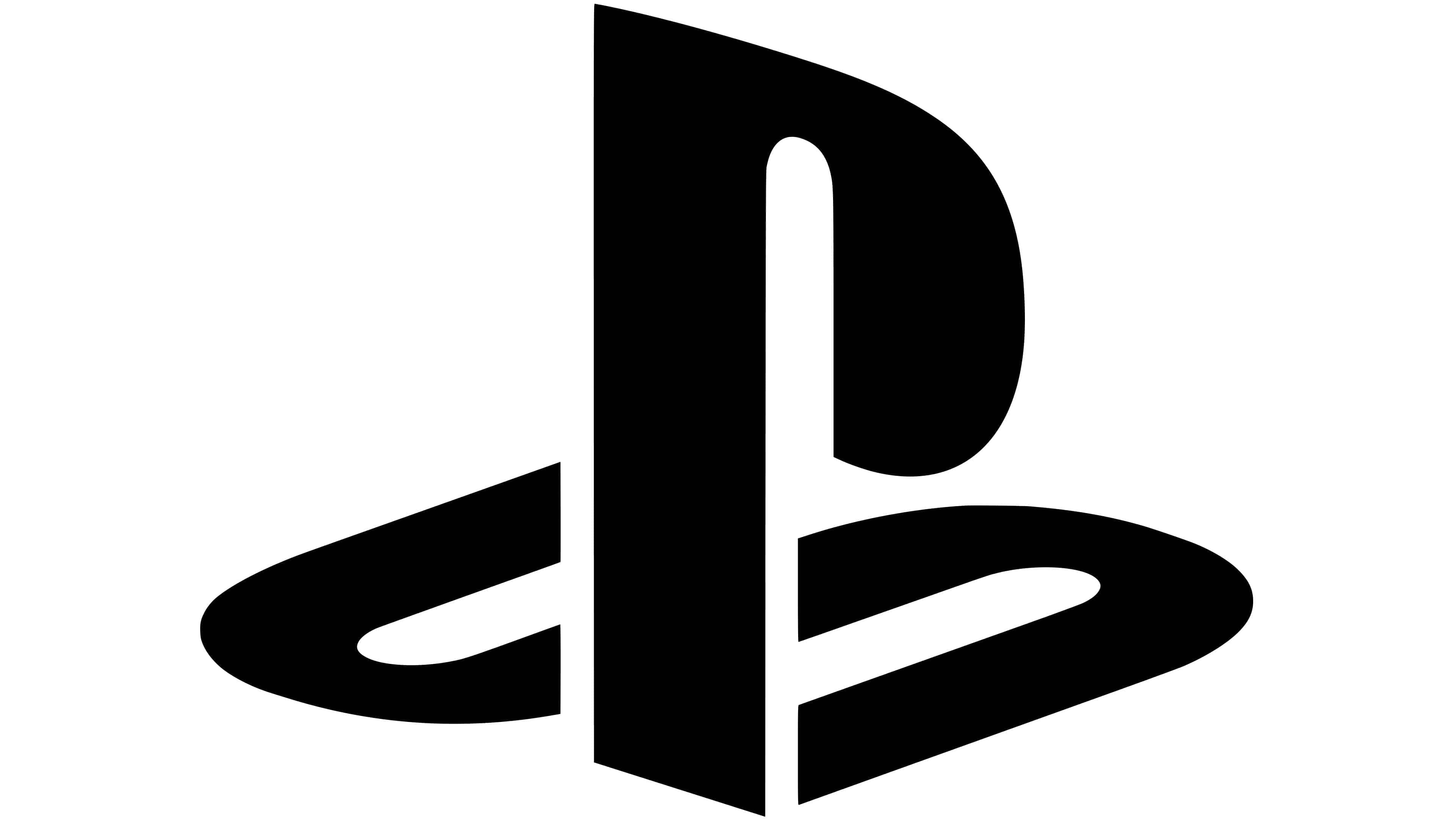
Like in the design above, the image featured a stylized “P” and “S.” The colors were removed, creating a monochrome palette in just black and white. In this variation of the logo, there’s also a white border around the “P,” which helps to separate it from the underlying “S.”
The PlayStation logo: Console emblems
Alongside the basic PlayStation logo, many people are also familiar with the console emblems created for the individual products sold by the brand. The initial PlayStation console didn’t have a unique symbol of its own. Instead, it used the multi-colored PlayStation design.
However, as the company evolved, introducing new machines, different designs were created.
The PlayStation 2 logo
The PlayStation 2 logo was a simplified wordmark designed to showcase the modern nature of the brand. The letters in “PS2” were stylized to look more like simple geometric lines than full glyphs. Underneath the stylish emblem, we see the full name “PlayStation 2” depicted in a sans-serif font.
This emblem was presented in black and white, like all of the following designs.
The PlayStation 3 logo
The logo used for the PlayStation 3 built off the previous design. The overall shape of the “PS3” emblem was similar to the former logo, though the lines were softened and curved in more spaces.
The font type was also made a lot bolder for both the monogram and the accompanying wordmark.
The PlayStation 4 logo
For the most part, the PlayStation 4 logo is really just an updated version of the previous design. The spacing between the letters in “PS4” is a little larger than in the former logo, which makes the overall design look slightly more refined.
However, for the most part, there have been no major changes. The biggest difference is the switch from a “3” to a “4”.
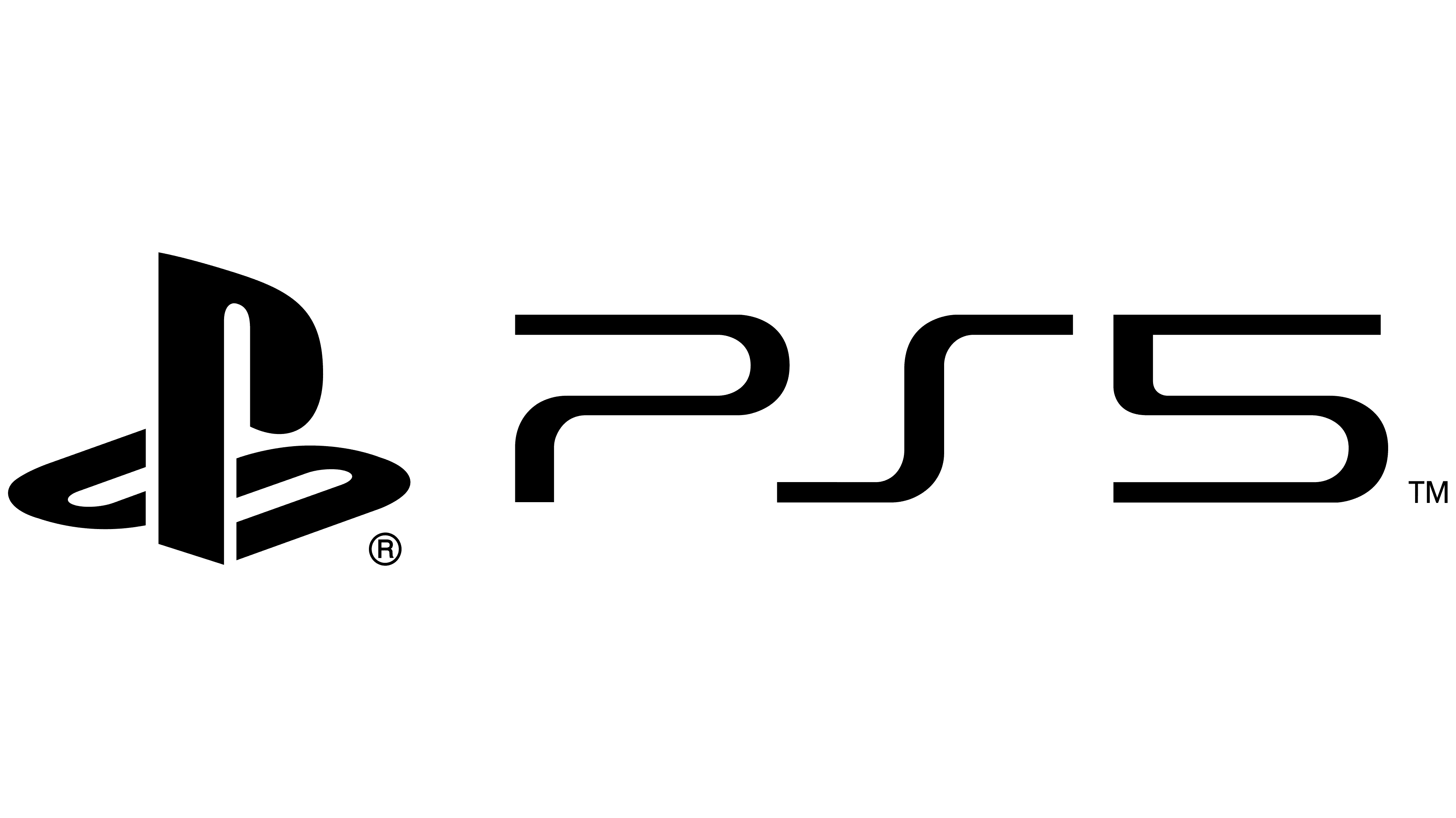
The PlayStation 5 logo
The most recent Sony PlayStation logo for the fifth version of the console contains all of the primary elements of the former design. However, in some cases, the “PlayStation 5” wordmark beneath the primary symbol has been removed.
Additionally, some variations of this logo also include the “PS” logo we know from the parent brand, in black and white. The “5” glyph is similar in style to the “4” from the previous design, with a harsh edge on the top left corner.
The PlayStation symbol: Colors and fonts
Compared to some of the other major video game and console logos introduced throughout the years, the PlayStation logo seems relatively simplistic. From day one, the company wanted to present itself not just as a thought leader in its space but as a modern innovator.
The use of stylized letters within the PS symbol certainly helps with this.
PlayStation’s logo has progressively grown more modern over the years as the company continues to refine its brand identity. In the initial years, the organization wanted something colorful enough to grab the attention of a younger audience and compete with existing symbols on the market.
However, as the PlayStation name became more well-known, the need for additional colors diminished.
If you want to take a closer look at the unique components of the Sony PlayStation logo, you can find some useful resources here:
What color is the PlayStation logo?
As mentioned above, there have been a number of different variations of the PlayStation logo over the years. Initially, the company started with a more vivid logo, which featured numerous colors of red, green, blue, and yellow.
This was intended to capture the attention of a younger audience in search of a company that appeared to be committed to fun.
At the same time, the multi-colored logo was in circulation, and the company was also experimenting with a simple blue version of its logo. However, it eventually decided to switch to a simple black-and-white motif.
The PlayStation logo colors have remained primarily black and white ever since 2009. Even the majority of the console logos created are in simple black and white.
What font does the PlayStation logo use?
The official PlayStation logo is comprised of letters rather than full words. However, despite this, there’s no real definitive typography choice in use. The PlayStation logo font was created specifically for the company and its branding assets.
Each letter was created carefully, focusing on lines and kerning rather than any decorative elements.
The unique “P” and “S” symbols are sans-serif in style and designed to appear as modern and contemporary as possible in any format. The positioning of the “S” is particularly interesting in this logo, as it lays behind the “P” horizontally, almost like a shadow.
The inscription is sometimes presented below or alongside the PlayStation logo on the console, and the designs are similar to the Paltion or Zrinc font families.
Game on: The PlayStation logo
Though there haven’t been a lot of changes to the company’s main design throughout PlayStation logo history, it’s still interesting to look back at the brand’s evolution.
Competing in an already growing market, PlayStation needed to create an emblem capable of capturing the hearts and minds of consumers in as little time as possible. The PlayStation logo seems to accomplish this.
Today, the Sony PlayStation logo is one of the most recognizable symbols in the world, despite its relatively simplistic presence. The convenient and modern logo highlights the modern and creative nature of the brand and draws attention to its focus on the future.
Fabrik: A branding agency for our times.

Clarity starts with a conversation.
Thanks—we’ll get back to you shortly.
Whether you're navigating a rebrand, merger, or simply need a clearer identity—we’re here to help. No hard sell, just honest advice from people who know the sector.
Let’s start with a simple question…
Prefer to email? Drop us a line.
Fabrik’s been helping organisations rethink and reshape their brands for over 25 years. We’ve guided companies through mergers, rebrands and new launches. Whatever stage you’re at, we’ll meet you there.