Milka logo history: Melt into the Milka chocolate brand
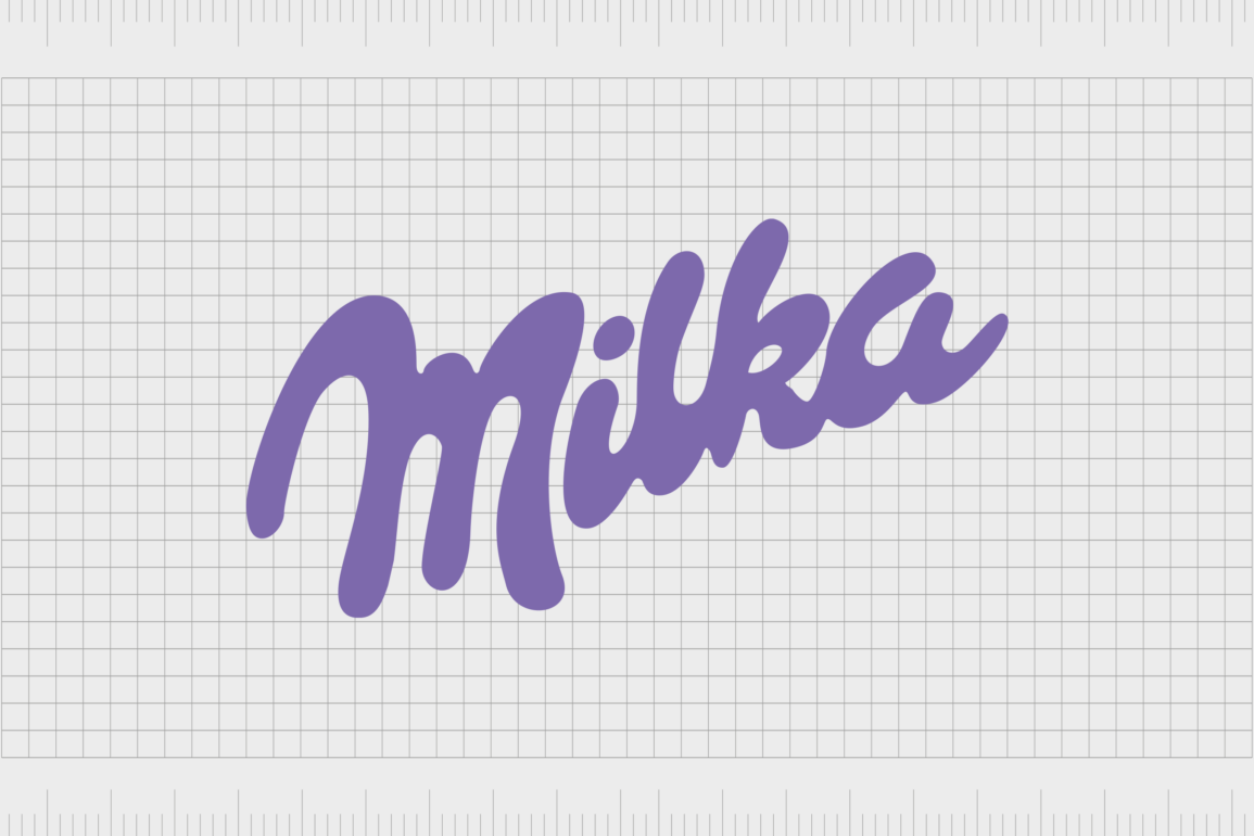
Are you familiar with Milka logo history? In various regions worldwide, the iconic Milka purple cow has captured the hearts and minds of endless confectionary lovers. While the company first launched more than 100 years ago, it remains to thrive as a successful entity to this day.
Milka is owned by Mondelez International and has a presence in regions all around the globe, including the United Kingdom and the United States. While many elements help to make the Milka company stand out, its branding choices are perhaps the most memorable of all.
A lilac purple and white color palette, a unique stylized wordmark, and a famous purple cow mascot define the Milka brand. Today, we will explore the origins, brand elements, and unique aesthetic of the Milka chocolate brand.
Milka chocolate origins: History of the Milka chocolate bar
The Milka chocolate bar and a host of other popular Milka-based products were originally produced in Switzerland. The company launched in 1901 under the “Suchard” brand. Philippe Suchard was a Swiss Chocolatier who established his first patisserie in 1825. Here, he sold a hand-made dessert brimming with luxurious chocolate.
By the following year, Suchard had already founded the “Chocolat Suchard” business and moved production to Serrieres, producing around 25-30kg of chocolate daily. In the 1880s, milk was added to Suchard’s recipe – an essential part of today’s Milka chocolate bar.
Phillipe’s son-in-law, Carl Russ-Suchard, took inspiration from Phillipe and launched his own company, the “Milka” brand, in 1901. The first bar was packaged in a distinctive lilac purple package – a color that remains consistent with the brand identity today.
Milka chocolate quickly captured the market’s attention, and products were introduced to Austria. By 1913, the company was already creating 18 times more chocolate than it had in 1880.
The Milka organization continued to grow as time passed, introducing themed chocolates based on certain celebrations like Christmas and Easter.
By the 1960s, the Milka logo and its iconic lilac packaging were both trademarked, as the company became Germany’s number one chocolate producer. In the 180s, Suchard eventually merged with Tobler to become the “Interfood” business, which later merged with Jacobs Coffee to become “Jacobs Suchard.”
In 1990, the Kraft Foods division, which eventually became Mondelez International, purchased Jacobs Suchard and the Milka business.
The purple chocolate brand: Exploring Milka chocolate products
The Milka chocolate brand is now one of the most famous in the world, with an instantly recognizable logo and color palette. The chocolate created by the brand has moved across various locations, starting in Switzerland before moving to Lorrach, in Germany, for the last 100 years.
Interestingly, the name of the business, “Milka,” is a portmanteau of the two main ingredients of the bar: “Milch” (or Milk) and “Kakao” (or Cocoa).
Today, Milka is sold in several different flavors and packages, depending on where you are. For instance, there are various partnerships between Milka and other well-known businesses, such as Oreo and Diam, which combine the two confections.
There’s even a Milka-flavored version of the famous Philadelphia cheese.
Throughout the world, buyers can find Milka products in white and milk variants and bars with caramel, hazelnuts, almonds, and various other fillings. Germany has a wide variety of unique Milka flavors, like Milka and TUC Crackers, and Milka with “Luflee caramel.”
Is Milka German or Swiss?
The answer to this question depends on who you ask. The Milka brand started in Switzerland but quickly moved production to Germany, where it became one of the country’s best-selling chocolatiers. Milka is produced in Germany, though it sells in regions worldwide.
Is Milka the same as Cadbury?
It’s common for consumers to assume Milka and Cadbury are similar, as both use purple-colored packaging. However, Cadbury and Milka are produced by two very separate companies. Milka also uses hazelnut paste regularly in its recipes, whereas Cadbury doesn’t.
Milka logo history: Why is the Milka logo purple?
Despite a lifespan of more than 100 years, the Milka logo hasn’t changed much. Indeed, the original Milka chocolate logos from the 1900s looks very similar to the one we know today and even maintain the iconic lilac coloring.
1901- 1922
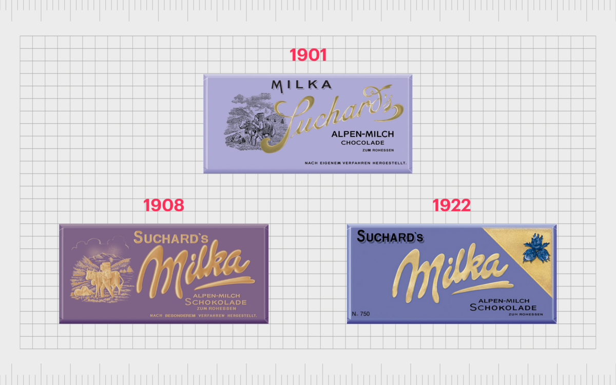
The first Milka logo to appear in 1901 focused more heavily on the name of the creator, Suchard, than the moniker for the business. This was an attempt to draw attention to the heritage of the well-known chocolatier.
Over time, the “Suchard” wording became smaller and less pronounced, and a script-style wordmark was introduced for the Milka name.
1960-1988
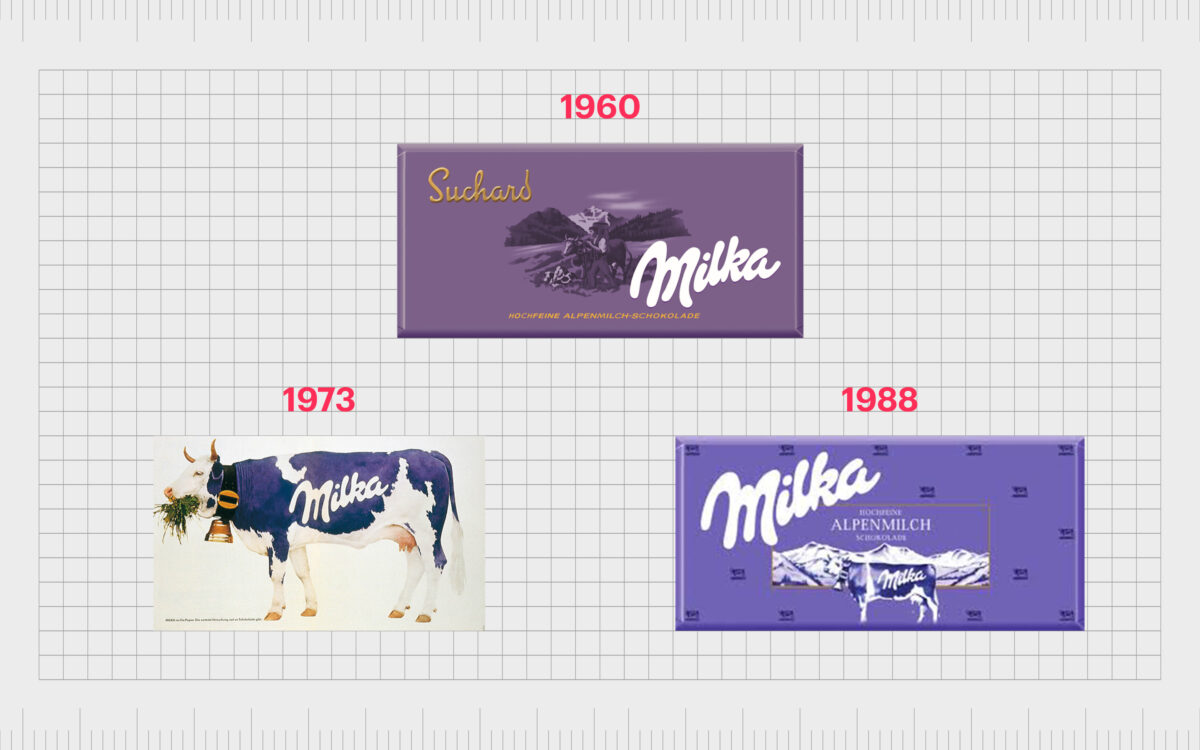
In the 1960s, Milka altered its wordmark slightly to make it more similar to the design we know today. The lilac coloring through the 60s and 70s varied a small amount, but the overall color palette stayed identical through the years. In the 1970s and 80s, Milka introduced the iconic purple cow.
The Simmental cow with a bell around her neck references the company’s Swiss origins.
1998 – 2003
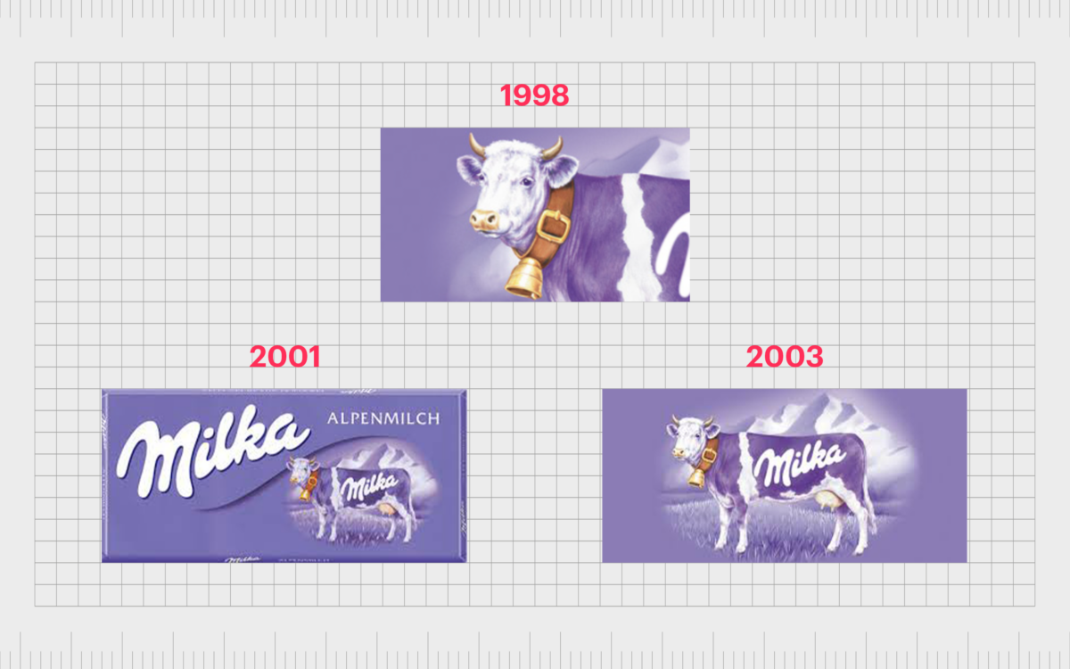
In the late 90s and early 2000s, the focus on the cow mascot was increased, and the image appeared on virtually every Milka advertisement and chocolate bar. The font chosen for the Milka wordmark remained consistent throughout multiple variations of the Milka logo.
The company also continued to use its iconic lilac coloring, which was now a trademark of the business.
The Milka cow helped to define the company as a Swiss manufacturer, even though the fact production of the chocolate bars had moved to Germany at this point. In advertisements, the cow was often placed in front of a landscape of the Swiss Alps.
2018- Today
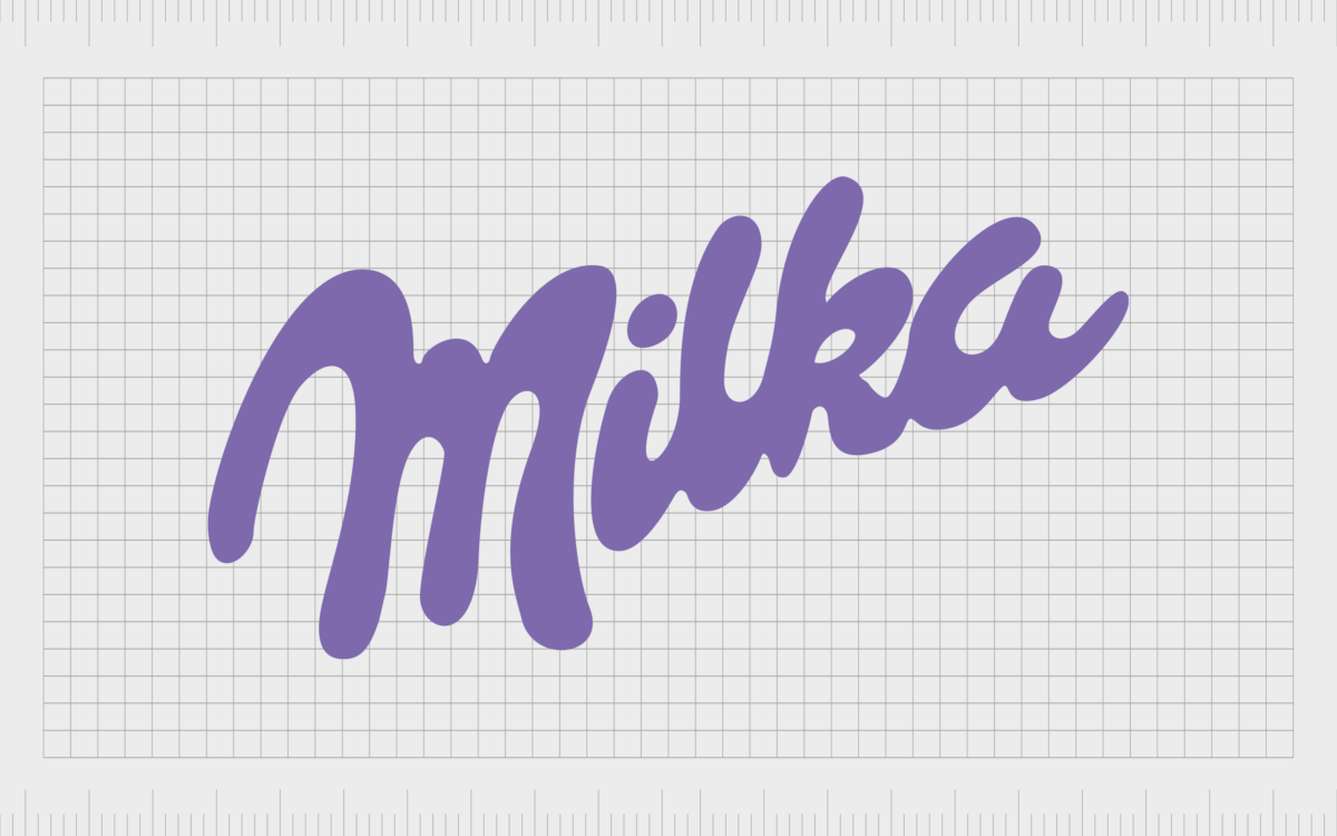
In the later 2000s, Milka simplified its logo somewhat, removing the cow and focusing entirely on the word mark. The font was refined slightly here to make it look more liquid, like the milk in the company’s iconic recipe. Even the dot over the “I” seems a little like a splash.
While the Milka cow still sometimes appears in advertisements for the company, it’s not an official part of the logo. You may still see the Milka cow on the company’s packaging, but she still appears in front of the Alps.
Milka brand assets: Colors, fonts, and meaning
Despite several stylistic changes over the years, the Milka logo and branding have remained consistent compared to many other confectionary brands. The lilac coloring and script-style font are two of the most significant elements of the organization’s image.
The choice of purple is famous for a company trying to convey luxury and differentiation without being overwhelming. Softer shades of purple are also frequently associated with positive feelings of compassion and affection.
If you want to check out the Milka logo for yourself, you can find some assets here:
What color is the Milka logo?
As mentioned above, the Milka logo colors are one of the main factors that help distinguish the brand from other chocolate companies. The lilac coloring is trademarked as part of its identity and has remained a consistent part of the organization’s image for over 100 years.
The Milka logo color is commonly defined as dark lavender:
Hex: #684FA3
RGB: (104, 79, 163)
CMYK: 0.361, 0.515, 0, 0.360
The color of the wordmark placed on the lilac background is simply a bright white, in reference to the crucial milk ingredient in the chocolate bars.
What font does the Milka logo use?
The Milka logo font is a stylized typography designed for the company itself. The image has changed only slightly over the years to become more refined. However, the brand has always stuck with a relatively cursive, script-style font with swirling, liquid elements.
The typeface’s design is intended to remind us of milk, particularly when combined with white coloring.
Celebrating the Milka purple cow
The Milka logo is an exciting example of a fantastic branding choice for a chocolate company. The brand chose its name as a reference to its distinctive ingredients and built its visual identity around this.
The decision to use lilac and white in the coloring for the brand was an important one by the business, as it has remained a consistent part of the Milka brand for decades.
Milka even has its own dedicated mascot, though it’s not included as part of the actual logo file for the company. While the Milka purple cow might not be a part of a logo, it’s still a distinctive part of the organization’s identity, along with the Swiss Alps’ image and the lilac color palette.
Fabrik: A branding agency for our times.
Clarity starts with a conversation.
Thanks—we’ll get back to you shortly.
Whether you're navigating a rebrand, merger, or simply need a clearer identity—we’re here to help. No hard sell, just honest advice from people who know the sector.
Let’s start with a simple question…
Prefer to email? Drop us a line.
Fabrik’s been helping organisations rethink and reshape their brands for over 25 years. We’ve guided companies through mergers, rebrands and new launches. Whatever stage you’re at, we’ll meet you there.


